The year is 2020, and I’ve decided to revisit an old childhood movie to escape the reality of lockdown while in college. I throw in Spy Kids 3-D: Game Over and watch a giant robot that looks like Sylvester Stallone self-destruct with Ricardo Montalbán inside it. As the robot falls apart, nuts, bolts and gears fly towards the viewer, and it would be really fun... if it were actually in 3D. Alas, once again I’ve thrown in a 3D movie with 3D gimmicks only to find that it’s somewhat awkward to experience a story that was formatted for a specific viewing experience converted and flattened for the older style. Thank God that doesn't happen with comic books.
Fast-forward a few months and I am a nervous wreck watching the presidential election and working on a midterm. I’m looking for something light to distract me from what feels like impending doom and a friend recommends a webcomic called Lore Olympus on Webtoon. I begin to read it and I notice that the comic is formatted to scroll down like a standard website article. It’s a bit jarring at first, but reading it this way soon becomes second nature. The formatting takes full advantage of a vertical phone screen in a way other digital comics wish they could. It’s freeform, has space to spare, and allows for the isolation of impactful moments with nothing else competing at a given swipe. It works wonderfully on a phone... but how would this look as a book?
 Many have asked how to present a comic book now that we have the boundaries of a screen to work within. More often than not, we see digital comics as just a jpeg of what would be a comic book page, and while this is a reasonable format for making previously-printed works accessible for digital consumption, the question of format remains: why are we still presenting comics in this fashion, and is there a better way for digital readers to experience comics, instead of the standard pinch and zoom of a digitized page? I myself was initially apprehensive of digital comics for this very reason. I didn’t like the way a comic page looked on screen; it simultaneously felt like a downgrade from the print medium, while also not utilizing any of the strengths of a screen.
This was until the concept of the "guided view" was introduced with platforms like comiXology. The basic idea is that the viewer’s screen is zoomed in on an individual panel (rather than filling the screen with the whole page), and, with the click of a mouse or the swipe of a finger, it takes the viewer to the next panel. This was a great step for meshing the two formats and utilizing the strengths of both. The caveat is that with something like a two-page spread, the reader is seeing only partial chunks of a larger image as they view the dialog; this also means that any cohesive page composition the artist utilized has been thrown out the window, with function taking precedence over form.
Separate from guided view digital comics is another form: what is commonly referred to as infinite scroll or infinite canvas. What this entails is essentially a long file that features all of the artwork and text of a comic, but instead of reading panels from left to right or right to left, the viewer reads them from top to bottom, thus only having to scroll down to “turn the page”. Because this formatting can be found on various platforms including Webtoon, Tapas and more, the infinite scroll is experiencing something of a renaissance. Webtoon enjoys a strong enough readership that they've even signed a deal with DC comics to have original licensed content hosted on their site and app. When looking at something like Webtoon, it’s worth keeping in mind that it is owned by a South Korean company, Naver Corporation, and, as such, got its start publishing independently produced manhwa; this linked the term manhwa with the infinite scroll format in a broad conversational sense. Where this infinite scroll format becomes... interesting, to say the least, is when a series becomes popular enough to receive a physical release as a comic book. At the time of this writing, physical print editions of webcomics formatted in the infinite canvas style are still relatively new to the market, so some growing pains are to be expected.
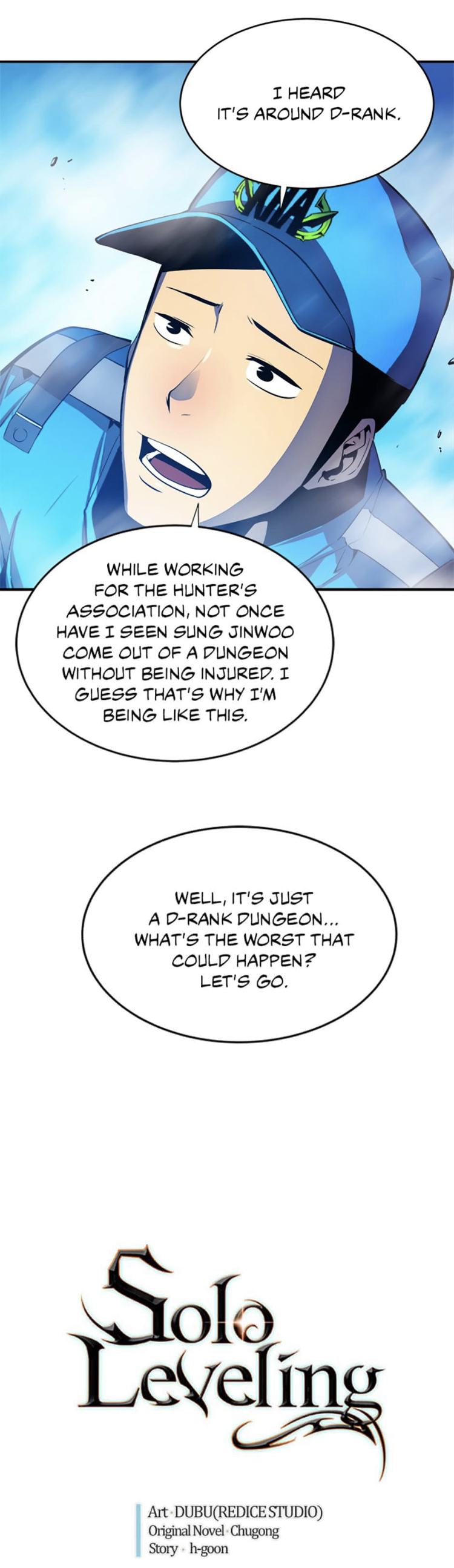
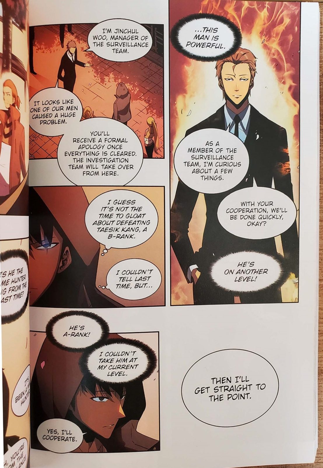
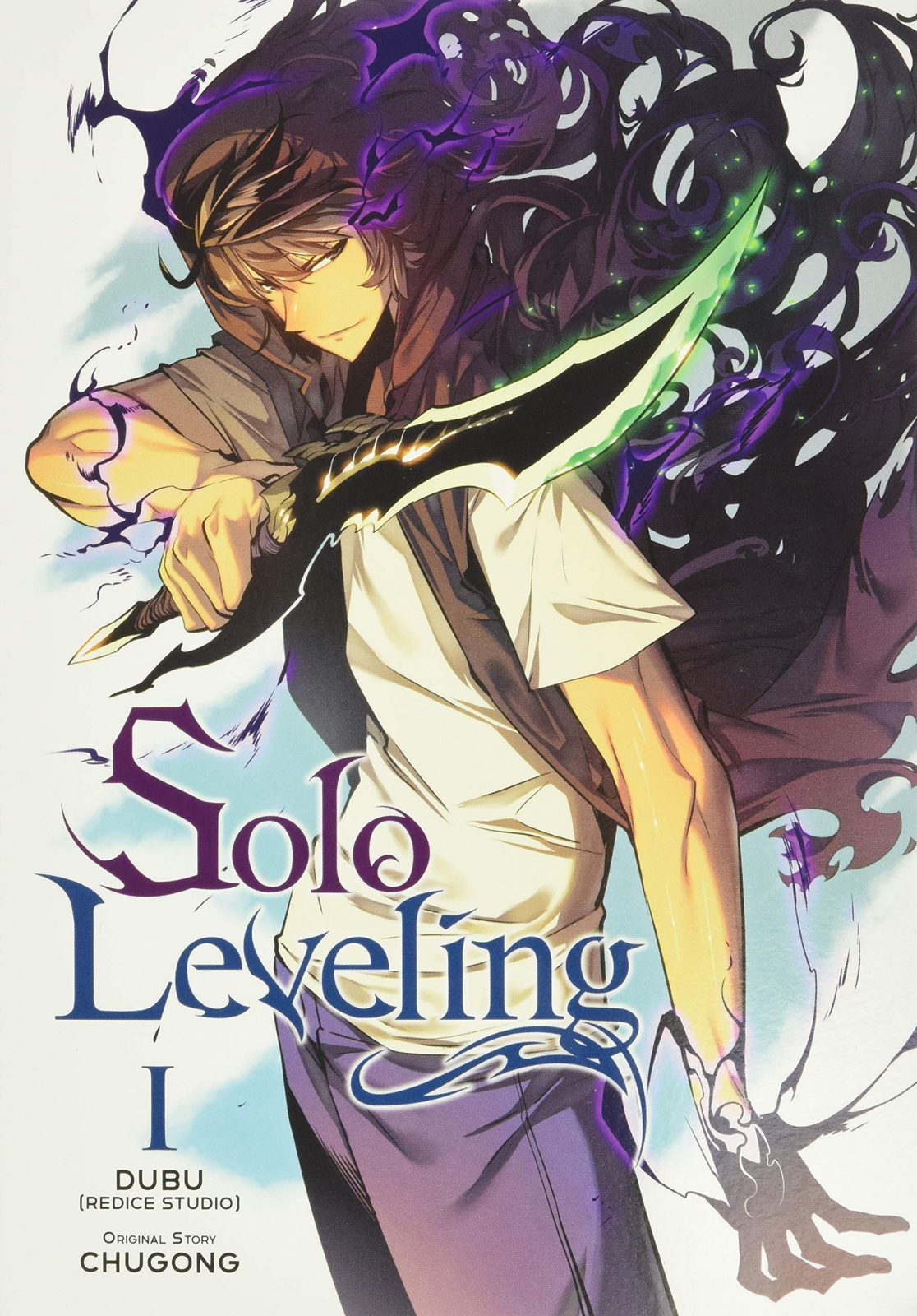 Take a series like the wildly popular Solo Leveling manhwa by Dubu, adapted from a web novel by Chugong, and initially published on KakaoPage (a media platform distinct from Webtoon; KakaoPage is owned by Kakao, which is a South Korean company specializing in internet applications). After garnering rave reviews, a loyal and passionate fanbase, and an official online English translation on platforms such as Tapas (also owned by Kakao), 2021 became the year of its first English-language print release, from veteran manga publisher Yen Press, following a 2019 Korean print release. Traditionally-published comic book artists have constantly had to pay attention to panel flow and how each panel guides the reader’s eye into the next one. If done correctly, the reader might not even notice their eye shifting from one panel to the next. If done incorrectly, the reader might become confused as to what panel to read next. With a format like infinite scroll, instead of pushing the reader’s eye to the left or right to encourage a page turn, the action of a story will instead direct the viewer to keep scrolling. The original artwork does not have a designated directional flow, because its main focus is to push the reader’s eye down. While I certainly have nothing against solid directional storytelling of any orientation, I do think this causes the printed physical book to have an awkward page design.
The first volume of Solo Leveling has a truly baffling page presentation. Due to the original artwork being formatted for a narrow cell phone screen, the publisher is faced with the difficult decision of how and where to cut the panels to group them on a physical page. These decisions have resulted in some panels just being a piece of art chopped in half and then placed on top of another to be used as two separate panels, despite their initial function. Some panels have been given room to breathe, and as a result look like your standard cell phone screen, while others have been cropped to fit where a landscape panel is needed. With all of the artwork cropped, the panels are then placed on the page, usually overlapping and ignoring any use of a grid, with almost no panels lining up vertically or horizontally. Instead of resembling your standard comic book page, it looks visually more reminiscent of a scrapbook. Panels are left floating in liminal space with large margins going unused, either left white or sometimes colored into a neutral value that matches the featured panels. The book is formatted in such a manner that some pages have as few as two small panels on the entire page, with much of the page being white space. The space that is so generously left blank is oftentimes used for dialog balloons instead of placing them within their respective panels. It’s an odd choice to guide the reader’s eye directly to a blank spot on the page just to read the text.
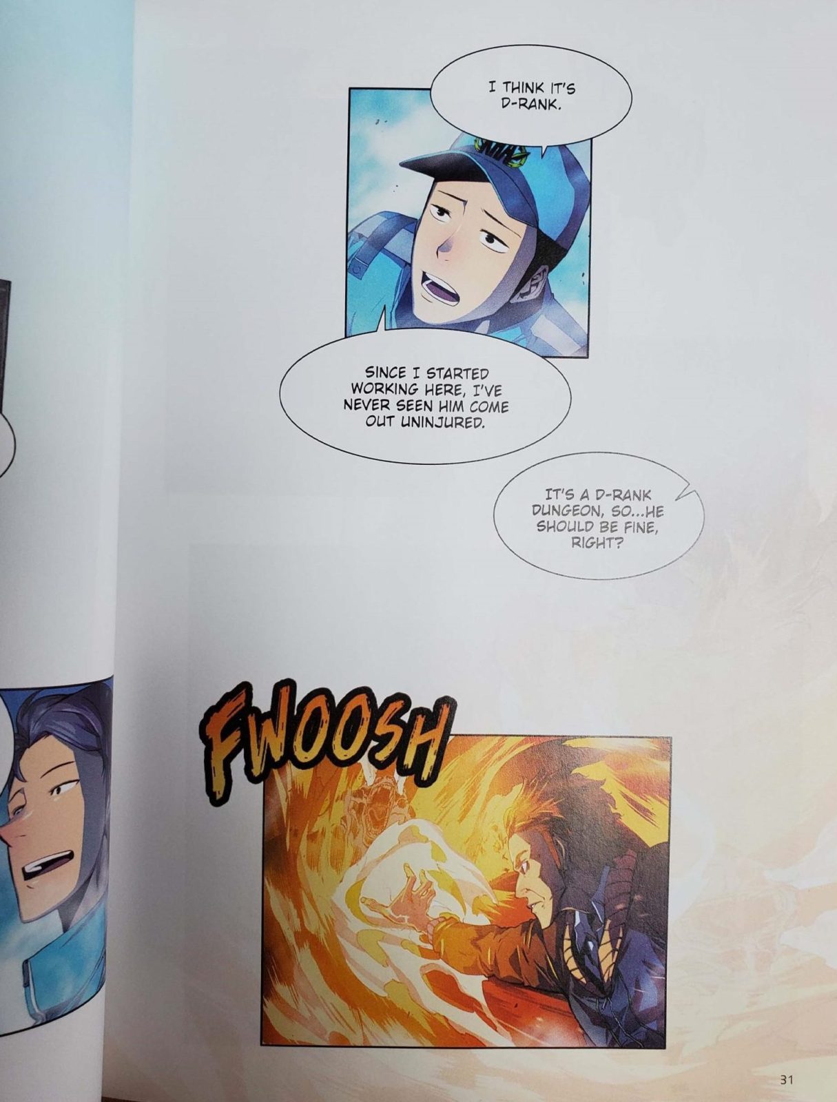
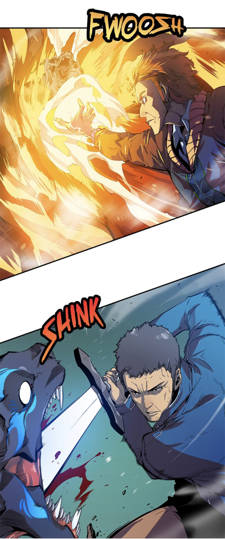
The reason the empty spaces and long panels occasionally read in a flat manner is due to the act of reading the digital comic. In the digital comic, as you scroll down on a large image, you are in a sense turning the page - and, as a result, you are revealing the image the further you scroll. This places the reader in an active position of moving through the space the characters occupy, while in the print editions much of the impact is lost with just an awkward oblong panel filling half a page. It’s not that they are boring panels, but rather that they come across as flat - and, depending on the panel, sometimes they are rotated 90 degrees so that they run sideways across an entire page.
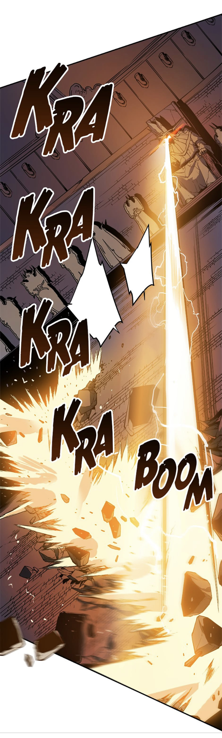

Not only does this affect the readability of the panel, but it affects the directional motion of the panel, now that it has quite literally been turned on its side. Sometimes these rotated panels even fight against the page turn, or run against the grain of the reading order. One can assume that at the time of Vol. 1's release the task of translating a digital comic formatted for infinite scroll was relatively uncharted territory, and as a result readers got this awkward book. I was beginning to question if there was a way to format this series in a manner that was more recognizable, while still staying true to the original format.
Volumes 2 and 3 of the print Solo Leveling made concerted efforts to address many of the oddities from the first volume, and to an extent succeeded. These volumes feature mostly new page designs with almost no wasted space or blank margins - indeed, in a similar fashion to comic books and manga that readers are familiar with. The art is still cropped, with some panels made longer while others are brought in closer to fit within the composition. While the books look immediately better at a glance, some cracks are still visible; for example, while the pages are filled with panels, the reading experience is significantly less intuitive, because the panels don’t always make sense from a reading perspective. This is because the panels are stacked left - meaning that on a given page, on the left side of said page, two or more panels are stacked on top of one another, thus leading to confusion as to which panel to read after the top left panel. Do you read the panel under it, or the one to the right of it?

Another byproduct of the translation from screen to page is the fact that, much like the first volume, artwork is reused in an effort to fill space on the page. This leads to the noticeable presence of useless panels - for example, one panel used to fill space in Volume 2 is just an image of a character’s crotch, for no reason other than the idea that it beats having blank space. With all of that said, the print-format Solo Leveling has made major progress in terms of its overall translation of the original webcomic.

After observing everything I could from one series’ print editions, I thought it would be good to check out another title for comparison's sake, to see if another publisher had a different approach to printing this emerging format. I returned to Lore Olympus by New Zealand artist Rachel Smythe (a native English-language comic posted on the Webtoon platform), and it just so happened that Del Rey was handling the print version of this title. The book design is handled by Edwin Vasquez, and I have to say this book moves with a different cadence compared to the previously-mentioned Solo Leveling volumes. Admittedly, the mass amounts of white space remain, though not throughout the entirety of the book - and where there is white space, it appears to be more reminiscent of the original format, as the Webtoon version features a large amount of white space between its artwork as well. Where we see differences is in the variety of page layouts utilized in this single volume; some pages have major white gaps between the artwork, and once again we are treated to dialog floating in those spaces.

A common occurrence within titles formatted for a platform like Webtoon is the inclusion of word bubbles that break the panel border. These word bubbles can serve as a way to aid the flow of the story while the reader scrolls through the comic. When applied to a book, an oddity occurs occasionally with a word balloon breaking the top right side of the panel - and, as the highest balloon, they are intended to be read before a balloon on the left that is positioned lower. Reading this way can become mildly tedious, as even strong layouts can feature such counterintuitive balloon placement. This again goes to the idea of the artwork playing to different directions, as the viewer’s eye in the original webcomic is encouraged to move down and cascade from one side of the screen to the other like a game of pong instead of the standard “Z” shape we see with comics in print.


Some pages in the Lore Olympus print edition feature colored backgrounds like pages in the first print volume of Solo Leveling, while some pages adhere to a grid. Or - it’s more like a partial grid, with yet again some free floating panels, but a grid nonetheless. While a book like Lore Olympus shares definite common DNA with Solo Leveling from a format standpoint, the white space left on the page is more easily forgiven, as the space is utilized in what looks like a more intentional design. White space is visible, but the panels themselves are emphasized within that dead space. The minimal panels on some pages can be used to show the passage of time, or for the special impact of a scene.
All together it still feels like early days for these print editions, so we may see revisions to the presentation of these books moving forward, as publishers zero in on what makes for a good reading experience. As far as the artwork goes, I think there’s no changing the fact that, when placed in a more horizontal format like a printed book, the panels feature less directional guidance and instead fit like family photos on a wall. In reality, it looks as though the publishers have taken what should be an incredibly simplified format—that being a single long page that features multiple panels, with no confusion as to the intended sequence—and managed to complicate the sequences entirely with little regard for the time or space implied between the panels. While these books are competently made and well-printed, it does feel like we are missing part of the experience "webtoons" are known for, much like the act of watching a 3D movie in 2D at home. It functions to tell the story, but lacks the format that made it fun. It will continue to be fascinating to see how publishers address this conundrum of formatting, and where the conversion of format eventually settles.


