The following is an excerpt from TCJ contributor Matt Seneca's self-published comics criticism zine, The American Mainstream.
 DECEMBER 1953
Captain 3D #1, by Jack Kirby, Joe Simon, Mort Meskin, and Steve Ditko, published by Harvey Comics.
This comic wasn't published because superheroes had made it back atop the market after their fall from grace following World War II. Far from it! We're still very much in the postwar era, and the trend being hopped on can be found in the other half of Captain 3D's moniker. Much as Jack Kirby has become a cautionary tale of the true artist who couldn't leverage his talents into the pop-cultural bonanza his counterpart Stan Lee did, he and earlier partner Joe Simon had their own marketing savvy. Similar to the Silver Surfer, Captain 3D is a superhero that leaps with Kirby-esque vigor onto an existing fad, in this case the early 1950s vogue for 3D movies (the first-ever 3D comic beat this one into print by two months). But it's also proof that the time for superhero comics' big comeback was still to come: the debut outing of a Kirby superhero executed with, if anything, a dash more inspiration than the first acts given to the Marvel characters he'd create in the following decade... and a commercial flop, never followed up with a second issue.
Where the earliest adventures of characters like the Fantastic Four and the Hulk lean tentatively into the heroic from a monster-magazine formula that had kept Marvel solvent during its leanest years in the late '50s, Captain 3D is a full-throated and unambiguous embrace of the idiom. Yet it isn't really cookie-cutter, because in 1953 the cookie cutter that would one day render so many samey super guys had yet to exist. The character's origin provides as good a primer on the breadth of Kirby's interests as anything else. Shades of Captain America and Shazam color his opening bow, as a boy who randomly inherits a used bookstore comes into possession of an ancient incunabula coveted by a long-forgotten race of, I shit you not, "Cat People"! Equipped with flesh-disintegrating "gamma guns" that allow for flashes of the extreme gore so popular in the era's horror comics, the Cat People menace young Danny until he uses a set of strange glasses to look at a drawing of Our Hero contained within the mysterious book, bringing it immediately to flesh-and-blood life. It's a great meta-hook - you, young reader, are the hero bringing Captain 3D to life by reading his adventures - and its consciousness of comics as the form most reliant on collaboration between creator and audience is as satisfying as the mixture of fantasy and science fiction filling in the backstory.
Like a lot of old comics, this issue is more enjoyable as a collection of great glimmers than a fully realized whole. In the second of its three short stories, our heroes face the Cat People's fearsome leader, Tigra, later the name of a Marvel heroine. At one point Kirby or Simon forget they aren't scripting the actual Shazam comic and have Captain 3D call Danny "Billy", as in Batson. The page layouts are as pinned to the geometry of a regular 6-panel grid as anything Kirby ever did, and watching him work it is a joy. Steve Ditko, here employed as assistant to inker Mort Meskin on only his third-ever published work, begins as an anonymous embellisher, but grows in recognizability as the book wears on, until by its final story (featuring a villain whose steel plated skull dooms him to a head-first plunge into a watery grave) we can see glimpses of an iconic style in the rendering of drapery and expressions on minor characters' faces. This comic is a great read.
So why didn't it take off? "Wrong place, wrong time" sounds nice, and there's certainly a grain of truth in it, but there are other factors to consider. Chief among them is how shitty the 3D really is. As a general rule, 20th century comics are badly produced objects, and this one is no exception. In a time period when it was an eternal struggle to get regular printing's color plate registration to line up accurately, attempting a 3D comic was tilting at windmills. Kirby's compositions do their best to make things easy - panels stick to two grounds, with objects in a clearly demarcated back- and fore- spaced well apart from each other - but the printing simply isn't up to the job, making the worst parts actively difficult to look at, let alone read. Compounding this is the low quality of the two pairs of earpiece-less glasses included with the book, with green lenses that are almost clear. Had I not had a different 3D comic from 2017 close at hand, I'm not certain I would have made it to the end. It's safe to surmise the kids spending their quarters on this book in 1953 didn't have that option. Where the hell is Ray Zone when you need him?
Captain 3D's final page tips its hand. The typical ad for the publisher's "other stuff you might be interested in" shows no cognizance that this particular item - again, the debut issue of a Kirby superhero comic! - might be something special. Instead, Captain 3D impels you to "read our companion 3D magazines", which include funny animal comics, a Little Dot ripoff called Dolly, and two magazines uninspiredly aping the Roy Crane noncostumed-adventure formula, True 3D and Adventures in 3D. Harvey Comics is just throwing shit at the wall here, burning through concepts that had already proved out commercially at some point in order to bolster a short-lived publishing experiment. In 1953 Kirby hero comics were just one of many such warhorse concepts: nothing special, until suddenly one day they were. That day wouldn't be for years, though. None of Harvey's 3D comics lasted more than two issues, and this one didn't even make it that far, despite its cliffhanger's promise of further adventures to come. Said promises were eventually delivered upon, when the few pages completed for Captain 3D #2 were printed by AC Comics in 1999 to, shall we say, limited fanfare. Wrong place, wrong time again.
MARCH 1962
Rip Hunter... Time Master #7, by Alex Toth and Jack Miller, published by DC Comics.
Flash forward a decade and the landscape is forever changed. The Marvel Age was only beginning its crest, but DC had a new cottage industry in superheroes after the infamous US Senate Subcommittee on Juvenile Delinquency took crime and horror comics out at the knees with the Comics Code Authority censor board. It's easy to look at DC's late-'50s modernization of previously existing superhero properties as canny or inspired. After all, here was material so wholesome no one could object to it, married to a milieu so ripe for flights of imaginative fancy that it could provide thrills equal to the chills of the stuff it replaced. What actually happened, though, wasn't much different from what Harvey Comics did with their welter of random ass 3D comics. In an industry-wide moment of crisis the top publisher threw a bunch of shit at the wall, and had enough of a war chest to allow them the luxury of waiting around to see what stuck.
 The reintroduction of the Flash concept with a new character streamlined for the jet age in 1956's Showcase #4 is popularly agreed upon as the zero point for the return of superhero comics as dominant market force. But the previous three issues of Showcase, DC's "try-out" series for new features, spotlight military strip The Frogmen, the Western Kings of the Wild, and The Fire Fighters, which is about uhhhh firefighters. Issue 5 introduces the espionage-flavored Manhunters. It's not until issue 6 debuts Kirby's Challengers of the Unknown (itself more of a high tech update of Crane's powerless-hero formula than anything) that the new ideas Showcase presents indicate DC is thinking about superheroes as anything more than a way to fill up panels. And even then, bets are hedged. Between all-timers like Green Lantern and Aquaman, the series steadfastly offers readers non-super pabulum like Space Ranger, Tommy Tomorrow of the Planeteers, and the first comic book adaptation of James Bond. It would be a decade before any comics publisher put all its eggs in the costumed adventure basket.
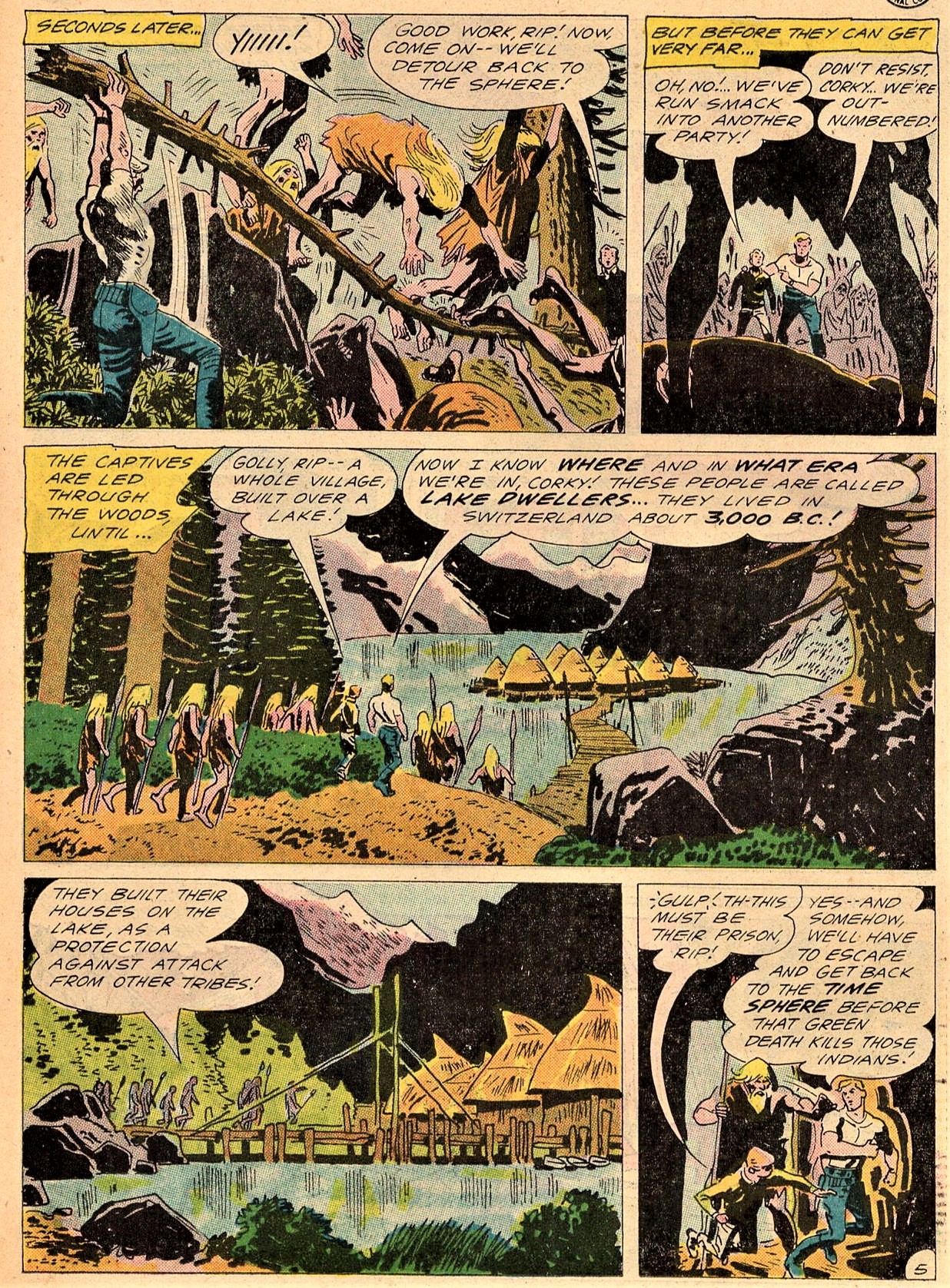
Rip Hunter, the Time Master, is one of Showcase's many halfhearted efforts at diversity of content. The feature's 1959-65 run, first in Showcase and then its own book, is a noncommittal mix of light sci-fi, adventure, and fantasy so typical of the period's DC comics that it's emblematic. Rip builds a cool looking time machine sphere, and he and his buddies go around from era to era doing vaguely heroic stuff. It's a great sampler of the kind of lukewarm material superhero stories won out over in the neutered post-Comics Code field. With some teeth and edge to it, this brand of comic can work, but done as ramrod-straight formula it just feels vague and gray (see Alberto Breccia's roughly contemporary Mort Cinder down Argentina way for something both very similar and light years ahead). This is the kind of old comic it's tough to read all the way through; the characters speak in undifferentiated voices to explain what's happening in each panel, and the overarching plot (a quest through time to find the antidote for a mysterious disease) is so shopworn it feels featureless, not worth recounting or paying attention to.
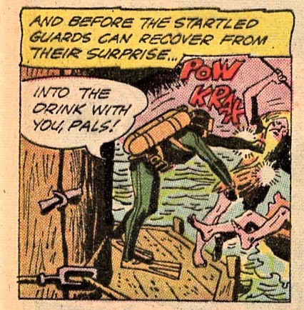
Luckily, DC was the big stable for action comics artists during this period, employing enough amazing dudes to make a large percentage of even their bad comics worth looking at. Rip Hunter #7 is an Alex Toth issue, and seeing one of comics' master craftsmen elevate this featureless feature is a delight. The first half of the book is Toth inking himself, and in a departure from his usual round and regular inking, Toth attacks these pages with only a thick, inelegant brush and pin-thin, spiky slashes of pen line. There's a huge gap between the two types of markmaking on display, so that you can really see the construction of the images beneath the content. Black areas are knocked out with slammed-down blottings, everything else scribbled through at maximum speed. There's force and velocity to everything on the pages here, totally unearned by Jack Miller's script but no less palpable for that. Even better, it's a visual approach that fits its subject matter, with our heroes captured by a shambling horde of lake-dwelling barbarians amid a Swiss pine forest circa 2000 BC. Toth composes large-scale action sequences in a landscape that bristles with life; you can smell crispness in the air over the musty newsprint.
Still, the ads in this comic too are telling. Toth's best pages are timeless; a lot of the other stuff DC was doing during this moment ended up historic. Whether any of Carmine Infantino's work on The Flash, Gil Kane's on Green Lantern, or Nick Cardy's on Aquaman is of a higher level of objective visual quality than what Toth's doing here is, maybe, a debate worth having. But all the other comics hawked in between the pages of this one carry a powerful element of world-building discovery and charm that Rip Hunter's adventures lack. The disadvantage is just too steep to overcome. In 1962, comic books were made for little kids to buy, and speaking for myself, I didn't start buying comics because of things like the savagery a page was inked with until I was old enough to start wanting to get laid and realize I was going to have to wait literal years to do so. Rip Hunter lasted another 22 issues, the majority of which saw its heroes don matching outfits that made them look like a superhero team, kind of.
 APRIL 1964
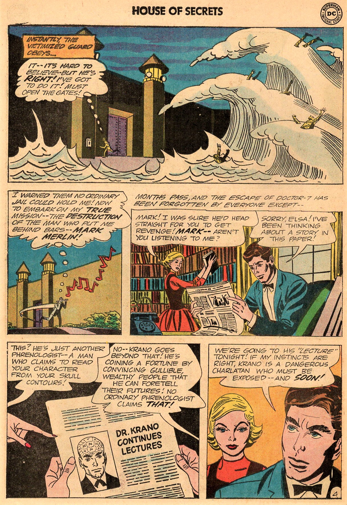
House of Secrets #65, by Alex Toth, Mort Meskin, Bob Haney, and Arnold Drake, published by DC Comics.
Here's another kind of comic whose time was yet to come - but not until much later. In 1964 Jack Kirby was just beginning the unequaled hot streak that would make Marvel comics' top publisher for good by the end of the '60s, and DC was in a renaissance. Showcase debuted issue after issue of long-running, oft-republished characters' early appearances: the Teen Titans, Dr. Fate, the Spectre. Guys like Rip Hunter would mostly take last bows in the next few years. But they hung on for now, edging into slightly more offbeat territory as the traumatic Senate Subcommittee experience faded deeper into comics' past and the '60s became The '60s. If the title House of Secrets rings a bell, it's most likely due to the various DC/Vertigo revamps of it that popped up during that imprint's 1990s heyday. Indeed, it's easy to draw a line from this issue's contents to the stylistic gestures of the "mature readers" Vertigo line: supernatural heroics with spandex and dynamism swapped out for occult leanings and a sprinkle of the mod. All but one of the other comics advertised herein would later see a Vertigo resurrection of some kind: Doom Patrol, Sergeant Rock, Tomahawk.
The first of the book's two co-features, Mort Meskin and Arnold Drake's "Mark Merlin", is justifiably forgotten. Its suited, bow-tied protagonist and his stylish girlfriend (complete with pet cat) attempt to debunk a popular phrenologist's (!) claims that he can forsee the moment of his clients' impending deaths, fighting various moving statues in the process. Mark Merlin's superpower is the ability to inhabit the body of his cat, which sounds as tailor-made a wrinkle as possible for whatever Neil Gaiman imitator Vertigo could have dug up to helm a reboot-that-never-was - but it's handled with a laughable lack of inspiration here by Drake, who literally just has the cat jump up to get something Merlin can't reach before returning the protagonist to his human body. Cool?
The closest thing the story has to an actual hook is Meskin's drawing. His influence on his Captain 3D assistant Ditko is immediately obvious: the strange, geometric featurelessness of the backgrounds and the gangling, drapery-swaddled figures are all too familiar. Meskin went further in simplifying his art than Ditko would for decades, though. A panel of a tidal wave sweeping through a prison yard looks like it could have come out of Beetle Bailey; the audience for the phrenologist villain's stage act is a few facial details engulfed in strikingly shaped shadows. It's nice looking stuff, but hardly a career high point for Meskin. You've never heard of Mark Merlin for a reason.
 There's an off chance you've heard of the book's second co-lead, though. Eclipso ("the most daring character ever created in comics!") has been a DC mainstay since his inception four issues before this one as an early supervillain protagonist, and there's a real spark to this fifth outing. Alex Toth, working in a more familiar mode than the scratchy style with which he rendered Rip Hunter, absolutely knocks his 13 pages out of the park. His minimal, black-drenched style is a great match for Eclipso, the split personality of paranoid schizophrenic Bruce Gordon, who succumbs to evil urges whenever he glimpses an eclipse, or even a simulated one, as he does in a carnival funhouse to trigger this adventure's action. ("Oh no! A disc of light being eclipsed!" he moans. God help this guy if he ever takes a record out of its sleeve in front of a light bulb.)
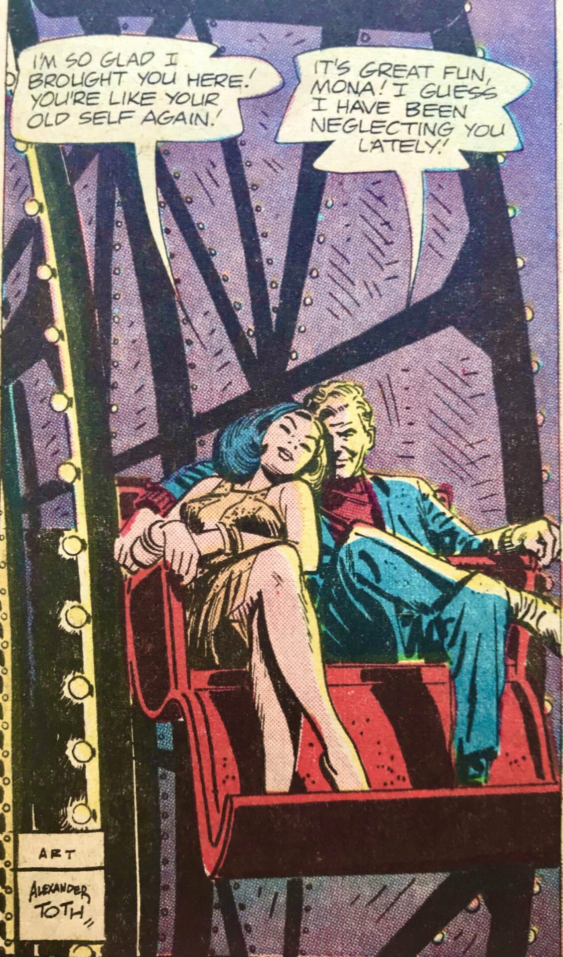 Eclipso is a feature with as much potential as plenty of the other inherently goofy ideas that became famous super-characters, and Toth works to imbue it with its own brand of distinctive visual weirdness. The carnival setting of the opening sequence resolves into an action set piece on the scaffolding of a roller coaster, dense grids of geometric brush marks filling up panels and providing all the depth of field necessary. Eclipso's energy rays escape generic-comic-book hell by being rendered in striking solid black. The issue's antagonist is an entry in the worn "old school chum with a grudge" ledger, but he gains a creepy grandeur with Toth drawing him as a naked man suspended in a green blob of luminescent energy, floating through the catacombs of a personal residence he built as a replica of an Egyptian pyramid literally just because he thought it looked cool. It's these kind of imaginative visual flourishes, these departures from the action formula established by Roy Crane, that elevated the successful superhero ideas of this period above the try-hard also-rans.
Make no mistake, this is still paint-by-numbers stuff from writer Bob Haney, with a plot revolving around a stolen nuclear warhead and a villain with mind-control powers. But 55 years later, seeing Toth sink his teeth into it is a fresh, even exciting feeling. There's no real good reason why this one didn't hit, besides heroes with a darker edge still not being ready for their moment. That's illustrated by the dumbass kids in the letter column calling for Toth's ouster and the restoration of original Eclipso artist Lee Elias. Little morons.


