Drew Friedman's latest book of portraits of iconic celebrities, almost-celebrities, and those nearly lost in the passage of time, Maverix and Lunatix: Icons of Underground Comix (Fantagraphics, 2022), is a love letter to the men and women in the battle trenches of the underground comics world, an explosive and short-lived movement that ran, essentially, from 1967 to 1977 on both coasts (New York City and San Francisco) with mini-eruptions throughout the rest of the U.S. I loved Friedman's Fantagraphics series on Jewish comedians (the three-volume Old Jewish Comedians, 2006-11) and the founders of the comic book universe (Heroes of the Comics, 2014; and More Heroes of the Comics, 2016), but this is the book I'd been waiting for. And it doesn't disappoint in any way; it exceeds beyond any expectation.
It is, in fact, haunting.
Early in his career, Friedman stood out from the pack due to his sheer talent, biting humor and nearly impossible-to-comprehend drawing style. His photorealistic work using an arcane stippling approach, starting with the strips he did with his brother Josh Alan Friedman for places like Heavy Metal and RAW, was brilliantly funny, scarily realistic, and often mean. It was unlike anything else, capturing hidden lives like a documentary photographer. Were those images made from xeroxes of old screen print newspaper photos? Jim Nabors, Tor Johnson... does anyone outside of the New York metro area even know who Joe Franklin is? It was an insular, black-and-white television world, filled with pitiful sad sack characters who caught the attention of Friedman, his brother and their friends. A lengthy Comics Journal interview I conducted with Friedman some 30 years ago more than recounts those earlier days.
Friedman gave up the stippling over 25 years ago, and has emerged to become, in the words of Steven Heller, "a master portraitist, precise yet with a smidge of caricature, who finds the right pose to capture and facial expression to focus on." In Maverix and Lunatix, Friedman chooses to focus on capturing the images of more than 100 of the best-known (and least-known) cartoonists working in the UG world during its peak. All of the familiar names—Crumb, Spain, Justin Green, Art Spiegelman, Bill Griffith, S. Clay Wilson, Trina Robbins and the rest—appear in the book, of course, as well as the other well-known names of the era, including Jay Lynch, Gilbert Shelton, Diane Noomin, Skip Williamson, Robert Williams, Aline Kominsky-Crumb, Rory Hayes, Rick Griffin, Shary Flenniken, Bobby London, Kim Deitch, Howard Cruse, Vaughn Bodē, Denis Kitchen and many, many more. And then there's a bunch of people who you may have never heard of, or maybe just saw their name once or twice, but can't remember what their art even looked like. All of them contributed to the power of that was the UG era. And Friedman honors their contributions masterfully in this elegant book, which includes an afterword from UG historian Patrick Rosenkranz and an intro from comedian/actor/podcaster Marc Maron.
Response to the book—by those captured in it and others—has been extremely positive. After flipping through an advance copy she'd been handed at Cartoon Crossroads Columbus (CXC) in October, cartoonist Lee Marrs replied, "It was better than a high school reunion."
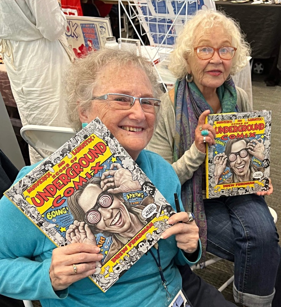
In a note to Friedman, cover model Robert Crumb wrote, "Among my favorite renditions are Rory Hayes and Jay Lynch. Glad to see you included Buckwheat Florida, Jr... I was surprised by the birth and death dates. I didn't realize so many of them had died. I was quite surprised to learn that Gary Arlington was born in 1938. I always thought he was younger than me. Turns out he was five years older!"

In another note, cartoonist Leonard Rifas said, "When you told me I would be in the book, I wrote that I expected to learn something new about my face. Studying my portrait, I have learned the words 'rhinion' and 'exophoria'."
William Stout: "I love my portrait; I am tickled pink that you included me in this great book. So glad you also included the great Ron Cobb, too. Sorry to see that so many of us have passed away.... By all means, pick up this book and Drew Friedman's two books on comic book creators. These three tomes are essential and all will truly stand the test of time. Drew's pencil never stops until he captures the souls of his subjects."
When Friedman's Heroes of the Comics volumes were published, this is the type of book from him that I had hoped would one day arrive. I was not alone. Friedman, who had been considering doing a book on the UG artists for some time, said he decided to finally proceed following a conversation he had with Robert Crumb.
"I had been vacillating about creating a book of portraits of UG cartoonists, my hesitation was that I didn’t love all of the major artists," Friedman told me in an email. "Many of them I certainly would include in my list of favorite artists, but some... without mentioning any names, I either felt indifferent to or just downright didn't care for.
"I had lunch with R. Crumb in New York in early 2019 when Jon Cooke and I presented him with an early copy of The Book of Weirdo and I mentioned this dilemma to him. His response was 'So what? You don't have to like everyone you draw,' which of course made perfect sense. For god's sakes, I've drawn Donald Trump many times over the years, beginning back with SPY. That's when I committed to doing the book."
And we're all the better that he did.
In an attempt to capture the importance of this book, I spoke to a number of people—including Friedman—about it. Maverix and Lunatix covers a sprawling era in comics history, and so, this will be a bit of a sprawling look at the book, with many voices weighing in. My interview with Friedman follows conversations with several people with portraits in the book, along with Everett Rand, whose influential zine Mineshaft keeps their spirit alive.
* * *
John Peck
(cartoonist)

You were never really expelled from the UG comix establishment, were you? How is it even possible to be expelled from the UGs?
The nicest way that I can put the situation, is that living in Providence and not wanting to leave Providence, I was never able to pal around with the underground comics establishment particularly. I did go into New York a few times. Primarily became friendly with Spain Rodriguez and Kim Deitch, who was editing Gothic Blimp Works (the comix supplement connected to the East Village Other hippie newspaper) at the time. So I contributed some work to some of their later issues. I always felt a kinship to the East Village Other because that's how I got started. There was a little variety store near the Rhode Island School of Design and somebody arranged for them to carry the East Village Other there. And that's where I got the idea of advertising for, like, pipes and papers... because some friends of mine who were instrument makers, they made banjos and guitars and they cut blocks of hardwood, like rosewood and ebony and so forth, to make extra instruments, and then they made pipes out of the pieces they cut out. And also, I found out where to buy cigarette papers wholesale. So I decided to advertise in the East Village Other, little ads that you see in the beginning of my anthology (Mad Peck Studios: A Twenty-Year Retrospective [Doubleday, 1987]), and like everybody else I was influenced by Harvey Kurtzman, who had once done a parody of those little ads that appeared in men's magazines. And that's how the catalog got started. And then people from the Rhode Island School of Design and other local artists and myself started filling out pages of the catalog with cartoons. And that's how I fell into the whole thing.
What do you think of Drew's portrait of you?
People tell me I look like John Waters. Which is fine with me because people used to say that I looked like Frank Zappa cuz I used to have a mustache and a little bitty goatee... I'm really grateful that Drew included me and as the saying goes, even though I have no real idea what I was doing, I'd say that I did a half-decent job.
Is it true you hadn't been photographed in 50 years?
Pretty much. Since I had the likeness of Dr. Oldie, which I consider much more handsome than myself, I thought, 'why should I let myself be photographed when I had this wickedly handsome cartoon representation to show to the public?' [Laughs]
* * *
Buckwheat Florida, Jr.
(cartoonist)
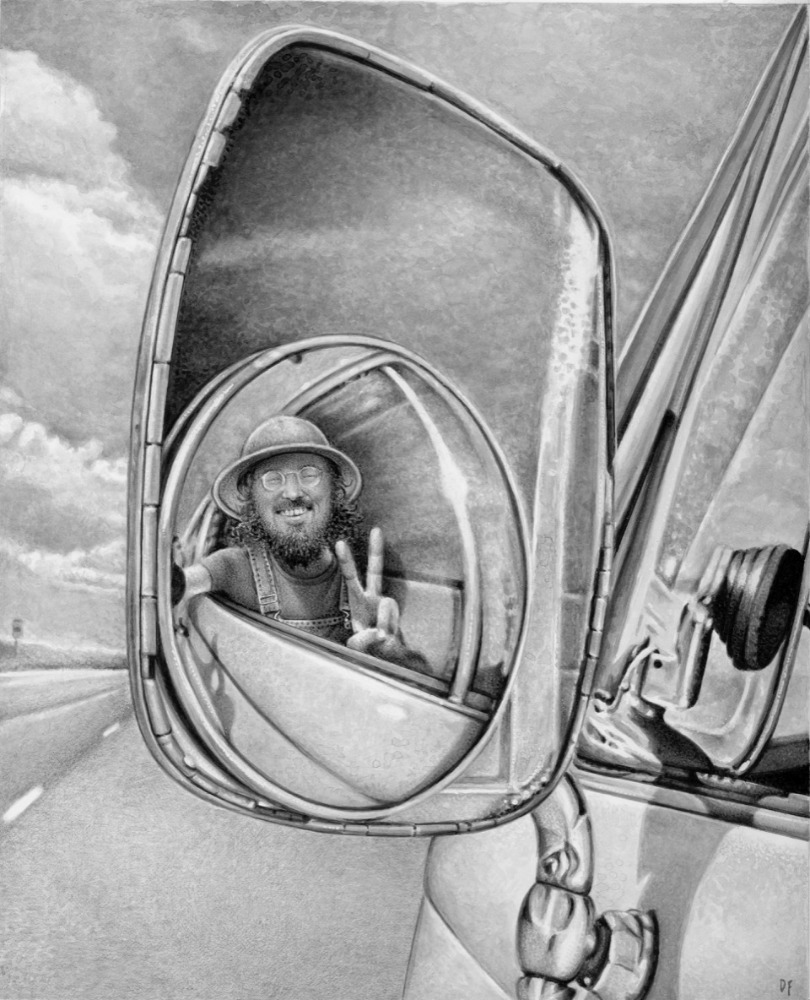
Were you surprised to be included in this book?
I was definitely surprised as I had no knowledge of a book until I was told of the arrival... because Drew included over a hundred people, I wasn't surprised to be in his book. I wasn't one of the guiding lights in the UG Comix and certainly some people had every right to think my stuff wasn't comix at all, but it was definitely weird stuff for weird times.
The big surprise for me was who Drew Friedman is. After I looked him up, I realized I had been seeing his art and portraits all over the place [for] probably 40 years, Rolling Stone, New Yorker, Heavy Metal, etc., so it is an honor to be included in his book.
This is an important book for my art right now. I started drawing, painting again about 2005... around 2010 started doing gallery shows over here in Chiang Mai, Thailand, where I have been living since '87.
Maverix and Lunatix will help me explain the UG Comix to them... a little more claim to fame.
What's the story behind your name? It's one of the best in comics history.
How did [the] "Buckwheat Florida, Jr." name originate? I kinda remember because since then I've seen the old composition book, that I wrote that name down when it came to me in an LSD trip. Probably late '67... in those days when I smoked grass or took LSD when it was available, I would sit and doodle in composition books... I was an angry young man at the time, Vietnam War, corporate greed, racism, etc.
I was being put on trial in SF court for refusing induction into US Army... I couldn't use my real name because of the crazy stuff in the art, so I needed another name... Buckwheat (about as bad as the N Word) Florida, [where] I was from. In 1963, I started Florida State U. thinking I would end up a Baptist preacher or missionary... quick transition to beatnik, Kerouac, Ginsberg and by spring of '66 accidently ended up in SF and watched the hippie thing unfold, and in real life, a Junior... and the folks and friends back home wouldn't likely see any of these publications I was in anyway.
* * *
Robert Armstrong
(cartoonist, musician)
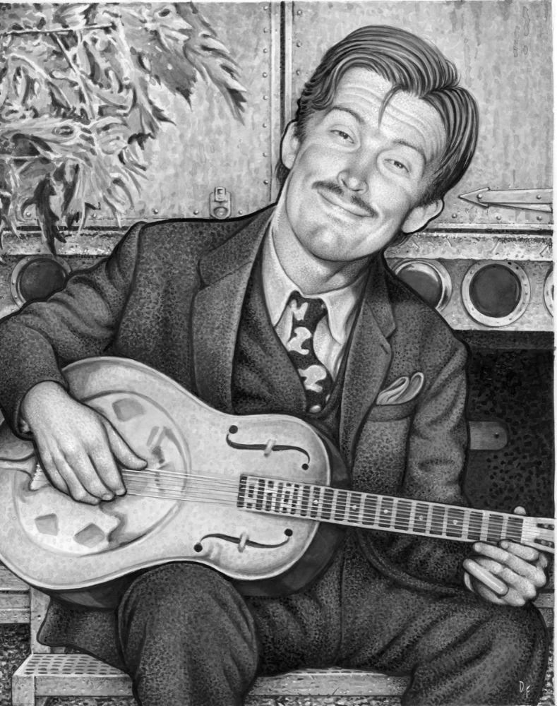
Naturally I feel honored to have my likeness featured in Drew's new book. He and I have never met, but I'm amazed how Drew not only captured me in my younger days, but younger versions of everyone else included in the book. I also like how Drew showed me playing guitar since playing music for me has always been every bit as important as drawing comics or creating other artwork. In interviews Friedman talks about how he first discovered underground comics when he was nine. I can relate to this because I was introduced to MAD magazine and comics when I was a young kid in 1956, so I understand how this could leave a huge impact on a young brain that was just learning about satire, parody and adult weirdness through beautifully drawn cartooning.
Of all the maverix and lunatix included in the Icons of Underground Comix, I was friends or was acquainted with a couple dozen of them, so I can say that the portraits ring true for the cartoonists I knew back in the day. It was a fascinating and heady time working on comix 50 some years ago. Even though we all worked in our own solitary situations, there were a few occasions where some of us would meet up such as when the contributors to Arcade, the Comics Revue would all meet in someone's apartment in San Francisco in the mid '70s. There was a sense of camaraderie that lingered even after we all returned to our solitary studios to resume our penciling and inking. This was the first time I really felt that I was part of a movement in comics, and though I was one of the younger members of this acclaimed group I enjoyed getting to know a few of these unique and often quirky individuals.
Sadly, we've had to say goodbye to so many of the major players that contributed so much great work, such as Justin Green, Diane Noomin, plus Jay Lynch, Skip Williamson, Spain Rodriguez, and S. Clay Wilson. So, it's especially important that these innovative artists are commemorated. Drew's portraits obviously required a lot of visual research, but I suspect also a good amount of educated guesswork. For someone who wasn't there at the time hanging out with these characters, he certainly has captured an essential quality of their personalities and the times.
* * *
Nancy "Hurricane Nancy"/"Panzika" Burton
(cartoonist)
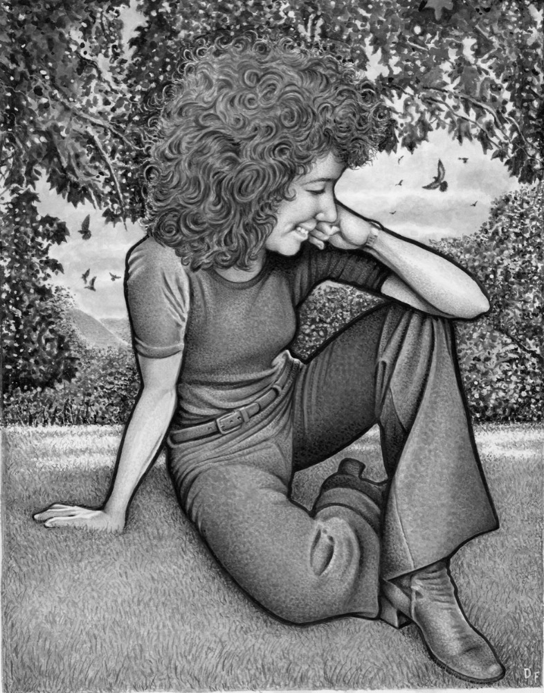
The book's design and presentation is in itself art!
Drew Friedman's Portraits are so Brilliant and insightful into the singular spirit of each artist that at the end I felt a renewed kinship with my fellow freedom seekers. WOW!!
My Portrait captures the dreamer I am. When one looks at my past and current cartoons they are made by the creative unrepressed spirit and the underground has allowed me to speak to others in my own very different voice.
Each article is personal, wise and witty. The whole book is a tribute to the idea you don't have to conform and don't be a slave!!!!!!
* * *
Everett Rand
(publisher, Mineshaft)
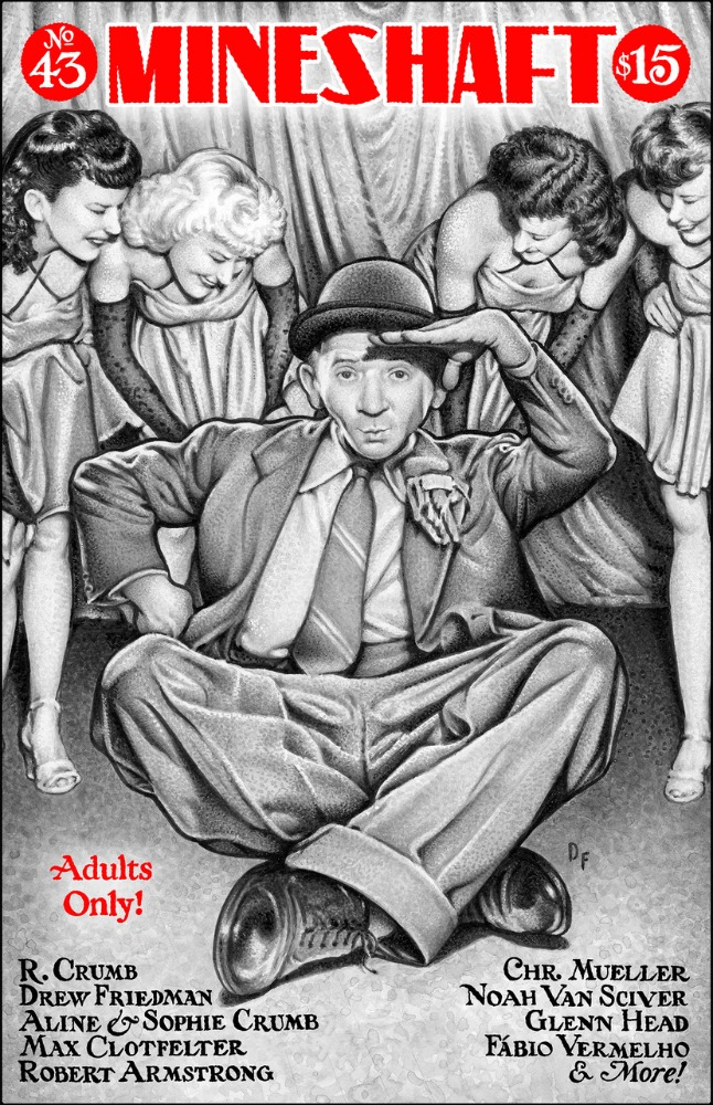
Drew Friedman is my favorite portrait painter in the world today. He's been referred to as the "Brueghel of the Borscht Belt," the "Rembrandt of the Comix Renaissance," and the "Hans Holbein" of the horrible and horrendous twenty-first century… but, however you want to hype it or phrase it, Drew is still the best and is carrying the torch of the aforementioned artists, as well as Harvey Kurtzman, R. Crumb, the Three Stooges, and many more.
What makes Drew so good? In an email to me about Drew Friedman's new book, John Kelly mentioned the "humanity" of the portraits. The word humanity comes from the Latin humanitas which means "human nature, civilization, and kindness." Drew Friedman's work has all of this. There's a compassion in it which comes from a deep understanding of human nature. Friedman brings all of his subjects to life. You never feel like you're looking at a façade. There's a detached mastery that goes into these portrait paintings that's based on hard work and great skill, a highly developed sense of observation, and artistic freedom. Friedman has been drawing and studying art, often comics, ever since he was a kid. More and more I've come to believe that no artist or writer can be truly great without this creative freedom that has to come from within. It usually doesn't come very easily.
Icons of Underground Comix captures the underground comix artists of the late 1960s and 1970s when they were young, back at the beginning of what I think of as the Underground Comix (and alternative comics) Renaissance, which is still going strong. Most art movements don't last for much more than 20 years, but what the underground comix artists started, around 1968, is still evolving today, more than 50 years later, making this the most important art movement since Impressionism (and Post-Impressionism), back in the 1800s.
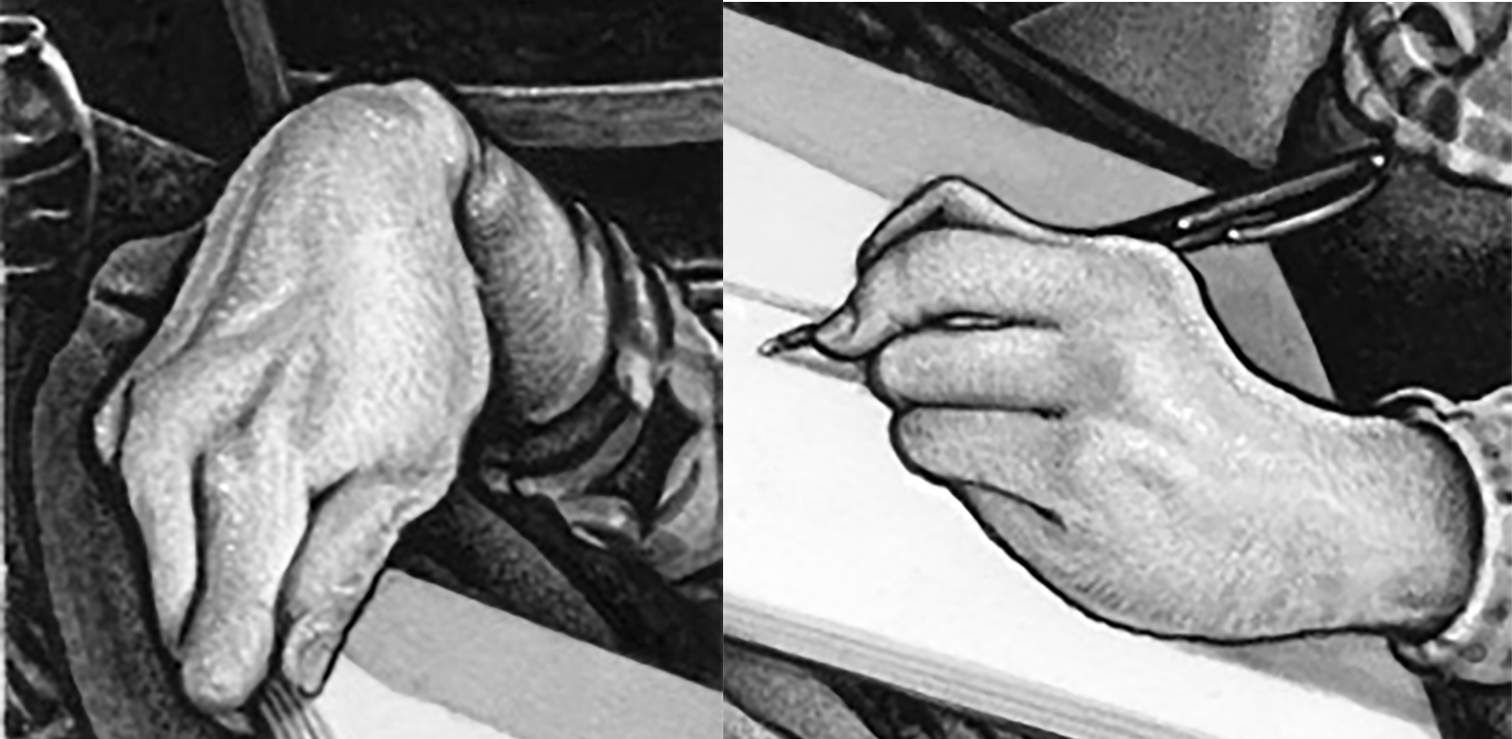
I asked my wife (Gioia Palmieri) if she'd looked at Drew's new book, and she replied, "Did you see Robert Crumb's hands?" It's true, Drew did an almost Leonardo da Vinci-esque treatment of Crumb's hands… they jump off the page. But if you talk to a dozen people about Drew's new book, everyone will have something different to say, to point out different highlights, because the work is so rich in detail and so fully developed. No one appears how they would like to appear, but how Drew sees them. Friedman is like a good doctor in this way. He doesn't tell you what you want to hear. He tells you what he sees.
I love the portrait of Simon Deitch. Simon is brooding. He has dark rings under his eyes. Beads of perspiration seem to glisten and coalesce on his forehead, and his hair looks like it hasn't been washed for some time. The portrait is enigmatic. It’s Dostoyevskian. You can't reduce it to any easy analysis. The portrait lives.
There are many more great ones. The whole book is a marvel. The backgrounds in the paintings alone are fascinating to study. I think one reason Drew Friedman's artwork strikes a chord with so many of us, is that we like to live in Drew's world. Drew Friedman doesn't seem to judge people. There's something nostalgic about his work. There's almost a sadness at times, as we feel the passage of time, but it's a good sadness.
* * *
Evert Geradts
(cartoonist)

What do you think of the book?
For me the book is a masterpiece, a treasure, an encyclopedia. Not a dull, matter-of-fact encyclopedia, as Drew has the gift to show people more like themselves than they would like to admit.
It is also a time machine that carries me back to the days I could develop my passion, close together with friends who shared the same one. Drew's book rattles my emotions more than I would like to admit.
Were you surprised to be included?
Yes, I was. I knew Drew was working on it (probably through Facebook) but I was pretty sure he would limit himself to American artists. And then one day my bosom buddy Glenn Bray sent me a picture where he held the book, open on my page!
Soon after I received my copy and it made me feel like everybody in the street recognized me as the famous Evert Geradts who had his portrait in Drew's new book!
I told my friend Mark Burstein how proud I was to be the only non-American in the book, but he corrected me, pointing to Rand Holmes who is from Canada, Moscoso who was born in Spain, and Art Spiegelman, born in Sweden, of all places. But he admitted that they were living and working in North America, so as the only European staying in Europe I still had some bragging rights.
Do you have a favorite portrait in the book?
Not a favorite, but the portraits that struck me most on first sight were those of George Kuchar and Harvey Pekar, because they are different. The other portraits are so magically lifelike you have the impression of having known these persons intimately for a long time already, even if they are new to you.
* * *
Denis Kitchen
(cartoonist/publisher, Kitchen Sink Press)
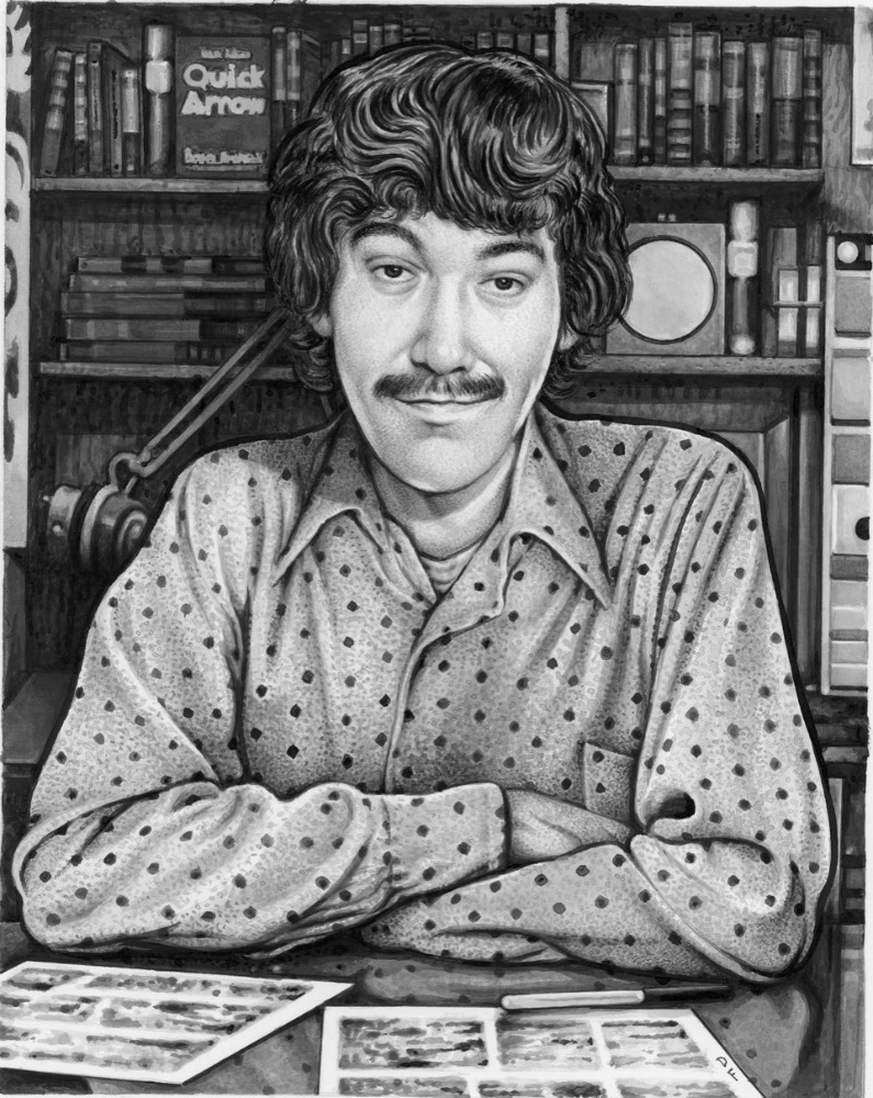
I deeply admire and frequently revisit Drew Friedman's earlier paired volumes on Old Jewish Comedians and, especially, Heroes of the Comics, the generation of cartoonists that came before mine. For those and most of his other books, Drew draws nearly all of his subjects in their twilight years, revealing age spots, deep wrinkles, and his trademark "warts and all". Given those visual precedents I love that, in contrast, Drew chose to portray the underground cartoonists in the glory of our youth, generally brimming with optimism, confidence, and sometimes attitude.
Paging slowly through the book several times was a bittersweet experience. I saw many friends and colleagues delightfully frozen in time, almost exactly as I remember them, inspiring visions of long-ago parties and hanging out. Some of the lesser known artists I saw for the very first time. And—as sobering evidence that I'm now in my mid-70s—I was reminded time and time again that I will never see many of these old friends alive again.
Favorite images include the brooding Howard Cruse, the always happy Grass Green, Bill Griffith with odd collectibles, a devilish-looking Harvey Kurtzman, half-crazy Jay Lynch, an argumentative Harvey Pekar surrounded by 78s, Spain leather-jacketed and sneering, and an exuberant Steve Stiles. Among those I've never met but now wish I had are John Peck, who looks like the John Waters of comix; Willy Mendes, who just looks so damn friendly; and Harry Driggs (I'll take that reefer you're passing at the Be-In, Harry.)
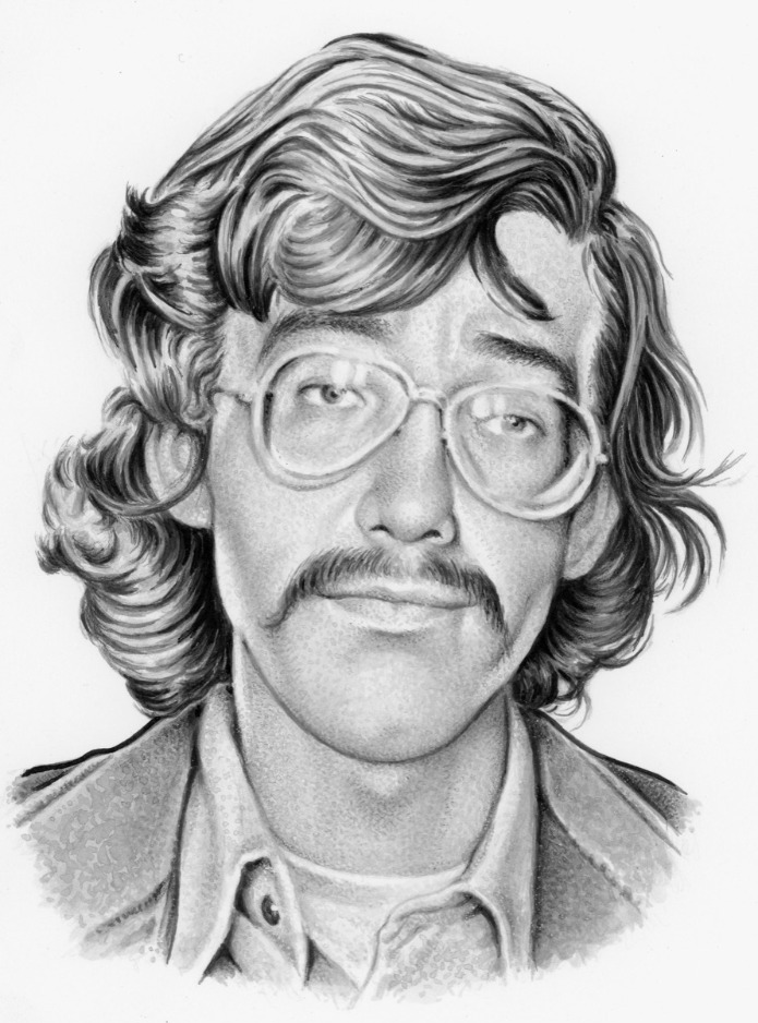
I was lucky enough to get two portraits because, besides the cartoonists, Drew included a publisher section. I look pretty wide-eyed and innocent in the former—though I probably was—so I'm more fond of the "publisher" portrait.
Maverix and Lunatix: Icons of Underground Comix will probably be most appreciated by the generation of fans who supported undergrounds when they were fresh and available only via disreputable local head shops in the late '60s and into the '70s, but I'm pleased that younger comix fans and any future comix fans may have this book as an introduction to the motley characters behind that most peculiar but groundbreaking hippie era phenomenon.
* * *
Bobby London
(cartoonist)

I'm wondering what you think about the book generally, your portrait, if you have some favorite portraits in the book.
It was a walk down Memory Lane. People I knew, people I thought I knew, people who didn't want to know me, people I only heard about and people I never heard of before. All in beautiful black and white.
I loved 'em all but a few that stood out were the zany Jay Lynch, pre-sainthood Vaughn Bodē, George Kuchar and his glasses, a beaming Aline Kominsky who got me my only appearance in a Print Mint book (El Perfecto Comics), spaced-out Rory Hayes, Alan Shenker from my freshman days on the Rat, New York’s Subterranean Weekly newspaper. The only one that made me LOL was of pre-Poptart Larry Welz. He and Larry Todd are the only two I've broken bread with in recent years.
It's my favorite of his portrait books so far. I really think he captures a real dignity in the pieces.
He's managed to lay to rest a lot of preconceived notions. This isn't his first drawing of me. I'm 27 years old in Chosen People [Fantagraphics, 2017] and was already battling being stereotyped. The drawing in Maverix goes back a couple of years. It shows the real person. He unveiled a fundamental truth about me that time hasn't diminished and I was very touched.
Wondering what you think, as well as any thoughts on his art generally.
I've spent decades trying to get watercolors to behave on a monthly basis so Drew's mastery of washes isn't lost on me. I know what he goes through when he sits down at his drawing table and I'm impressed. Have been for years. I'm *really* looking forward to his next book.
* * *
Drew Friedman
(author/cartoonist)

One of the things that's somewhat different that the Old Jewish Comedians and Heroes of the Comics books is that the majority of these portraits capture the artists at a time when they were pretty young. I assume that this approach—like choosing to make the portraits in black and white—is to capture the time and essence of the UG era. You wanted to best capture what they looked like in that 1967-77 period. In some cases you were limited in reference materials, but those were people who I had no idea what they looked like (or, sometimes, who they were), so it didn't matter to me. I had no idea what Hak Vogrin or Buckwheat Florida looked like, so seeing any image of them was a treat. But a number of the artists in the book, you have known for many, many years. Was there any challenge drawing, say, Art Spiegelman at such a young age? Though for him, that may be pretty close to what he looked like when you first met him. But I guess we tend to think of people we actually know as looking like what they looked like last time we saw them. And for those who have died, what they looked like in their later years. At any rate, there's really no wrinkles and liver spots in this book.

Right, I wanted to draw them all in their prime… drawing them as older folks wouldn't have worked because quite a few died young, obviously Vaughn Bodē and Rory Hayes, among others. The prime of UG comix was the late '60s… the publication of Zap #1 to the mid-'70s, when thanks to the Supreme Court head shops were shutting down, so much sub-standard work was being published, and distribution became far more difficult. I expanded that a bit for the book to the demise of Arcade as the official UG downfall, but the UGs were essentially over in their original incarnation by, say, 1975, even though, like Chaplin continuing to make silent films after the talkies came in, Crumb continued to release UG comix titles. I also had no idea what Hak Vogrin or Buckwheat Florida, Jr. looked like… let alone his real name. That was a challenge for this book, researching the more obscure artists; barely any ref exists on many, an uphill battle which I enjoyed. My friend John Wendler is an absolute whiz in digging up obscure photos and information, so his help was vital for the book, as was Denis Kitchen. I knew Art shortly after the time I depict him in the book, mid-'70s. He was one of our instructors at SVA [the School of Visual Arts in New York City] and then used us (me, Mark Newgarden and Kaz) in RAW #1, so we got to be around him quite a bit at that time. Art had an intense and memorable stare which I wanted to capture. He could be sitting around a table with a group of students and could center that penetrating stare on one person at the table, as if no one else sitting there existed. [Laughs] The Spiegelman drawing of him at his desk working would be 1975-ish, he’s working on a page that would go into Arcade and then later appear in his first anthology, Breakdowns.
There's a real dignity to all of these pieces. In some of them, it's very haunting, especially for those who have most recently died. But for all of them, I see these portraits as tributes to the lives of a group of people who collectively made a type of art that is important to me. I know that you were initially hesitant in doing this book because you weren't always a big fan of the work of some who'd have to be included. Was it an early thought to stay away from any form of caricature and were there any people you were tempted to portray in a less flattering way (not asking for names)?
That did cross my mind at first but I resisted that temptation; then the temptation faded completely as I saw everyone as an essential part, to varying degrees, of the UG movement. There were artists whose work I never cared too much for, but returning to their work I began to see, in many cases, the quality and craftsmanship of their drawing abilities, even if the storylines or subject matter was uninteresting to me. There were also talented artists who I previously wasn't aware of but discovered while working on the book, like Harry Driggs, Ed Watson and Nancy Burton (Hurricane Nancy), and inevitably there were artists whose work was pretty crummy, but most of them just dabbled briefly in the UGs and faded pretty quickly into obscurity. I feel the 101 subjects I chose to include are the cream of the crop.

This has been a rough stretch for the UG community, losing Justin Green, Diane Noomin and others since you completed the book. If you started this project in the fall of 2019, by my count there have been 11 people featured in the book who have died since that time. I think that's why I find the book so haunting and beautiful. I worked on long obituaries and memorials for three of the people in the book in the past few months and those are difficult. When I look at the portraits of the still-living people in the book, I have to wonder how many will still be here 5 years, 10 years from now. And you've felt loss, personally; both of your parents died during the time you were working on this book. And it was done during all the stress and isolation that COVID created. And we are all getting older. Did any of these things contribute to the fact that these portraits are all done in a way that is more... "loving" than some of your earlier work? Again, "dignified" is the term I keep coming back to in my mind.
No doubt. I began working on this book pre-COVID, fall of 2019. I already had decided to paint all the portraits in b&w, in keeping with the b&w tradition of the interiors of the UGs (aside from Bijou #8 and a few others), but then the lockdown hit and for two years this was basically all I centered on. A horrible, scary time of isolation; I didn't go anywhere or see anyone, no traveling or socializing aside from nervous, twice a month supermarket shops. But for selfish reasons it was ideal, I could spend an extra amount of time working and reworking the portraits in the book, taking my time. Yeah, little by little several of the subjects began dying, several soon after I finished their portraits. I began to wonder if I was somehow responsible. [Laughs] And yes, since finishing the book we've lost four major players, Justin, Diane Noomin, Tom Veitch and Simon Deitch. I sure hope that's it for a while.
Did the research and study you put into the book give you a better appreciation for some of the artists you may have previously dismissed, found uninteresting, or even weren't aware of?
Yes, like I said earlier I began to appreciate quite a few of the artists whose work I previously disliked or just didn't pay that much attention to. While working on this book for two+ years, I'd begin by spending at least an hour a day revisiting and rediscovering my fairly large collection of UGs, and many of the anthologies. It was interesting to see how many artists were inspired by EC comics, and especially Wally Wood. Spain obviously, also Roger Brand and George Metzger, but Rand Holmes more than any other. I had loved his wraparound cover for the Mark James Estren A History of Underground Comics book [various publishers, 1974-2012] which I obsessed over as a kid, but taking a deep-dive into his meticulous work in Patrick's Holmes anthology [The Artist Himself: A Rand Holmes Retrospective; Fantagraphics, 2010] was a revelation. I felt the same about a few others, including Greg Irons, Dave Sheridan, and even Richard Corben, whose work I was always indifferent to. Technically, his stuff was pretty amazing.
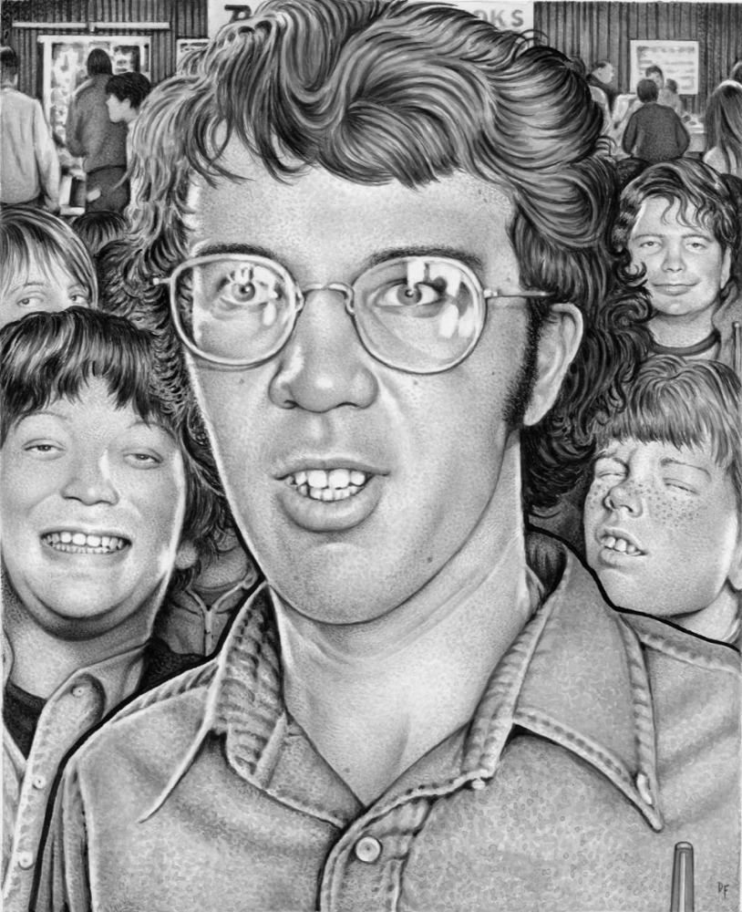
The background of the John Pound portrait looks like Toxic High School, the series you worked on for Topps in the early '90s. My understanding is that you did the pencils and layouts for those cards, and others, including Pound, painted the finals. If I'm remembering correctly, that's about the time that you started to move away from your pointillism style and began to move into what has become your current style. Did that project have any influence on your decision? You were having to make an awful lot of preliminary layouts in a short time period. Did it seem that it would be more efficient to move to painting your pieces? And since making the switch, do you ever play around in your old style? Even if you're just screwing around?
As a young fan-artist, Pound was a frequent presence at early '70s west coast comic cons, mostly the early San Diego cons, so that's where I decided to place him, surrounded by obnoxious kid fanboys, there to get freebies, buy cheap comic books and glom autographs and sketches from pros. I should know, I was one of those faceless rabbles of kids who attended many of the [Phil] Sueling cons at musty New York hotels like the Statler Hilton near Penn Station, far past their glory days. In fact, that’s young me in the Pound drawing, smiling on the left.
I worked on Toxic High with Mark Newgarden (and initially Art Spiegelman) for Topps in the late '80s. And yes, working on that project, creating a massive amount of pencil art that would be painted by others, including Pound, did help to initiate my decision to drop the stipple a few years later, slowly learn to paint, and work exclusively with a brush. The main thing for me was at that point, early '90s, mostly thanks to SPY, assignments were coming in far more in frequently, some with tight/overnight deadlines, so the stippling became a burden, way too time-consuming, so little by little I began to phase it out so most people wouldn't even notice. I'll never go back to stippling per se, but you might notice I'm using the brush now to get a similar but more low-key effect, which I think creates a far more realistic effect in rendering clothing and faces… flesh and pores.
I thought that was a self-portrait in the Pound piece. Are any of the others based on real people?
The only other crowd scenes are in the Harry Driggs and Rory Hayes images, but no, none of the people are based on actual folks. All the other portrait subjects are unto themselves, aside from Bobby London, who shares the page with his heroes Laurel and Hardy, and Jim Franklin with his beloved armadillos.
During the period of transition (which was many, many years ago by now), was there any part of the process that you found more difficult to master? Sometimes I find myself transfixed by some of the "minor" or secondary aspects of your work. Like the texture of someone's clothing or the images in a background. Was there anything that you struggled with?
I wouldn't say anything was especially a struggle, I put my mind to working with color and the brush, and used my assignments during that transition period to experiment and work out the kinks. The main problem, which I came to realize several years later, was that I was overcompensating with color, going too bright, too much yellow, red and purple. You can see that in my much of my work work from the mid-'90s, early NY Observer covers and magazine illustrations. But I soon began diffusing the color to I think a much more desirable effect.
Some artists sketch and doodle all of the time. Some are always keeping sketchbooks for ideas or just… because they do, I guess. Other are completely focused on the next project. What about you? Is all of your drawing focused on projects that you are working on?
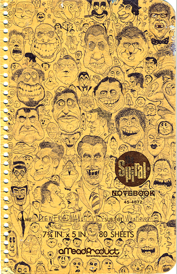
When I was a kid I was constantly drawing… at home… during school… getting in trouble for it... in fact, occasionally I'll hear from old schoolmates on Facebook who remember me "always hunched over my desk drawing the teacher or horrible monster faces." [Laughs] That habit continued on into high school and even into SVA. Aside from all the drawings (to my teachers' chagrin) that I drew all over my school desks, I kept all the doodles and sketches I drew in my school notepads. So I guess I got that all out of my system, because unless I'm working on a specific piece, I never sketch or doodle anymore. But I am totally focused about whatever it is I'm either working on or about to start working on, especially if I'm having a problem with it.
These portraits are all in black and white. Probably a lot of the reference material was also in black and white. Which do you find easier, or more comfortable, painting in color or black and white?
Depending on the subject, I'm fine with either. Maybe because we've just all been through such a dark, depressing period which didn't really inspire happiness and color, b&w seems more appropriate to me now. Of course in some cases it's not my decision, like the cover to an upcoming book of illustrated Weird Al lyrics I agreed to do. The book company wanted a full-color Weird Al, which of course made perfect sense. Also, working from a b&w photo and rendering a color image based on it is usually an interesting challenge, and of course you have to know beforehand what color their hair and eyes are.
But for the UG portraits, I felt the b&w approach made the most sense, again, in keeping with the b&w UG interiors. Sam Gross frequently states "Color is not funny!" [Laughs] Which I'm not sure I agree, although most of my favorite comedy films and TV shows are in b&w, and I do tend to visualize things more in b&w than color… so maybe he's on to something.

Was there anyone whose your work you came across after the book was completed that you wished you had included? Or anyone who almost made the cut that you would have liked to have included?
Not since I completed the book, but there were several cartoonists I considered as I was working on it, but finally they just didn't create enough work to warrant their inclusion. I considered Harvey Kurtzman's eldest daughter, Meredith, but she was only in the one issue of It Aint Me Babe, and didn't pursue a comics career. Also, Ted Richards' then-wife Teresa, but she also didn't do very much work, and not enough for her to develop as an artist. I originally planned to include Richard Jaccoma, who I knew back in the '80s as a magazine editor; he did some art for his friend George DiCaprio's two issues of Greaser Comics, but no other comics. Someone asked me why Dori Seda wasn't included, but her work didn't start appearing in print until 1981 in Weirdo, post UGs, around the same time as Phoebe Gloeckner's, Kaz's, Peter Bagge's and my debuts, all of whom are not included.
The one guy I really wanted to include was Bill Crawford, who created the wacky character Rufus the Radical Reptile for the Print Mint’s 1970 High-Flyin' Funnies Comix & Stories, but I was just unable to come up with any photo reference on him. Even Patrick couldn’t help with him.
Is there anyone you think that should have been included but wasn't? I did wonder if Keith Green, Justin's brother, would be included.
Keith Green appeared in only one UG comic, Sacred and Profane from early '77, so he didn’t really qualify. The youngest Deitch brother, Seth, was also considered, but he only appeared in one UG comic. I though about including Charles and Maxon Crumb, but they really weren’t involved in the UG comix movement. Charles stopped drawing altogether by the early '60s and Maxon had some of his drawings appear a bit later in Weirdo.

This book sure gave you the opportunity to work on drawing hair and beards! Harry Driggs is someone I was unfamiliar with. What a perfect name, and man! What a face! Were you familiar with his work before starting this project, and if not, what lead you to him? He looks like a Manson Family member.
I wasn't really familiar with Harry Driggs either, although I remember reading about him and seeing some images from his over-the-top comic parody The Life and Loves of Cleopatra, which was a pornographic comic first published in 1967, pre-undergrounds. I looked into him and his work appeared in a few '70s UG titles, and Rip Off Press later published a couple of volumes of his political cartoons. He was a really talented cartoonist but he mostly worked as an art director and graphic designer. And yeah, that face, how could I resist? Not only does he look like a Manson Family member… he could pass for Manson himself!
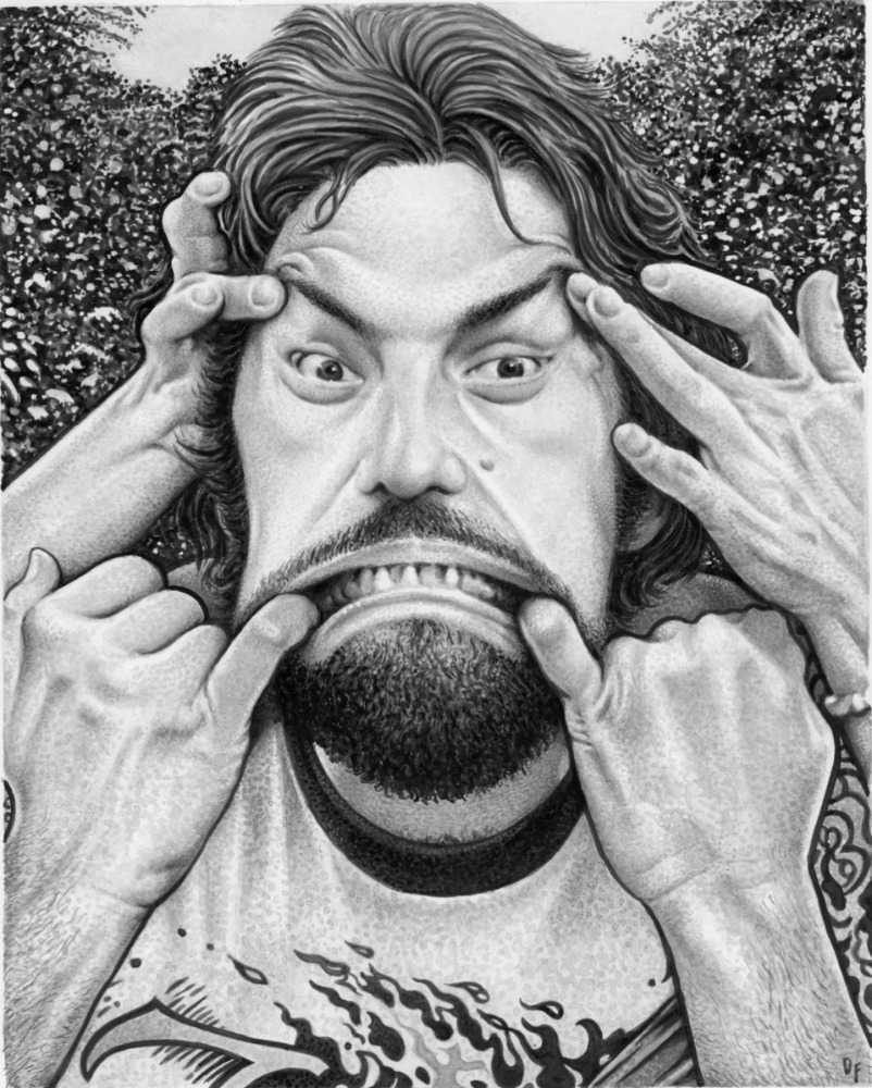
The George DiCaprio portrait is great, and I love how you just casually throw in at the end that his son Leonardo is an actor But what's going on in that image? There's an awful lot of hands and his face is being pulled. Is that based on a particular photo of him?
Yup, it's based on a photo taken by my old pal, collector Glenn Bray. Those are the hands of Glenn's wife, Lena, formally "Leny" of the '70s Dutch comics movement that I refer to in Evert Geradts' brief bio - she was married to Evert back then. I met George DiCaprio back in the mid-'80s through Glenn and he was into enacting Stooge-like distortions with his hands and his mouth, and other people's mouths and faces, and encouraging people to do the same. There's a photo Glenn took of George and I pulling each others mouths.

I also love the Charles Dallas one. He looks… happy, I guess. Or something. I was slightly familiar with his work. Where did you find an image of him?
A fellow Pennsylvanian! I was only able to come up with one single photo of his face online, and yeah, smiling and happy… although his work was dark and morbid! I enjoy contradictions.
I was really glad that Michael McMillan was included because I've always been curious about him. I wish he had done more comics and don't really know much about him other than the work that I've seen. I'd never seen a photo of him that I remember. In your portrait, he looks like a pretty normal guy working away in his studio. Do you know anything more about him, beyond what you have in his bio?
He was a great talent whose work should be more well-known. I especially loved that cover he drew for Diane Noomin's comic book Lemme Outta Here! in 1978. I still don't know why his work didn't appear later in RAW, but perhaps he was just working on different projects at that time… he was also a sculptor and animator. Dan Nadel has been championing his work over the last few years and recently mounted an exhibition. I think an anthology of his work is way past due. There was one photo I'd seen of him, posed with a large group of UG artists in San Francisco, mid-'70s, about the time of Arcade, which he contributed to, and he drew a few small self-portraits for their contributor page. But the photo of him was very small and the cartoony self-portraits were not enough to base a realistic, full-page portrait on, so through Nadel I wrote McMillan… who's almost 90 now… requesting a photo or two. He was happy to oblige and snail-mailed me some pics of him and his studio from back in the '70s, and that's what I based my portrait on.
I'd also love to see collections of Buckwheat Florida, Jr, Yossarian (Alan Shenker), Nancy Burton and Andy Martin's work, among other of the lesser-known UG artists. Perhaps one book collection featuring all of them… hint hint, Fantagraphics. There is a biography of Nancy Burton in the works.
I love the black background of the bio pages, with the white text. It works so well as a spread with the black and white art. Whose idea was that?
My idea, I envisioned the page layout that way when I decided to paint all the portraits in b&w, a nice flow.
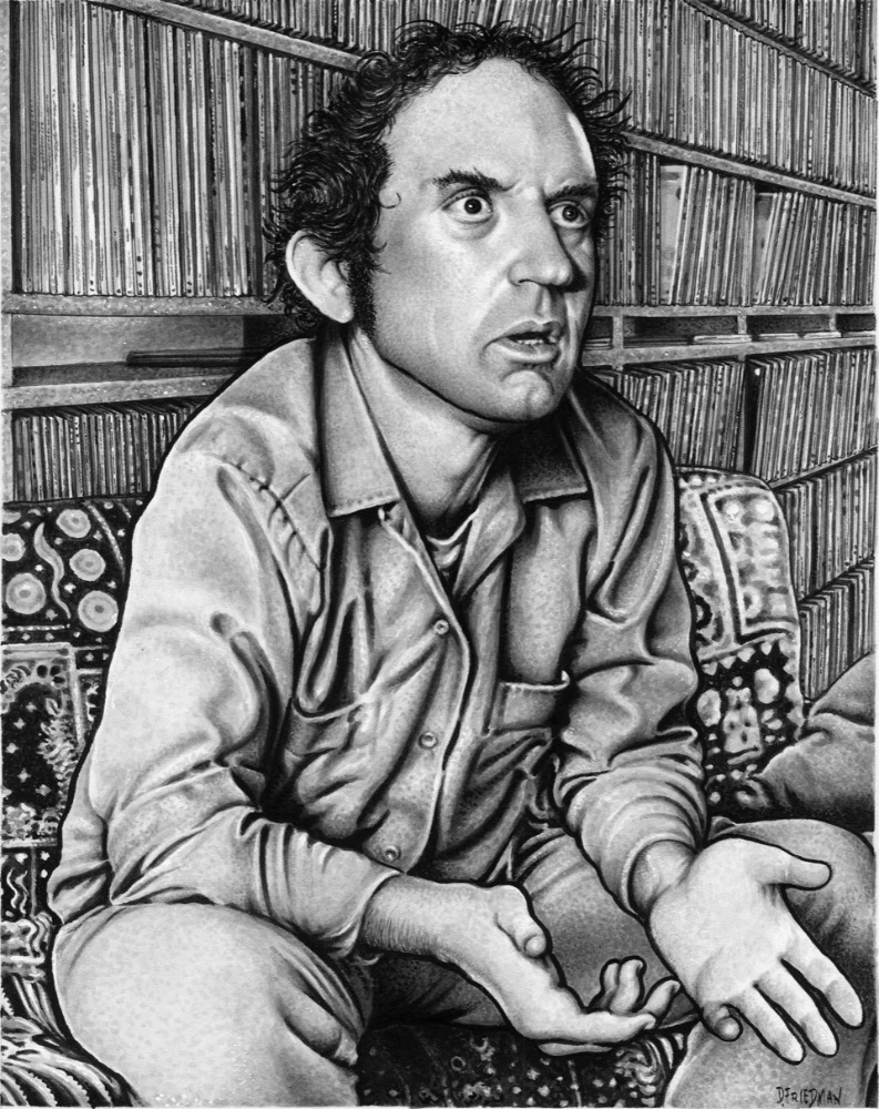
You've talked with some others about the inclusion of Harvey Kurtzman, and it makes total sense to me. He was a huge influence on a number of the UG people, and there is crossover work too. But what about Harvey Pekar? He wasn't an artist, and he's probably not broadly thought of as really being a member of that original UG crowd. He was a jazz guy in Cleveland. But there is crossover with Crumb, Willy Murphy, Robert Armstrong and a few others, when, before he did American Splendor, his work appeared in a bunch of UG publications. He was in Crumb's The People's Comics in 1972. I know you must like drawing him, but was there any hesitation in including Harvey? I don’t question him being in there, but most of the others were artists. Though there are a couple of others who were writers. Tom Veitch is one.
I might have had a slight hesitation at first when I was compiling a list… I really don't remember, but like you point out, Tom Veitch wasn't a cartoonist either and he's included. I spell out all the reasons in my brief bio in the book of why Pekar was connected and a part of the undergrounds, which I stand by. I also think if I hadn't included him, I would have gotten some backlash. And yes, I do love to draw him.
When you do a massive project like this, how do you pace yourself? I imagine you had a list of 50 or so people who were no-brainers for inclusion, another big group that were on the B list, then the maybes, etc.
I didn't have an A, B or C list, I created one master list with all the obvious choices and everyone else that I felt needed to be included. From there I'd add on names of folks that I had neglected to include at first, some of whom were suggested to me by friends, and artists who I was previously unaware of but ultimately felt needed to be included. The original list was 100 which grew to 101 when I realized I needed to add The Dying Dolphin artist Jim Evans. The first portrait I painted for the book was S. Clay Wilson. The last was Jim Evans.
But once you decided who was in, how did it work? Did you do them start to finish, or pencils to ink, one at a time, and then move onto the next one on the list, etc.? Did you ever stop in the middle of one portrait and jump into another one because of sudden inspiration or something? Did you ever get beyond the pencils with anyone, only to change your mind about how you wanted it to look when you were already inking it? Or was it a big jumble and you shifted as it progressed?

I'd render one illustration from start to finish, I never jumped around to others. That's how I work in general, my mind is focused on what I'm working at the moment before beginning something else. I'm no Jack Davis. [Laughs] So basically I'll start with a loose pencil sketch, take that to a tighter sketch on a sheet of Strathmore Bristol… the 500 Series… and then paint on top of that. The whole process for one illustration takes about 4-5 days; some, like the Trina Robbins and Bill Griffith because of all the background details, a bit longer. There were a few pieces that I began that I'd make changes to if something wasn't working out, or scrap it all together before it was finished. I went though several versions of Pekar, Lee Marrs, Rick Shubb, Mike Vosburg and Leonard Rifas before landing on the right image of each. I painted a Robert Williams portrait that I was pleased enough with, at least for a time, before scrapping it and creating a new portrait that's the version included in the book. Same with Willy Murphy, I wound up doing two finished paintings of him. I still do like the one that I didn't wind up using and I think it'll be included in my next book of portraits, Schtick Figures.

I really love the Jay Lynch portrait, because… well, I really loved Jay. It totally captures him, but in a way it seems just a bit different than most of the other pieces. More like the Crumb one on the cover, maybe because of the goofy eyes and cartoony background. Did that image come from any particular photo of him, or is just that you knew him and that's what he was like? At any rate, it's one of my favorites in the book.
Thanks. Jay was always one of my heroes, a cartoonist's cartoonist. Yes, it's based on a photo of Jay. Most cartoonists are fairly shy and retiring types, but get 'em in front of a camera and they act like a naughty kid alone in a photo booth - uninhibited, making crazed, goofy, distorted faces, like the photo of me when I was nine that's included in the book. Sensitive and self-effacing, Jay was no exception, and I thought that expression truly captured the real Jay Lynch.
Are there any portraits in this series, or any of your previous ones, that didn't make the cut for some reason, but are "completed" works?
Just the two aforementioned: Robert Williams and Willy Murphy. I don't think there were any finished paintings created for my two Heroes of the Comics books that weren't used, just a few tight pencil sketches, including a Jack Kirby.
At some point, it seems that it would make sense to produce series of portraits of that next generation of cartoonists, of which you are a member. Any plans for that?
No plans for that, but I've learned to never say never. I have already drawn portraits of some of my favorite younger artists… Chris Ware, Dan Clowes and Charles Burns. I have a few ideas for future projects, but haven't settled on one yet. I'm actually considering a series of drawings that doesn't include any people.
We'll see.


