
I've been alternating between a few different projects. One of these is a new book titled Discipline (which was excerpted in Kramers Ergot 9) about a Quaker soldier in the War Between the States. Discipline gets its title from a Quaker book detailing the different Quaker disciplines -- one being not to kill anybody. Although well-known for their pacifist beliefs, many Quakers did take up arms during the War. My main character is a 16 year-old boy who wants to escape his family and small Quaker community. In the 1860s, Quakers were very orthodox, speaking in "thee" and "thou" (the informal way of speaking, although it sounds more formal to us now), and forbidding music, and so when the boy is thrust into the larger world he experiences a bizarre "culture shock" on top of the totally insane, harsh war.
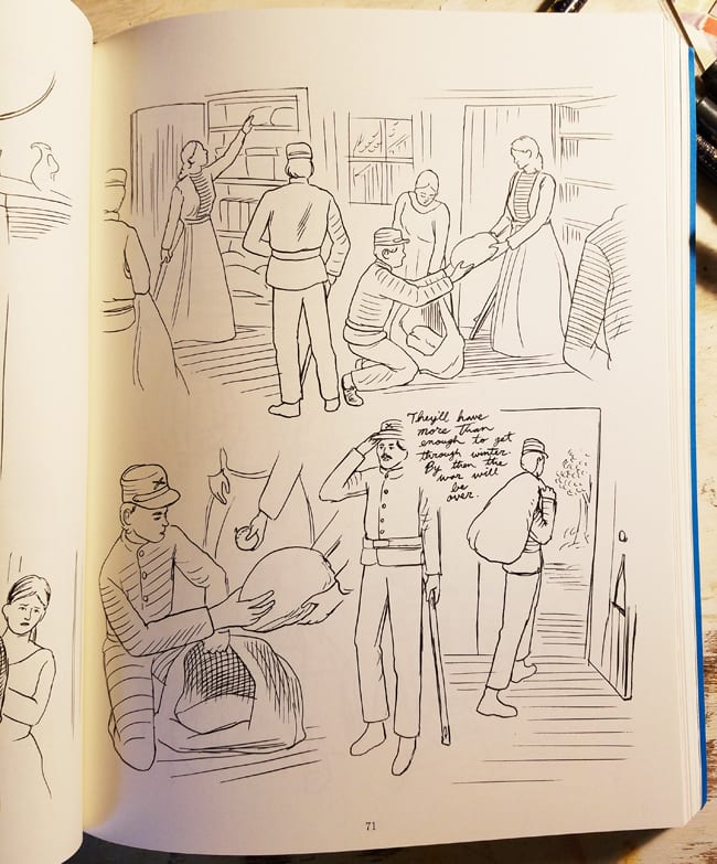
This book is a long comic book, but it does not have any speech balloons or panel borders. The illustrations and the hand-written cursive text float on the page. This activates the negative space of the page, which lends the book a spacious stillness, or a quiet, "Quakerly" tone. This spacing relates to Civil War-era illustration, where elements hover inside of articles. Also, this allows me to write and draw all of the elements separately, so the book is easier for me to edit. With the conventional comic approach, usually the insertion of a panel throws off all of the other panels in the book. Because of the collage-like structure of my book, I can easily insert illustrative moments and pieces of text and research/write while still making new drawings.

For example, I drew a couple chapters at the MacDowell Colony, in the woods, and I sketched trees and leaves and insects in my sketchbook, and then I could place these drawings wherever I liked in the book. Obviously, most of the drawings don't get used. But it's nice to doodle branches and bugs and think that I now have these pieces that I can place into a book if I need them. I had made mini-comics and comic short stories (particularly one called New Jobs) that were panel-less before, and so I was already thinking about it, but when I saw that so many Civil War-era illustrations floated, and the negative-space-to-silence relationship became clear to me, I knew how to go forward.
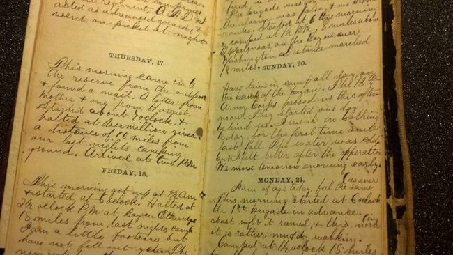
Much of the text for my book is adapted from actual Quaker and soldier diaries and letters I found at the New York Public Library. I laid out the book and completed the first 120 pages while a NYPL Cullman Center Fellow. I appropriated pieces from Friends journals and letters into my narrative. A key book is The Fighting Quakers by Augustine Joseph Hickey Duganne, published by J.P. Robens in 1866, which is mostly composed of a correspondence between two Quaker brothers and their mother.
Most soldier journals were extremely boring. Mostly they would talk about what they ate, and the weather, and how many miles they marched. But there would occasionally be very long, heightened, dramatic streams of text that were very powerful and moving and surreal. Even though I was holding an actual diary, written in pen and ink, the diarist felt no closer to me -- even the handwriting was so much more precise and "inhuman" than contemporary diaries... There is a gap in time that is maybe impossible to bridge. I'd take the texts that were interesting or mysterious to me and try to pair them with drawings and sequences in my book. I was aiming for interesting juxtapositions, really, where the text and pictures weren't completely aligned but also weren't completely unaligned either. Ideally something happens that is unexpected and beautiful in a way that is hard to articulate why.

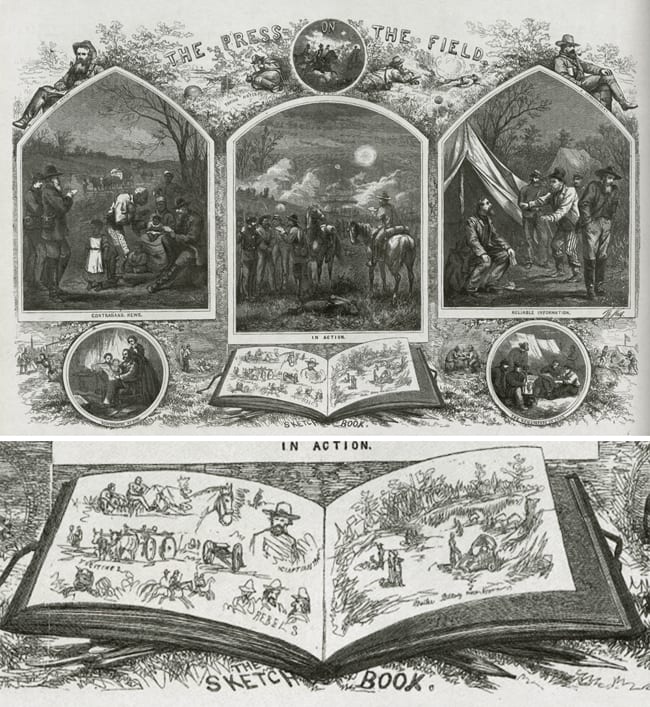
The key visual reference point for Discipline is the Civil War-era "special artists" or "specials", such as Thomas Nast, Alfred Waud, and Winslow Homer, illustrators who were dispatched to the field to draw. Their sketches were then sent to their publisher's team of etchers. What we commonly think of as the style of Civil War-era illustration (the dense hatching) is a result of the etching process. Some "specials" would cheat and doodle very loosely in their Manhattan studio and turn it in, because they knew it'd look polished by the time it went through the etchers. Some would even steal sketches from other "specials" and sign them to turn them in as their own. The actual drawings that the sketch artists did were very loose, and the etchers would complete them in an elaborately hatched, embellished style. I studied the original pencil drawings done by "specials" (at the library) as well as the finished etchings, to slowly realize a way of drawing my book that is natural for me while still appropriate to the subject matter. Because I am making a comic, the drawings are meant to be read, so the images are more open and reduced, but they still retain some rendering associated with Civil War-era illustration. I don't have the craft skills to completely visualize everything that I want a book to look like, but I can make the "rules" for the book and roll with whatever happens... Every cartoonist has to decide what scale to draw their book, or what tool to use, simple things like that, so I just try to make decisions that feel appropriate to the story.
Here is an 1864 Thomas Nast drawing "Press in the field" explaining the "specials" -- look at the book at the bottom, with the open, scratchy crow quill lines and collage-like arrangement... this is exactly what I want my comic to look like! Ha ha ha.
Dash Shaw is the cartoonist of Cosplayers.


