
Slavonica: Tapas (formerly known as Tapastic) has been an useful if not sketchy platform for cartoonists, hosting independently made comics and published comics that are in need of web distribution. Slavonica is a series of short fantasy stories inspired by Slavic mythology and culture drawn by Katarzyna "Panna N." Witerscheim. The art style is stripped down to pleasing shapes, a meek digitally-textured line and a tastefully limited palette, utilizing a swatch of muted corals and slate blues. The pacing and dialogue is stilted and matter-of-fact in the manner of well-trodden folktales but I find Witerscheim's art and layouts solidly cohesive and still developing with each page. It's not a comic that packs much of a punch visually but it's mostly attractive and easy to read and though it’s subdued to the point of lethargy, I’m still curious to see how her work grows.
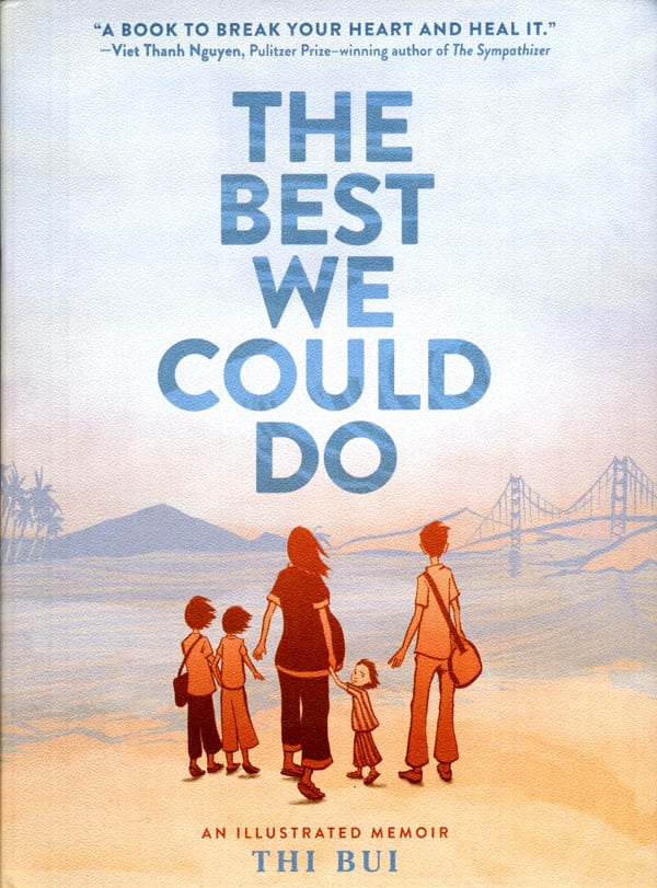
The Best We Could Do: An exceptional graphic memoir by debut author Thi Bui. Thi was born in Vietnam three months before the end of the Vietnam War and arrived in the U.S. as a refugee in the '70s. Gritty, dry brush strokes, bleeding ink and terra cotta washes offer the eye dimension and texture to hold onto as it winds through Thi’s retellings. While not wholly attractive, Thi's comics benefit from her loose brushwork, which allows an emotional charge that a stiffer application would have dampened. The figures feel unfinished and unstructured at times, but it feeds back into an overall atmosphere of nebulosity that has sat with Thi in regards to who her parents are. Thi tries to arrange a coherent narrative to connect her parents' past to her present, relaying her parents' memories in candid detail, not shying away from the dissonance of having one parent go through intense trauma while the other experienced privilege. She doesn't sugarcoat her mother's confession that she married her father out of a sense of pity, or that she herself was scared of her father as a child. Thi unwinds these sometimes ugly or awkward revelations until she seems to reach a state of discordant acceptance. The arrival of the author's son allows her an epiphany: that even though her parents are so culturally and emotionally distant from her, sometimes unknowably so, there are also clear touchstones that connect them: love, fear, survival, family. There is no clear resolution in the end, no complete connection that surfaces and ties their homeland, their experiences, past and present, together, that solves for their relationship dynamics and their identities. What there is is a clarity about how our past echoes beyond us into the people in our lives, into our children and into the ground beneath our feet.
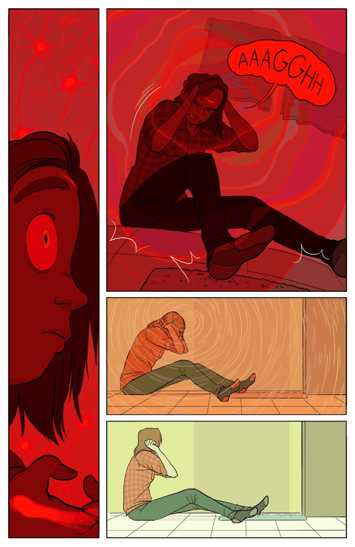
Brainchild: An urban fantasy webcomic about college students, paranormal phenomena, and mutants created by Suzanne Geary. Brainchild has recently reached its third chapter and started exploring the more fantastic elements and conspiracies surrounding the lead character, Allison, a stressed-out college student with a past we’re slowly growing privy to. Suzanne has a surefooted sense of pacing that she conveys through shrewd layouts. Her coloring is a standout aspect, some examples being when she douses a crowd of house party guests in strong violet light, fills panels with flat jarring reds for emotional or physical distress or casts a dimly lit basement scene in a deep patina green-toned palette. Suzanne's cartooning has a pleasing blend of flexible tooniness that she plays up during emotional moments, but for the most part she grounds the characters in their bodies and in their environment. Brainchild is one to keep an eye on.

The House on the Cliff: Created by Mar Julia, The House on a Cliff is a urban fantasy webcomic about magic, girls, and the sea. It's fairly new and so not far along into the story but Mar's art has a whimsical lightness to it and her characters are drawn with such a caring, delicate hand that I find myself checking back for updates. Mar's attention drifts mostly towards her figures, quaint long-legged figures with very slightly oversized hands and feet. The world has hinted at a system of magic at play with sand golems being harassed by teens, dragons and little… dragon kids? The use of the standard three-tier composition is overused throughout the comic so far but as it stands, I'm excited to see Mar's cartooning skills mature.

Blackwater: A collection of short urban fantasy comics set in Blackwater, Maine, that follows two teen protagonists, Eli and Tony, as they discover the town's mysteries and deal with high school drama. Blackwater is a new collaborative effort between Jeannette Arroyo, a illustrator who specializes in character design, and Ren Graham, an illustrator who specializes in background design and science illustration. Arroyo's characters are dynamic and vividly expressive, while the studied backgrounds offer a spare, static environment for the characters to sink into. The textured grayscale rendering adds a pleasing atmosphere and never overpowers the characters. Arroyo and Graham compliment each other well and it'll be interesting to see how their collaborative efforts evolve over the course of Blackwater.

Superpose: A vaporware SF horror webcomic set vaguely in the '80s that follows a group of mischievous seaside teens. It's written and drawn by Ciaran and Han and drawn in a way to mimic the look of film stills. Screenshots, a computer function first created around the '60s, has taken on an interesting role in the film savvy side of the internet and especially on blogging platforms like Tumblr, where users will arrange screenshots from films recreating their favorite scenes, collage together a trailer of stills or even create a montage of their own made-up story using the stills as material. In Superpose, the long frame-by-frame panels, while not a failure, often feel tedious and unnecessary, especially when a series of smaller, denser panels might convey a moment more efficiently. That strict adherence to maintaining the look of a really good anime still comes across as more important than effectively telling the story which becomes distracting.
This gimmick has loosened up as the comic has progressed with more variance in panel layout but the dedication to the look seems strained and contrived. Narratively, the story has maintained a low-key but tense atmosphere with a strong focus on the daily life of two characters, Rafael and Royal, their family drama and dull post-grad work struggles. The art utilizes a lot of techniques common to digital artists and webcartoonists: sharply cel-shaded figures, sometimes blurred in shallow focus, and painterly concept art for backgrounds. The backgrounds are most attractive when edging towards impressionistic but the artists shine the most when they have a strong sense of light (or lack thereof) to work around, pushing contrasts or diffusing barely illuminated darkness. The characters are visually strong and versatile, offering a strong and unique range of facial features and applying a feeling of heft to the characters bodies and clothes. Superpose is a confident work so far and I'm eagerly waiting for it to broach the SF horror elements of its pitch in-story.
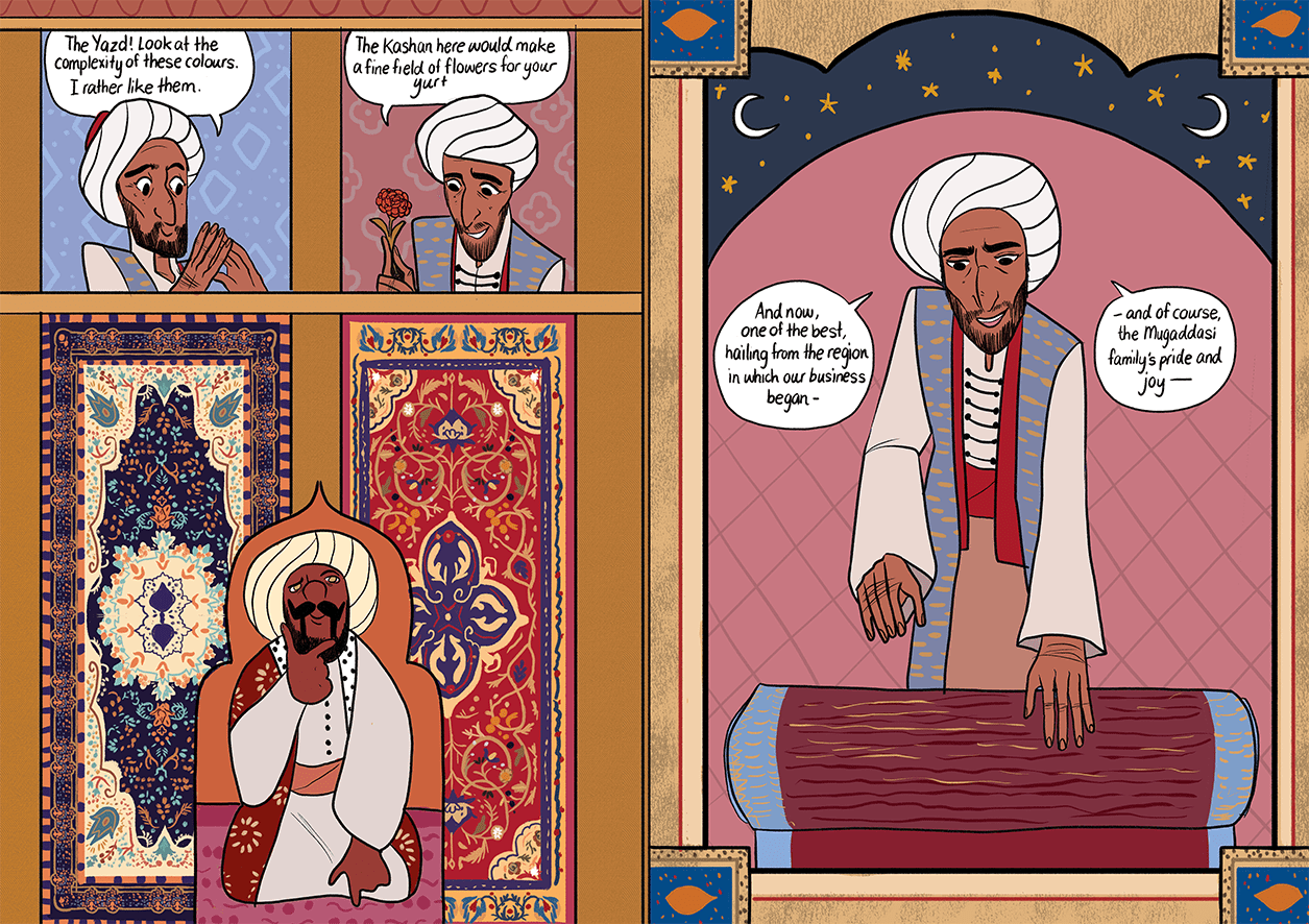
The Carpet Merchant of Konstantiniyya Vol. 1: Reimena Yee is a fascinating cartoonist with a style that stands out in the crowd of overly-rendered, grimly realist webcomics. The Carpet Merchant is part of her long-form comic project The World in Deeper Inspection, which explores the life of Alcott B. Grimsley, a detective who helps to bring peace to the recently dead. The Carpet Merchant is about the romance between Zeynel and fellow carpet merchant Ayşe, his introduction to the world of carpets as a teenager, and his unwilling transformation into a vampire (a djinni) in middle age. The cast of the story is small but hones deeply in on their relationships and struggles with cultural expectations and faith.
Yee's cartooning incorporates a lot of Turkish/Persian/Islamic tapestry patterns with dense, heavy geometric patterning and arabesques throughout the background of the pages. Yee even embellishes within the gutters and adds stylized motifs that shape the panels themselves. Yee also pays homage to Ottoman miniatures which translates into compact layers of spare backgrounds, handsome caricatures and ornamentation, a distinctive visual ambition amongst cartoonists today. Despite the embellishment, Yee's cartooning never becomes an afterthought. To highlight a brief moment: a rolled note, colored the same hue as the tray it sits on, comes into a characters awareness and gains its proper color. These little visual narrative touches are not just useful flourishes but a key technique is Yee's meticulous storytelling toolbox. Reimena Yee is a singular cartoonist with a self-assured voice and vision that everyone should give attention to.

Dicebox: A webcomic by Jenn Manley Lee, tells the story of Griffen, a genius troublemaker with a mysterious past, and her wife Molly, a hallucinating factory worker, in a space-faring future. Manley has a strong grip on the story's point of view, keeping the SF elements in the periphery, with a few splashy environmental establishing shots scattered throughout the two volumes of the comic. She blends them seamlessly into the world Molly and Griffen have to traverse as they try and pick up blue collar odd jobs across various planets. The story doesn't push too hard on the theatrical but instead, with its emphatic focus on character dialogue, builds an intriguingly dense web of romance, threatening military bureaucracy and interpersonal adventure. Manley has a naturalistic art style in the sense she’s not trying to push unreal proportions or lines of action in her figures. Her characters have a weight to them and their movements are small but expressive, subtly captured motions.
The style of figures isn't the most appealing — the underlying structure of the bodies are quite weak at first — but it does improve quickly, along with the strength of the character acting, which was already decently expressive to begin with. The art overall feels very static, but the life of the story flows mainly from the dialogue between the cast, what I consider the entire comic's backbone. Manley paces out conversations with natural speaking quirks and small talk. The application of word balloons to page, usually a challenge when it comes to dialog-heavy stories, is accomplished well, never flooding the page or laying them out in a confusing way. The balloon designs themselves could use improvement, especially early on, as text bleeds out of the borders or is squished into ill-fitting borders. Book Two introduces elliptic painterly flashbacks which is a stylistic breath of fresh air. The comic hasn't reached any sort of narrative crescendo per se but I find myself coming back to keep up on the story and find that it remains compelling in its own steady way.


