1. Sentimental Romance
"Sentimentality" has become a bad word, a way to describe art that only wants to make us feel good about ourselves. The sentimental work tugs at our heart-strings, generating a response that confirms our belief that we're deeply sensitive people; and the artist behind this overwrought emotion cries out to be recognized as a "sensitive," an Aeolian harp played by the world's passions. But there are other, subtler kinds of sentimentality than what appears on the Lifetime network or in any number of contemporary graphic novels.
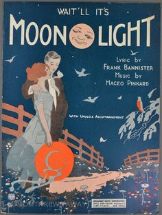
This Ivan Brunetti New Yorker cover shows a restrained and complex sentimentality that's seldom seen because it's difficult to pull off. It requires a confident artist who's willing to explore sentimental tropes and resist "the call to pander" to the audience.  Brunetti references several sentimental conventions but stops far short of adopting any wholesale. Precursors to his New Yorker image, these early twentieth-century sheet music covers display a longstanding association between women, sentiment, and the moon.
 These scenes suggest the longing present in an imperfect or unrealized romance. The woman awaits the element that will complete the scenario, and her: "A night, a girl, and a moon" needs a man. The culturally authorized ideal version of this scene appears on this sheet music cover, as a happy couple is watched over approvingly by the moon, the symbol of romance itself:
The female in Brunetti's image (her age is ambiguous) could be viewed, sentimentally, as purely a figure of pathos because she skates alone at night. But the scene rejects the coupling premise that drives the vintage images. The heroine does not look outward toward an absent lover, but inward.

With eyes closed, her face wears a contented expression. While traditional sentimentality sees a woman's value as defined by her relationship to others (as wife, mother, daughter, etc.), Brunetti's cover celebrates female solitude and introspection — a romance with the self.
But the romance comes with a little danger. Hinted at on the cover, the classic sentimental trope of "virtue under duress" appears in everything from made-for-TV movies to antebellum seduction novels: an appealing female characters threatened by external forces, even her own desires. Brunetti's image initially "feels" placid, yet the skater might be in for trouble. Like many of her literary sentimental precursors, she flaunts convention by ignoring the rules — and the temperature. She jumps the fence during the New England 'January thaw' (the cover was released in early January 2007). Her rebellious actions are admirable, even inspirational, but a little reckless. Perhaps she should open her eyes.
Responding sentimentally, we feel for her, and we worry. Yet the design offers some consolation, providing the skater with a figurative (though perhaps illusory) sense of safety. Brunetti places her within an implied circle formed by circular objects (moon, ice, puddles):
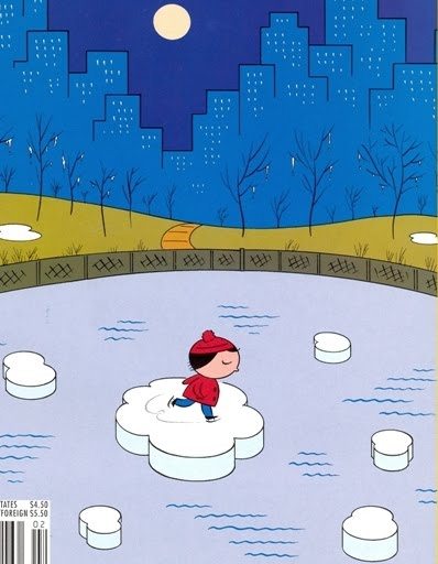
The circle is domestic sentimentality's favorite shape, as seen in the protective embrace of "the family circle" or the heavenly continuity of "Will the Circle be Unbroken".
Classic sentimentality relies on strong moral and visual contrasts, creating a clear-cut system of binaries and oppositions. Brunetti subtly evokes this tactic by using sets of contrasting objects and fields of color, while resisting the predictability of symmetrical placement.
The moon is partially aligned with the skater and the pond's pathway, while the blue colors of the sky and buildings reappear in different shades in the water and its ripples. (Color emphasizes the image's traditional three-part structure: two blue areas separated by green). The skater's natural motion (her doodle-like curlicue trail) harmonizes with the ripples, the park's gentle slope, and the barren 'weeping' trees (an example of sentimentalism's pathetic fallacy). Yet the doodle-like looseness of her legs and body resist the buildings' straight lines and towering block shapes. Her artlessness confronts the city's artificiality and nature's creeping hazards: she's "on thin ice," the cover's title. And something more threatening, a non-natural danger, hovers over the scene and its marginal yellow and red imagery: the onset of global warming. Everything's melting.
In many literary and visual modes, sentimentality's favorite sign is the tear. One harsh critic of 19th-century women's novels created a "lachrymal index" that derisively listed instances of characters crying. While Brunetti's image lacks tears, teardrop-like gestures are plentiful: the snow that drips from the tress, the dozens of teardrop-shaped lit windows, and the melting New Yorker logo. If the logo were to worry about the cover's protagonist, its tears would be white. (In Brunetti's first version of the cover, nine teardrop shapes melted off of the logo, instead of the final three.)

All of these design choices, plus the scenario itself, evoke the pathos of sentimentality without any of its maudlin excess. Winter images often drown in their own holiday sentimentality, but this cover, like the skater herself, moves lightly on its surface.
- Background Time
The over-sized head of Brunetti's heroine recalls the art of one of his heroes: Charles Schulz, the creator of Peanuts. Both artists frequently return to images of solitude, examining the value (and danger) of self-reflection and self-absorption. The following Schulz strip belongs to a curious — to me at least — subset of Peanuts strips. While many feature a single location (a stone wall, living room, baseball diamond), others, like this one, portray a solitary character in a different setting in each of the comic's panels. 
This creates an interpretive quandary. Typically, we determine the approximate duration of a comics sequence by comparing it to reality: roughly how long, for example, would a given cartoon monologue or conversation last if it occurred in the real world? The flow of the dialogue in the above strip suggests a short passage of time, maybe less than ten seconds. Yet the shifting locations may complicate this approach. As Charlie Brown moves to a new location, he takes — off the page in the comic's gutter — an invisible, undefined pause between each line of dialogue. Or perhaps Schulz leaves some of the character's monologue un-narrated. Though we never hear it, as Charlie Brown walks from place to place — from panel to panel — he meditates aloud on ideas about punishment, adult-child relationships, and the inevitability of his own disciplining. (In many Peanuts strips, the only actions are walking and/or talking — and the walking here is off the page, until the final panel.)
We could also think of the backgrounds as simply decorative: they don't imply any 'actual' time gaps between panels. Instead, Schulz uses them to create interest for readers (and for himself as he when draws), especially when the joke doesn't depend on visuals in the way that some Peanuts gags do. The backgrounds, then, are to be experienced, not interpreted.
When I read strips like this with students and ask about time duration, many overlook the backgrounds. If they notice the changing settings, they think of them as embellishment, with no narrative implication. They pay more attention to words than to pictures or to the word-picture relationship. Given the monologue's rapid flow (and in other strips, the conversation's rapid back-and-forth), this approach makes sense. But imagining that these narratives take far longer for the characters to live through than for us to read them lends the strips — and the characters' lives — a little pathos. So much is left out, making Schulz's quiet approach to cartooning even quieter.
This strip calls into question a way of reading that emphasizes an over-literal connection between comics time and real-world time; this 'reading protocol' overlooks what makes the comics medium interestingly strange. Like some mysterious, otherworldly force in a sci-fi drama, the comic medium plays with and violates all rules of "the space/time continuum."
 Comics time is an ever-shifting, elusive presence: actual comics will always invalidate our theories of temporality. It's worth remembering this fact: there’s no time in comics. It’s a still, flat, timeless medium. A comic doesn't fragment or segment some kind of imagined continuous narrative into little boxes. To think of comics this way is to force reality onto art, deadening what makes a fictional world a compelling alternative to real life.
When a live-action TV show or movie employs a dramatic series of background shifts during a single conversation, the 'weight of reality' pushes us toward an interpretation that acknowledges the presence of non-narrated time. After all, it takes real people a while to move from place to place. Cartoon characters, however, can move instantly from scene to scene or, if they choose, take their time, doing whatever their authors want them to.
________________________________________________________
Coda: More Skating and Talking
* Brunetti's New Yorker cover is part of another sentimental tradition: images of skating in New York.
Winslow Homer: Skating on the Ladies' Skating Pond in the Central Park, New York (1860):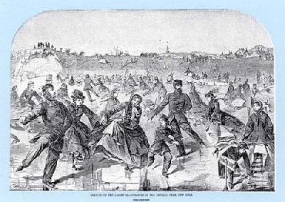 Currier and Ives: Central Park Winter - The Skating Ring (1862):

Thomas Kinkade: Skating in the Park (1989):

*More Peanuts strips with a (potentially) continuous conversation and shifting backgrounds:


____________________________________________________________
Ken Parille is editor of The Daniel Clowes Reader: A Critical Edition of Ghost World and Other Stories. He teaches at East Carolina University and his writing has appeared in The Best American Comics Criticism, The Believer, Nathaniel Hawthorne Review, Tulsa Studies in Women's Literature, Comic Art, Boston Review, and elsewhere.


