
Perhaps we shall begin with Albrecht Dürer?
Oh, gosh, I hear you say, shuffling your feet, clutching your felt cap in your hand, I didn’t know there was gonna be homework . . .
Don’t worry about it. This is the age of Google. Scan the wiki five minutes before class like a normal person.
Anyway. Dürer. How about Melancolia I (1514)? If you haven’t seen it in a while, it’s the one with the winged woman sulking in a pile of symbols, her expression purportedly difficult to parse. She looks to me as much annoyed as anything else, impatient. It’s a recognizable human emotion despite the classical framing. The winged figure is unmoved, surrounded by symbols of learning and culture. Bored, even. Perhaps she’s a muse? The geometer’s shapes and the artist’s tools have been cast aside, all of the customary distractions meant for idle hours of self improvement, along with familiar evocations of peace (the lamb), justice (scales), and time (hourglass). Nothing touches her. You can almost hear the dissatisfied groan escaping her lips as she pouts, eyes glazed and fixed on the middle distance.
So step back a minute. What are we looking at? Well, on first glance we’re looking at a drawing, but we’re really not. Melancolia I was a wood print, carved for use in early printing presses. What that means in practical terms is that after all the preliminary sketches and drafts were completed the final version was carved into a block of wood with a knife and chisel, resulting in a form we would recognize as very similar to a photo negative.
Look again at the print. What draws your eye? For me, it’s her waistband. Drawing is a magic trick, after all. With just a handful of lines on a flat plane the artist can simulate the curvature of the human body. That’s the real challenge. Anyone can draw a sphere, and with a little bit of practice anyone can figure out how to shade a sphere relative to the direction of a light source. But a human figure, irregular and curving, and turned away from the viewer at a 3/4 profile? Twisted slightly, no less, hunched over with the weight of her elbow on her knee? Wrapped in a voluminous gown that obscures almost all of her figure, yet held tight by a stiff girdle visibly pinching her waist? In artist’s parlance, that’s called “showing off.” Again, just look at that waistline. Even moreso than the cheek - itself remarkable - it’s her girdle line that truly impresses. Such a subtle set of lines to communicate the illusion of curvature, mass and texture. You can hear the rustle of her dress as she slouches. Crinoline wasn’t invented yet but you want to use the word anyway.
We are left then with the disconcerting proposition that not only was a man, a mere mortal human being, capable of drawing such a perfect set of lines, but that someone - possibly Dürer or possibly an assistant, I understand there’s dispute - was capable of translating those infinitely fragile lines onto a flat carving. Someone had a steady enough hand, was able to push with enough strength onto a hard surface with a chisel or blade, while still maintaining the grace and control of a sharpened pencil, to wrest that luminous piece into being.

What does this have to do with anything? Well, perhaps another woodcut might bring the relevance into sharper focus. Take a look at Expulsion from Paradise (1510). Does that not seem a remarkable four year’s difference? The cramped influence of the medieval that still lingered in much of his carving evaporates like a morning dew in the later piece. That heavy gothic air still clung in the shadows of the 1510 carving despite the quite un-medieval anatomical delineation that already marked its firm allegiance to a later paradigm. What sticks out, for our purposes, from the earlier piece is the degree to which you can see the later and larger print as a sharpening and refining of a precision that was already present, as well as the degree to which the smaller print betrays more of the texture of the original wood. The progression here is a man learning how to counterfeit the effect of one medium into another. If you hold a sharpened pencil broadside against a piece of paper you get a thicker line of variable darkness, but how do you possibly convey that grayscale through a block of wood? Well, simple: you draw a bunch of tiny little lines, often parallel but sometimes in a crossways hatch pattern - hence the name, crosshatch.
He may not have invented crosshatching but he’s certainly cited on the wiki.
Pull out a bit from the virtuosity of Melancolia I and look at the more visible technique of the earlier piece. Expulsion betrays more of the medium’s tactile vulnerability - the shading and crosshatching has been more deeply gouged, unconcealing a ghost of depth in the printed remainder. It’s a smaller piece as well, only 5 x 3 7/8” as opposed to Melancolia’s 9 1/2 x 7 1/2”. The smaller scale means the striation technique with which he communicates the shape of muscle is more visible, hence more stylized. However, even if the first piece is smaller, the fact remains that Melancolia I is still only the size of a regular piece of typing paper. Remarkable.
Another thing Explusion betrays is the degree to which contemporary illustration still resides in the shadow of Dürer, five hundred years later. The guy who drew Explusion could have made a good living drawing the X-Men. He knew the most valuable skill for any comic book artist: how to place a woman’s shapely ass at the forefront of any kind of composition, no matter how solemn or holy. We even have a fancy word so art historians can talk about shapely asses without blushing: steatopygous.
Reflect for a moment that most comics, at least up until the turn of the century, were finished in ink prior to printing. Black ink works well on cheap paper. The tools used to transfer the technique of an older medium were again ported over, from comics strips, newspaper comics and the popular illustrators who preceded them in the nineteenth century. Crosshatching remained and remains a constant. People still do it just like Dürer, using an excess of lines to launder an exaggerated conception of human anatomy.
I have spent a good deal of my career in fruitless pursuit of the proper description of an ink line. Every critic has their weakness, one supposes, and mine is that I am fascinated by ink as a medium, nigh unto distraction. That line is the fundamental ingredient in most comics excepting occasional painted or CGI outliers. That seems basic, right? Like it almost doesn’t need to be said? But how do we judge that line, hold that line in our memory like handwriting, such as to make an individual artist’s mark instantly recognizable even in unfamiliar contexts? Pure sorcery! The line is alive and in it you see the shape of the maker.

Barry Windsor-Smith's Monsters is a bloody book drenched in black ink. It is perhaps another weakness of mine as a critic that I flinch from writing hyperbole, even when seeming appropriate. I’ve certainly done my share. Certainly. But it’s useless, except as a pastime for reviewers reaching for a bit of the ol’ lyrical fancy in their own prose. Empty calories in terms of world count. For the same reason however I struggle sometimes in praise of greatness. I often begrudge being pulled to unvarnished compliments as a stubborn horse pulled to water. Leave it be said this big bloody book is a great book, in the most profound sense of the word. Does that satisfy as a normative value judgment? As a demonstration of sheer skill between two covers it has few peers.
If you wish further lecture and pedantry regarding the negative utility of excessive praise, I will by example offer the further qualified pronouncement that although Monsters is an undeniably great work it is nevertheless an imperfect work. Perfection is only ever incidental to greatness, as a great many perfect works of art stir neither heart nor tongue while many great works struggle at times to overcome the limitations of imperfect creators.
For the most part Monsters turns Barry Windsor-Smith’s few failings into virtues. He’s been writing his own material off and on for decades so we have a fair amount of work in our control group, enough to state that when left to his own devices his plotting can be dilatory and elliptical. Perhaps he got that from Chris Claremont, a strong influence whose voice can still be heard in Windsor-Smith’s prose. This isn’t a straightforward story by any measure, and to be frank it makes for a frustrating read in places. The pace varies from section to section - quick sequences of action or horror are interspersed with long conversations or diary entries. Different characters are prominent in different parts of the book and in different eras, in such a way that it took me a while to figure out what the actual core of the story was.
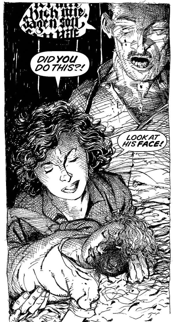
But there’s meaning to the drunkard’s walk through thirty years’ of dark American history. Frustratingly, you don’t see the point of anything until you reach about the three-quarters mark in the book, at which point everything comes into focus in a scene of domestic violence so brutal that when I turned the page I flinched as if struck and had to put the book down for a spell. That’s when it makes sense and the pattern snaps into nauseating place. All the seeming side stories that make up front of the book, separate from the putative main line of Bobby Bailey’s horrific disfigurement at the hands of the US government, add up to something a lot bigger than just another pop culture remnant of Project Paperclip. (Though it is certainly that, too.)

Y’see, the book isn’t about the monster on the cover - I know, another first rate observation from the Ace of Critics over here - but it’s worth pointing out that the monster character who appears on first glance to be a Hulk analogue isn’t that important to the story. The book is mostly flashback explaining how he came to be in such a dreadful state intercut with people in the present investigating the same question. If you come to the book expecting a Hulk story with the serial numbers filed off I expect you may walk away confused and disappointed. You can certainly see the outlines of where a Hulk story may have existed, way back in the acorn, but it’s hardly an intentionally metafictional “exploration of the archetype,” or whatever be implied by such a borrowed foundation.
Pardon that I keep beating around the bush but, I’m taking after the book itself. It only slowly disgorges its actual subject, as a clam only begrudgingly disgorging the pearl. At its heart the book is a character study of a woman - Janet Bailey, Bobby’s mother. Everything else is soft red tissue concealing the bruise. This is a book about how abuse destroys families from the inside out, and how it crushes the best of us under its weight, how it can even reach out and scar bystanders. About how the end result is like as not to be a bunch of unrelated men standing around wondering why they couldn’t see what was in front of their faces the whole time.
Does it hold up better with that in mind? The early chapters primarily follow Sergeant Elias McFarland, the recruiting officer who ushers Bobby into the arms of Project Prometheus. Soon after doing so Elias begins to suspect he has a closer connection to Bobby Bailey than he initially suspected. They share a connection going back to their fathers having served together during the war, although their meeting one day in a Los Angeles recruitment office appears at first glance to have been sheer chance. That tremendous coincidence - which the reader does not even understand for a significant portion of the book’s span - is the crux on which the drama turns.
The shakiest section of the book is that immediately touching on Sgt McFarland’s domestic life. Why is it the shakiest? Well, partially because it leans heavily on the extended use of AAVE for Elias McFarland and his family. They seem in most respects a perfectly normal middle class black family of the early 1960s, Elias having followed his father’s footsteps into a career in the military. The dialect is distracting. It sticks out as a conscious choice that could just as easily been sidestepped without notice.
There is one aspect of the book, I think, where it may show some of the stress of having been ported over from a shared universe - even as I acknowledge I don’t even know if these elements have any connection to the original pitch, which probably didn’t feature Professor X. Bobby Bailey’s transformation into a Hulk at the hands of Nazi mad science is only the first fantastic element in the story, the second of which is the low-grade telepathy shared by Elias McFarland, his father, and his daughter. To be blunt, the McFarland family has the Shining. Is it called the Shining, after the famous Stephen King book and related movie adaptions? No, of course not. But it does act precisely like “the Shine,” mystical, prophetic, and ambiguous in nature, in pointed contrast to the more quote-unquote “rational” boundaries of Professor X-style comic book telepathy. It explains the way the lives of successive generations of Baileys and McFarlands remain tied together and intersecting despite the compounding of ludicrous coincidence necessary to pull them back together. The “pulling them back together” is the whole point of the first chunk of the book, though you may realize only in hindsight. Since the McFarland family telepathy is never explained or explored except in passing it stands out as a plot device that hints at a larger context. If there is more to be written on the subject of race in this book I am certainly not the person to write it, but one question I am left with is if Windsor-Smith’s use of “the Shine” might not also mirror the dated racial politics sniffing around the edges of King’s work vis a vis the use of black Americans as avatars of magic.
Anyway. To put it bluntly, the McFarlands just aren’t as interesting as the Baileys. Elias is a good guy with a good family, complete with adorable moppet, whose life gets torn to shreds because he happens to run across the kid of someone his dad knew. This triggers a nervous breakdown which in turn propels the plot forward by compelling him to investigate further. That’s the theme of the piece, incidentally - successive generations of good people are destroyed by the compounded consequences of trauma created by total war. Innocent people who have nothing at all to do with anything, white people and black, young and old. All just meat for the grinders. Not particularly subtle, but neither is the military industrial complex.

Deserving of mention is the car chase sequence that occurs partway through Elias’ section. Although it isn’t really an action book the few action sequences are quite stunning, and even though it comes fairly early in the running time nothing comes after to match the scale of the car chase. They’re hard to do on paper, you know. The sequence is so good it made me wish Alex Toth was still alive, just to see his margin notes tearing it apart.
Strip away all the fantastic elements and what are you left with? What’s the shape of the thing? It’s about a guy who goes off to the Second World War a picture of youthful vigor and comes back, fresh from an extended stay in the sanatorium, a weathered middle-aged man consumed by rage. What happened? Well, he was one of the first Americans into the camps. After what he saw he was never the same. It was only a matter of time before the broken man destroyed his family, and again only a matter of time until the child of that family destroyed himself because he didn’t know any better. He signs up for the Army in the early days of Vietnam and gets fucked up so bad he comes home in constant pain and dying of cancer. His dad’s war buddy’s kid risks a lot to try and make up for the shit hand Bobby Bailey was dealt, but ultimately only gets destroyed himself in the conflagration. We’re left with a picture of two families annihilated in the wake of the wars, symbolic of the insidious ways in which these successive conflicts further coarsened an already brutal national temperament.
At it’s beating red heart Monsters is a domestic tragedy. Everything else in the story exists in metaphorical relationship to the harsh glare of the real horror that defined Bobby Bailey’s life. It’s easier to live with the stories than the truth, which is that regardless of what happened to Tom Bailey during the war he was afterwards left almost entirely alone to grind his family to dust. People saw - of course they saw. Half the town fell in love with Janet while her husband was gone, they were already looking. So everyone in that town saw Bobby lose his eye, everyone knew it was his father’s doing. From that point the next steps unfolded with sickening inevitability.

They all saw, it happened on their watch and they did nothing, and that’s the moral of the story. Bobby is the recipient of such severe abuse at such a young age that he never recovers. No one of all the people who saw it happen bothered to follow up and see how Bobby turned out. Elias is the first person in Bobby’s adult life who is depicted as paying even the slightest bit of attention, and he certainly suffers for his troubles. Of course Bobby signed up for a mysterious secret project with the Army during the early days of the Vietnam war. The part of him that placed value in his own life had died a long time ago.
That’s the story here, how that part died - a descent into a hell of purely domestic dimensions. Those dimensions are illustrated by Windsor-Smith in exacting detail. More than anything else, this is what impresses: it’s not the (very brief) sequence of Bobby Bailey being pursued by a helicopter through the wilderness in Ohio, it’s not the details of the scientific tortures committed by the United States government or Nazi Germany. The imagery in those passages is purposefully obscured and fragmentary, much also seemingly borrowed from Weapon X, his previous meditation on the brutality of the military industrial complex. Familiar ground that doesn’t particularly seem to interest the artist this time out. New and fantastic sci-if imagery isn’t on the menu.
Virtuosity is found here in Windsor-Smith’s most exacting creation, the Bailey’s late 40s home in Providence Township, Ohio. It’s not monsters or the military hardware that stays, it’s claustrophobic walls and hardwood floors, deep shadows hiding inside the ubiquitous crosshatching smeared across every panel like cobwebs. The clear comparison here is the indefatigable Gerhard, otherwise known as the other guy who did Cerebus. He drew backgrounds, which didn’t just mean nature and cities but also extended - very extended - domestic sequences. For what it’s worth he’s the most prominent and accomplished credited background artist in English language comics, an achievement only ever dimmed by the activities of the, um, other guy who did Cerebus. With literal years of the running time of that book often devoted to exploring the interior of a single house, Gerhard set the standard for exacting attention to architecture and design. When you do it right, environment is character.

Certainly, monsters and army men are one thing, but a banister? Period automobiles? The kitchen sink? It’s right there on page 190. Not a line out of place, the most perfect kitchen sink you have ever seen in a comic book, courtesy of Mr. Barry Windsor-Smith. Just what does this level of detail give you, besides nigh numbing verisimilitude? Well, that’s certainly important, don’t get me wrong. Context is important. Grounding is important. Environment is very important. Maintaining a consistency of physical dimensions, which means in practice repeatedly drawing the same room and set of furniture across hundreds of numbing pages, allows for cinematic depth of effect. The light and shadow are alive and malign, seeping black ink so thick it might smudge. It doesn’t feel like an empty soundstage with blank backgrounds against which the artist can set their drama. It’s a real home in which real people move and interact.
But with a slight change of emphasis a home becomes a trap, simple as that. Walls and ceilings that protect can so easily be made to confine. No one sees what goes on behind them. Even people who see are incentivized not to understand.
The slow downfall of the Bailey household is chronicled in Janet’s diary, given in page after page of looping cursive. Anyone who wants to understand how much character a single ink line can have should study these diary pages. Windsor-Smith communicates a great deal of necessary character development through the medium of handwriting via fountain pen. You see when her handwriting is tidy and her pen is full, and you see as it becomes slightly less neat and she lets the pen run out of ink. Such a simple effect. If this were a movie you’d hear narration with tone and inflection. In a comic book all you can see is the writer’s hand shaking as her writing becomes more cramped and tight. As the tension ratchets in her household so to does Janet’s visible anxiety.
Towards the end of the book I found myself reflecting on Windsor-Smith’s kinship with another artist, and I’d say one of Windsor-Smith’s few peers in pen & ink cartooning, Eddie Campbell. Perhaps it’s simply a physical synchronicity - lugging Monsters around the house for the better part of the week I couldn’t help but think about Campbell’s similarly massive compendiums, the various Alec and Bacchus omnibus volumes I’ve given as gifts multiple times. Those are also squarebound monoliths filled with page after gorgeous page of a world-class illustrator showing off all the things they can do with ink on paper. I mean, there are some words there too, writing and such. But there’s just something about that ink . . . big splotchy pools of jet ink raked into tidy piles across the page.
As different as they are Campbell and Windsor-Smith cluster in my brain owing to their facility with ink, their respective abilities to translate extraordinary intimate and diverse effects with such a stark palate almost unparalleled. It’s a merciless medium, not for the faint of heart. There’s no colorist waiting in the wings to fix your composition when the lines are too fussy, that’s all you, baby. Sink or swim.
Perhaps there is a kind of holographic principle at play with ink - only, we’re not talking about the information found on the event horizon of a black hole, we’re talking about the illusion of dimensionality on flat paper, projected upwards from abstract conglomerations of ink like shadows on a cave wall. Ink is a peculiarly chiaroscuric medium, you see. Pencil and charcoal are gradient tools, they allow for much more subtlety in certain respects. Unless you want to get into fussy washes, ink is far more stark. (Ink washes have fallen out of favor in recent years, and for this I credit only the cowardice of contemporary illustrators. Prove me wrong, kids!) It’s also a lot more difficult. In order to be able to achieve that magic - summoning dimension and nuance with plain black ink - an artist has to be able to see the page not as a window but as a flat reflection, so to speak. Why does such an abstruse distinction matter?
Return to Dürer. Think about the actual cognitive challenge of sitting down with a block of wood and figuring out how to make that solid two dimensional surface somehow look like three with only a handful of carving tools - fucking carving tools, like a goddamn pumpkin. It doesn’t require the ability to draw a person but the ability to translate the drawing of a person onto another medium - to carry what is necessary of the image while approximating that which cannot travel of the technique. This is a second-order process that requires conceiving of the drawing not as a drawing but as a flat plane covered in abstracted marks which when reflected on a printed plate will create the illusion of a drawing. As part of this process the original drawing must be made into a physical tool that will use ink to produce a final product that replicates every iota of the subtlety of a freehand pencil drawing. Whew
I’m doing a poor job of explaining a complicated process, just go read Benjamin. It doesn’t have to be that hard. Just picture yourself using a brush to push ink around on the page. Ink is roughly the consistency of water, to give you an idea. Is that easy? No, honestly it feels a lot more like pushing a tiny little mop, and your initial results might not look much better. (Mine didn’t!) You can’t really draw with a brush, you see, not in the same way. (Or at least, I couldn’t.) You pull the brush across the paper. You don’t press it, you have to be able to apply just so much black as you need with a few tiny bristles on the end of a stick, using little more than a twitch of your wrist to make the gloopy ink smear into the shape of a coffee cup. Now, the artist knows it’s not a coffee cup. The artist knows it’s a bit of ink sloshed in a curlicue by their experienced hand. A reader examining closely will also readily see it maybe looks less like an actual coffee cup, in detail. But somehow the globs of ink doodled on the page have been made to congeal into a flat pool that resembles the shadows cast by a cup of coffee as seen by the reader from their perspective looking down at the page. It’s a miracle. A hologram. Et viola!
Dimensionality is a projected illusion. Close up nothing looks like anything and the very best artists are completely unselfconscious of that fact, blithely unconcerned by the reader sitting there at least eighteen inches away from them at all times. The trick is to doodle in such a way that when you zoom out it looks less like a bunch of random lines on a page and more like a picture of something or other.
Ink is balky. Ink is not itself a hard tip (as a pencil) or even a quill, it is runny liquid that stains literally everything it touches, forever. The artist uses a small assortment of tools to smear this ink across the flat grain of the paper, hopefully in some copacetic manner. You’re suggesting an object. Tricking the ink into looking like what the reader needs to see to infer presence and absence from contrast. You have to know both how to draw that line and how to goad the obstinate ink into counterfeiting that line in such a way that it will stand out when printed onto flat paper as line art. Do that without color, without even greyscale. Draw a woman’s face so beautiful it can break your heart, a little dash of ink to trace the curve of a cheek carven onto the page as if by chisel. Good luck.
That’s the trick at the heart of Monsters. You think it’s going to be about monsters, but it’s not - it’s about the people monsters destroy. It’s about Janet Bailey, mother of Bobby. Her story emerges from the fog of interlaced reminiscences like a bright major key melody emerging from a scrum of atonal motifs. Now, admittedly, I am biased here, as someone who very much likes looking at drawings of beautiful women - a common bias shared by a high percentage of the population, however, so I don’t feel too bad. Janet Bailey is portrayed as the most delightful, most vivacious, most perceptive woman you can imagine, a vision of health and beauty. Windsor-Smith shows us a lovely woman, the sort of lovely woman who can’t turn around without attracting admirers, and over the course of a couple hundred pages he plays the very same trick on us. Of course we too fall in love with Janet Bailey. After all, she’s doomed.
We know this from the very beginning. It’s what the book is about. Janet and Bobby Bailey are trapped in a rapidly shrinking cell with a dangerous man. The walls close in, those beautifully illustrated walls with the dense crosshatching, ominous darkness eating away at every corner and cranny. The vision of domestic fear at the center of the book is scalding. Whatever the reasons - and oh, there are always such reasons why people end up hateful - the outcome is the same. The madness of one generation is visited upon another, and another, pulling in more and more people like a tornado. The cycle never ends. Bobby loses an eye at the very beginning of the book and the loss carries with it no wisdom, only a bottomless conviction of worthlessness. An eye for an eye for no reason at all.

It’s a sad story without any real humor to leaven it. There’s no sense to any of it, ultimately. The most lovely person and her darling child are crushed by domestic abuse, oldest story in the world. That kind of sustained childhood trauma leaves a person half a shell of who they could have been - no, that person is inaccessible. Instead they grow up bent into people who don’t know how to do anything but hurt themselves because they were never taught to place any value on their own lives. People trailing behind them a lifetime’s worth of baffling decisions made with the lack of foresight endemic to the imminently condemned. People barely distinguishable from wreckage.
But anyway. We were talking about inking. I don’t think I’ve ever discussed this to any great extent, but as a kid I wanted to be an artist when I grew up. I knew how to draw better than just about anyone else my age, spent years practicing. Learned how to use different kinds of pencils and charcoal, as well as how to use and clean fountain and technical pens, how to erase lines neatly with those big grey putty things. And then when I was around thirteen or so I got an inkwell and a brush and spent the next little while trying to figure out how to use the damn things. Having read Will Eisner’s The Dreamer at a tender age I believed mastery of those tools to be the ultimate expression of skill in the comics medium.
As I say, I was pretty good for my age. Still a kid, but getting to the point where I could sort of begin to see the difference between good and bad. To see where I was lacking and where I actually could perceive development. If I squinted real hard I could even have seen a real future in it . . . but then I tried to teach myself to use a brush and ink, for real. A perfect illustration of the difference between talent and real skill: I had a modicum of talent and was content to develop inasmuch as it flattered me to do so but balked the moment I came up against an obstacle of sheer mechanical skill. It was harder than I could have imagined. Eventually I put it away and stopped drawing altogether.
After making the decision that my talents and inclinations were better spent as a writer I never truly regretted it. In hindsight I recognize the obstacle wasn’t skill but impatience. Certainly not a lesson that would recur throughout my life in bitterly ironic fashion, nope. But anyway, that’s my secret origin as a writer and as a critic: I couldn’t hack it as an inker.
Ink is my favorite medium. Give me fine feathered brushwork, give me tight precise Rapidograph lines - give me some damn freehand crosshatch, for the love of God. I know precisely how hard it is. I knew how to draw a little bit, but I couldn’t even begin to grasp how to make the brush do anything but masquerade a crude approximation of a pencil line. It required a leap of imagination I could not make at that point in my life, to break down the act of drawing into small enough pieces to be able to put it together in a new lexicon with a new syntax.
When Dürer learned how to replicate a fine pencil line by gouging out a splinter of wood he was learning to see not as the viewer admires but as the machine reproduces. Windsor-Smith’s crosshatching in turn reproduces Dürer’s technique five hundred years after the fact. A stylistic choice that emerged as response to a technical challenge stuck around as a foundation stone of contemporary illustration. Again: look at all the little lines in Dürer’s Expulsion and then all the little lines in, say, Jim Lee inked by Dan Green. Why, it’s the very same little lines!
And it is with those little lines that we see the magic trick assembled before our very eyes. What else but magic could create a creature so lovely as Janet Bailey simply out of a random conglomeration of lines? Dürer knew the trick. Look once more at Melancolia. What sticks out to me now is her disinterest relative to the viewer. She’s not performing, not even acknowledging the frame of the picture in the reflexive way of most posed subjects. If this were a camera portrait you’d almost say she was refusing to cooperate. It’s so very human a response, a passive-aggressive attitude to being the subject of a work of art. Why is she melancholy - could it be because she too is trapped? Stuck forever in a mysterious illustration, being stared at by generations of creepy voyeurs intent on breaking her secrets and dragging her name through the mud on internet forums . . . after five centuries you’d probably feel a bit like an animal in a cage, too.

So where does that leave Dürer and Windsor-Smith, separated by those same five hundred years? What else do they share, besides a commitment to aestheticizing female discomfort, so many butterflies trapped in diving bells - oh, hey, look at that, we’re out of time today! But that’s the nature of greatness, one supposes: it doesn’t have to be perfect, in fact, it’s probably better if it’s not, better that it’s thorny and complicated and possibly conflicted and wincingly dated in some ways while still unerringly contemporary in others. Monsters is not a great book because Janet Bailey is a beautiful woman, but because she is a living woman, one who - like the unnamed, diffident angel in Melancolia - just happens to be made of ink on paper. Here you find the breath of life jutting at abstruse angles from the jumbled thicket of technique and theme, held firmly in the mark of the master. Unmistakeable in any context. Technique cannot make up the deficit in the absence of that spark. In its presence the correct posture can only be gratitude.


