Connor Willumsen is, in my mind, one of the most exciting young cartoonists working today. When looking at his pages it is immediately apparent that he is an astounding draftsman. He is able to design appealing characters without any sense that shortcuts in his drawing dictate their look; there is always a meat to them that enables them to be shown from any angle, in varying kinds of light. His backgrounds feel lived-in, and so do the bodies themselves. On the basic level of drawing chops, I am reminded of Robert Crumb.
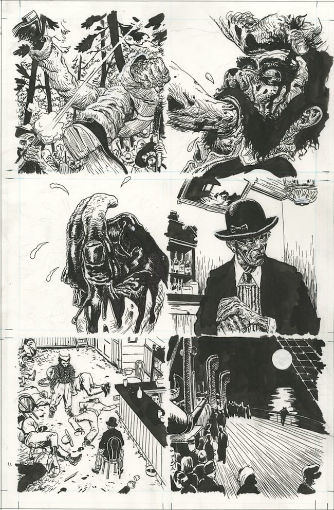
This set of skills has resulted in work from some high-profile clients. You may have seen his art accompanying Criterion's recent edition of David Cronenberg's Scanners, drawing heads in various stages of exploding. The single issue he drew of Untold Tales of the Punisher Max, written by Jason Latour and released by Marvel a few years back, flew under the radar of most comics fans, but rewarded those who had their eye out. An issue of Wolverine Max followed not long after, containing only six pages of Willumsen's drawings, seeming to confirm that his art, despite the facility that would attract an editor to hire him, is essentially too good for major superhero publishers.
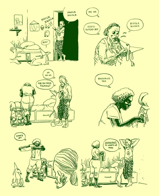
More recently, Breakdown Press began publishing Willumsen's serial Treasure Island, after seeing its first installment online. The web is where most of Willumsen's comics he writes for himself can be found, although several of his older comics are no longer archived on his website. Many of these, if I recall correctly, were quite interesting. The work he writes for himself largely jettisons the action sequences he has such obvious facility with in favor of paying attention to smaller gestures. His narratives are direct and immediate in their address of emotional realities, but also occasionally unnerving and distressing in the sense of the larger worlds of ideas they raise. The variety of approaches and attacks meant that, going into this interview, I knew nothing about who he was or where he was coming from.
I talked with him over Google video chat and, after editing for flow, e-mailed him some follow-up questions I should have asked initially.
Brian Nicholson: I figured I'd just start off by asking the basics of where you were born, and when, and schooling.
Connor Willumsen: OK, well, I was born in Canada in the late '80s. I was born in Calgary Alberta, grew up there until I was twenty-one.
And you went to SVA for college?
Not exactly, I didn't, no. I went there for a year but it was sort of a strange situation. I went to college in Alberta at The Alberta College of Art for four years, and it was like a design degree but near the end I was just sort of doing cartooning, passing it as design or illustration. Then there's this weird program that designers have access to where they get sent to SVA for a year after graduation for one year of study but it's undergraduate study, it doesn't really count for anything, it's just extra. So I applied for that and I got it, but I don't know if I did it appropriately, because I think I was expected to take the design classes at SVA but then I ended up taking the cartooning classes. So it was just one year of extra study. So I just sort of took what I want.
Did you have any notable advisers?
Not really advisers, but teachers, yeah, I had David Mazzucchelli, I had Keith Mayerson, John Ruggeri. Dan Nadel was teaching a business of comics class actually, where he taught contracts and publishing and that sort of thing. I was in a Mark Newgarden class briefly. Who else was notable there at the time? Gary Panter I didn't have. I think I'm missing somebody. Stephen Gaffney was my figure drawing teacher, he was really good.
Were you doing minicomics? When I started hearing your name, it seemed like people just got them when they were in New York. Maybe you gave them to people at shows but I don't know if you were exhibiting. Or were you just putting things online?
Let me think. The way I got into doing them in the first place was, I was doing this design degree in Alberta, and near the end feeling like part of the program or system was inappropriate, you know, really geared toward having a really professional career, sort of. Near the end I got flippant and just started submitting a comic for every project, you know. The reason I got dissatisfied was they'd have assignments where you had to do like a radio advertisement for jeans or something like that, or like a bus ad for, I don't know, name a product. I'd have to do a brochure for Amazon or something stupid like that and I would just draw a comic book, make it weird, and slap on Amazon at the end of it. And then I'd put things online and I started to get weird commercial work with comic books, I just think from posting things on forums and on the internet I got some little jobs. When I was in New York I actually working on a book for Casterman, like 115 pages or something like that, that Antoine Ozanam was writing. And at SVA I was continuing to make these twelve page comics for assignments that ended up in anthologies and stuff like that. It was about that time I started actually printing them, I exhibited at MOCCA once but I didn't really like exhibiting, I wasn't really selling them, I was just sort of handing them out but I never really made a lot, I wasn't that passionate about actually making the minis and printing them, but I was pretty passionate about distributing them on the internet for free whenever I could, finding an adequate format for doing stuff.
Would this have been like the comic you did adapting the commercial for the Batman Forever soundtrack?
No that would've been slightly after, I made that a year later, when I moved to Montreal. And I think I might've brought that to MOCCA that year, the year I was at MOCCA, when I had a table somewhere.
How did the Casterman thing come about?
I think it was from an internet drawing forum, where you just post things on a thread and people would comment. Like, something I was doing in junior high and high school. And this guy had written my name down or something like that and e-mailed me later on. Yeah, he e-mailed me, asking if I wanted to do it, I was like "OK." I think that was my first paid comic work, really.
How old were you?
When I started doing that? I would've been about twenty-one or twenty-two.
And how did the stuff for mainstream publishers come about? Was that through MOCCA, or just the internet?
You mean, like Marvel Comics?
Yeah, that stuff.
I'm actually not entirely sure. Whenever they contacted me it was out of the blue, and I sort of got the impression that a particular writer or someone had spotted me and wanted to work with me and they had sort of put my name in a file. I'm not really sure specifically what work work they were looking at. I remember once when I was in New York getting an e-mail from Marvel asking what I wanted to work on and to send in some JPEGs of whatever and I sent them but they never got back to me about it or anything. So I think I was sort of on file because someone mentioned me or something like that. I'm not really sure exactly but I never really gave them comics that I'm aware of. Maybe I gave someone who works there a comic and didn't know it or something. So I'm not sure how they knew but I think it had to do with general internet presence.
Do we want to talk now about how that didn't work out?
Why I seemed to have a difficult time working in that commercial comic area, I have some understanding of it. I've done a few different projects for DC and Marvel and at this point I'm sort of used to it not working out. I understand there's pretty fundamentally a commercial saleability problem, I guess. I started a book for DC Comics around that same time I moved to Montreal called Witchlands with Kurt Busiek, I did two issues of it, I tried to do the best I could but they didn't feel it was very sellable so it never saw print, I got fired from that. And with Marvel I think I just got so used to the idea that you could make whatever you want that my standards for what you should be allowed to do when you're generating content were way higher than what an editor might expect from a newcomer at Marvel. I just sort of maintained my own freedoms and they aren't in line with what they're doing. They sort of had an editorial divide and conquer system, where it seemed like each person knows less than the other people so you don't have a lot of faculty, you're just expected to fill in the gaps, kind of.

Like a house style?
Not really like a style, but just there's these small things. One that particularly bothered me that led to my not working for them was just this incessant use of these widescreen tiered panels. Which seems trivial, and it is trivial, sort of, but it just represented like a total priority contradiction between me and them. My priority was to make the page layout and the storytelling work as clearly as possible, and I expected for myself the ability to be able to change that to make it better, but I think their priority was make a systematic hierarchy where, we'll just have you do four widescreen panels every page, and all you have to do is fill those in, whether or not it looks good, it's just, that's your job to fill in those widescreen panels. It's just sort of like a lazy way to write. Page five: Four widescreen panels, and then you just say what's in them, and to not do that is to disrupt the convenience of casually making that structure.
What's weird is you seem pretty into grids. There's some stuff you do where the layouts are crazier, but the grid is a really straightforward layout. Do you just prefer that as a compositional starting point as opposed to a longer thing? It seems easier to compose for and less contrived?
Not necessarily. I don't think there's anything inherently wrong with widescreen panels. I'm calling them "widescreen panels" because that's what they're called but I think that's a dumb thing to call them. Like the widescreen panel thing is more symbolic than anything, there's no reason it shouldn't be useful at times in the same way a square panel would be useful at times, or something with no panels might be useful at times.

I saw a page you did for Captain Victory, that's a pretty crazy layout, is that a better system, being published by Dynamite, are they cooler to work with, or is it probably not going to happen again?
No, that seems fine. Every time I get a job like that I just do what I would do otherwise and hope I don't get fired basically. Sometimes it's pretty clear ahead of time what is acceptable and what's not. With that, it seemed okay, it seemed casual, there was less at stake because they weren't dealing with a major property, so I just did what I would normally do and if they liked it great, and if they didn't like it then we could move on or they could find someone else or something like that. But I'm not so naive to think that doing that at Marvel would necessarily be okay, just doing whatever you want. I did arrange with Marvel ahead of time a sort of understanding that either they would let me sort of draw whatever I wanted in terms of layout or ahead of time we would agree on a set grid system, like three by three or something like that and I could work off of that. I'm aware why these sort of vague restrictions are in place. So every time I start a job I make it try to accommodate my own interest as much as possible.
Do you learn things, either about what to depict, or about narratives in general, from working with writers when you work collaboratively, whether it be for Casterman or Marvel, or with Kurt Busiek on Witchlands?
Maybe, but if they are good thinkers, not by nature of their being writers. Like, a lot of what I would learn from a comic book writer, short of being able to discuss narrative and collaborate, would be about writing a script, which I have no interest in doing. I really try as hard as I can to not distinguish between drawing and writing as some kind of duty. At best it's like a sometimes commercial necessity, and to me it incorrectly implies the result is a negotiation of two separate and more pure languages. It tends to be very strict, and I think that's been the cause of a lot of unfortunate habits and generally limited thinking. It tends to diffuse the responsibility of creative agency of both writer and artist. Some writers seemed to have a better mental image of what could fit in a box, other writers would wantonly inventory excessive action and scenery, cramming anything without thought of what would look good. And for various reasons, the script has become the editorial last word, not the drawing. My working relationship with Jason Latour was notably productive. He wrote an efficient script in terms of communicating to the artist. He was open and confident and concerned with the result, and I think that has a lot to do with the fact that he himself is extremely adept at drawing good, readable pages.
Did you learn anything from your working with other colorists on those, or do you compose any differently knowing that it's going to be colored by someone other than yourself?
I try to. I try to make little guides for them of what I imagine, and make it a little more collaborative than what's expected. I think a lot of lines in comic books are redundant when you're using such vibrant color. Like the idea that you would draw a contour line and fill in the line seems like a cop-out, almost. So I try to make these guides for what I was thinking, work with them, blow out the lines here or use color to define an edge, or whatever, that's what I was thinking, but like I said, with commercial projects, you divide the responsibility so there's a little less interaction between them. I never had that deep of interaction with them but some times I'm pleased with it, sometimes I'm less pleased but I also accept that it's out of my hands at this point. I would prefer to control it myself, but that's not the way it is.
If you draw two issues of a comic that don't come out, you still get paid for it or is there a kill fee? Right now you're not doing anything for other people you're getting paid for, you're just doing Treasure Island for Breakdown, right?
I'm doing not commercial comic book work, I'm doing work that pays money, illustrations and stuff like that. Currently I'm not doing any commercial comics work. I've done some recently. Captain Victory was only couple months ago I did that and I did a short story for Red Bull with Zack Soto. Occasionally I'll do that but I prefer to be left to my own devices. I don't think there's anything necessarily wrong with the idea of these commercial projects but they just have a lot of weird restrictions.
The Red Bull thing is semi-animated, and there's a lot of work on your website that's semi-animated. Does it seem particularly useful to do animation, or is that a commercial consideration for what they might want?
With the Red Bull one in particular I wasn't really interested in it being animated in the first place because it was always going to be a sort of simplistic Flash animation. It was also sort of expected I would draw the pages in two dimensions and there would be small elements that would be animated. And I didn't think it was necessary but they seemed gung ho about doing it. I wouldn't have done it if I was up to me. If anything, I don't think it was cheesy enough. So in regards to that process it was completely separate. I made some suggestions of what they could animate if they were adamant about it but it was sort of up to them, ultimately.
When you put animation up on your own online stuff, do you have specific reasons for doing so, specific effects you want to achieve? Or is it more for fun, just doing something else you can do online that can't be done in print? Is it a demonstration of a skill to potential employers, or is it something you wouldn't want to do for anyone else? Is it labor-intensive or can you do it pretty quickly?
The way that I have done it is not labor intensive because I don't have a lot of technical knowledge or background. In the instances I used it I didn't want it to be too novel. For instance, in Blackhold its use is indicative of something specific in the story. Its presence is meant to be information. But it is a bit novel, I'm messing around. There isn't a huge pool of precedent for good use of this 2d/animation mix... Parallax has obvious potential, where the scroll controls the speed and direction of the animation. It's never seems deeply engaging, more playful. There is an animator named Jonathan Djob Nkondo who puts these animated looping panel sequences on Tumblr, it's a simple and appropriate use in terms of a clean narrative.

So you said you don't really have a problem with working for those companies, but you did that comic "Sunset People" that's in Study Group which Zack Soto published, which is sort of a superhero comic in its way, but it's also about paternalistic attitudes in that vigilante mindset, against this weird myth. Do you care about superhero comics at all? Is that what you grew up on or is it just this weird thing that exists?
First of all, you said I don't have problems with mainstream comics. I do have a lot of problems with them. I think they don't necessarily have to exist, is my thing. There's a lot I can say about them, and in regards to my relationship with superhero comics, which I think is what you're asking about, yeah, I grew up reading those, that's my introduction to drawing and comic books, and yeah it's a funny relationship, and it's so pervasive, the idea of these images, and the way they're proliferated in these large spectacular but hollow movies that are coming out, and it's just kind of incessant. and I grew up interested in them and excited by them. It was something to focus on, and the more and more I grew up, the more I thought of the relationship between these superheroes and exploitative commercial practice, the more I felt betrayed by the culture in general. But the isolated focus of the idea of a superhero as an image is a relevant part of our culture and worth focusing on at times. And yeah a lot of times I question what it was I was I learning from reading all these superhero comics and how it was specifically influencing me in my personality, for better or for worse, so those are the terms I'm thinking of it now, questioning of the extent of cultural betrayal I feel at these kinds of things.
When you were learning to draw, are there people whose work still carries weight or does it all feel like something to unlearn?
No, I don't think there's things to unlearn, I think for the most part I've learned most of what I want to from the people that did influence me, in those particular comic books. For instance, I think I was most obsessed with, in my pre-teen years, when I was becoming interested in drawing, was David Mazzucchelli. I feel like I've been so thoroughly interested in his superhero work that I feel like I've covered that territory of influence. I still look at those pages and have an emotional reaction to them and how they taught me to draw or envision things. I 'm trying to think of examples of ways it specifically influences me today, and I'm not really coming up with anything, just a foundation for me becoming interested in making images. I'm sure it formed many habits, some of which i'm aware of and some of which I'm not aware of, but I don't try to purposefully reject them if possible. I just try to let new influences have an effect on me, even if that involves forming a pathway over those old influences.
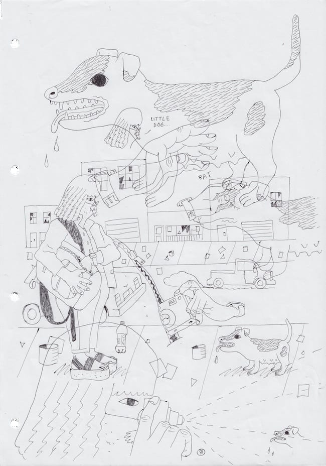
So I really like that comic Swinespritzen a lot, which reminds me of Philip Guston a lot and Ben Jones also, so I'm sort of interested in new influences, but there's also that quote someone said about Guston, "a mandarin pretending to be a stumblebum," as he made the transition from abstract expressionism to the more cartoony figures, and I was wondering if, when you draw in more straight-forward or cartoony, or dumbed-down style, especially since Swinespritzen is about art and trying to draw, do you find it preferable, or do you find it "cheating," like it's using a shortcut, or is it faster, in any way?
No it's not really any of these things to me. I definitely don't qualify it in relationship to something I'll do like an underdrawing for. I don't qualify it as faster or dumber. I'm not intentionally trying to do something "stupid" when I make it. The way that particular comic looks is more of a result of how I draw it and where I chose to draw it. It's more of a result of circumstances than it is a decision to be or think in a certain way. That comic was drawn on loose-leaf tear-out pages from a drug store notebook that was quite thin with a thin ball-point pen. That alone had an effect on the way it looked because I was restricted from being able to do certain things. It was less flexible. So I had to make deliberate movements that would accommodate that surface, which tended to be simplistic in profile. At times I would get in trouble with space organization and I'd have to overlap things. and I couldn't be too clever about making things clear I had to be more blunt. The result of that is a more naive appearance at times but I made no effort to diminish technical prowess or whatever it is the quality distinction we're making between that and something that looks more conventional or commercial or whatever.
What are your tools generally?
Well I have them here. It's pretty simplistic. I try to use simple paper as much as possible. Inexpensive materials, loose papers. I use this little ballpoint pen here, that's more thin than a normal ballpoint pen. This is the pen I did Swinespritzen in. Thin line pencils. Really simple. What I do and how it looks is a result of making my studio space as portable as possible. I'd like all of my supplies to fit into a relatively small backpack, if possible.
So Sunset People, you put up all the color separations online, is that about making the process transparent or is it just trying to highlight the amount of labor that goes into each element and trying to make each element on its own?
It's less of a "behind the scenes" feature type thing. The idea with the separations or me eliminating the linework is me coming to terms with the idea that might be a superior version of the comic book. There's a lot of weight of qualifications of levels of finish, especially in comic books, where the art of inking is considered a finalization of the process. Color and line is code for completeness, or something like that. A lot of times when I'll do commercial illustration or making something that's tight I'll blow out the linework and will find what's underneath to be far superior, more expressive without contours holding them in. So juxtaposing those three things is me coming to terms with what's actually qualitatively better here. There's three versions of it, I'm not sure which one works better for an audience reader, but I question myself if the finished version isn't the worst one of the three.
Do you feel similarly about the distinction between print and internet displays? Or do you have a preference for one over the other?
Not an ideological one. I'm completely uninterested in the debate of whether print or digital is better. I don't even know what to call that debate, but you know what I mean, between the fear of digital and the fetishization of print, either-or.
You did that comic, for Frank Santoro's class, "Calgary: Death Milks A Cow" and everything was done, I guess on index cards, or index card size, and then Studygroup presents it as a scroll, where you see each panel individually, but I imagine that if that were in print comic, if you made a PDF of it, where it would be as a book display, just as a reading experience.
Yeah, it would different in print than it would on the web. And that particular version that's on Studygroup isn't the ideal web version of it. The reason it's single panels is the amount of width allotted to a particular Studygroup comic, Whereas I would probably design it differently if I was allowed an entire page width. Originally that comic was not designed for the web. And yeah, there is a problem there. Making something that will fit on the web it's really hard to suppress the inclination to make something that will also work in print, which truly limits what's possible. If I was making something for the internet I wouldn't be concerned with pages at all. I would probably disregard that and probably have more of the effect of a continuous scroll. A continuous image with immense spaces in between them, something you couldn't do in print. It's hard to commit so much time and energy to that though. It's zero lucrative. Except for its own sake, and I would like to find the time to do things like that.
So Sunset People has that gradient shifting on the page. Blackhold has like a zip-a-tone gradient, increasing the size of the dots, and there's also this thing online, A Dumb Ration, which I don't really know what it is, but also seems to be about gradient. What's the deal with A Dumb Ration, and are you fascinated with gradients just in general as their own sort of beauty?
I guess I don't have an opinion of it as a good or bad thing. It's practical sometimes because it represents a space of transition in the way it does in the color of the sky or a fog I guess. it's a tangible empty space. It's something that's more practical on the web than in print I think, because it can potentially go on forever.
What's the concept behind A Dumb Ration?
What that is is a photograph of shadows cast on the ground in a particular corridor. Those all happened to be in Beijing. So it's like a photograph of a long strip of white paper placed on the ground to capture shadows on that particular location. So those gradients are caused by trees, architecture and clouds in the sky on that day, which is why the coordinates and date are included. It's sort of a photograph of the way the light is oriented in that time and place, as a cheap drawing of its surroundings.
And that was done with institutional support, you got a grant for it?
I was in Beijing for a residency, and that was one of the things I did for it. And the reason it's a scroll is because what led to that residency was a general research of scrolls from China that predates western influence. They have forms of perspective and space orientation that are alternative to western ones. Part of it was justifying the scroll research and coming up with something that was a scroll and functioned on the internet. While there I had done some drawn scrolls, like continuous images and I still have them but I'm not sure they're the greatest thing. Something about doing a scroll photograph just seemed right at the time.
There's also a mention on your website of a feature film, Zoe Koke's "Sky Parts," you hoped to edit if it reached its Kickstarter goal. Have you done much film editing?
I did, when I was in junior high and high school. I had a stolen copy of Adobe Premier, and was taking clips from movies and cartoons and editing them together to make new sequences. It's hard to imagine now how I would do that at the time. I don't know how I would have found clips of cartoons on the internet. It was clips of Dragon Ball Z and some action movies and stuff, things I'd never really seen before, I would montage together. But that's the only experience I have. But beyond that, when I was asked to edit this movie, which I haven't started yet, or I'm waiting to start that, at the time I had just finished reading this large book about editing that was a conversation between Walter Murch and Michael Ondaatje. Walter Murch is a film editor who did Apocalypse Now and The Conversation, Coppola movies; and Michael Ondaatje, that Canadian author. It was one of those big Hitchcock-Truffaut type books about editing. I had read it just coincidentally just before Zoe asked me. I was reading it for the commentary on juxtaposition of images which is obviously really relevant to what I was doing already. I think if conventional comics are an easy transition into another medium, like film, editing is an obvious fit, as opposed to actually directing a film. It's an efficient transition, that way of thinking is really translatable. They shot the movie and I'm waiting to see what happens. I'm not experienced but I'm pretty confident I'll be able to complete it at least and put something interesting together I hope.
So around the time you did that Batman Forever comic I mentioned earlier, you also did a comic that's an interview with a cam girl, and also in Treasure Island there's a sequence of people watching Independence Day, which feels like this conceptual gesture, of trying to capture the consumption of media. Do you view it that way, or is the cam girl thing more an experiment in figure drawing, and what's in Treasure Island is a separate experiment, or is there a conceptual interest in these forms?
Yeah, I guess you could call it a conceptual interest. I've never thought of it so directly as that. it seems pretty natural to focus on these things. I guess I'm not trying to think of our viewing of culture as a separate type of experience than, for example, two people fighting or arguing. It's a portrayal, the act of watching Independence Day and viewing it is as authentic an interaction as a story about divorce, in terms of a portrayal of life. It might not be a particularly interesting one, or dramatic but it is equally authentic. Those things are legitimate experience, and I think when I'm using real material like that, like the Batman Forever soundtrack commercial, or Independence Day, it's because often I'll see something like that and want to create something that has a similar effect, and usually I'll come to the decision that just using that actual thing would be better.
What is the effect you see a commercial for the Batman Forever soundtrack as having?
Well, I think my relationship with it is particular, but not unique, maybe, where it's this sort of hyper-fraction of this pop culture symbol that you're expected to be heavily invested in, if at all. Suppose you're interested in Batman, you're expected to be interested in all things Batman, or that's what you're trained to do, as a consumer. So it's only natural that you'd be interested in a movie about Batman. And to that extent, it's only natural that you'd be interested in a VHS of Batman, and then you'd be interested in a soundtrack for Batman that's advertised on the VHS. And then, from that, you'd be interested in a minicomic about the advertisement on the VHS of the movie about Batman. That's sort of what it's showing I think, in that particular example. That's an authentic experience of my own surroundings but I think other people have it too. Or that relationship, at least.
So right after that scene in Treasure Island, there's something that I'd hesitate to call a running theme, but looking through your work I realized there's a lot of open address of the fact that we're all going to die. That reoccurs in @marcofthebest and also Explanation For Sator Stuff. Is that something you think you think about more than other people, or is it something you think just needs to be in narratives more?
This is tricky to answer because it's not something I've thought of until you asked it just now. What you just said is not something I've noticed about my own work. I don't know, I like to treat death casually. Or it's important not to dismiss it as something that's not actually going to happen which seems like our usual attitude to it. I'm for a casual relationship towards the idea of not being alive as opposed to a dismissive one. It's not something I dwell on, I'm not trying to force it on the work but if you're saying it's in there it's part of my desire to have a casual attitude towards it and maybe put everything else that's being portrayed in the context of that reality. People making decisions in the context of them being dead one day sheds some light on their decisions. It's the ultimate broad context.

Yeah. Explanation For Sator Stuff is also a psychedelic or "drug" comic, I don't know if you view it that way, of if you just view it as a science fiction comic, or there's also the image of a hand holding this orb that doesn't cast a shadow, which seems like it stems from drawing or an interest in optics. I guess I'm interested in where that comic comes from, or when you approach a narrative what are the things you're thinking about?
Well, that story and a lot of other stories it's hard to avoid narratives that have, for example, some optical concept, or talking about the way the light slips, or how we look at things, which is a lot of the material I was consuming. I don't read a lot of fiction.Those are my attempts to relate what I'm reading and thinking about to the work. And I think it's hard to do that while also making interesting narratives. With that particular example, it's hard to say what I was absorbing at that time in particular. There was like the concept of drugs and thoughts of how they effect you mentally, but also this conceptualization of understandable physics or something like that. I think I was reading a lot of Stanislaw Lem at the time. His relationship with science fiction is almost from more a engineering and physical angle, which seems more like the interesting side of science fiction I think.
You said you don't read a lot of fiction. What sort of things do you read? Or if there are comics you look at, do you view that as reading, or as part of a further exploration of the idea of looking at things, where you don't count them as fiction?
No I view comics as reading or consuming I guess. I don't read a lot of comic books. Or maybe not as many as might be expected of a cartoonist. I think it's related to how I don't read a lot of fiction, maybe. I'm not takings things in too much in terms of narrative, like what I read and consume. I try to read with a purpose, which is hard to do, and that tends to lead me more towards history or a practical philosophy of how we live or how images are made or anything like that on the subject. Pretty broad concepts that it's hard to relate into a narrative. I think the process of making a comic book is kind of finding a narrative acts as an armature to relate those things. I don't think that's the ideal way to communicate them, or investigate, but that's the way I happen to be most experienced in.
Is there a direction you see yourself going with your comics or something you want to explore overall or is it just moment to moment, project to project?
It's hard to define the goal. I admire a lot of people for the things they can do that I can't. I also don't know if I'm the appropriate person to do those things. I really admire people who can create this really relevant hybrid of nonfiction, historically accurate research, and a bit of autobio, like Sophie Yanow's War of Streets and Houses. There's certain elements I'm not really equipped to deal with but I aspire to. But I don't think that necessarily means that's my goal.
What do you view your skill set as being at this moment?
My idea of what I can do is to push my own limits and hopefully my reader's limits of what's readable, push the visual tension to a height that is at the upper limit of what's acceptable as a reading experience. I don't think I'm doing those things in any of the works you're mentioning but that's what I'm hoping to do these days, and to come up with really practical processes that make it more engaging to read. I mean, my worst fear is wasting a reader's time.
Is there work I haven't mentioned that's out there, or is it just stuff you're working on now that no one has seen?
Yeah, it's work I'm doing now that's been sort of a struggle to wrap my head around that I want to be both readable and unlike what I've done before. Really basically what I want is to be more engaged with my surroundings and be more a part of it in a broader universe than specifically comic books as a medium. They're a medium, but I I don't think they necessarily should be their own subject. Do you know what I mean? I don't want to go too far down the hole of my own work being the subject of the work itself. I would like to broaden its application.
What did you mean by "visual tension"? What are works you consider having a high degree of it? They don't necessarily have to be comics.
Hearing that phrase quoted back makes me feel dumb for saying it, so I take it back. Tension sounds negative. I guess where like... the work shows a confidence in the reader to navigate complex information, but is also inviting. Like it's an overlapping collage of pictures but there is trust that everyone knows how to use their eyes, so chill out. Not so reliant on comic symbolism and technical convention that supposedly makes things more readable. A natural readability rather than a learned one, the same way dense foliage is naturally readable. Some examples: Those hot sex Blaise Larmee comics. This wonderful comic by Gloria Rivera that I saw on tumblr recently. Lale Westvind. Ryan Iverson. Jean Giraud. A lot of people draw just as "good" as Giraud, but he hits that elusive spot which has no name. That sweet spot is what I've been trying to pay attention to when I draw lately. I'm trying to become sensitive to it and know when to unceremoniously eliminate drawings that don't meet it. It' a spot where, anything more or less drawn is vapid... I'm trying to focus and even narrow my perception of what isn't vapid in my own drawings. Basically, seeing how far I can take it to the edge of that. I don't think it's the ideal way, or that a drawing has to be understood, it's just what I'm thinking about at this time.
That seems like a good place to end an interview unless there's things about yourself or your work that you feel should be understood in terms of what's important in anyone's evaluation of you as an artist.
Well, I guess I don't proudly welcome an evaluation as an established, practicing artist. I feel like I'm very much a part of a learning or training process still. I'm still naive and in the process of being educated. I'm not really interested in imposing myself in the world or in the field too much until I have more of a grasp of what I'm doing I guess. I'm just trying to make decisions that allow me the time to deal with those things rather than practical career moves, maybe. I don't want to suggest myself as making a body of work that needs to be paid attention to. It still seems very process-oriented.


