Here's a story about people's attitudes towards art: while exiled in Mexico, Leon Trotsky spent time with the painter Frida Kahlo, the muralist Diego Rivera, and the founder of surrealism André Breton. This group enjoyed a close intellectual relationship, co-authoring a manifesto for the short lived International Federation of Independent Revolutionary Art.
One key difference emerged between the practicing artists and the political revolutionary. When Breton and Rivera discussed the importance of cave paintings, Trotsky was appalled. "I can still see the reproachful look [Trotsky] gave Rivera when the latter maintained (which was hardly extravagant) that drawing had been in decline since the cave period," Breton later recalled.
A non-artist/theorist bristling at modernist stirrings of reverence for primitive art might not be surprising, much less noteworthy. But in Trotsky's case it illuminates larger issues of what people allow to be acceptable art. Trotsky was not indifferent to creativity. On the contrary, he saw the artist as "the natural ally" of his concerns, and wrote about art constantly (the Independent Revolutionary Art manifesto represents a fraction of his words on the subject). He saw modern art, especially the surrealism that Breton represented, as a positive sign: "Modernism in painting, which was accused by representatives of the old academic piety of malicious farfetchedness and false mannerism was, in fact, a life-giving protest against the old style which had outlived itself and turned into a pose."
But the very modern idea (in 1938) that cave paintings, free of ulterior motives involving career, status, or academic hierarchy, represent a true expression of what lies within human hearts and minds, and, more crucially, that everything since then is corrupted and self-conscious--this is too much to accept. Never mind that this idea forms the basis for most of surrealist thought. Trotsky could accept the idea of surrealism as a rebuke of established art pieties, but to actually maintain the belief that human’s earliest markings are superior to the standard of Renaissance art (a period that Breton noted was close to Trotsky's heart) was impossible to stomach without shooting a 'reproachful look' at whoever had maintained something so idiotic. With Trotsky we have a person who, rightly or wrongly, could think far outside of what most could imagine as acceptable boundaries for organizing human life. An attempt was made to extend that far reaching vision to art, but Trotsky’s face betrayed an inescapable philistinism.
Within the radicalized group of people who view cartooning as a worthy art form (a smaller and lower stakes transgressive sect than that of historical materialism, but probably equally ludicrous), a similar contradiction emerges, this time sharper than a befuddled facial expression. Cartooning, to our diehards and fellow travelers, is an art form, in spite of a world that thinks and acts otherwise. But a disdainful thesis hovers above the poetics of even the most expansive theorists: this medium can only withstand so much.

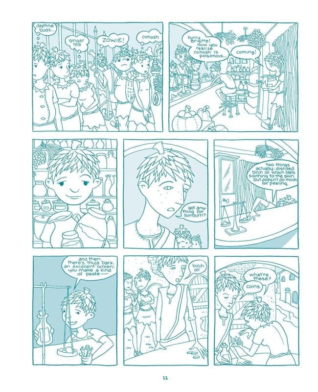
I consider Megan Kelso one of the most significant cartoonists of the last two decades. I recorded an interview with her recently, focusing in particular on her 2010 graphic novel Artichoke Tales. We discussed a storytelling tactic Kelso used in the book:
ENGLISH: There was a choice [in Artichoke Tales] to make the characters less distinct. It fits in with a lot of your statements about work where you'd rather confuse than over-explain. Your body of work, on any given page, asks for some minimal piecing together. But once that piecing together is done, the emotions and storytelling are amplified. But I do imagine that some readers were frustrated by that choice in Artichoke Tales. Since it's a specific choice in that book, I wanted to know your thinking behind it rather than rely on my assumptions as to why you did that.
KELSO: To be perfectly honest, it wasn't very well thought out. The Artichoke people started out as a doodle that I just got a ton of pleasure out of drawing. Then I did the short story with them and I just sort of knew. There was a larger world there and I loved being in that world. That was the motivation for the book. I feel like, in some ways, it sort of speaks to my ignorance about how comics work. Not having read a lot of comics or having even thought very deeply about them, I kind of just threw myself into figuring them out by making them instead of studying them. It sounds so obvious, but I don't think it really occurred to me how crucial different hairdos on different characters are to the making of comics.
Do you truly think that's it's crucial? My view is that it's not crucial. Comics people think that it's crucial. I was wondering maybe, if on some level, you reject that.
If you take away hairstyles as the thing that differentiates the characters, you’re sort of like making comics with one hand tied behind your back, you know? It's a really powerful way to differentiate characters. It's part of the whole comics tradition. People expect it. If you take that away, it becomes a sort of horrible exercise almost. Then how do you differentiate characters? I tried... [Laughs] I really tried. But I think it was sort of like a stubbornness in me. I realized the problem, but I was so invested in this world where everyone had artichoke heads. I loved the way they and the world looked. The homogeneity. I just really loved it. I didn't want to drop it. So, my approach was like, "OK. The characters in the North are different." They are like angular, and skinny, and have freckles. In the South, they have rounder bodies and dark eyes. I personally felt like that was fairly obvious. [Laughs] I got a lot, a lot of criticism for that book. A lot of people just threw up their hands and said, "Fuck it. I don't get it." You know? "I can't tell the characters apart." I definitely lost a lot of people who had no patience for it. I don't know. I experimented with doing it in color to create some differentiation. But I just really loved the airiness of the uncolored art and the homogeneity, going back to that word, and the way it made that world look.
I know it was kind of stubborn and obtuse of me to stick with that, but I wanted it that way. I guess one thing is, early on I didn't quite see the problem and then when I realized it was sort of a problem, I just decided that I would see if I could solve it in another way. I feel like people who read it carefully could see the differences in the characters, and the family tree was supposed to help. But it didn't work too well with the casual reader.
It's a confusing thing that people have a problem with in comics to me. I could see if you were watching a film and there was a similarity in visual appearance to certain actors. The film is going by. But comics seem to have that problem solved.
Right.
You can spend time with it. That's something I've always felt. But despite comics having so much potential to not be bogged down with problems like that, comics are very rigid in their conventions. People who read comics are very insistent on these conventions.
People seem to expect to be able to read comics quickly. Unfortunately, this is at odds with the kind of comics I like to make. They will not always make perfect sense on the first read…or you won’t get everything on the first read.
With Artichoke Tales, all the tools for understanding the story are embedded within the work. Part of the joy of Kelso's art, especially in Artichoke Tales, is finding these tools. And these are not postmodern keys which require awareness of seemingly unrelated texts and variables, but far more achievable visual ones, found in the pages of the book: this character has a slightly longer nose, this character carries themselves this way. Rather than lull you into a world where a series of lines represents one character's face and a slightly different series of lines represents another's, Kelso's comics require attention from the reader from panel to panel. If this attention is given, the emotional resonance of what Kelso is up to becomes amplified. This way of interacting with or making comics, to paraphrase our earlier comment by Breton, is hardly extravagant. In fact, I always wonder why this mode of cartooning is not the standard, as comics uniquely offer tools for the reader to explore any kind of puzzle (intentional or incidental) that the author's full expression requires. All that is asked of the reader is patience, a quality comics culture has unwisely discarded (in this country at least; the cult of Taniguchi says otherwise).

It's exhausting to assert that William Blake's Jerusalem is a brilliant comic, even though such a statement is necessary and true. 'Why is this work not in the comics canon!' is a battle that feels laborious to even consider, mainly because the merits of such a work are so strong and the world cartooning has created around itself is so foreign to Jerusalem’s properties. The gap between the two feels like a hopelessly tattered and beyond repair bridge. Why bother? Energy is, pragmatically, better spent elsewhere. Still, one wonders why we don't see more comics work in the tradition of Blake, and instead see quite a bit of cartooning that, more or less, resembles Ben Garrison:

It would be disingenuous to argue that outside approaches to traditional cartooning are discouraged in 2018. In fact, they are more welcome than at any other time in comics history, as artists of all disciplines and concerns make comics for engaged readerships of all kinds. But when I think of how comics asserts itself outside of the underground, Garrison is closer to the norm than may be comfortable to admit.

The Nib, The Believer, The New Yorker, and most mainstream publishers that work with comics, while often publishing beautiful and innovative work, do not deviate from the same rule that their spiritual arch-nemesis Garrison holds dear: clarity. Some artists make transcendent work for these publications, mastering and making wide leaps within the realm of clear communication, the brilliant work of Liana Finck serving as a noteworthy example. And Garrison himself, while espousing ideas that most readers of this site find counter to their core values, makes thrilling work, precisely because it elicits such strong rejection.
Garrison leaves nothing to doubt: you know what he thinks and what he wants you to feel. His success with commanding the tools of cartooning within its chosen narrow path is undeniable, despite the repugnance of his ideas. His approach ultimately resides in a dangerous section of the same ballpark as Scott Bateman's work for The Nib, though Bateman sits in a dilapidated and tepid aisle. Ultimately, they're on the same team in terms of aesthetics: here's what I have to say, with no ambiguity afforded.
Tellingly, any deviation away from that barebones template of clarity seems to help, if art is what we are concerned with. Here we have a rather morally hard to defend image by Garrison and a typical cartoon by Matt Bors. We might agree with Bors's worldview far more than Garrison's, but the expression which Garrison adds to his meat and potatoes message (McCain, bad!) give it more to recommend as art. I can’t, with a straight face, say that about the Bors. I don’t know why Bors's cartoon is drawn, and not simply a text tweet. Here’s the same joke without the aid of a Cintiq: “Grim Reaper 1: uh oh, its McCain’s time to go! TV Announcer: John McCain is prepared to strip millions of healthcare, which will kill many. Grim Reaper 2: ah, he’s always been so good to us, let’s give him some time.” I don’t see much difference! You cannot say the same about Garrison, as the drawing adds power to the "message." Through his lines, you feel that Garrison really hates McCain. While the idea of McCain crashing the plane he flew in Vietnam into his own grave is in extreme bad taste, it is a visual idea; I can find none in Bors. Both artists, in the end, want the same thing: to be understood clearly, with Garrison succeeding slightly more as an artist by simplifying less. Bors's approach seems to speak directly to the problem of cartooning that relegates itself to hyper clarity: there isn’t much room to be moved when everything is perfectly understood, ensuring cartooning to a fate as a highly consumable and forgettable medium.
Blake, on the other hand, had a desire for you to understand him, but since his interests were expansive, he could not caricature his project. Blake’s work, famously, touches on all things, so as not to elevate one aspect of life over any other. There is sex in Blake, but he cannot be defined simply as an early social progressive, because there is also everything else.
But if Blake wanted to communicate "everything else," why is his expression in every way the opposite of Bors or Bateman, pure communicators? Bateman expresses ABC and the reader understands ABC. Blake expresses AёÑ漢字 and the audience has an equally personal but not identical reaction. Interaction, instead of mere communication, as is true of all worthwhile art. At some point, if we care enough, we could get closer to understanding Blake's AёÑ漢字 intention by using the logic the work itself expresses. The process of getting to that point, the complicated interaction with the work, seems worthwhile in and of itself, an artistic project of its own. Bors’s and Bateman’s work, on the other hand, "solves" itself instantly and explicitly. Cartooning, it seems, falls in line with the explicit in its official version of itself.

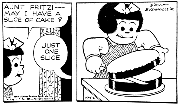
A masterpiece like "Three Trees of India", an illuminated 16th-century manuscript (sometimes on view at the Met), feels like a grand lost artifact of sequential art that, again, fits uneasily with contemporary comics' self-conception as vessels of clarity. The peaks and valleys of emotion that this work suggests has been traded for a photocopy of Ernie Bushmiller's Nancy, which in theory sounds fine, as Bushmiller's simplicity rivals the complexity of Blake. Yet few (if any) cartoonists are Bushmiller.

In fact, most cartoonists are more Matt Lubchansky than Bushmiller.

Deep clarity is, perhaps, not for everyone and is on dubious ground as an ideal of cartooning. Clarity, in the hand of its modern practioneers, becomes oddly garbled.

The last panel of the above sequence by Golden Age cartoonist Mort Meskin is exhilarating. We see Carter shot at, the crux of the story's drama. And yet, we have to read the panel a few times to register this. The shot doesn't exactly align, Carter's defense is awkward, the shooter's pose highly abnormal. The message ("Carter is shot at") is competently delivered, but so much more is drawn out in our reactions, both mentally and emotionally. A way of standing, vulnerability, Meskin's personality itself: it's all there in that moment, an overwhelming thing to behold. This panel defies clarity, instead embracing vagueness, and yet it's still cartooning, a world of drawn information. From this period, collective memory's lesson about comic art is, of course, Kirby dynamism, not "Meskin inversion." But Meskin brings us closer to a medium capable of living and breathing, and (more tantalizingly) a possibility beyond all that.
Would Meskin be able to draw this image, a Stalin-era appropriation of Lenin as a Santa Claus figure? I don’t think he’d be able to sell it, to himself or others. His more human concerns would get in the way, making it impossible to simplify a weighted concept so as to involve it in the opposite of its true purpose. The lie of this image is powerful and pleasurable, so much so that we might read it as a "comic." The regime that endorsed this image is the same that would assassinate Trotsky not long after the same moment he shot his glance at Rivera. If Trotsky could not accept the complicated argument of the primitive nature of early human expression containing more human feeling than refined court painting (painting that is pleasing enough to us all that our reaction to it is simplified), he respectfully limited his lowbrow leanings to a glance. Those that would destroy him breathed it through and through. Lenin as Santa Claus is the logical end game of Garrison or The Nib, repurposing thought into cheap simplification.

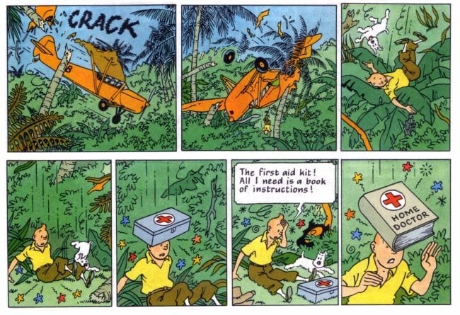
Of course, there is this: Tintin drops out of a plane, only to be cushioned by a gigantic plant. He falls onto the ground with Snowy. A first aid kit hits him in the head. Unfazed, he wonders where the guide for the kit is. Immediately, it hits him on the head. All of this is drawn with beauty and is an actual tangible pleasure to behold, everything this dry summary is not (here we have the counter to Bors). With all its aesthetic power, it becomes clearer than that summary. If cartooning is to strive for simplicy, its standard might as well be Sur-clarity, as Tintin clearly is. By misunderstanding and underestimating the intensity of Hergé and Bushmiller’s lessons, cartooning instead finds itself over explaining its own simplicity at the expense of all else. People who enjoy thinking might, understandably, be confused.


