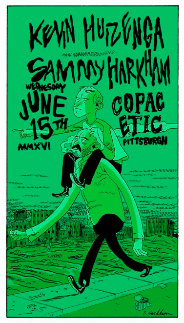
Retrofit Comics began as a Kickstarter experiment in 2011. By then, comics tended to be printed as minis or graphic novels, leaving Box Brown missing the heyday of the alt-comics comic book. In 2013, he joined forces with the DC-area comics store, Big Planet Comics, which took on a lot of the costs and production work, allowing Brown (and BPC's Jared Smith) to concentrate on other duties as publisher and tastemaker. This was one of the early examples of a store deciding to publish its own comics.
Overall, the results have been of a fairly high quality, and quite varied in genre and approach. Brown has fairly catholic tastes, ranging from esoteric comics-as-poetry to slice-of-life to big, dumb genre tales. (I imagine Smith has also had some influence on what's been chosen.) Brown has made it a point to publish work by up-and-coming talents from the world of self-publishing. He's also published work by veterans like James Kochalka, Steven "Ribs" Weissman, and Matt Madden. He's reprinted minis from notable young artists like Georgia Webber. Artists from outside the US, like Olivier Schrauwen, Zejian Shen, and Antoine Cossé, have been some of the most notable contributors. Retrofit has also published some of the best work by Josh Bayer, whose work I recently reviewed on my own High-Low blog. Let's take a closer look at a sampling of works from 2013-2016.

Debbie's Inferno, by Anne Emond. This is a clever stunt concept, adapting Dante Alighieri's classic into a comic about a journey through the various circles of one's own mind. Emond's line is agreeably scratchy and lumpy, stopping just short of grotesque as it retains an element of cuteness in this exploration of some dark, ugly places. Instead of Virgil, Emond's guide is her cat. The central idea of the comic is that standing still emotionally and simply allowing oneself to wallow and drift will only lead to drowning in one's own self-obsessive thoughts. To get back home, action is required in the form of a hero's journey through the lands of self-knowledge. Much as Dante encountered different kinds of sinners in different levels of hell, so too does the main character encounter different kinds of emotional dysfunction. There are the people who drown in indecision and self-paralysis and become fish, there's a land of people with icy hearts, and a "desert for burnt out passion," where pleasure is pursued without any thought as to its consequences but eventually leads to the cave of self-loathing. The jungle of jealousy (where everyone cranes their necks in order to look at everyone else, making them like snakes) is followed by the land of crowds, the plain of broken hearts and the mountains of no atmosphere, inhabited by people solely dedicated to their art and nothing else. The journey here is one of simply understanding and acknowledging one's own mind rather than a progressive journey from a higher state to lower state. Emond says that becoming trapped in your own mind at the expense of living it leads to paralysis, and she does it in a funny, colloquial manner.

Dumb #1 + 2, by Georgia Webber. Retrofit reprinted the first two issues of Webber's originally self-published series, which tells how she coped with an injury to her vocal cords that left her unable to speak. It's a subject tailor-made for comics, which must make up for a lack of sound in getting across its narratives. Indeed, as Webber's life transformed into a series of complex puzzles that she had to solve simply to survive, so too is Dumb a series of puzzles to solve on the comics page. Using a variety of clever formal tricks and a forceful application of the color orange, Webber is able to describe her experience without devolving into maudlin cliches. Certainly, while there are moments of despair, they are expressed using the language of comics, and its familiar iconography proves incredibly powerful in how it allows her to portray her experience while always focusing on the solution. The second issue features an intense twin narrative, as Webber fights a split version of herself on the top half of the pages while on the bottom, we see her navigating bureaucracy and the actual day-to-day details of living her new life. In tandem, the violence of the top half is her way of giving vent to the frustration of the bottom half, as she seeks to find ways to express her voice, both artistically and in real life.

Ink For Beginners, by Kate Leth. This is an informational comic offering guidance to those who are considering getting a tattoo. Leth is a popular webcomics presence and this comic reveals just how far afield Brown and Smith will go in terms of diversity of subject and format. Leth's appeal as an artist is a constant, ebullient sense of enthusiasm for the things that she likes and the clear & straightforward manner in which she expresses it. Her line and character design is stylized and highly rounded, maximizing the cuteness in every panel. Leth thinks tattoos are awesome and wants you to think so too, but also wants the reader to have a safe, smart experience, armed with as much knowledge as possible. It's a public service announcement in the form of a comic, using cuteness as both a blunt and a fine instrument in getting its message across. Considering that James Kochalka was an artist Brown published early on in Retrofit's history, it's not surprising to see Brown select other artists who employ cuteness as the essence of their aesthetic.
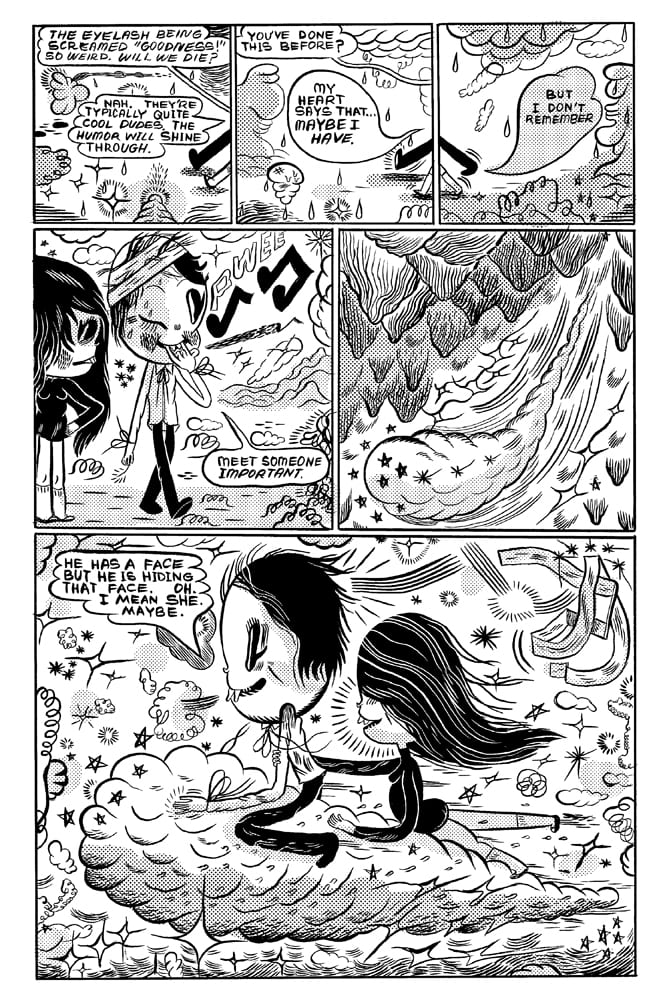
Eyelash Out, by Ben Sea. This is a comic by an Australian cartoonist which is impossible to read without seeing the influence of Michael DeForge on nearly every page. DeForge is probably the single most imitated young cartoonist today (even Brown has used some of his tricks and techniques in a few of his comics), but the shape of the characters' heads and arms, the body horror concepts, the melting lines, the confluence of grotesque and cute, and even the spot use of zip-a-tone screams "DeForge!" so loudly that I could barely "hear" the rest of the comic. The actual writing tends more toward skewed fantasy—it's a sort of romantic quest that goes horribly awry—than the sort of horror favored by DeForge.

Piggy, by Niv Bavarsky. The blocky, stiff, strange images of Bavarsky are reminiscent of Skip Williamson in places, especially in the way Bavarsky uses blacks. There's a love scene in which a couple literally go eyeball-to-eyeball and almost seem to merge, which segues bizarrely into a hunt for an especially vicious pig. The sheer density of Bavarsky's line imbues his powerful images with a sense of dread even when the topics he tackles (like pushing a volcano into a boulder in order to prevent it from erupting) are absurd. He reminds me a little of Matthew Thurber in that regard, especially as I found myself staring at his images as much as I was actually reading them. Packaging this mini to contain both stories and drawings lent itself to this treatment, showing off Bavarsky's chops both in terms of illustration and cartooning. This is an an artist I found myself wanting to see more of right away.

Drawn Onward, by Matt Madden. This is a reprint of an outstanding story first published in One Story magazine and then later self-published as a mini by Madden. Madden is now perhaps best known as a comics educator, but he's also been a practitioner of comics formalism for quite some time. Sometimes those experiments, based on a variety of constraints, produce gimmicky results, but are also often quite striking, and this is one of the latter. This is a mirror comic, told in retrospect from the point of view of a woman who encounters a man on the subway. The strange thing is that when she first meets him, he acts as though he knows her and is desperate to see her. The first half of the comic finds her initially alarmed by the attentions of this strange man, who confuses and alarms her by asking why she's avoiding him. At the same time, she starts to become fascinated by the idea of him, until they meet on a train platform and kiss. Then, in a virtuoso display of storytelling, Madden mirrors the narrative, reversing it while still moving time forward. This time around, the woman comes to meet the man the next day, excited to see him--only he's standoffish. Mirroring each panel from the first time around, Madden changes the story simply by flipping the characters around, subtly altering dialog here and there. Even the last page mirrors the first, as the woman (a cartoonist) has drawn the story in an effort to figure things out but is despondent at her drawing table. Madden also echoes the different line weights he chose for different parts of the story. On some pages, he uses a delicate clear line style. On others, he uses his more typical, brushy and black-heavy style. There are witty storytelling clues along the way: streets named Rorschach Avenue and Nogegon Street, and the woman's reading matter: a book called Le Debut De La Fin (The Beginning of the End). The second half details her mounting despair as she faces precisely the same dilemma as the man did in the first half of the book, only it's from her point of view. The title itself is a palindrome that refers both to the act of the protagonist drawing the story and being drawn to this mystery man. It's a perfect meshing of Madden's storytelling pyrotechnics and a genuinely affecting, emotional story.

Bear, Bird and Stag Were Arguing In The Forest, by Madeleine Flores. This is a collection of short stories that reexamine fairy tales in interesting ways, not unlike the sort of thing that Eleanor Davis and Colleen Frakes do so well. The title story involves the three animals debating which of them should be king, and turning to the Forest Witch for wisdom. After a series of contests to come up with royal vestments, the witch naturally pulls a double-cross and claims the crown for herself, silencing each of the animals for eternity while doing so. Flores uses a cute and cartoony style for this story along with a lot of zip-a-tone for depth. "Weave" is a straightforward fable about a spirit helping a mother in need in a forest, drawn in an open format style with one or two panels per page. The drawing here is much more spare and intimate, befitting the far more serious subject matter. Flores switches up yet again, using a thick line and cursive script in the next story about the relationship between the soul and body. "Wander" explores dreams using white on black images, with negative space being key. The collection shows off Flores' skills as a cartoonist in each story, as she never repeats the same formal techniques or approaches twice and makes each new one effective. There were times where I thought the techniques were more of a focus than the actual narratives, as every story but "Weave" was instantly forgettable if attractive. Still, it's obvious that Flores is a skilled artist who's rummaging through her toolbox to see what styles fit her best.

Harold, by Antoine Cossé. In Cossé's comics universe, a loose connective tissue unifies his earlier books, Kiddo and J.1137, with this Retrofit offering. There's a nightmarish quality to them, to be sure, as though the end of the world has already happened but things still linger on somehow. Perhaps it's not the end of the world so much as it is the end of the old order, with vestigial remains to be found here and there, and with a new order that isn't necessarily any better. The characters in his books used to be Somebodies but now desperately want to keep a low profile, despite the omnipresence of an almost rapacious press and paparazzi. They happen to have vicious, anthropomorphic forms. Cossé is entirely uninterested in establishing a protagonist, much less giving the reader a likable character to identify with. In this comic, a man in a limo wonders why the press happen to be there. They are looking for the princess who once lived up in a tower that resembled a tree, and whose sheer resistance to the reality of her world crumbling around her makes her a prototypical Cossé character. The book's long shots of dogs running is emblematic of the truth of this world: limousines coexist with packs of wild dogs (indeed, packs of predators of all varieties) looking for prey. The reader is given fragments of narrative, but they're mostly rejected by the listener within the book, who'd rather linger on his own little world. Self-obsessiveness as a form of slow self-destruction is a running theme in Cossé's comics, and it works to fracture reader expectations in a story like this.
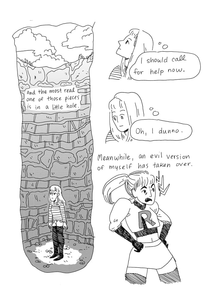
Sea Urchin, by Laura Knetzger. This is a harrowing and intensely honest look at the artist's own mental illness and the way it affects her ability to function, love, and create. Most of the comics I'd seen by Knetzger have been well-drawn and cute, but didn't offer much beyond that. In this comic, Knetzger attempts to depict her darkest thoughts and feelings on the page in a way that's clear and easy to parse. Essentially, Knetzger explores an old and familiar problem: the feeling that we are alone, that we are frauds, and that we are disconnected from the rest of the world. She also explores the idea that when she's in a depressive state that she feels like two different people: the "good" self stuck in a hole and her evil twin wreaking havoc on the world (and in her case, dressed as Jessie from Pokemon's Team Rocket). There are moments of hope and moments of connection as empathy allows her to understand that everyone else has their own struggles, and that by attempting to reach out and connect, she is able to fight the paralysis she faces every day. Knetzger's loopy line is put to fantastic use throughout the comic, subverting cuteness on every page. There's one memorable page after she muses about her own existence and how other people love to fill in gaps where she washes her face in front of a mirror, wiping away the naturalistic drawing of her face and replacing it with two dots and a curvy line for a smile. There's not so much a narrative here as there is a stream of consciousness that floats from idea to idea. She doesn't attempt to tie a bow on her daily struggle or minimize it, only acknowledge that the fight is worth it. This is an example of how Retrofit lets each artist choose her own format is so important, because this comic needed to be big in order to let the art breathe.
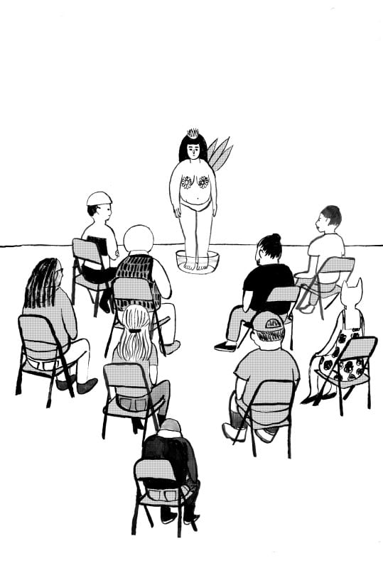
Ikebana, by Yumi Sakugawa. This comic starts out as though it is going to be yet another lampoon of art school (and to be sure, that sort of humor is present here), but it goes to far more dark and affecting places. Sakugawa's drawing choices are absolutely impeccable; she pares down detail in most panels but offers up thick lines for her character designs. The sense of design is eccentric without being self-conscious, and she never once winks at the audience. In the context of the rest of the comic, it makes sense that the teacher has a blank face, glasses, and a single leaf on his head. The initial premise of the strip seems to be an art student creating a bullshit non-project in place of the actual work she is supposed to be doing. Standing in a bowl of water, she means to embody ikebana--the Japanese art of floral arrangement "on a physical, emotional and spiritual level. And thus expressing the ephemeral nature of identity, academia, womanhood and life itself." At a certain point, the student wordlessly walks out of the class, which follows her, uncertain if this is part of the performance. Sakugawa cleverly plants all sorts of clues that this is both a performance and a cry for help, and the final scenes are remarkably beautiful. Everything about this mini is pitch-perfect, especially the remarkable use of negative space.

An Entity Observes All Things, by Box Brown. This is a collection of sci-fi stories from Brown, drawn in a simple line that draws inspiration from the Chris Ware/Ivan Brunetti style of reducing people to basic geometric figures and featuring the flattening found on a Michael DeForge page. The bright and distinct use of spot color throughout the book gives a strong emotional resonance to each story, especially since Brown's actual drawing tends to be neutral in that regard. While the stories are not directly linked in a narrative sense, there's an underlying theme regarding the ways in which technology affects our lives. "Memorexia" is about a machine that allows one to travel back to a memory in order to deal with trauma, and a subject who continually defies reality by trying to rewrite history. "Mundo Jelly" is about a researcher in a post-apocalyptic world finding a form of food that's incredibly delicious, so much so that it makes all other life activities seem pointless. The title story is about a solitary creature who is charged with watching existence on our world and becomes so frustrated that she finds a way to leave; however, her absence is immediately noted by the real intelligence on the planet. Some of the stories address a character's personal issues and obsessions with a sci-fi backdrop, like "Travel" and "Voyage Of The Golden Retriever"; these stories feel more gimmicky by comparison.
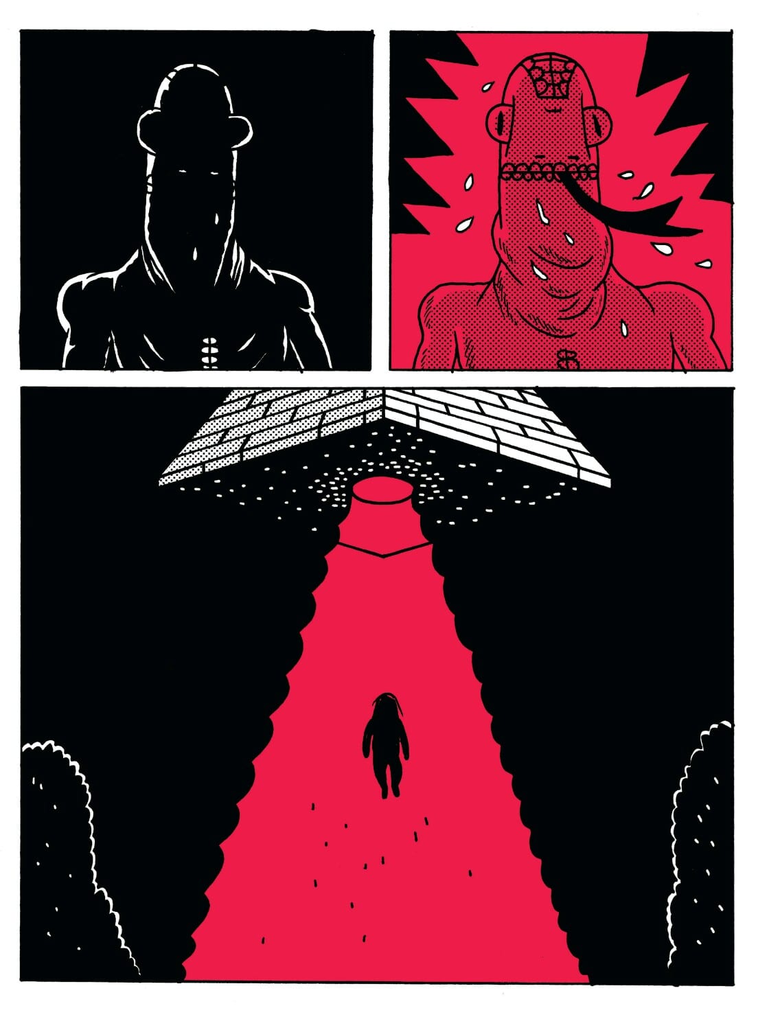
"New Physics" is perhaps the best story in the book, mixing social media, cult nonsense, and the instant connection promised by technology into a potentially deadly mix to create power for one woman and her ideas. The Ware influence is strong here in terms of design, but once again it's Brown's use of color (a deep red) that does much of the narrative's heavy lifting. "The System Corpus" similarly mixes the intimacy one can feel in a chat with a hilarious, over the top set of action sequences. The shortness of the story is what makes it work, as the gimmick doesn't overstay its welcome. Similarly, "Communion of the Star Warriors" is a sort of shaggy dog story about a worker whose job it is to help these giant robots "commune," but his own self-obsessive qualities blind him to the actual importance of his responsibility. Finally, "The Lizard" is about trauma and overcoming it through a sort of presentness brought on by a communion with an alien lizard. It's remarkably affecting and sad, as the happy ending the character experiences comes at a price. Overall, this is strong work from Brown, who's as comfortable with conceptual work as he is with slice-of-life stories.

The Experts, by Sophie Franz. This short comic about a group of researchers in an above-ocean station is one of the more chilling stories I've read. It begins in media res, as the researchers are starting to come to the end of their rope as one of them has been turned into a fish-man and one of them has had her finger bitten off by a humanoid, blank-faced, and seemingly playful creature that's part of a pack that lives in the ocean. By this point, they are eating food they don't recognize and the reader learns that they've completely forgotten why they're even out there. Working in a style that's a little Dan Clowes and a little Dash Shaw (but still very much her own), Franz creates an atmosphere of horror simply by introducing a mystery with no explanations and no solutions. By leaving out the beginning and not showing an explicit ending, Franz lets the reader fill in the gaps as she leaves in the real meat of the story. This storytelling restraint allows her to decompress the story even further, with many panels of quiet images that assist in creating atmosphere rather than explicitly further the narrative. In The Experts, the atmosphere is the narrative.

The Unmentionables, by Jack Teagle. Teagle's comics are long, crazy fight scenes that wink at the reader in terms of the initial set-up. Within the worlds he creates, everything follows a perfectly linear, logical series of steps and expectations. This one starts with a professional wrestling bout between Lizard Woman and Vulturella, and the mystery here is not why they have superhuman abilities or resemble their respective namesakes, but why the match goes on for so long. The "heel," Vulturella, is supposed to lose, but she is playing for real. Lizard Woman finally beats her, only to learn that the match's length is simply a ruse for Vulturella and other heels to rob a bank, setting up an even bigger fight scene that turns out to be an origin story. Teagle's line is simple, emphasizing form and action over everything else in much the same way Johnny Ryan does in Prison Pit. The silliness of the proceedings combined with Teagle's genuine enthusiasm for drawing fights makes the comic work as a bit of dumb fun.

Mutant Punks Fuck Off, by Kevin Panetta & Jared Morgan. This is a big, silly action comic that's most notable for the exaggerated, stylized art by Morgan. It's about a city where an evil corporation is poisoning the water by dumping toxic waste, and where gangs of punks try to survive in limited living spaces. Printed on cheap newsprint in black and white, everything about the presentation of this comic feels just about right. There's a concert scene at the beginning, and then a big fight with a rival punk gang that has decided to work for the evil corporation. It's the grotesque and funny detail that Morgan provides that makes this an enjoyable little comic, the first in a series.

Late Bloomer, by Maré Odomo. You have to hand it to Brown and Smith--they're willing to go all over the map in terms of style. At one extreme you have artists like Teagle and Morgan, with big, dumb fun. Then you have Odomo's use of comics-as-poetry that creates a sort of journal in smudges, scratch-outs and densely-hatched drawings. There's also some absolutely beautiful drawings of the beach, the street, and people around him. There's a surprisingly propulsive quality to this comic, as though we're not only following Odomo around in his day-to-day journeys, but we're also following his thoughts, fears, and dreams. Odomo gives his words a formal solidity, incorporating them into his drawings for emotional effect, be it humorous or sad. In between images of raindrops and fruit stands, the reader is invited to follow Odomo as he tries to make connections, loses connections, and attempts to create meaning out of his life. It's a compact and powerful book that inverts the relationship between image and text--instead of text clarifying the mean of images, the images here often clarify the meaning of the text. And of course, there are many pages where the text and image are the same thing. The result is warm and inviting, even as that invitation leads to something that's a little harrowing.
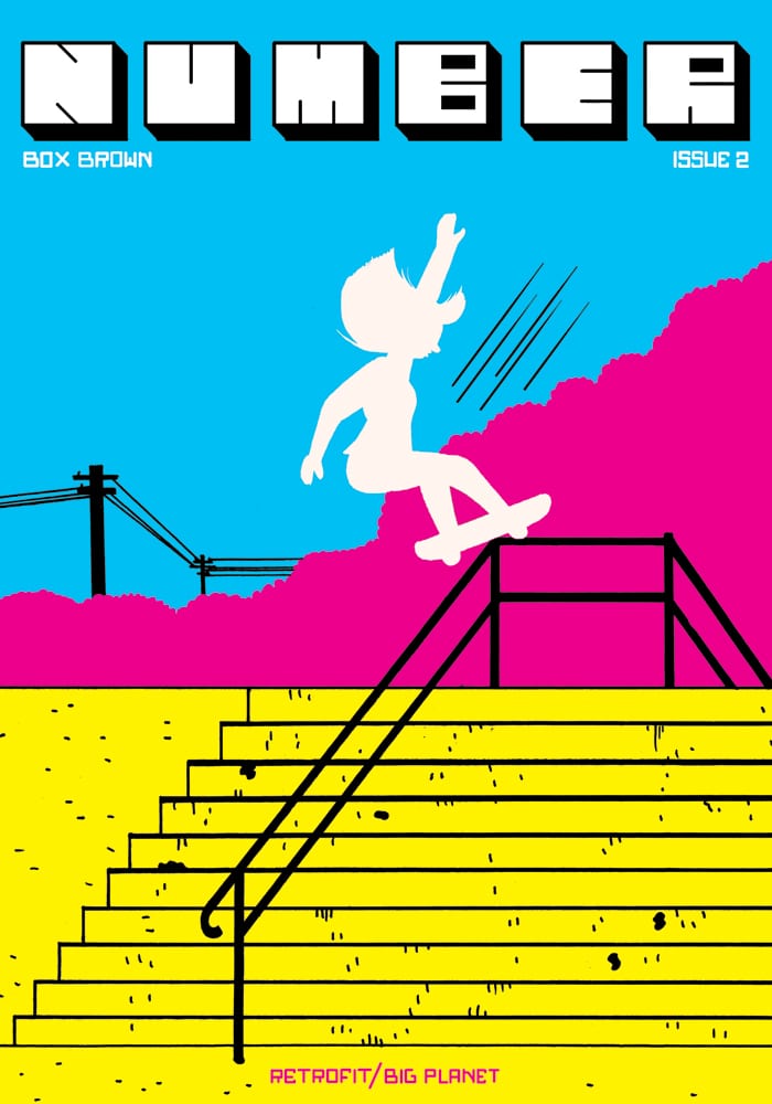
Number 2, by Box Brown. This series contains more short work from Brown, this time in slice-of-life mode. The first story, "SK8R H8R", details a woman going home on her skateboard after a long night of drinking, only to encounter a drunk and mentally ill local man. I love the way Brown uses close-ups in this story to add a touch of detail and naturalism to his simplified figure drawings, giving the story a sense of the dramatic. There are no lessons or loose ends tied up in this story: it simply ends as it begins, with the woman on her skateboard, this time defying a cop. The second story, "Elroy Mirrors' Big Score", is a familiar one. The titular character, a documentary filmmaker who's just barely scraping by, deals with his own insecurities and jealousy toward a friend who's starting to hit it big. The beats of this particular narrative are familiar and feel played out. Running jokes about taking his anti-depressants, the ubiquity of hearing about his friend and wallowing in his own self-pity are all here, and this appears to be a pointed self-critique, albeit one that's treading worn-out ground.
Picnic, Ruined, by Roman Muradov. This fuzzy, foggy, and funny comic uses highly stylized dream logic to create a meandering account of one man's dream journey through a city. Beginning with the narrator at a bookstore where a pornographic movie is being filmed, the narrator shuffles from location to location in an open page format that frequently bends, stretches, and engulfs him as he makes his way through a series of identity crises. Muradov uses that European clear line style for his character design but isn't afraid to allow lines around faces to completely drop away or else become enveloped in shadow. He plays with geometry and form on the page, a bit like the painter Kandinsky, always returning to a pointy nose and the glasses that rest on it. At one point, the protagonist runs into a pole and splits in half, with a white half and a black half walking together and arguing about what he might be missing out on in life. Ultimately, the comic ends when Muradov's field of vision stops focusing on the nearby and instead focuses on the beauty of the city as a whole, and he is silent. While this comic is self-indulgent, the sheer commitment to its ideas that Muradov evinces give it a surprising amount of emotional depth.

Keep Fresh, by Zejian Shen. Shen is one of my favorite young cartoonists, and this slasher genre comic has twists and turns that twisted me into knots. Using a series of odd, sharp angles that often trick the reader, Shen relates a hot summer night when a young woman working at take-out restaurant is watching increasingly-bizarre programming on a TV set, while a deranged, helmeted motorcycle killer is running amok in the city. Shen, in a highly detailed but cartoony style that emphasizes detail, facial reactions, and body language, creates a tense atmosphere that seems to be initially resolved, comes to another crescendo with an anticlimax, and then finally concludes with a classic case of mistaken identity looming very large. Mixing Chinese on the page with subtitled translations in English only serves to heighten the suspense, giving each panel a more visceral quality as we wonder whom the killer might be and if the woman in the restaurant is going to be the newest victim. Shen, whose style reminds me again of Matthew Thurber, uses humor just as skillfully as Thurber does, introducing hilarious advertisements for absurd items like a rectally-inserted rocket to escape annoying people. Those ads provide comic relief for the tension of the plot, until one realizes that a certain ad reveals everything about the plot, setting up the story's final twist. Shen is highly deserving of having her work collected by a smart publisher.

Mowgli's Mirror, by Olivier Schrauwen. This oddly-formatted (12 x 10 inches), relatively brief (48 pages) book is yet another reason why Retrofit can be such an appealing publisher: they are always willing to publish according to the specifications of the artist. Here, that also includes two-color (blue and orange) printing for this story of the Jungle Book character's essential loneliness. Schrauwen makes two key decisions that separate his story from Kipling's narrative. First, there's no overarching narrator and no language at all. This is important because the reader is forced to rely on what they see rather than wait to be given an explanation. Second, the animals here are presented as animals, rather than being given anthropomorphic qualities. The book opens with Mowgli being befriended by a female orangutan, and the two share some antics like the mirror game where they imitate each other. The only pages that are depicted from anything other than an objective point of view are huge splash pages where we see a cruder version of the things Mowgli sees, representing his own mind's attempt to understand the environment around him. When the orangutan gives birth, Mowgli believes that he's truly found a new family, a notion he's disabused of when he tries to have sex with the orangutan. Things get worse when one of Mowgli's wolf friends comes to visit, terrifying the orangutan and setting a long chase scene into action. There are later scatological encounters with elephants (Schrauwen's use of orange is particularly effective and disgusting here) that start off as funny and later become incredibly sad when Mowgli builds an effigy out of dung so he won't be so lonely. What appears to be a sad ending transforms into something hopeful in a scene that mirrors the book's first. Schrauwen has become one of the top cartoonists in the world thanks to his wit, daring, formal cleverness, and willingness to commit to an idea. His fascination with "primitive" cultures and ideas is always shot through with a modern lens that understands the brutal nature of colonialism and colonialist ideology.

Butter and Blood, by Steven "Ribs" Weissman. Smaller presses like Retrofit are now in a position to publish work by more established artists who are either currently between publishers, or have a project that's not a great fit for a bigger alt-publisher like Fantagraphics. Weissman hasn't had a book out in a while, perhaps in part because he's been doing more short stories. This book is a collection of those strips as well as miscellaneous illustrations, giving it a sketchbook feel. A number of his excellent strips from Mome are included here, like his hilarious mash-ups of Guns 'n Roses and working at a delicatessen. There are what like look like tear sheets for a series called "Stinckers", beautiful and weird illustrations done in color, and strips both vicious ("Eagle Man and Batboy") and absurd ("Pioneer Chicken"). Perhaps the best representative here of Weissman's aesthetic, which combines cute drawings and subjects with incredibly dark themes, is his adaptation of Watership Down. The classic novel about the harrowing lives of rabbits is played for laughs, albeit brutally nasty ones. Weissman's sense of comic timing is impeccable. There's always a logic behind the absurdity and there's always humor behind the horror.
Anthologies
Big Planet Comics, edited by Jared Smith. This is a highly mixed bag of comics by mostly lesser-known cartoonists. There are some pleasant discoveries, like Jensine Eckwall's "horse comic", which uses a deceptively simple line to emphasize the nightmare of being a societal pariah and how fetishizing pain does little to heal it. Mark Burrier's "Crash Land" is typically well-drawn and thoughtfully considered as it details an encounter between a spaceship and natives. Saman Bemel-Benrud's strip about a child's drawing of her beloved pup truly gets at the heart of how on the internet, everything is for sale. Robin Ha's "French Cows" depicts what she initially thinks is a life-and-death encounter with a herd of cows, only to reveal that she is in no danger and continues with a beautifully-drawn series of panels of consumption of delicious food. Box Brown's "I Am Magic" kind of gets at the same ideas as Bemel-Benrud, only this time in a more absurd, live setting. Angelica Hatke's strip is crude beyond the point I am able to absorb, while the Jared Smith/Brooke Allen strip is little more than an ad for Big Planet Comics. Andy K.'s strip is big and loud, with garish colors and a grotesque drawing style. Fortunately, Ben Sears's subtle and charmingly drawn hour-by-hour account of a space observatory is the perfect way to end the book. This is a story that rewards a close reading and attention to detail, yet flows smoothly and easily.
Secret Prison 7, edited by Box Brown and Ian Harker. Brown and Harker had a Kickstarter to fund this anthology, which TCJ.com co-editor Dan Nadel derided in his infamous "Sell your boots!" rant. The concept of the anthology is to honor Garo, the seminal Japanese anthology of manga that often had gekiga (serious/dramatic) stories. To the credit of editors Brown and Ian Harker, they included three different text pieces on manga and Garo, including one by expert Ryan Holmberg. The book starts off with a story from Japan resident Ryan Cecil Smith, whose work is directly influenced by genre manga. His story here uses a time fracturing device with dramatic but stiff action set pieces as a way of freezing moments so as to create atmosphere. Angie Wang's story about a girl making friends with a creature who lives in a tree is moving as it incorporates a common manga theme of spirits being found in everyday situations and also serves as an aching coming of age tale. Charles Forsman goes further down that road, incorporating a demon's torments as the consequences for masturbation. Mickey Zacchilli's crazy swamp-ceremony comic uses her remarkably readable scrawl to mock that kind of supernatural coming of age story.

Some of the stories in the book are tongue-in-cheek, like Pat Aulisio taking the piss out of epic sword battles by turning one into an employee grumbling about his job. Katie Skelly's strip about a teen being seduced by a girl into joining her death cult is campy in just the right way. Other artists, like James Harvey and Noel Freibert, amp up the visceral, disturbing aspects of what they've seen in manga; their pieces are less interesting. One of my favorite strips is Tom Hart's "Arid", which adapts a story by Shinji Nagashima to create a spare and heartbreaking tale of memories just out of reach, dreams realized and then lost, and how to survive afterward. Another strong strip is Luke Pearson's intricately-constructed narrative about a home invasion that leads to a breakdown of identity, as the shadow-self of an impotent man traps the "real" version and rapes his partner. What's interesting about the story is that it's narrated by his partner, whose demeanor goes from frustration and disgust to ardor and wonder. Finally, there's a piece by a non-Western cartoonist: a short from Masahiko Matsumoto, which previews a larger book published by Top Shelf. All told, I'm not sure I learned much about Garo after reading this book, but there is a lot of very good work by cartoonists who didn't seem to be venturing all that far from their comfort zones.

Future Shock 0, edited by Josh Burggraf. Burggraff self-published several volumes of his trippy sci-fi anthology and put together the biggest volume yet when offered an opportunity by Brown. This volume is by far the most successful, as the earlier installments often suffer from style over substance. Burggraf mostly limits his own contributions here to some beautiful collages that act as interstitial material, that resets the flow of the book after every few stories. Some of the best stories use genre trappings as background material, like Sophia Foster-Dimino's formally innovative "Not Colleagues", which tries to reconcile the differences between art and science in the form of lovers. The fractured layout makes an intuitive sense despite eschewing standard panel format. Lala Albert's "Hybrid" uses a more painterly approach in terms of the figures in a standard grid to explore the relationship between science, commodification, and futurism. Alex Degen's "Mindhunters" is a heartbreaking and colorful strip about virtual reality decaying. William Cardini takes a different approach, using his trippy, stilted compositions to create reactions in readers based on the ways big shapes interact with each other on an almost visceral level.

The highlight of the book, one that Burggraf wisely makes the book's centerpiece, is Keren Ketz's remarkable "My Skeleton Week". Using an angular, distorted style for her figures, an open page layout, and densely saturated colors, Ketz tells a story concerning anatomy, intimacy, and bodily transformation from man to machine. The other stories of interest came from Future Shock veterans Anuj Shrestha and Victor Kerlow. Shrestha's cool, almost antiseptic approach is perfect for his story about alienation when a new technology essentially drowns out those unable to afford it. Kerlow's ragged line and raunchy sense of humor contrast nicely with the existential crisis of an anthropomorphic dog. While there's plenty of good writing in this anthology, it's definitely aimed at those who value a variety of visual approaches.