
This is Part 3 of an ongoing series where I speak to some of the pioneers of risograph printing. Check out Risograph Workbook 1: Mickey Z and Risograph Workbook 2: Jesjit Gill/Colour Code Printing.
Now Ryan Cecil Smith weighs in with his riso story.
==============================================
Santoro: Ryan, legend has it that you were one of the first American small press comics makers to employ risogragh printing of your comics, and that you basically introduced the process to the States. I remember you were in Japan making comics around 2008. Can you give us your "Risograph Origin Story"?
Smith: I heard that risograph was “a thing” but I didn’t know what it was. I guess I’d heard that Mickey Z was using it and Ryan Sands was using it. I discovered that my office workplace (in Japan) had this weird photocopier that was used for mass handouts on cheap paper. It was manufactured by “Ricoh” not “Riso,” but I eventually figured out it was the same technology. (This was 2008.) I loved how the prints from this machine lay on the paper; they seemed to soak into the paper, yet they lay flat and matte. They weren’t glossy or threadbare like laser prints/Xeroxes tend to look. So I was very happy that I had this machine that could make prints which didn’t look like anything else I’d ever seen! I made several books and tens of thousands of prints on my office risograph machines over the next few years.

Tell me about your current setup. What kind of machine(s) do you have?
I don’t have my own risograph, thankfully! Basically since 2010 or so I’ve used a risograph print shop in Japan called Retro Jam for all my color prints, and then after leaving Japan I’ve continued to use them for everything I make. I love working with them and I don’t want to change my process if I can help it. The tricky part, honestly, is the logistics of paying them and getting everything shipped to me in the US. But they do such good work, and I like working with them so much, that I’d rather figure it out than start working with someone else. And… well, it might be a good investment to buy a risograph for myself… but I don’t really have the space for it. I like my deal now.
Personally, I am fascinated with how risograph printing has changed the landscape around making color comics. Before risograph, as you know, the choices were expensive offset or expensive print on demand. And often dealing with those printers was difficult. The riso printers I have engaged are not faceless sales reps on the phone who have no experience making comics. So riso printers and their enthusiasm for the materials has reinvigorated the small press scene—which has drifted into "book publishing" (like giant offset press books)—and I was hoping you could speak to that?
Well, my print shop Retro Jam is kinda a mix between those two things. They are a big commercial shop with an official process and are quite strict about how they do things. They’re very professional, clear, and fast. Actually it took awhile for me to get used to this. But now, I like it! And, I think that if you only worked with them over email, they would be basically faceless and get the job done. However, thankfully I have gotten to know everyone at my print shop (they have a staff of 25 or so) and am happy to be friends and know that many of them are artists and designers, too. Which, of course, is clearly reflected in their website, print material, workshop space, etc.
I do enjoy knowing the faces and names of people in risograph publishing. Everyone is very excited by how accessible this medium is - we can easily experiment, publish small or weird projects, or just print something very basic, very easily. This is so great! And much nicer than having to dream of an offset budget, or wishing print-on-demand looked the way we wished it could. Because (unlike owning an offset press) risographs are sorta accessible, the scene is pretty nice and helpful - you don’t feel like there are gatekeepers here.
Can you talk about how (riso) printing your own work has influenced the way you make comics? For example, you might have had experience using a limited palette or spotting colors before using riso but has the riso process changed the way you approach making new work?
There are two ways I can speak about this. First, when I started using risograph, I loved the way it cleanly and flatly reproduced my lines and spotted blacks, with no grey scuzz. It made my black and white drawings look great, which encouraged me to use screentone as a tool with more projects, and just made me love graphic drawing. Second, when I started figuring out the color experiments I could do, I dove in and couldn’t stop trying new things with color — probably to my detriment, as I haven’t done as many long stories since then. I spend too much energy and enthusiasm doing weird color stuff. But that’s great about the risograph: it gives us exciting new options ("I can publish this book” or “I can print in color!?”) and we can pursue whatever we want.

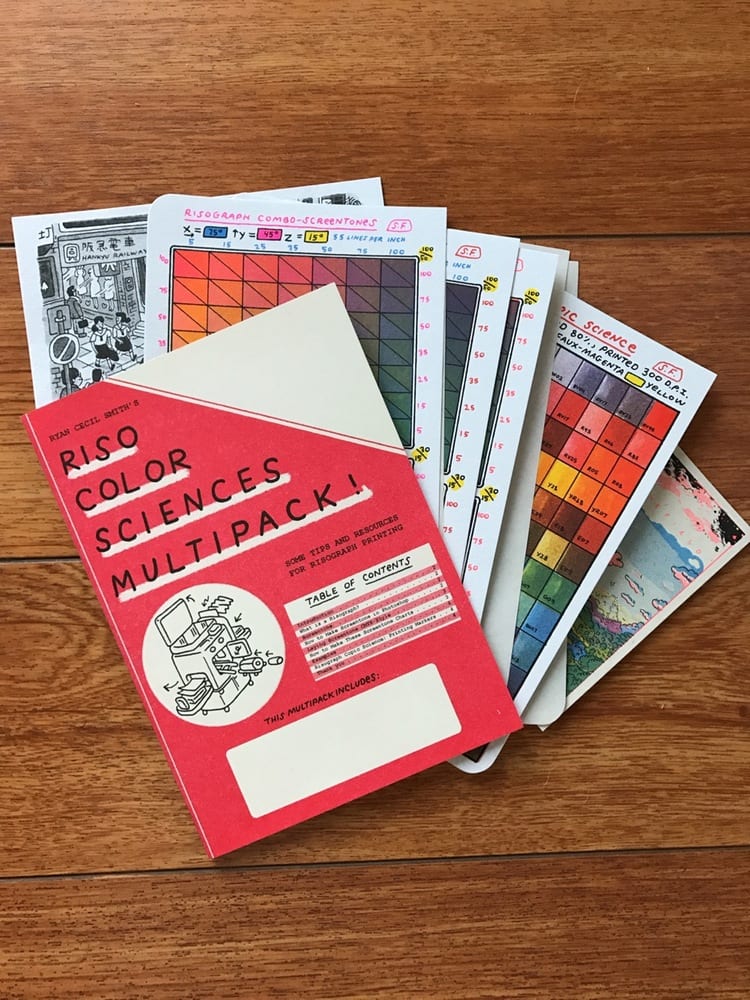
I just got your Riso Color Sciences Multipack in the mail and beyond being beautiful, I find it to be a very useful guide, a tactile show and tell exhibition of color, paper stock, and so many other things. It's remarkable. Kind of what I've been searching for to explain to non-initiates what risograph is. Tell us about the genesis of this riso sciences multipack?
I have always made smaller versions of these print charts before doing a multicolor risograph book. I'd usually make 15 or maybe 50 copies, just for myself (since you can’t make just one copy on a risograph), and then use that chart as a key to coloring the next book. I was still figuring out this process of mixing screentones, so they were formatted roughly, often had little mistakes, and were hard to explain. Once I had them really nailed down, I wanted to make a final, good version of the chart for my own use - and of course I know it’s something others will be interested in, especially if I can include good instructions and explanations.
I’ll share some of the weird questions I worked out on the way to a "Good Enough Version," over countless dumb (and expensive) trial and error test prints: What’s a good frequency for the screentone? (A: I like 55-75.) How many values do I need to include for each color? (A: 7 values is pretty useful before returns diminish quickly.) Where on the scale are there lots of important differentiation, and where can I mostly skip? (A: My grid is weighted to mostly measure 0-50% tones, because above that it gets too saturated and dark.) Anyway, the point of publishing these is to publicly share what works well for me. I hope I’m clear in helping others make their own and figure out what looks good to them. There are a thousand ways to go about this, and I hope artists can learn from what I’ve done.
There’s a Copic marker reference chart in there, too. That’s a pretty guileless (but careful) CMYK separation. After I had figured out screentone mixing pretty well, I wanted to try something different. It’s different! It’s weird. It’s maybe overkill. But it’s fun to try.
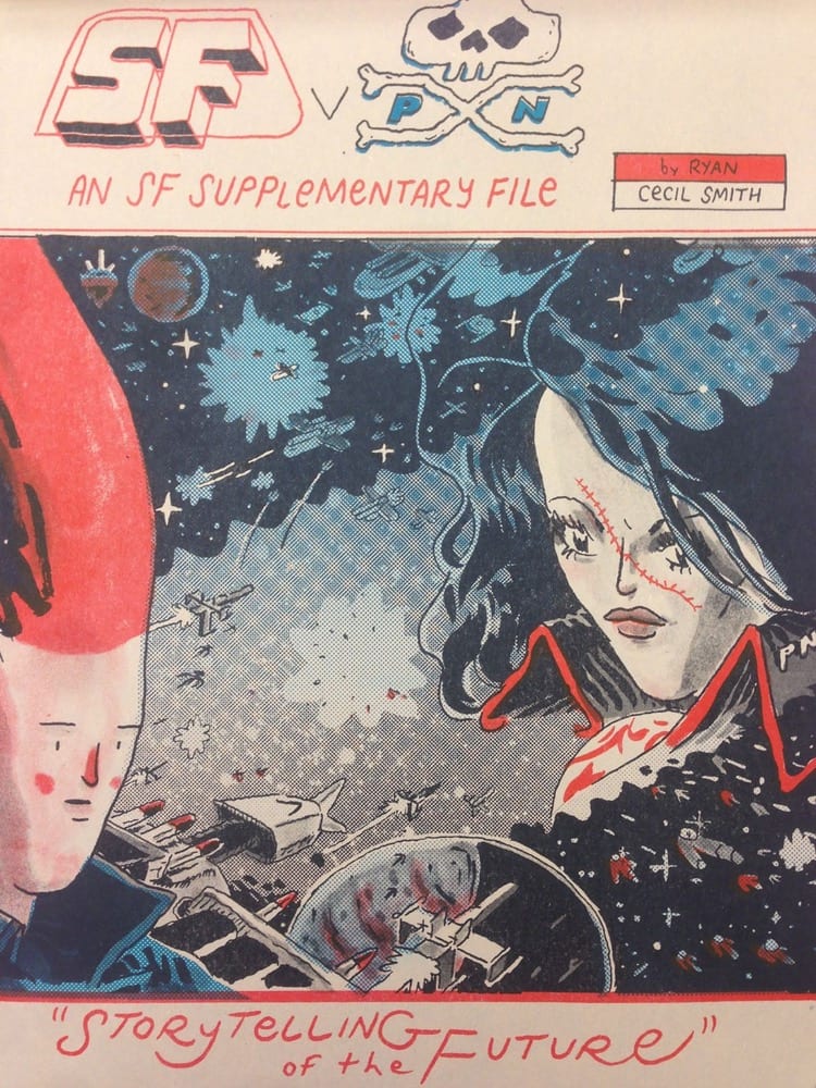
Those rare SF riso test print secret folios - were those things that you made yourself or were those things that you sent out to be made? Tell me more about those. I find the secret folio to be an interesting precursor to the riso pack. You've always been interested in explaining the process to your readers as well as entertaining them.
Those Folios had a similar origin. I had done so much test printing, figuring interesting stuff out, and I wanted to share it! I was sure there was a small audience for them. I think the Multipack is better because it’s a bit more carefully and considerately assembled. It just feels like a waste to figure out all this stuff and not share it!

You threw a couple of other booklets into my recent package. Tell us about Zine Field Supplement Issue #2: Meet Nixel Pixel?
Oh yeah, the Zine Field Supplement! That’s the second one I’ve made. I’m overdo to publish a third. Nixel Pixel is an artist from Moscow I met on Instagram (@nixelpixel). I love her work, but most of it is in Russian! She had a few small zines in English so I asked if I could sell them for her in the USA. (I still have a few on screentone.tv), and also interview her for the ZFS. The first ZFS featured reviews and an interview with Sarah McNeil, a zine artist (and risograph printer) from Australia. Actually, I have a zine of hers in my store, too, Peach Spell. She has an online store of her own, but she ships from Australia so it’s a lil cheaper to try to buy it from me, if you’re in the US.
I make these Supplements because it’s fun to make an interesting looking print (I’ll try some new paper and some new inks), and I get to promote some books and artists I like, and hopefully spread good vibes. They’re cheap to make and fun to share. My goal is to stay positive and not ramble on!
===============================================
Check out more work by Ryan Cecil Smith on Screentone.tv. Get a copy of the Riso Color Sciences Multipack!


