Kevin Czap was recently awarded the Emerging Talent award at the Cartoon Crossroads Columbus (CXC) festival, a fitting honor for a cartoonist and publisher who is starting to publish on a more aggressive basis. A self-proclaimed "Comics Mom," Czap's goal as a publisher is to nurture and encourage the artists that they publish (Czap's preferred pronouns are they/them) to be their best and most fully-formed artistic selves, no matter their style or method. Their forward-thinking and nurturing presence as a publisher is most closely aligned with how Annie Koyama works with her artists, but Czap's dedication to the crew of artists they've been publishing for years as well as their eye for challenging, weird, and poetic work reminds me most of Dylan Williams' Sparkplug Comic Books. Like Williams, Czap is 100% invested in their artists. Also like Williams, Czap is very much hands-off in terms of content; the only real "editing" is the selection of the artist for publication. The result is a surprisingly wide array of genres and approaches, united only by the humane themes in their art. Czap is also publishing some of the most challenging, cutting-edge comics available now, like Czap Books' flagship anthology title, Ley Lines, one that focuses on relationship between art and artists. Let's take a look at some recent and older work published by Czap, including their own comics.
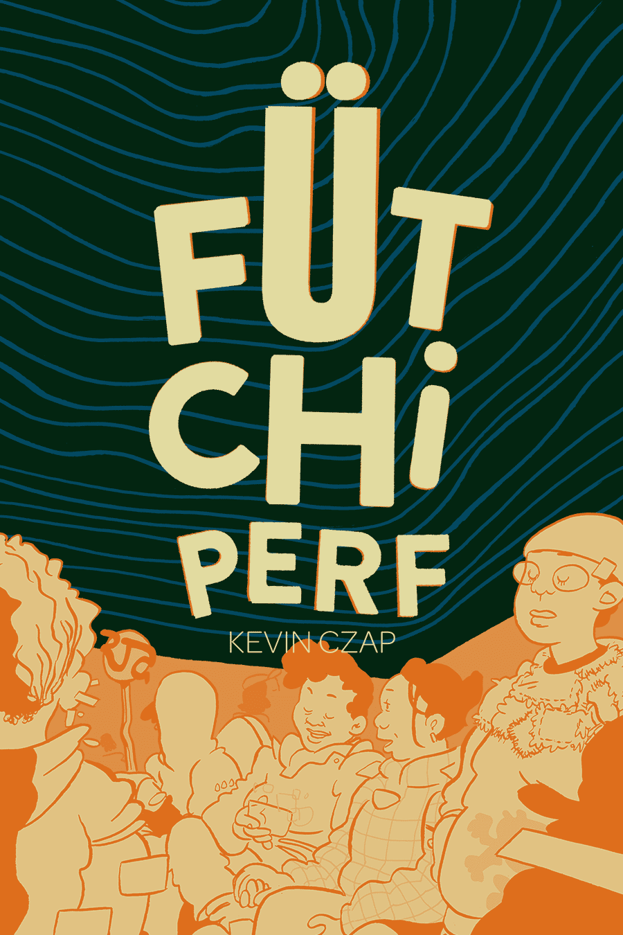
Futchi Perf and other Czap Books By Czap
Turning first to Czap's own work, the centerpiece of that is the enigmatic and blissfully beautiful Futchi Perf (a linguistic variation on "perfect future," I'd guess). Prior to the full publication of that comic, they published some precursors in anthologies and minis, like Lyric Sheet and a split mini with cartoonist John G. In the latter comic, both artists explored an alternative version of Cleveland, with John G.'s delving into loneliness and isolation as earnestly as Czap searches for connection and meaning. I think describing Czap's work as utopian doesn't quite hit the mark. A utopia implies a perfect working system where everyone is happy. It has an almost mechanistic connotation.

What Czap instead posits is a city where all basic needs are met, and which is devoted to free self-expression, connection and understanding. It's a sloppy and beautifully human city, subject to human frailties and limitations but also buffered by the possibilities of kindness and empathy. The introduction, appropriately titled "Theme", is a best-case scenario extrapolation, where "all the right things are winning!" and "this neighborhood is swarming with all your closest friends!" The dense and shadowy but still cartoony line reminds me a bit of Kyle Baker's old work. A more contemporary mutual influence, I believe, is the cartoonist Jeremy Sorese. Czap's character design, world-building, and unspoken but obvious focus on a society that is clearly gender-fluid, racially mixed, and diverse in every way imaginable (including but not limited to sexual preference), creates an environment where there is at last an even playing field. That fascinating exploration of a world where being genderqueer is the norm instead of the exception reminds me of Sorese, only Czap is more interested in how that plays out across a wide swath of society rather than with a small set of characters.
Czap is also interested in exploring what kinds of conflicts still exist in a society where basic needs are accounted for. The story "Seventh Energy" provides fascinating, cut-away diagrams of how Cleveland is powered by an energy-harvesting source that comes from Lake Erie. While life may be a best-case scenario in this version of Cleveland, Czap notes that as long as human beings have emotions, desires, and interact with one another, there will still be the possibility of conflict, unhappiness, insecurity, and confusion about one's path.

That idea is tracked throughout the comic, as the lack of self-actualization is explored in conjunction with a society that emphasizes inclusiveness and innovation. Czap's Cleveland is strongly influenced by the Kid Mind, a sort of living-cloud think tank that influences culture and trends. Young people, with their fashion, sociopolitical consciousness, and dialect informed and informing the Kid Mind in near real-time, use devices to find house parties and other ways to connect. Their appearance in the story "Lyric Sheet" is connected to the story's protagonist and a famous singer-poet named Graces. Czap delves deep into mythology, as the Graces were the patrons of the pleasurable things in life, including play, rest, and happiness. The protagonist's connection to Graces (at first unspoken and later explicit) goes beyond even the influence of the Kid Mind.
Czap's dense but cartoony line creates a more pleasant version of the sort of future worlds that another potential inspiration, Brandon Graham, conjures, complete with bushy eyebrows, highly expressive lettering, and noodly figures. It's a world that's every bit as crowded as Graham's, only far less grimy. The real key to the comic's visual success is the deft and clever use of color via the Risograph. The light from devices is a swirling pink, color contrasts offer a quick key to foreground and background figures, and key panels switch from dark blues to pinks to emphasize the emotional importance of that component. The final comparison I'd make is the Zak Sally story "The Great Healing", in which a narrator reveals a world where every desired miracle has taken place, where "tears crawled back into wet eyes." What makes Czap's version unique is less of a focus on a single moment than an exploration of this premise, simultaneously world-building and character-building. Of all Czap's comics, Futchi Perf comes closest to recapitulating Czap's entire project as a publisher.
A Lesson In Survival, on the other hand, is very much an OuBaPo kind of experiment, matching Joni Mitchell lyrics to swirling black cityscapes and figures. While many of them border on the abstract, the reader is made to juxtapose them against the lyrics, which have their own meaning when separated from the original songs. It's not an entirely successful experiment, as the repetition and lack of variation on themes drags the mini down, and there's not quite enough to connect the images and lyrics to make it all click.

"He Fought Like a Little Tiger in a Trap" is a collaboration with Cathy G. Johnson, another long-time presence at Czap Books. This is a short, black & white broadsheet that in many ways is the quintessential Czap publication. It's scratchy, expressive, slightly oblique but also emotionally open. Featuring the narratives of several characters in what appears to be a small Southern town, it's about identity, gender, and the sense of being trapped or locked into one's life with no recourse for some, and the infinite possibilities available to the imagination of children. The loopy lines converge into figures beautiful in their grotesqueness, drawn with their hearts on their sleeves. I'm not quite sure how the division of labor was split between the two artists, but there's a remarkable degree of storytelling fluidity, and the reader is left wanting so much more.
Czap Books

Eat That Toast is a collection of full-color gag strips by Czap's brother Matt. He's an animator and improv comedian associated with the Upright Citizens Brigade theater, and it's clear that a lot of lessons from the world of improv are reflected in his sense of humor. Czap's art is functional, relying heavily on exaggeration and color in support of his gags, which are mostly conceptual. The drawings are clear and don't detract from the jokes, but they aren't usually funny as drawings; if anything, they feel a bit web-comic generic. That said, the conceptual nature of his gags is killer, and it's clear that he's a skilled comedic writer. What I like best about this collection is the way he sets up a group of recurring characters that create a certain set of expectations as to the eventual punchline, yet Czap is repeatedly able to find a fresh way either to tell the joke or else cleverly subvert expectations. The best is the recurring saga of a family of anthropomorphic toast and the ravenous bird that stalks them. What's great about it is that in many of these strips, Czap will go to great lengths to discuss the most intimate details of the toast family's life and then spring the bird on them in horrifying fashion.
Other highlights include the vegan who's against food consumption of all kinds, the bird who works in a pizza joint (including a truly unsettling strip where being told to pour soda on a pizza he's delivered turns out to be some kind of fetish), the contagiousness of pick-up-artist syndrome, the archeologist-adventurer whose dreams of treasure never quite materialize in the ways she expect, and all kinds of ridiculous puns and wordplay. My favorite strip of all is one about a dad who's just explained "the birds and bees" to his son, and when the kid gets with his girlfriend and is being pecked by birds and stung by bees, he triumphantly thinks, "I'm doing it!" Another great one takes the concept behind "hugs, not drugs" to its logical and dark conclusion. I actually would have preferred to have seen the jokes without the use of color, because it didn't really add much and was actually distracting at times. The core ideas are so solid that going simpler might have been preferable, but there's no doubt that Matt Czap is as funny as any humorist out there. Fans of Joey Alison Sayers would especially enjoy his work.
Ulcera is by young Brazilian artists (Paula) Puiupo and Adonis Pantazopoulos. What it shares with other Czap books is an interest in futurism, utopianism, and a radical rethinking of personal identity within the context of interpersonal connections. Considering the ages of the artists (20 and 19, respectively), it's remarkable to see how thoroughly manga has become the international comics lingua franca. The influence is so deep and pervasive that it can't be ascribed to a particular artist or artists. That's because such a wide variety of styles has been available to younger readers for nearly two decades now, and that influence has spawned a generation of cartoonists who sprang off from manga and developed their own ideas and visual approaches.
The plot involves a young woman named Ulcera who infiltrates an organization (and structure) called The Tower, a cultish influence-peddling group. There are echoes of Catholicism, future tech, bionics and other human-machine mash-ups, sex, body horror and transformation, BDSM, and magic. The plot is non-linear and frankly difficult to follow at times, but there's an essential wit at the center of the whole production that embraces the madness of the story while poking fun of it. The thin line of the artists is set off by the dense use of blacks. The characters are angular and expressive, bordering on the grotesque. Multiple readings don't necessarily make it any more coherent; instead, the book becomes easier to apprehend by approaching it as a series of slips in time and space that are connected but not in ways that are always obvious. The Puiupo/Pantazopoulos created their own storytelling language in the course of making this comic, one that intersperses stretched-out silent moments with new and sudden interjections by heretofore unseen characters. The experience is one of being kept constantly off-balanced and surprised.
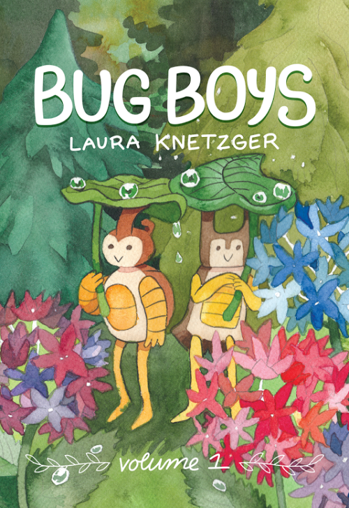
Laura Knetzger's Bug Boys began like many of the best comics do: as a series of sketches that took on a life of their own, until stories and ideas started forming around them. I'm most familiar with Knetzger as an all-ages cartoonist, though her autobio comic Sea Urchin was a bold and creative attempt at confronting her depression and social anxiety. Some of her other comics are more clever than heartfelt, and it's obvious that Bug Boys is Knetzger's comics lab for working through problems, both as a creator trying to find her way and on a personal level. There is no cute high concept to Bug Boys, nor is there a deliberate sense of world-building at the expense of character. Everything in the book is built around the friendship of beetles Stag-B and Rhino-B, two insects who are trying to find their way in the world.
This volume collects individual issues of the Bug Boys minicomic, and the story of this book is as much Knetzger's evolution as an artist as it is her own characters starting to grow up. Knetzger leans heavily on manga for her style, though there's certainly a touch of James Kochalka to be found here as well. The comic never reaches Kochalka's level of twee in part because the comic is about the characters working through their negative emotions in what feels like a genuine manner. It's obvious that Knetzger has invested much time and energy into the characters. Another influence is Jeff Smith's Bone, and Knetzger takes from that comic the depiction of a restless thirst for adventure. The boys love exploring treasure maps and going on little quests as much as they do cooking or camping.
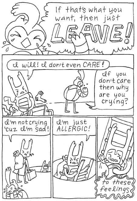
The beetles also often face existential crises, wondering about their role in a world where they are so small and have to co-exist with so many bigger, frightening species. The boys learn to cope with diverging interests, as Stag-B starts to help Dome Spider catalog bug knowledge in a library (which includes comics), while Rhino-B starts to become a better outdoorsman. They act as village representatives and help prevent a massive war from breaking out between the bees and the termites. They survive a hallucinatory and truly harrowing journey through a cave with their friend Dragonfly. Much of the book is told in the language of meditation and therapy, as the boys learn again and again that they have to find ways to accept themselves and live in each moment without looking too far ahead. There's a genuine warmth and a humane quality to this book that still embraces but is not consumed by a loosely told overarching history of the Bug Village. Any details the reader is given only serve to enrich and deepen the relationships that are at the forefront of the story. The impeccably clean and cute line of Knetzger is versatile enough to embrace the lighter and more fun aspects of the story as well as darker or more interior scenes as well. It's a work where each chapter serves not only as its own enjoyable, self-contained piece, but also to add another building block in the beetles' friendship and the world they live in.
Jessi Zabarsky's Witchlight is Czap Books' most recent publication, and it's an all-ages fantasy/adventure/romance with queer overtones. It's impeccably plotted down to the last detail and Zabarsky's world-building is vivid without overwhelming the story or the characters. It's the story of Lelek, a young witch, and Sanja, the daughter of a local trader who happens to be handy with a sword. Lelek has robbed several customers and Sanja gets roped into training Lelek how to fight while insisting that she stop stealing. Lelek's initial distrust slowly turns to friendship, warmth, and then love, and the plot revolves around Lelek's tragic and mysterious past as she slowly comes to terms with it. The McGuffin of the story is the essence of Lelek's magic, part of which was taken away from her for safekeeping when she was a child, leaving her only a potion skill that involved a complex set of spitting actions.
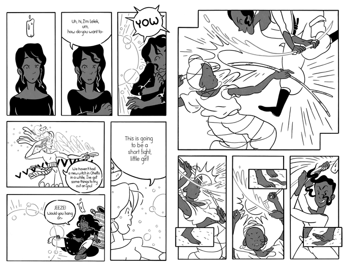
The narrative moves forward around Lelek's search for that part of her, with the other part of her essence is contained in a lit candle that always floats above her head. A tragedy at the end triggers the book's climax, tying up all the plot threads with remarkable tidiness. One subtext of the book is the toxicity of patriarchal customs and beliefs, as they push Lelek into crime and cause the tragedy at the end of the book, as Sanja's younger brother feels forced to do something horrible to prove his masculinity to his demanding father. The book's focus on cooperation, openness, friendship, and generosity gives it a remarkable sense of warmth, but the characters are far from perfect. They make mistakes. They are insensitive at times. They lose their tempers. The characters are so fully-formed that I sense that this book could be a big deal for its rightful YA demographic. The rubbery and cartoony quality of Zabarsky's line for her character designs is contrasted with the wonderfully detailed nature of her drawings of nature and the villages the characters explore, and Zabarsky's use of spotting blacks and negative space in composing each panel is ideal. Another important aspect of the work is Zabarsky's ability to clearly render dynamic action sequences, which is a key element of the first half of the book. It's perfect YA storytelling: easy to follow but lovely to look at.
Czap Distribution
As part of his publishing concern, Czap has long championed and sold the work of others whose work he hasn't directly published. That's happening less now that a real body of publishing work has started to coalesce, but those comics are at the root of their operation and represent the way that they've supported a small group of like-minded cartoonists.

Cyanide Milkshake #5, by Liz Suburbia. Suburbia's minis have been distributed by Czap for years, long preceding her breakthrough first book with Fantagraphics, Sacred Heart. This zine is a good old-fashioned, one-woman anthology. It's chock full of gags, a continuing adventure storyline, autobio, stories about her dogs and much more. It's the most no-frills, back-to-basics mini possible, printed on copy paper and drawn with Sharpies. It's a testament to her skill and style that it looks so good. It's punk in the best sense of the term: do-it-yourself, thoughtful, questioning of authority, and entirely personal. It's fun because Suburbia is good at so many things; her fake ads (like for something called Spermicidal Tendencies--"when you need hardcore protection") are hilarious, her lettering is eye-catching without being distracting and has some genuinely beautiful decorative qualities on some pages, and her genre parodies are true to the characters while still earning laughs. Her recollection of her sister helping Suburbia manage her anxiety and OCD is genuinely touching, and she's one of the rare cartoonists who really knows how to draw children. Even her continuing zombie-apocalypse adventure is more notable for the way she depicts relationships than it is for the flesh-eating action. Distributing Suburbia's work illustrates one of Czap's crucial qualities as a publisher: an eye for developing talent.
Ojitos Borrosos ("Blurry Eyes"), by Ines Estrada. Estrada is an emerging artist and Czap handed me a copy of her book a couple of years back. Estrada has published comics in her native Spanish as well as in English, and this is a cleverly edited collection of her short works. They're subdivided into several categories, including autobio, love stories, science fiction, and "instructive" comics. Estrada is the rare cartoonist whose use of greyscale doesn't detract from the clarity of her storytelling, in part because she's so direct, funny and gross. It's clear that Julie Doucet was a big influence on her character design and scatological bluntness, but Estrada's sense of humor and narrative interests are all her own. If there's an American comparison I might make, it would be Eleanor Davis. Take "The Next Thing: Nesting", for example. It starts off with a bird looking to nest in a tree, only to be slowly pinned and trapped by its branches. Like Davis, Estrada can employ a cute, cartoony style for horrific effect. "Plastico", in its own strange way, is a statement about the ways in which men objectify women. In this case, a woman trapped in a department store meets a number of women covered in plastic who are being used as sex toys, but they protect her by covering her up and then melting, frustrating the men who are watching them, hoping to watch them have sex.
Estrada's sense of humor is at the core of all her stories, and that sense of humor ranges from silly & whimsical to nihilistic. A talking head lectures the reader about how the end of the world is an anthropocentric idea, since insects will take control. The narrator chides the reader for wanting to take the easy way out but then informs them that she's just a comic character whose end will come soon. "Girls Also Pee Standing" is a step-by-step instruction manual to encourage women to urinate standing up, and in many ways it's the quintessential Estrada story in its scatological qualities, cute drawings and powerful sense of personal identity. "Mitocondria" is the show-stopper in the collection, as it tells a story of a woman's boyfriend who has his personality switched with the dog. The resulting story (where the two appear to switch heads as a symbol of the switch but appear normal to everyone else) features the man (now a dog) getting progressively more agitated at his fate and the dog (now a man) at first enjoying eating and having animalistic sex. The ending, when the dog sniffs out the source of the change is incredibly dark, as the couple is eventually reduced to maggot-ridden protoplasm. Her diary comics are every bit as scatological as her other comics, but there's a surprising level of sweetness to them as well when she talks about her boyfriend. There's a rawness to Estrada's comics and a sense of immediacy that energizes her work, but it's also obvious that her imagination, storytelling ability, and assured craftsmanship go hand-in-hand with that expressiveness.
Ley Lines
This is a series of minis that all have the same logo and trade dress, but each issue is by a different artist. In many ways, this series, co-published by L. Nichols and Grindstone Press, is Czap's greatest achievement. It purports to be "dedicated to exploring the intersection of comics and the various fields of art & culture that inspire us." Each cartoonist's interpretation of what this means is different, and while many select fine artists, there are also poets and performance artists as well. Here's a rundown, issue by issue:

#1 (November 2014): Unholy Shapes, by Annie Mok. The deceptively flip cover copy aside, this is a remarkably studied, thoughtful, and frank self-examination by an artist and her relationship with the art and artists that have shaped her, for good and ill. Mok uses a smudged, inky approach to her art here as she both does her own cartooning as well as copying in her own hand a number of key works by the Austrian Expressionist painter Egon Schiele. This comic is both biography and autobiography, weaving the two together in clever ways. It must be said that despite the many interesting formal decisions Mok makes in this comic, it is by no means formal experimentation for its own sake. Every panel and every line has an emotional resonance to it, as though solving the problem of making this comic was a way of resolving other personal and aesthetic issues. Mok is frank and forthright with her own sexual and drug-related escapades; not to make the story more sensational, but rather to echo Schiele's own iconoclastic and sexually blunt life.
Mok's evaluation of the plastic qualities of Schiele's work is fascinating. The title of the mini refers to the monstrous and vampiric qualities of Schiele's highly angular figures, especially his frequently tortured self-portraits. Mok relates Schiele to a childhood fear of seeing Nosferatu on a TV show as well as to certain toxic individuals in her life. Mok's rundown of that angular, somewhat androgynous figure in today's culture is spot-on, and the comic concludes with an understanding of the ways that Schiele's work has become an unconscious part of Mok's own work as an artist and performer. Mok's raw honesty is balanced by her sense of restraint, and the fact that she used a 2x4 grid on almost every page points to how the tight compositional structure of the comic was key to that restraint. Most every moment, regardless of its emotional significance, is given the same amount of room and has the same visual impact, as Mok does not vary her style much in the comic.
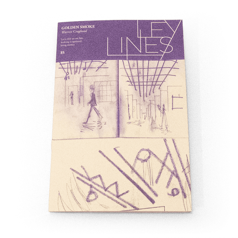
#2 (February 2015): Golden Smoke, by Warren Craghead. One gets the sense that Craghead would have had no less meaningful an aesthetic experience on the floor of the New York Stock Exchange as he did at Art Basel Miami, noted as "the largest art fair in the U.S." It is fitting that the festival is held in Miami Beach, the part of Miami where the conspicuous display of wealth is a spectator sport and where appearance is more important than substance. I like to refer to Craghead as the Godfather of Comics-As-Poetry, and his distinctive merging of word and text gets at the raw, naked commodification of the festival and its utter disconnect from the aesthetic experience.
The commodification of art is not exactly a new phenomenon, but Craghead doesn't purport to making a startling discovery with regard to how the rich treat art as a status object that's one of many excuses to throw exclusive parties. Instead, Craghead simply draws what he sees in the moment, using a style that blends the signifier with the signified as words fill up images and create forms, all while informing the image with things that he overhears and events that he sees. My favorite page involves a gallery where works by Rothko and Calder are given Pinterest "pins" by Craghead, as paintings are reduced to the banal level of recipes or macrame projects.
#3 (May 2015): Thank God, I Am In Love, by Cathy G. Johnson. Johnson's comic is the thematic opposite of Craghead's, as she expresses her unabashed love for Vincent van Gogh. Johnson makes it clear that it's not the mythology of Van Gogh that enraptures her; to paraphrase Heidegger, the true biography of Van Gogh might be: "He was born. He painted. He died. The rest is anecdote." This is not to be dismissive of his life or struggles, but Johnson makes clear that what connects her to him, what brings her so much aesthetic bliss, are the actual paintings. The actual strokes and stabs and whorls, the creation of color and light that we can see and know that were made by his hand. That in many respects, we have the privilege of knowing him as well as anyone because we have his work to experience. To be sure, what Johnson is describing is the aesthetic experience in the Kantian sense: the "sublime," that almost transcendental experience that is separate from the descriptions and even the emotions that surround it. That Van Gogh's paintings bring her this on a regular basis, as she notes, is a constant source of happiness.
#4 (August 2015): For Lives, by Andrew White. White delves into the creative process of Pablo Picasso vis-a-vis his portrait of Gertrude Stein. If the other pieces followed a personal, aesthetic or emotional connection to art and artists, White's focus is analytical. His approach is certainly immersive, as he overlays text over image, most of which are drawings and paintings from Picasso. Much of the text is from Stein herself, as she discusses her reaction to the work and her understanding of Picasso's process. Like Johnson and Van Gogh, there's an understanding that the only way Picasso truly expressed himself was through his work. It was his language, but there is also a sense of frustration that he could never quite match up with the ideal, transcendent image in his head on canvas. His paintings are ugly because he felt ugliness matched the intensity of that very struggle. The struggle represented his honest attempt at communication, capturing and wrestling with a single image in a single moment. White's use of the 2x2 grid throughout creates a rhythm not unlike Mok's comic, only his light, sketchy line and prominent use of negative space gives the comic a more languid pace.
#5 (November 2015): Poems to the Sea, by Erin Curry. Artist Cy Twombly's work has always seemed grossly out of place in a gallery. Though he worked big, his scribbly poetry should have been a minicomic, and cartoonist/sculptor Erin Curry saw it that way as well, creating a sequel to Twombly's 4x6 grid Poems to the Sea. Curry's comic is yet another approach in trying to understand and express the sublime, this time through abstract figures, erasure, and the grid. It's an attempt, at the most basic level, of trying to communicate and capture the feeling of that moment of connection to the transcendent, with the most immediate and rudimentary of markings. If the sea is a metaphor for consciousness, this is Curry's attempt to plumb those depths and show the reader what she sees.

#6 (February 2016): Medieval War Scene, by Aaron Cockle. I've long enjoyed Cockle's elliptical storytelling, use of erasure, conceptual humor, and fascination with conspiracies. This comic full of visual fragments talks about the relationship between art and destruction, opening with German painter Werner Heldt's paintings of devastated, post-World War II Berlin. With a sense of coldness, Cockle notes that Germany had inflicted the same kind of long-distance destruction as its foes did to it. His rattling off the specific technical specs of his page is meant to reflect the "just the facts" nature of long-distance warfare. A strip about the loss of so much of Sappho's ancient work thanks to vases cracking and papyrus crumbling over time notes how so much of the totality of cultural antiquity is elided into a single entity, comprised of love poems and war maps alike. The title of the mini refers to the Edgar Degas painting Scene of War in the Middle Ages, an ahistorical painting where soldiers kill nine nude women, and follows up the other two stories by noting how maps reduce war zones to distant dots and dehumanizes groups of people.
#7 (May 2016): Made with Love in Hell, by Mimi Chrzanowski. Chrzanowski's approach is to take a particular piece of art (in this case, Hieronymous Bosch's The Garden of Earthly Delights) and riff on it. This is a mother-daughter story where Bosch's alien architecture (which looks like it might have also inspired Jim Woodring) is very much left intact, only in a form that is at once more hellish and monstrous but also cute. The mechanics of navigating hell are simultaneously disgusting and adorable, like climbing up the anus of a giant witch and being spat out when one reaches their destination. There are "Demonmon" (i.e., Pokemon) cards, where the monsters involved perform mundane activities, fruit platters are eaten constantly and also provide shelter, and Mother is a robe-wearing, terrifying mass of swirls with teeth above a furnace who works out at Curves. It's a charming and bizarre comic that's not just a reinterpretation of Bosch's imagery. It feels like Chrzanowski took the time to imagine what it would be like to inhabit and grow up in such an environment, down to good old-fashioned maternal guilt. Her character design is inspired and both drives the narrative and is secondary to it in many ways. The tension between the horrible and the cute informs every page, especially when Chrzanowski really zooms in for a close-up. While bizarre background details pop up without comment, we are occasionally reminded that despite the conventional nature of the mother-daughter conflict at the story's center, every detail that we see would be terrifying to the point of utter madness in any other setting.
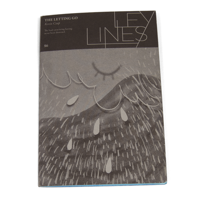
#8 (August 2016): The Letting Go, by Kevin Czap. Czap's contribution to this series fits in with the others in that it's very much about the sublime. The way they get there, however, is quite different, as the story builds on Dutch conceptual/performance artist Bas Jan Ader's last work, In Search of the Miraculous. That work was a trip via boat across the Atlantic Ocean, and the artist did not survive the trip. Interestingly, the work was a reference to a book of the same title by P.D. Ouspensky, based on the teachings of the thinker George Gurdjieff and a system that came to be known as the Fourth Way. The Fourth Way essentially synthesized different forms of Eastern thought and practice in a way that was deliberately non-dogmatic. All of this is relevant because Czap's unnamed narrator (depicted as a woman whose face we never see) begins the story discussing the things they need to let go. In particular, fear and control are named.
Czap connects these two feelings to desire, which of course is at the heart of Buddhism as the cause of all suffering. This comic is a snug fit with Futchi Perf because of the way Czap describes a kind of dynamic, propulsive and positive growth as fear and control give way to trust. The drawings are beautiful and elegant, incorporating a number of intricate decorative elements while still remaining entirely clear as individual compositions. Czap makes a lot of allusions to the ocean, of discarding things in it, as well as storms at sea that are barely survived. After the gentle quality of the first several pages, the end is a harrowing journey, with the text blowing up in size and dominating the page and the images carved up by the small grid that's appeared on each page. Unlike Ader, Czap's character makes it to shore, thanks to unyielding support.


