I was cleaning out the basement and came across a box marked "mini-comics 2009." If you're a collector of mini-comics you might have a box like this: a misshaped, pathetic looking box that gets kicked around from place to place. Something in stark contrast to the sturdy white longboxes for standard-sized American comic books. Anyways, I looked through the box and I realized much of it was booty from the last time I went to APE in 2009. And the rest of what was in the box seems to be stuff that was pre-2009, stuff I liked and kept instead of donating to Copacetic Comics.
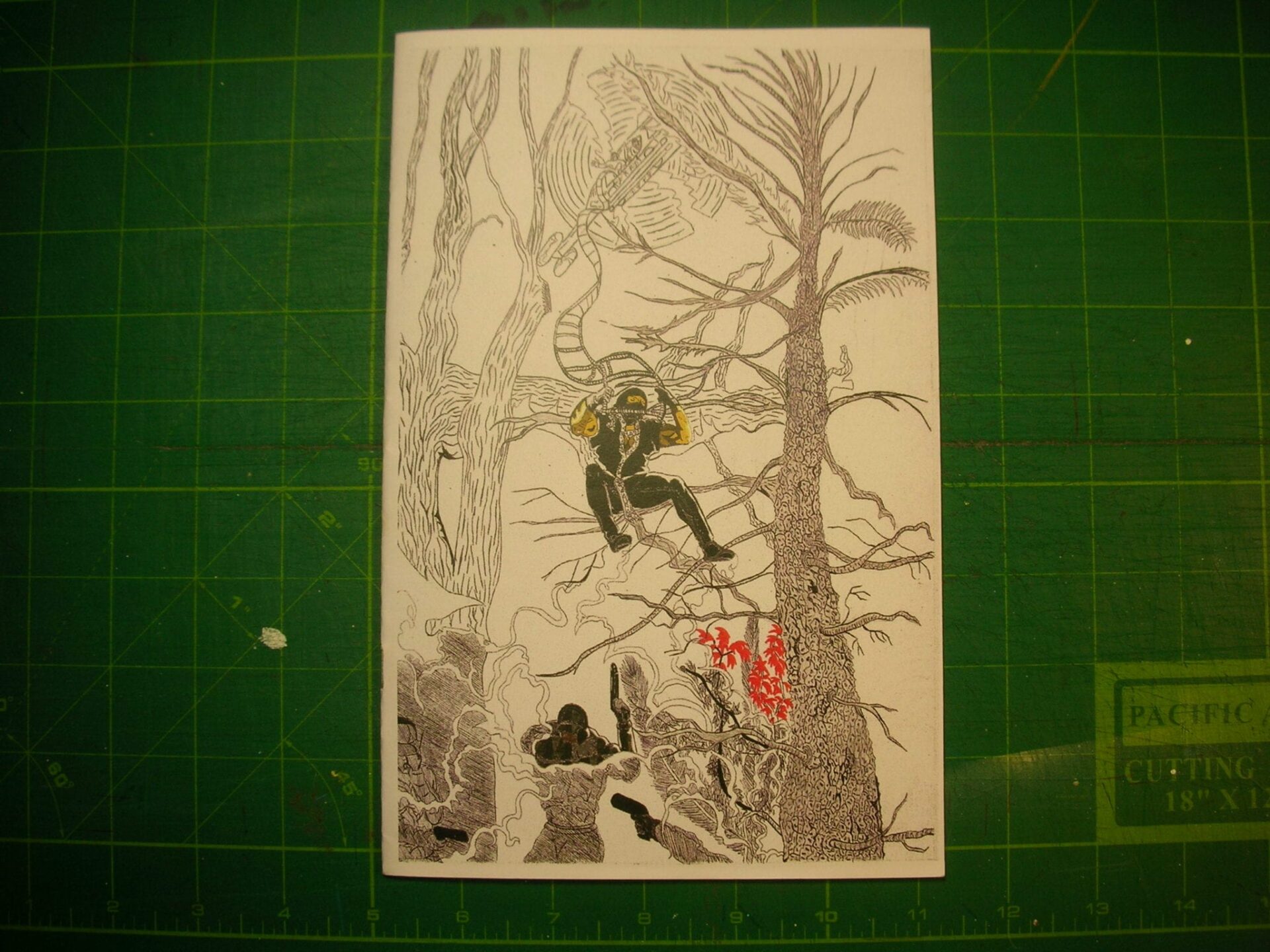
Back in 2009 at APE, I was walking around checking out different tables. George Mensah was set up there at that show and he was selling his comic called Swords and Balance. George seemed like the kind of guy who just loved genre action comics and his own work was an interpretation of genre. I like the coloring technique. All the patterns and mark making on the color layer creates an interesting tension with the linework. I feel like he gets a lot of depth and texture without using simple color fills.
I couldn't find any information about him online. I'm not sure if he's still publishing his own comics.
George Mensah - Swords and Balance #9 -2008/2009
==========================

=============================================
======================================

================================================
================================================
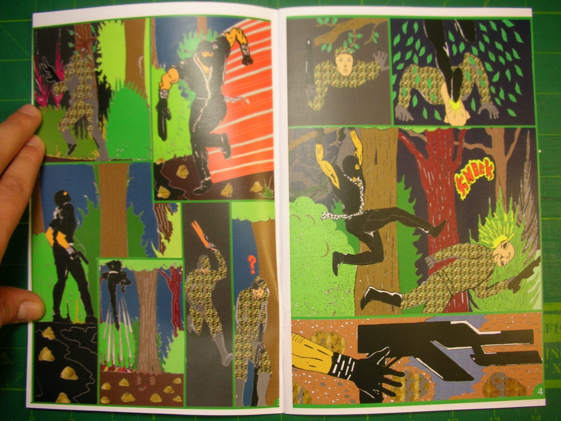
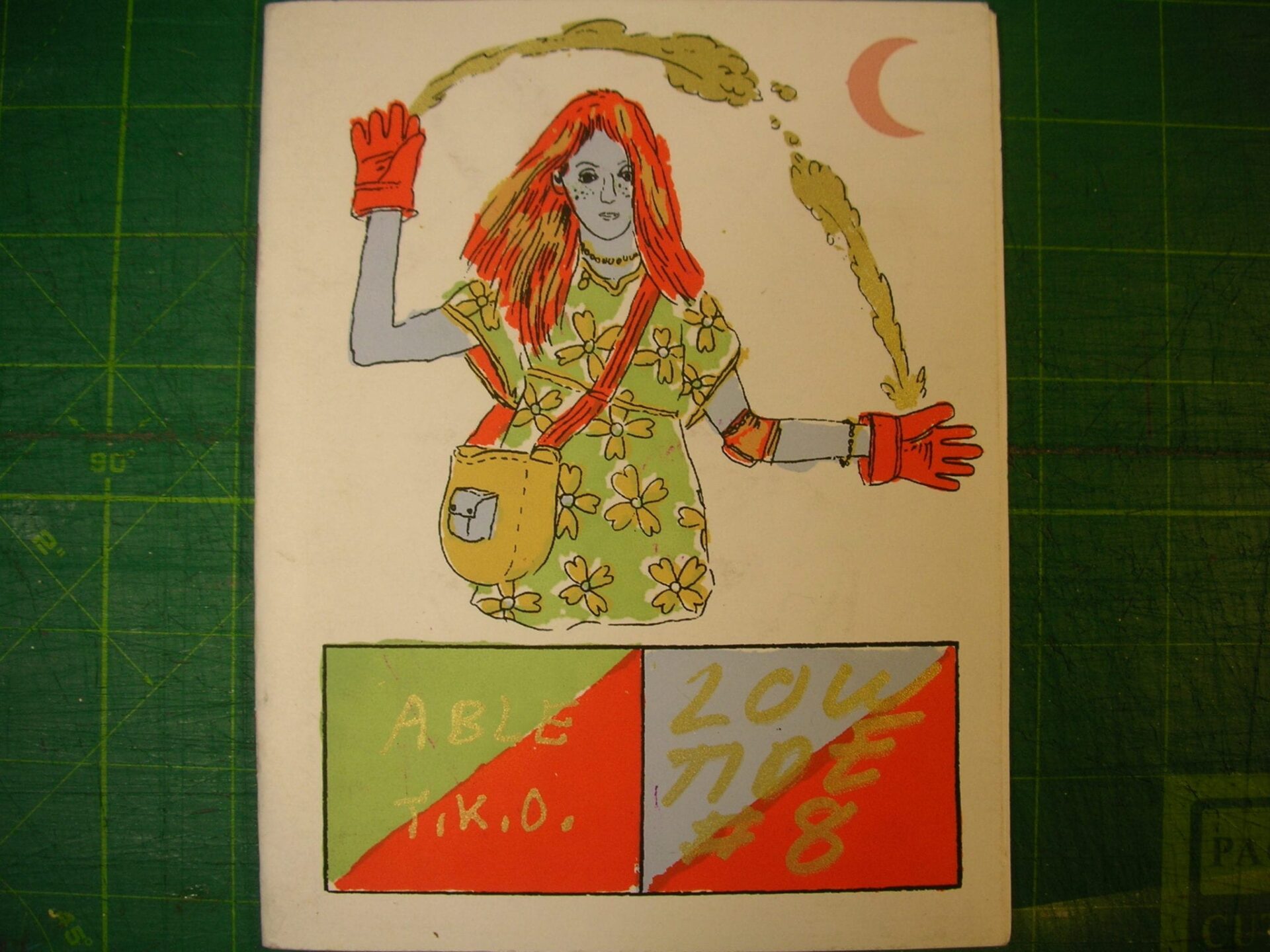
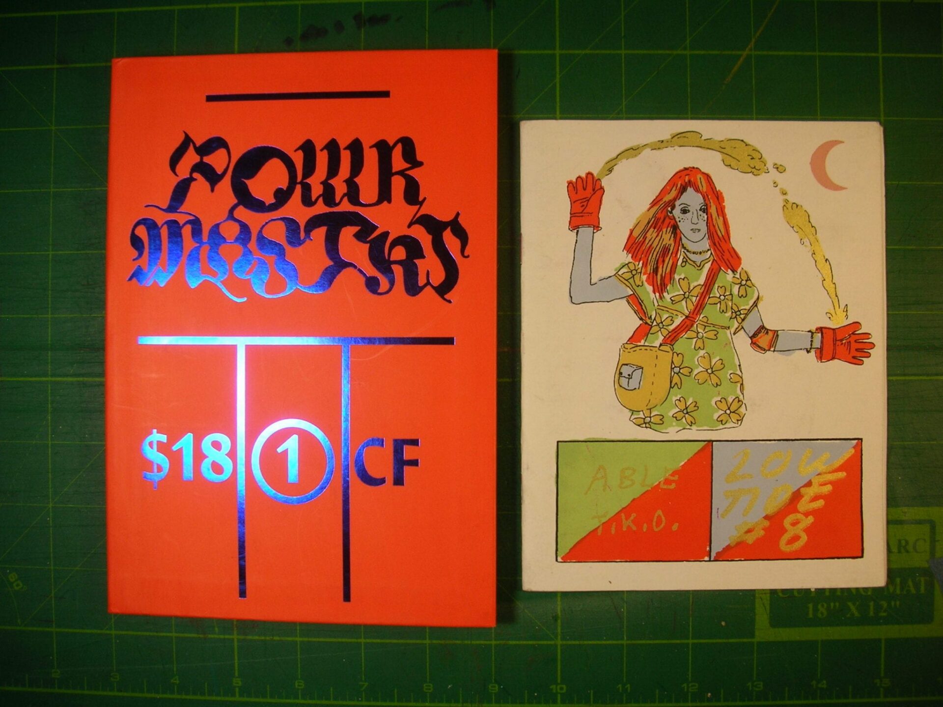
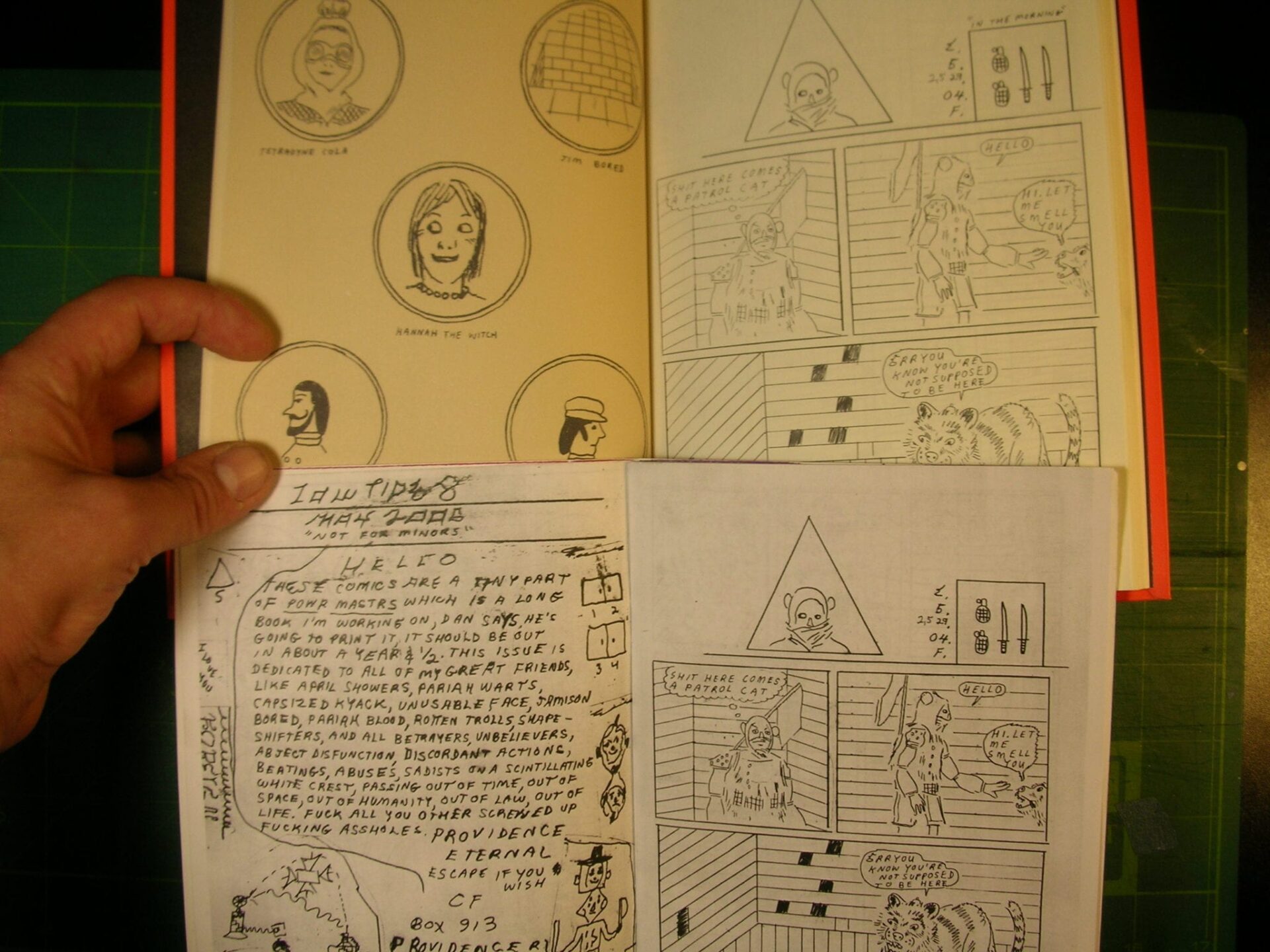
Here's Lowtide #8 - a CF zine from May 2006. It's the first chapter of what would be republished as Powr Mstrs #1 in 2007. I like comparing the two formats. I like how the Lowtide was squarer and Powr Mstrs skinnier. Christopher draws his originals at 8.25 x 11 inches on copy paper. So to me it's interesting to notice the wider margins in the skinnier format. I wrote about this once before here.
===============
==============
=============
I like how the cover became the title page.

===================
I also like how the cast of characters pages changed.

============================================
And the way it opens in the Powr Mstrs version - the circles across from the squares instead of the indicia. And lastly, check out how dark the pencil lines are in the Lowtide version.
=================
==================================
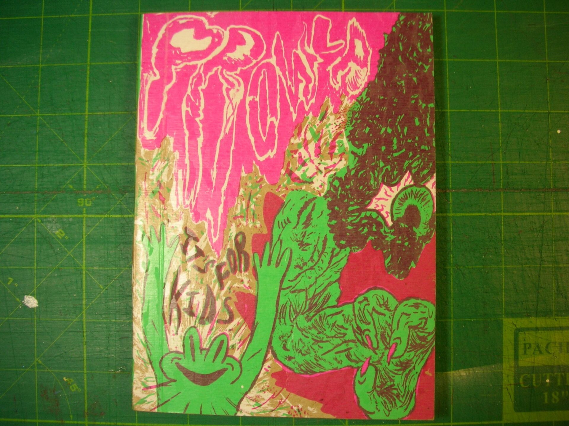
Noel Friebert - Prowla - 2008
It's a 5.5 x 7.5 inch silkscreened comic book on heavy brown paper cardstock. I like the colors and the presentation. The comic itself is a simple, almost storybook tale about a big head lording over a yard amongst the vegetation.
========================
Noel was a big fan then of what Brian Chippendale calls the "pudding school" of comics. Everything just slides all over the place and sometimes it's a little messy. Readable - but messy.

========================
Here's the big head.

====================
It's a cut out. A pop-up book type spread. The Prowla monster head eats the kid hanging out in the yard.
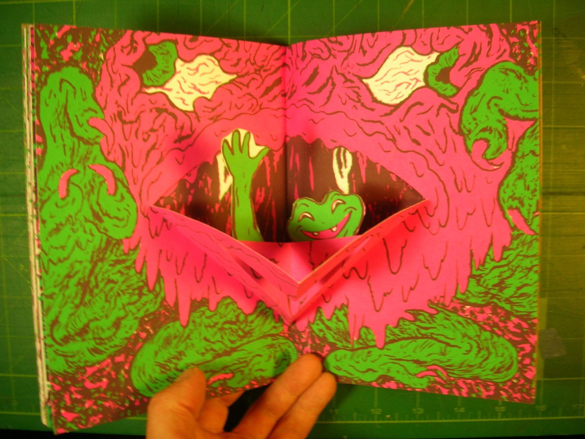
I liked this comic when it came out in 2008. Noel had only been on my radar for a year or so then. At the time he seemed to be really focused on making elaborate color books. He made some black and white comics back then but honestly I didn't really like his work in black and white so much. The drawing style didn't seem to work as well when it wasn't all-over-crazy color. I think the color sort of propped up some of the weaknesses in Noel's drawing.
=============
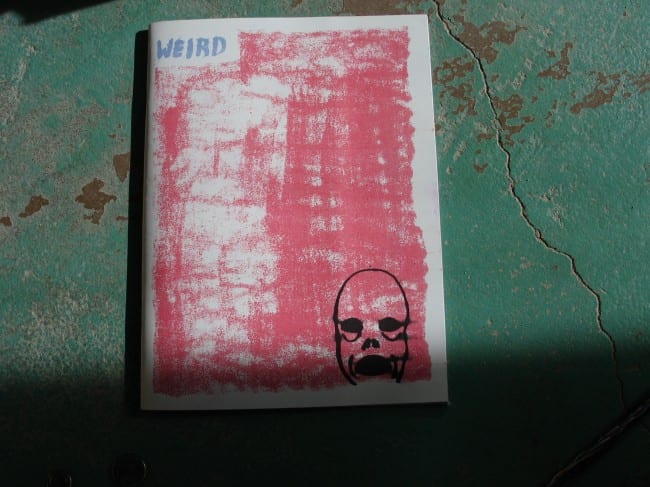
And then over the years, Noel became a better draftsman. He stuck at it. He tried new things, new approaches to making less elaborate and more stripped down comics. He honestly won me over from "this guy is kinda good" type of fan to a "holy shit, this guy is awesome" type of a fan. And I gotta admit, it was his choice to move away from the "pudding school" of comic book layouts. Have you seen Weird?
=====================
This is from 2012.

Noel said in an interview (with Sean Collins here on TCJ) that he was drawn toward using a grid, that "It allowed me to spend less time thinking about making a certain panel larger than the others. I could free myself up and focus on crafting a coherent story. Also I felt like I wanted to make comics that appeared to be 'straight' or 'normal.' I wanted to teach myself what making 'real comics' was like. I wanted to be able to make work where having abnormal grids would really mean something. I pared it all down to the basics so that if I chose to do something in the grid that strayed from the norm, it would have an impact."
He also said, "When I worked at [an art] museum I read a lot of Tintin, and that sparked an interest in using 12-panel grids. It’s interesting for me because every page has double the panel count compared to six panels, and it allows me to spread moments out and/or pack information in."
What I appreciate about Noel is how he played around with formats and drawing approaches for years before he seemed to “level up” to being a veteran comics maker. The small press circuit is, well, small and I have seen a lot of folks who have had very promising beginnings making comics – but then they sort of just disappear. It’s like sports in a way. You practice your whole life and then start playing in different leagues. Soon you’re playing semi-professionally, or even professionally. Making some money. Not much, but some. You hit some home runs, get a couple notices in the paper. A solid rookie. You worked your butt off to get this far, but then - how good are you? How long are you gonna stay here? Are you gonna improve or get worse? Show us something. Show the fans something. At least, that's how my mind works. So, it's refreshing to see someone like Noel go from promising new talent to veteran hit maker in the last five years.


