
Urban Decay #0 (ashcan edition) and Urban Decay #1
cover by Mark Texeria, 1994
Here's something you don't see too much of in the back issue boxes: a full-size black-and-white "ashcan" edition of a comic book with a color cover that's the same size as the "real" version of the same full-color comic.
First - what's an "ashcan" edition? It's usually a black-and-white version of a color comic book. It was a way of getting pre-orders for the direct market, and, of course, a simple way of showing the work to distributors and stores and fans before the book went to print and was delivered a few months later. Many "ashcan" editions are also reduced, like a mini-comic or a zine. They can also be just cheaper black-and-white xerox versions of more expensive black-and-white offset jobs. The ashcan was the lo-res pdf of its day.
So, it's a little uncommon to find a full-size ashcan edition of a regular-sized comic book with a color cover. What's also interesting about Urban Decay is that it's from the early '90s, so it is from the dawn of digital color, typeface, etc. It's right on the borderline when the drab newsprint black-and-white explosion comics morphed into slick paper color comic books. The cover stocks and paper stocks on ashcan Urban Decay #0 and regular #1 are different - one feels like it's from the '80s and the other feels like it's from the '90s. It's a perfect example for me of this transition period in independent American comics when the process went from analog to digital.
-------
Ashcan edition (below) with interior art by the Justice Bros.

--------------
color edition (below) and same Justice Bros art colored by James Widmark with color separations by Chromatrix.

--------------------
page 1 comparison - check out how the typeface changes

-------------
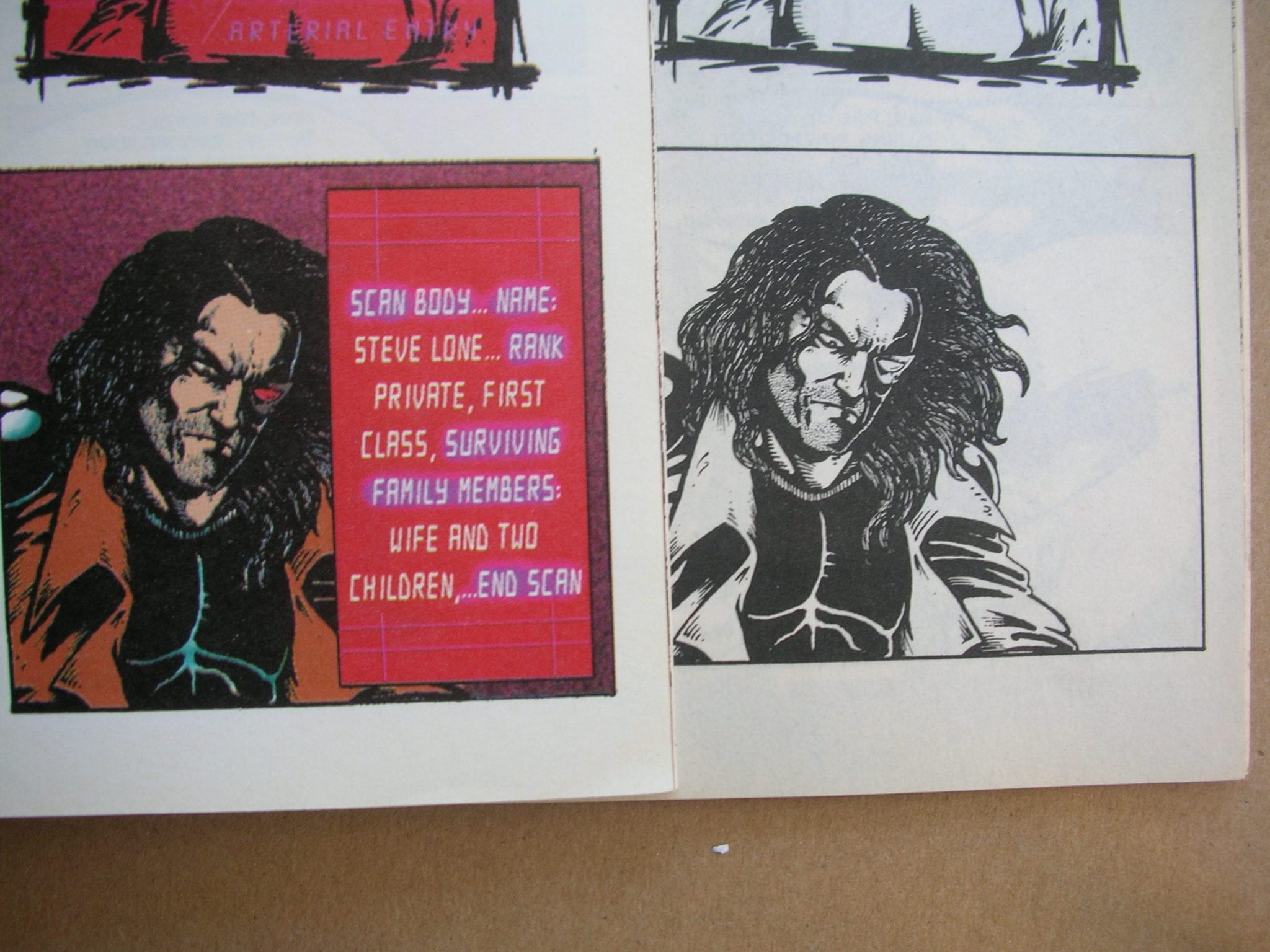
I like to think about how the art here is created first in black and white and then colored over digitally. It's like spray-painting over the top of black marker - there is this haze of color with black underneath. Look at the image below. Nowadays the lines of the hands and the lines of the pulsing energy could be changed digitally to a color - and you could remove that dark color underneath. The lines have been blown out with white, but there is still the black line art underneath. The art isn't really created for color. Look at the pulsing energy lightning bolts in the black-and-white version. You could remove the black lines and you did this back in the early '90s with a hand separation process but it was complicated. And of course you could have done it digitally but it was, again, complicated. The look of painted over black-and-white comics with lots of heavy black spotting was (and still is) very common.

------------------
---------------

--------------
I like the different indicia pages. The ashcan edition (below left) is basically just a shout-out list. But the regular edition (below right) has a pumped-up intro about how long the publishing company has been in business - "approximately one and a half years" - and a thank you to all who have supported the company from the time they began "about 1 year and 6 months ago".

------------------
different back covers, ashcan on the left, regular edition on the right (below)

-----------------
This is my favorite coloring bit:

--------------
I like the additions of the digital text (below)
---------------
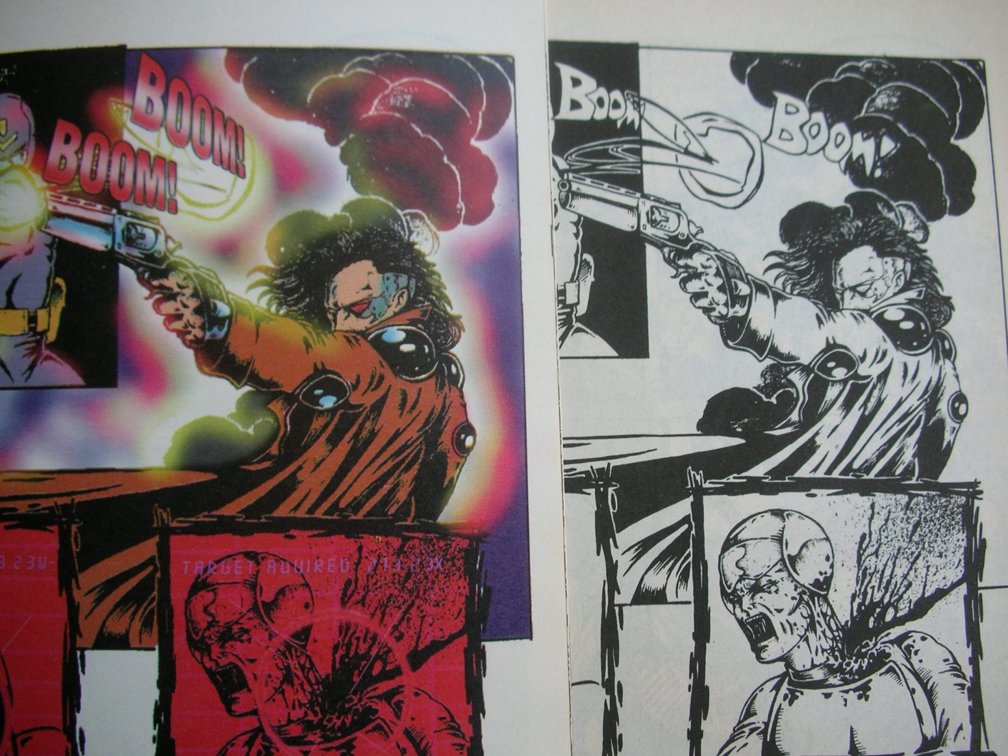
and the new sound effects (below):
=============================
==============================
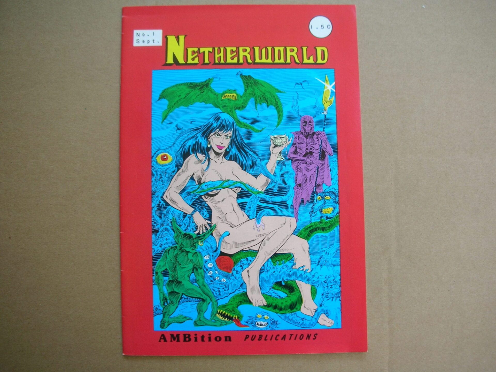
Ok, moving on. Here's a wacky comic from 1986 called Netherworld. If this comic came out today, I would buy it. Story and art by Alan M. Baker.
----------------
This is one of those pain-in-the-ass comics that doesn't fit into the regular comics box because it's too tall and wide. It's closer in size to a comic book from the 1950s. I'm comparing widths (below), not height. It's not a big deal but then this comic gets put into the magazine box and gets lost in the shuffle. One of my secret Cold Heat inspirational material sources so I'd hate to lose it.

---------------

---------------

-------------------

-----------------

===========================
==========================
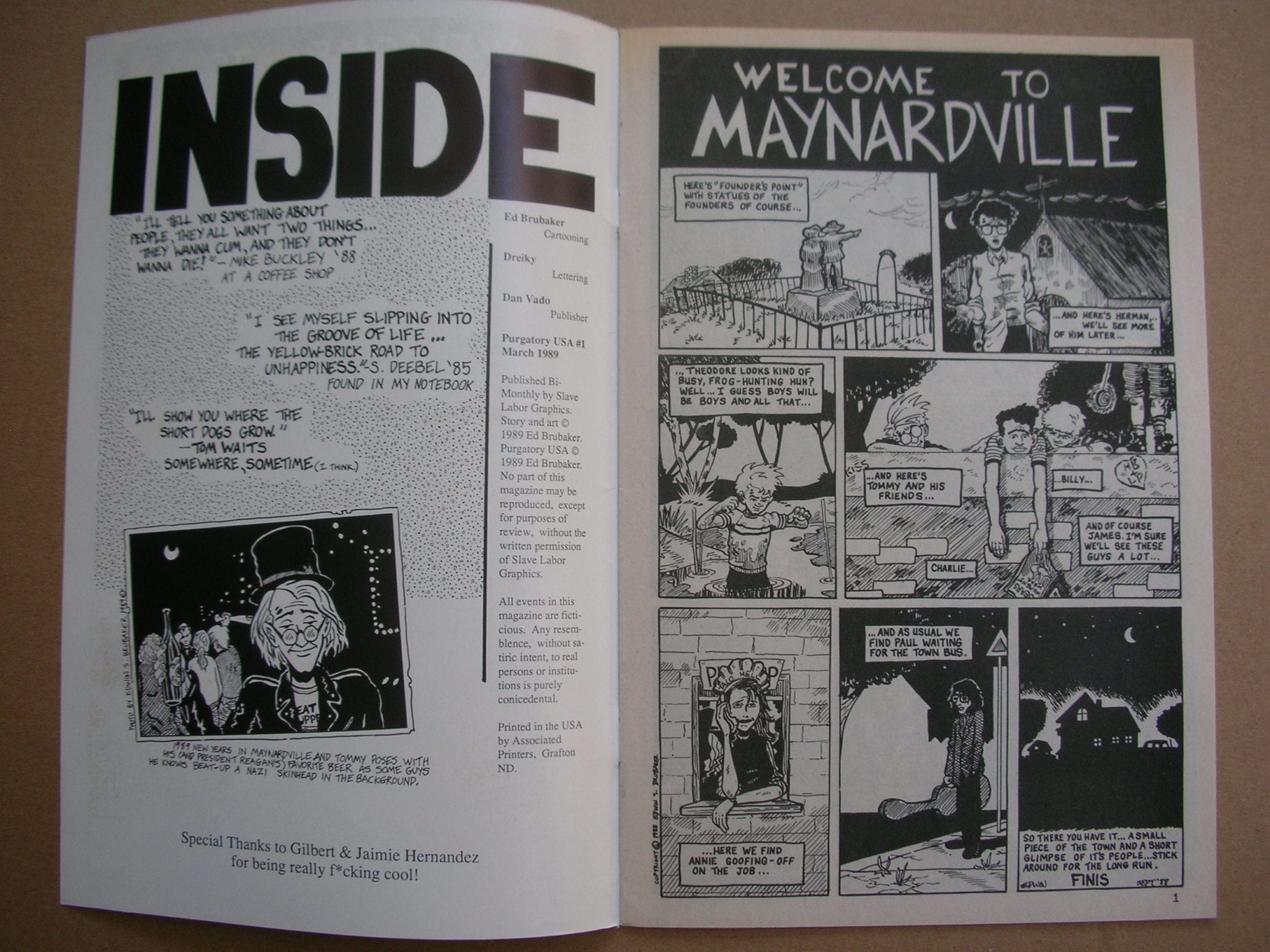
Here's another comic you don't see floating around much anymore. Early Ed Brubaker. I think maybe Brubaker tracked all the copies down and hoards them. This is when Ed had a man crush on the Hernandez Brothers (who doesn't?) and even got them to do the cover for this 1989 Slave Labor Graphics comic book (below):

-----------
Purgatory USA was the first time I ever saw Ed Brubaker's work. I remember liking the cartoony drawing. It reminded me of Gilbert Hernandez but also Archie comics and there was Chester Brown in there too - but Ed was doing his own thing even at this early stage.
-----------------
I specifically remember liking the way Brubaker did interior narrative and placed the words throughout the pages. Reading this comic again 24 years later I still think this is Brubaker's real strength as an artist: his timing. I like this sequence (below).

---------------
I like this splash page (below) - check out the Beto influence. I think the Beto and Chester influence in Brubaker's early work is cool. I'm not trying to make a joke here. Have you ever read Lowlife? It's interesting to see Brubaker change as he was making this early work. It's like you saw the writer in there but weren't sure how all that was going to come out. Brubaker seemed to work through his influences and then found his own voice on the other side - he didn't try and sidestep them.

---------------

=================
=================
Thanks. Over and out.


