
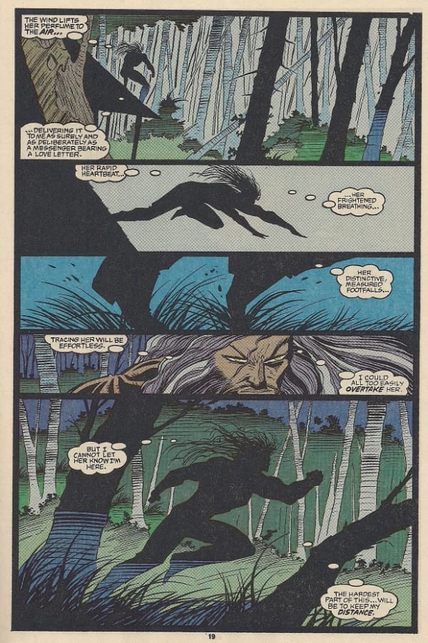
Above we see a typically curious isolated frame from artist Jae Lee, one of the most singular talents currently active in superhero comics. I mean, sure - why not include a moment of portraiture for Pa Kent and his weird hands in the midst of Batman/Superman #2, a Greg Pak-written team-up comic that would doubtlessly carry less charge if divorced from the very specific visual style Lee has devised with colorist June Chung, a simplification of the approach the duo brought to Before Watchmen: Ozymandias: figure work derived from early 20th century illustration, explicitly *posed* in and out of shadow against stylized, often sparse arrangements of background silhouettes, with frames arranged in symmetrical, circular patterns. As a result, Ozymandias was the only segment of that misbegotten project to feature art that was not only slick, or professional, but openly conversant enough with the order and symmetry favored by Alan Moore & Dave Gibbons to depart meaningfully from the original text.
As with many readers, I initially felt this approach marked a major departure from Lee's prior works, which tended to favor more photo-real figures gesturing vigorously against stage-like horizons; this itself was whittled down from the more evidently labor-intensive crowding of Lee's pages with colorist José Villarrubia in such late '90s/millennial works as Inhumans and The Sentry, which grew out of the ganglier, over-stylized musculature of Image revolution miniseries like Youngblood: Strikefile and WildC.A.T.s: Trilogy. Not unreasonably, these early '90s works are typically dismissed as fashionable juvenilia; fittingly, Lee was barely into his 20s at the time.
Yet I've recently begun to look at some even-earlier Jae Lee art, from his very first major comic book assignment: the 1990 John Byrne revamp of Namor, the Sub-Mariner, which Lee began drawing in 1992, reportedly devising his own layouts from Byrne's plot outlines, which were then scripted over by Byrne and Joey Cavalieri. The "Marvel Method," which does afford a now-unusual amount of liberty to the artist - it's one way to learn fast, and I was surprised, looking at such early work, by how many of the small techniques utilized by Lee today were in place right at the beginning.

For instance, here is a typically dialogue-choked 1992 superhero comics page, hailing from an era when readers demanded prolonged reading experiences for their $1.25, lest they be forced to venture outside and gamble pogs. The book is Namor #27, Lee's second issue. He is inked by one J. Albrecht and colored by Glynis Oliver. Note the extreme lack of detail to the blonde woman's hair; it's like a wave of steam, outlined only to the extent that the colorist may find it necessary to have *some* guidance as to where the hair ends and the black ink background begins.
Now, look at this page from Batman/Superman #2, also a sophomore issue, and Lee's most recent comic.

Despite the many obvious differences between these two approaches, to say nothing of the even-greater latitude Lee probably enjoys -- he does not have any external inker (I suspect he's not inking at all), and he's working with a longtime colorist with whom he's devised a specific visual scheme -- the hair on Lois in panels 1 and 5 functions in exactly the same manner. Indeed, this approach may actually flatter Lee's present look, which has dialed down the detail on characters' (especially women's) faces to the point where almost any suggestion of three-dimensional existence is provided by slight modifications of digital shading.
And that's when three dimensions are even on the table.

Is this the Batwing? A robot? Part of the cast of Space Invaders? Regardless, Lee trusts that the reader will respond to these slashing pikes and looping wires on a visceral level, as aspects of superhero compositions less inclined toward movement or impact as majesty, or at least some novel weirdness.

Yet careful observation of Namor reveals a similar technique, rather self-consciously allowing more 'work' to be seen down toward the treads of this destructive beastie, but otherwise arranging the none-too-realistic talons of the contraption as suggestive dangers. Typically Lee's early work is associated with the over-detailed mania of Rob Liefeld and the like, but he really tended to restrict that kind of stuff to the foregrounded figure work, otherwise maneuvering silhouettes in a manner not entirely unlike the also-developing (if more experienced) Mike Mignola.
My personal favorite Jae Lee comic would have to be 2005's Ultimate Fantastic Four #20, which is executed almost entirely in elaborate shadowplay, with only tiny dots of intense color signifying the bare minimum of orientation for character's eyes or faces. This much earlier page is considerably more detailed in terms of backgrounds, but it still codifies Lee's fascination with having characters emerge into 'detail' only when necessary, especially when engaging in vigorous activity. Such as fighting.

There is a pragmatic theory behind all of this, of course. Deservedly or not, Lee is infamous for his slow production of pages, and like the similarly-drubbed Frank Quitely, his emphasis on placing bodies in relation to one another in sparse environments -- and Lee is very much a stronger communicator of spatial relations than physical contact -- can easily be read as handing over a bunch of work to the colorist; I don't expect the original pencils for this one consisted of much more than the panel borders and a pair of Bat-smears of varying distinction. That said, I am not reading Jae Lee's original art, but instead laboring under a helpful fiction that when I refer to "Jae Lee" I am hopefully restricting myself to considerations of his drawings and layouts, with the understanding that the wholeness of the page is attributable in large part to June Chung.
Many readers, I confess, don't discern much wholeness at all. They find Lee's pages shallow, if not outright unfinished, his lack of backgrounds and his reliance on shadow evidencing little more than a man incapable of hitting timely deadlines - after all, a fill-in artist *still* had to be recruited just to get issue #1 of Batman/Superman released. Even to as sympathetic an eye as mine, I notice a grave conservatism to Lee's layouts in issue #2, all squares and rectangles again, perhaps to give him one less thing to ponder in the crunch of serialization.

Still, there are moments of fine amusement, such as this cosmic trickster peering down into the earthly affairs of Our Heroes like an especially privileged reader. It's reminiscent of J.H. Williams III's logos-as-worlds in Batwoman and the like, but Lee, somehow, evidences an earlier interest in such decorative layouts than his highly-regarded Bat-family compatriot.

You didn't see much of this in Youngblood; it looks almost P. Craig Russell. In fact, I can't recall seeing anything like this from Lee again until Before Watchmen a full twenty years later. Perhaps in concocting a newer, sleeker approach, Lee looked back to where he came from... or maybe such possibilities merely seemed again the natural choices from a toolkit built over long decades of devising solutions for assigned plots.
***
PLEASE NOTE: What follows is not a series of capsule reviews but an annotated selection of items listed by Diamond Comic Distributors for release to comic book retailers in North America on the particular Wednesday, or, in the event of a holiday or occurrence necessitating the close of UPS in a manner that would impact deliveries, Thursday, identified in the column title above. Not every listed item will necessarily arrive at every comic book retailer, in that some items may be delayed and ordered quantities will vary. I have in all likelihood not read any of the comics listed below, in that they are not yet released as of the writing of this column, nor will I necessarily read or purchase every item identified; THIS WEEK IN COMICS! reflects only what I find to be potentially interesting.
***
SPOTLIGHT PICKS!
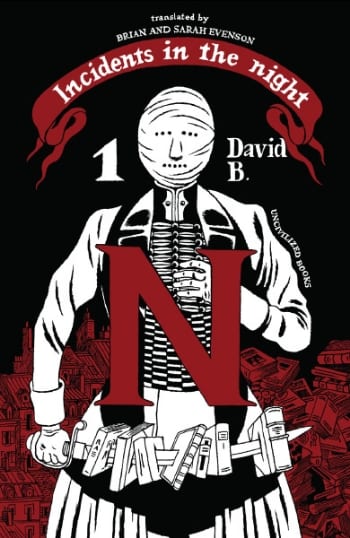
Incidents in the Night Vol. 1: It was with some consternation that I discovered Mr. Pierre-François "David" B(eauchard)'s recent Black Paths was not, anecdotally, all that well-received a book -- I speak of anecdotes because reviews on the ground tend to run thin in these circumstances -- since I'd found it to be a compelling exercise in mostly-straightforward semi-generic suspense material, one that underlined David B.'s debts to earlier European 'adult' cartoonists like Georges Pichard. That said, the chatter I'm hearing about this new 6.5” x 9.6” Uncivilized Books hardcover is very, very good indeed, possibly owing to the material itself hailing from 1999-2002, i.e. the same period in which Beauchard was finishing Epileptic. The scenario sees a fictional version of David B. haunting Paris' bookstores, only to find himself pulled into a web of historico-literary esoterica involving dreams, ghosts and Death. Note that this 112-page edition apparently does collect the entirety of the original series (as compiled in French by L'Association in 2012) - as far as I know, the 'vol. 1' reflects the artist's intent to eventually return to the subject matter. Sample; $19.95.

Kitaro: Undoubtedly your manga pick of the week, as Drawn and Quarterly embarks on the next phase of its Shigeru Mizuki reprint effort, this time rolling out the big guns. From 1965 through 1969, Mizuki cemented his reputation as a master of supernatural creature-themed yōkai manga with GeGeGe no Kitarō, a sequel of sorts to a 1959 kashihon rental manga (Hakaba no Kitarō), which itself was derived from a classic tale of the kamishibai paper theater storytellers, for whom Mizuki produced illustrations in the early days of his career; the scenario concerns a ghostly little boy who confronts bad monsters and does good deeds, and it's been revived and re-told in many forms across various mediums pretty much throughout the entirety of the artist's life. There was even an abortive attempt at translating the material to English back in 2002, when Kodansha produced three volumes' worth of the stuff for the purposes of teaching English to Japanese speakers. I suspect, however, that D&Q will supply a superior experience via this 432-page, 6.44" x 8.75" softcover, compiling the earliest of the '60s series. Introduction by yōkai expert Matt Alt, with a bonus illustrated guide to the featured creatures. Be aware, though, that a potential vol. 2 has not yet been scheduled, and that the next entry in the publisher's Mizuki series will instead begin his 1988-89 series Showa: A History of Japan 1926-1939. Preview; $24.95.
--
PLUS!
Optic Nerve #13: Aah, old-school alternative comic books. I love 'em, you love 'em, and publishers like Drawn and Quarterly... don't really love 'em, because I don't think they make any money at all, but when you've got a major dude like Adrian Tomine going "no, comic books," you answer "how many staples?" Which isn't really a good answer, granted, but these aren't real quotes anyway. SO: three complete stories in this spanking new issue, including the memoir of a immigrant wife, a slice of recent autobio, and "a dark comedy about 12-step programs, drug dealing, and minor league baseball." I am totally down for an Adrian Tomine baseball comic, no joke whatsoever. Slip this between your copies of Kick-Ass 3 and Red Lanterns tomorrow, and watch your retailer give you a big ol' wink like Clark Kent at the Fleischer Studios; $5.95.
Sammy the Mouse Book 2: And getting back to Uncivilized, here is the continuation of artist (and Journal interviewer extraordinaire) Zak Sally's former Ignatz series(!), now an all-original 104-page softcover presented in the same 6.25" x 8.25" format as the artist's 2011 compilation of the original Fantagraphics/Coconino issues - there *might* be two more volumes, as Sally has recently been describing the story as halfway completed. I've enjoyed Sammy the Mouse; it's like a glimpse into an alternate universe where Critters provided a feasible model for alternative comics, seeing assorted animal characters encounter weird religious troubles and just live the life in a fantastic, ominous city. Not to cockblock your local retailer, but be aware that Sally himself is still offering a special deal in which direct orders (solicited to help offset printing costs) will receive an exclusive two-color print (OFFER ENDS WEDNESDAY). Either way, check it out; $15.00.
Bluffton: As you all know, I am obsessed with the notion of high-profile comics that make their money and find their audience with virtually no acknowledgement or support from the comics specialist press, probably remaining completely invisible to comic book stores and the vast majority of those who would describe themselves as 'comic book readers.' As such, here is a widely-reviewed Candlewick Press release of a 240-page color graphic novel by accomplished children's book illustrator and bookstore market YA comics author Matt Phelan -- an earlier project, Around the World, was nominated for the Eisner for Best Publication for Young Adults last year -- concerning real and fictional events from the great Buster Keaton's youthful summers in Muskegon, Michigan, as seen through the eyes of a local boy. Given that my Twitter handle is "snubpollard," I cannot help but highlight this work sight unseen; $22.99.
[a steamin' hot slew of 2000 AD releases:]
Specifically,
Judge Dredd: The Complete Case Files Vol. 20 ($32.99)
Judge Dredd: Fatties ($19.99)
ABC Warriors: The Volgan War Vol. 3 (of 4) ($21.99)
Two of these are Rebellion imports Diamond just happens to be getting in. Case Files 20 continues the publisher's semi-comprehensive Dredd reprint scheme by pushing into 1994 with 320 more pages, covering a lot of admired John Wagner-written stuff from Judge Dredd Megazine (including the famous Bury My Knee at Wounded Heart), as well as a cache of very much unadmired Grant Morrison/Mark Millar content from 2kAD itself, with a smattering of other writers, such as John Smith. Volgan War 3 is a new softcover edition for one particular segment of a long storyline for Pat Mills' robot fighters, illustrated by Clint Langley in his reliably divisive neo foto-funnies style. And Fatties is as a UK/US simultaneous release -- handled stateside by Simon & Schuster -- collecting 144 pages of Judge Dredd stories concerning the largest threats to justice around, as drawn by Carlos Ezquerra, Mike McMahon, Cam Kennedy and others. Yes, it's an entire action comic making fun of enormously obese people. Eat healthy, citizens!
Batman Incorporated #13: It's kind of difficult for me to believe that Grant Morrison has been writing Batman comics steadily for close to seven years (don't ask me for a full accounting, but I think his cumulative stock of issues must rival Alan Grant's by now), and I think that's because his tenure is easily divisible into distinct phases, typically demarcated by the title of the series: Batman, Batman and Robin, Batman Incorporated. And while this may be the desperate, gasping-for-air contemporary standards of DC today talking, it's my opinion that this final stretch of issues -- which is to say the 2011 one-shot Batman: The Return, the eight pre-reboot issues of Batman Incorporated, the 2012 Leviathan Strikes! special, and these fourteen post-reboot issues (remember #0!) -- has been the strongest of the whole run, no doubt aided by the continuous presence of artist Chris Burnham, ably demonstrating that maybe 1990s throwback muscle art *wasn't* the best means of communicating Morrison's subtler intent after all. Anyway, this is the spellbinding conclusion to the whole goddamned thing, save for a tribute anthology Special next month in which I don't believe Morrison himself is participating, as he is no doubt busy with his upcoming Wonder Woman and Multiversity projects; $3.99.
Tom Strong and the Planet of Peril #1 (of 6): Of course, nothing ever really ends with superhero publishers, as demonstrated by this rarest of birds - an Alan Moore-derived DC series produced with (maybe) Moore's (tacit) approval (I think) (possibly). Specifically, it's a new galaxy-spanning outing for science hero Tom Strong, written by Moore's favored successor Peter Hogan, and pencilled by co-creator Chris Sprouse, with Karl Story on inks as always. Now officially a Vertigo series, in case you were wondering. Preview; $2.99.
Capote in Kansas: Speaking of superhero artists well-appreciated today for their clean look, Tom Spurgeon recently dubbed Chris Samnee (currently of Mark Waid's Daredevil) "one of the more interesting artists in mainstream comics," an opinion shared by not a few on the scene. Here's a new hardcover Oni Press printing of his breakthrough work, a 2006 historical fiction/crime drama graphic novel written by Ande Parks, 144 pages in b&w; $19.99.
3 Guns #1 (of 6): And speaking of criminal returns, here is the latest crooked piece from genre specialist (and former Journal columnist) Steven Grant, following up his 2007 2 Guns, a motion picture adaptation of which is scheduled to open wide this weekend. Art by Rafael Albuquerque, published by Boom! Grant has recently been posting essays on comics-as-movies here; $3.99.
Edgar Rice Burroughs' Tarzan: The Sunday Comics Vol. 1 - 1931-1933: Reprints! Golden Age! How about a 15" x 20" Dark Horse hardcover packing in the first two years of Hal Foster's pre-Prince Valiant run on the jungle Sunday? I bet you'd like that, Richie Rich! Preview; $125.00.
Superman: The Silver Age Dailies Vol. 1 - 1959-1961: Reprints! Silver Age! I mean the superhero Ages now! That's not a qualitative statement! I think Bill Finger wrote some of these, along with Jerry Siegel and Jack Schiff and others. Publisher IDW promises art by Curt Swan and Wayne Boring too, across 288 pages in their Library of American Comics format; $49.99.
Black Bolt: Something Inhuman This Way Comes..!: Uh, less fancy reprints! I don't know enough about current Marvel continuity to gauge the reasoning behind this thick comic book of vintage Inhumans material -- usually there's some kind of tie-in, as with the surprise Steve Ditko Captain Universe compilation that dropped last month -- but Neal Adams is the penciller for most of it, with additional art by Mike Sekowsky and scripts by Roy Thomas and Gerry Conway. That's The Avengers #95 and relevant portions of Amazing Adventures #5-10; $7.99.
Age of Bronze Vol. 3.B: Betrayal Part 2: Perhaps it's easier not to look very closely at the numbering, and simply trust that this Image softcover collects issues #27-33 (so, everything recent, right up to the present) of Eric Shanower's very handsome Trojan War saga; $18.99.
Mark Schultz: Carbon: Also in "handsome," this is the newest among many Mark Schultz releases from Flesk Publications -- the same publisher also has a new printing of its all-in-one edition of the artist's Xenozoic Tales this week -- a 56 page, 9" x 12" collection of new illustrations, b&w and color, along with an essay on working with paleontologists to accurately assess the appearance of a newly-discovered dinosaur. Obviously, there is an enduring interest in this artist's work; $24.95.
Walt Disney's Mickey Mouse Tales: Another not-quite-a-comic for your end-of-July week - an 80-page, 8.75" x 12.25" hardcover, compiling a decade's worth of one-page illustrated poetry(!) adaptations of classic Disney cartoons from the pages of Good Housekeeping, featuring original painted illustrations by Tom Wood and others. I think Gemstone last released this material in 2005 under the title Mickey and the Gang: Classic Stories in Verse, but now the publisher is Rizzoli New York's Universe; $19.95.
Worlds of Sam Kieth Vol. 1: And finally -- since I no longer have President Shima Kōsaku to provide a ready-made excuse for falling to my knees and thanking you all for putting up with this -- I'll try and put a bow on the week by clarifying that while Namor, the Sub-Mariner was Jae Lee's first *major* comics gig, his actual professional debut came by way of completing an unfinished Rob Liefeld serial across eight issues of Marvel Comics Presents (#85-92); this material ran in 1991, at the same time Sam Kieth had begun what would become something of a star turn on that anthology, which would continue basically right up to the debut of The Maxx at Image. But while Kieth has kept one foot in the comic book waters, he's also known to have spent a good deal of his recent time exploring standalone illustrations and abstract painting, some examples of which were published by IDW in its short-lived Sam Kieth: The Sketch Books series back in '10. Now the same publisher brings a 256-page, 8.75" x 11.5" hardcover showcase of heretofore unseen pieces, encompassing paintings, drawings and photographs. I plan to arrange my copies of Fantagraphics' old I Before E compilations in a ceremonial manner before I partake, and I suggest you do the same; $49.99.
--
CONFLICT OF INTEREST RESERVOIR: Speak of the devil! Ben Catmull had a really fun comic book titled Monster Parade out a few years ago (it's now a serial at Study Group), and Ghosts and Ruins is his official Fantagraphics follow-up, an 84-page landscape-format hardcover wedding new illustrations of haunted houses to creepy blisters of background and trivia; $22.99. But readers Adrian Tomine has left panting for MORE SPORTS, MORE SPORTS will also be served, as Willard Mullin's Golden Age of Baseball: Drawings 1934-1972 presents 240 pages of vintage work from the man of the title, edited by Hal Bock & Michael Powers; $29.99.


