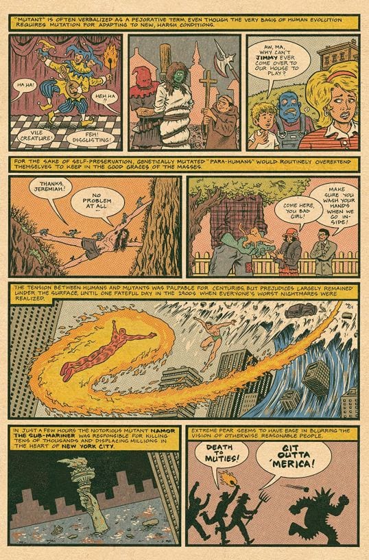
The “comic-book movie” is perhaps our most significant form of mass entertainment. Superhero movies generate fan obsession, extensive media coverage, lots of think pieces, and tons of money. The comic book itself — a humble medium of ink, paper, and staples — has fared less well. Once the home of million-selling issues featuring an array of realistic and fantasy genres, it now serves mainly as an antiquated delivery system for formulaic tales about super-beings read by a dwindling audience of devotees.
When compared to its film offspring, the superhero comic book, though certainly not dead, feels a little exhausted. Writers and artists fight with the genre’s core clichés, unsure how to play things: serious and relevant (superheroes, they say, are essential myths for our time), or cutesy and comedic (if the genre is tired, let’s just have some fun with it!). Visually, the superhero comic has been struggling against its format for decades, but never more so than now. Many artists suffer from “film envy”: though confined to little boxes on small pages, they try (and inevitably fail) to capture big-screen-style drama. With limited distribution, weak sales, and the growing possibility that a comic may lead to a lucrative TV or movie deal, the safe bet is on the familiar: crank out another high-drama fable, reboot or revive a character, rewrite a classic, etc., etc.
Satisfied with narrative, visual, and verbal tropes stale since the early 1960s, most superhero comics have no interest in testing the genre’s boundaries. But several writers, artists, and cartoonists — some working for corporations and some independently — are self-consciously breaking from the past. They twist standard plots, reimagine superhero visuals by way of an underground aesthetic, embrace new kinds of characters, or blend genres in strange ways. In the midst of so much aggressive mediocrity, their work offers hope for a troubled genre.
***
Flash #35 (DC Comics, 2018)
Dozens of artistically unadventurous superhero comics like Flash #35 go on sale at America’s comic-book shops each Wednesday. Exemplifying problems that plague the genre, Flash #35 relies on very conventional hero vs. villain fight scenes, bombastic dialogue about profound subjects shouted mid-battle, and art that overflows with chaotic lines, shapes, and gestures. This troublesome density competes with the colorist’s use of near-indistinct, often dark tones, further decreasing legibility by blurring distinctions between a panel’s foreground characters and background details. Perhaps this overload wants to function, not realistically, but symbolically, communicating an atmosphere of “intense action.”
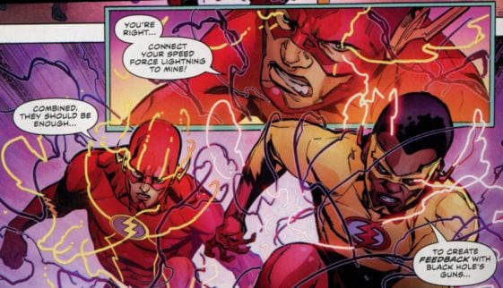
But it ends up communicating very little. Featuring overwrought visuals that resemble videogame stills rather than narrative drawings, many comics yearn to be big-budget special-effects “experiences,” not the ink-on-paper, non-motion pictures with words they are.

Ominous Press (From ominouspress.com, 2018)
 Literal and figurative explosions abound in superhero comics (in Flash #35, for example), making the explosion perhaps this decade’s dominate visual trope. Even when something’s not actually blowing up, the art often tries to simulate it. This promotional image from superhero publisher Ominous Press may be the trope’s apotheosis. Its “explosive” chaos is tough, if not impossible, to decipher.
Mister Miracle #1-4 (DC Comics, 2017)
These four issues acknowledge the superhero comic’s pressing need to innovate by rejecting standard plot formulas. Writer Tom King inverts the approach of comics like Flash #35 and its ilk: the non-stop action comic becomes the negligible-action comic. In well-drawn art arranged in old-fashioned, easy-to-follow grids, Mister Miracle and his super-friends talk about his depression and suicidal thoughts while receiving updates on a galactic battle raging off the page. The comic’s conceit, though admirable, is taken far too far: minimal action can be just as wearying as maximum action. (Taking good ideas too far is the hallmark of our comic-book era.) Though these issues contain a few fight scenes, their static design and opaque coloring mute the effect; the moments don’t really register as different from what’s before and after them. Somewhere in Mister Miracle is a forward-thinking comic. But lacking a sense of visual rhythm and narrative pacing, the story stalls on the page.
I felt like I was waiting for something that never arrived — and the comic’s mis-timed jokes and cheeky, out-of-place throw-back narration (“Hold it, dear reader, we’re not done with you yet!”) provided little relief. I held on for four issues, but after paying $16 for 16 minutes of reading I was done.
Black Hammer #13 (Dark Horse Comics, 2017)
In this issue’s letter column, a reader expresses his frustration with the series’ pacing: “the action needs to be ratcheted up. . . . action is in my comic book DNA.” The editor assures him that future issues will meet his needs. But it’s in part the limited action that makes this series entertaining. Though it takes super-heroics seriously — a risky move that often means simplistic good vs. evil plots and the veneration of vigilante “heroes” — writer Jeff Lemire continually underplays his hand. In several slowly unravelling mysteries, he develops an eclectic cast of human, superhuman, and fantasy characters.
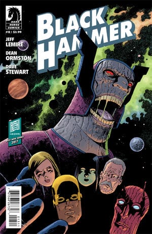
With a family of superheroes who act unusually every-day, Black Hammer avoids another embarrassing caped crusader cliché: the BDSM-esque costumes of comics like Flash #35 and countless others, spandex outfits that barely restrain bulging muscles and ballooning breasts. Though rated “T” on the cover for “Teen,” many superhero comics somehow manage to look like chaste porn. Along with action and fights, libidinal energy is in the superhero comic’s DNA — it’s just covered up, redirected. Black Hammer thankfully ratchets down this erotic push and pull in favor of well-paced, intelligent storytelling.
Doomsday Clock #1 (DC Comics, 2018)
In this age of low sales, maximizing profit drives corporate comics. To exploit the collector’s syndrome known as “completist anxiety” and boost the bottom line, comic-book issues are sometimes sold in multiple versions, each with a different “variant cover.” Doomsday Clock #1 (which has seven cover options, each at $4.99) is the latest offering in DC’s attempt to monetize Alan Moore and Dave Gibbon’s celebrated 1986 graphic novel Watchmen, a comic that for decades after its release was respectfully (and shockingly) left alone, without prequels or sequels. Sadly, Doomsday #1 reads like an ill-considered Watchmen variant.
Moore’s labyrinthine writing and wide-ranging political concerns (American paranoia, Reagan-era politics, superheroes’ fascistic appeal) require great clarity to work, but writer Geoff Johns and his team have few literary-visual aspirations. At times, it appears as if Johns is trying to one-up Moore, confronting the elder’s status as arguably the best writer in mainstream comic’s history; Johns plays usurper by rewriting (unsuccessfully) several parts of the original, such as the famous opening monologue of Moore’s anti-hero Rorschach. The art also reads like a hostile parody, an over-rendered version of Dave Gibbons’ attractive, clear take on a 1970s DC house style. Making things even less legible, Doomsday reimagines John Higgins’s peculiar and unexpectedly bright original coloring as a slog of dense and muddy shades.
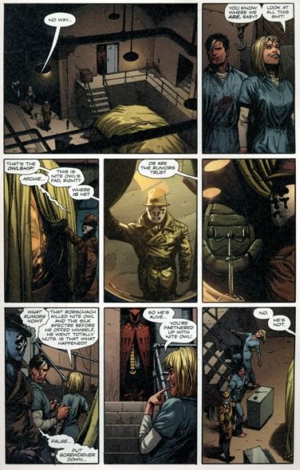
Though I’m not one of the many who venerate Watchmen as a “sequential art” masterpiece, if one wanted to demonstrate its greatness, a comparison with Doomsday Clock might offer compelling proof.
X-Men Grand Design #1 -#2 (Marvel Comics, 2018)
Hip Hop Family Tree cartoonist Ed Piskor takes on a decades-long superhero soap opera that fascinated him as a young cartoonist in the making: the sprawling saga of Marvel’s X-Men, which unfolded over hundreds of comic-book issues. There’s no agon with the source material here, as there is in Doomsday Clock. The joy in Piskor’s comic is the art (he draw hundreds of famous and obscure Marvel characters) and his compact restaging of original scenes. Piskor reduces complicated plots to sequences of a few pages or less, maintaining a sense of adventure but draining out the Marvel Macho Melodrama that burdens the source comics. Although Grand Design occasionally comes across as a little rushed — like a pop singer’s greatest hits medley — this approach shows how entertaining the Marvel Universe can be when drawn (as it rarely is) with a light, even cute touch and sense of humor.
Piskor never struggles against the comic-book format’s size limitations, avoiding the trend toward motion picture-like visuals. Grand Design is comfortable and assured cartoony cartooning.
All Time Comics: Blind Justice #2 (Fantagraphics, 2018)
Some critics dismiss comic books in the All Time Comics line as exercises in fannish nostalgia, mere imitations of late-twentieth-century superhero comics. If they’re nostalgic, though, it’s not for that era’s popular comics but for its esoterica, things like weird back-up features starring third-tier characters drawn by obscure artists. A perfect counterpoint to current superhero comics, Blind Justice #2 imports an underground-y aesthetic into the types of “heroic” narratives that dominate what was once called “above-ground comics.”

This issue’s art is the product of an unusual and inspired team-up, one that brings together the worlds of art comics and mainstream comics: the casual, almost folksy drawings of alternative cartoonist Noah Van Sciver; the bold inking of Marvel veteran Al Milgrom; the odd, over-the-top color palettes of Paul Lyon and Jason T. Miles; the refreshingly old-school hand-lettering of Rick Parker (another Marvel veteran); and a striking cover by cartoonist and Kramers Ergot editor Sammy Harkham.
Though released by a publisher known for alternative/art comics, the line’s comics are not parodies, nor are they meta-commentaries on superhero tropes, two currently popular superhero sub-genres. Their plots unapologetically rely on stock confrontations between gaudily costumed heroes and villains. Crucially, however, they lack the moral earnestness, the inflated “Seriousness” of comics like Flash #35 and Doomsday Clock. All Time Comics reinvigorate superheroes by making them a little peculiar and almost a little funny, just as Ed Piskor’s Grand Design does for X-Men stories. While recent comics like Action #1000 (with eight variant covers at $7.99 each) celebrate superheroes as moral examples for Americans young and old, Blind Justice wants nothing to do with our world. It’s content to be an escapist comic book.
Shade The Changing Woman #1-2 (DC Comics, 2018)
In every way but one, this is a strong comic book. It features imaginative plots and subplots, interesting characters, stylish art, a playful approach to comics form, unusual fluorescent coloring, and interesting pop-art special effects:
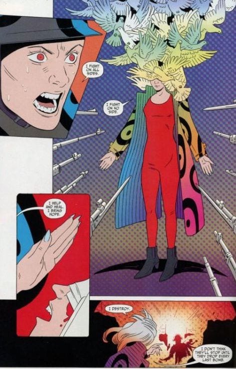
The problem lies solely with some of its text. Characters, especially the lead, make a lot of ostensibly profound pronouncements on big themes, especially life and love:
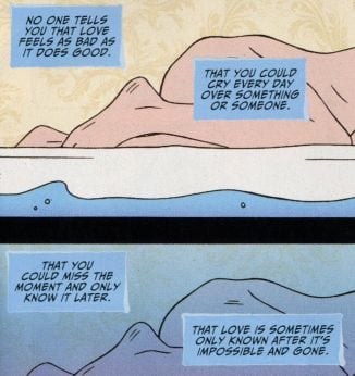
Given that Shade avoids many tired comic-book conventions, I was disappointed that it relied on the “weighty” text that bogs down comics like Flash #35 and its type. I especially wished that the editor had encouraged the writer to create internal monologues that feel a little more peculiar, that display the kind of artistic care present in other aspects of the comic. (It’s odd, too, that while the cover indicates that the comic is for mature readers, with the exception of few naked bodies and swears, much of it reads as if pitched directly at young readers.) Perhaps the hero is stuck in an overly-reflective phase she’ll soon move beyond. I hope so, and will give the next few issues a shot.
Prism Stalker #1 -# 2 (Image Comics, 2018)
Sloane Leong is Prism Stalker’s cartoonist, an auteur who, free from the corporate comic’s stifling editorial control, writes, draws, and colors her own work in her own way. Though not cartoony, her art has a looseness seldom found in the oppressively slick world of mainstream comics. The story’s striking coloring, executed in a series of regularly shifting schemes, is the antidote to the muddy confusion of countless comics like Flash and Doomsday Clock.

Taken together, the comic’s art, coloring, and design make for a refreshing look, an improbable mix of psychedelica and clarity.
Prism Stalker isn’t really a superhero comic, but Leong partially envisioned it as a response to the genre: “When I started writing ... I felt like there are so many comics that are just teams of dudes, super-powered or otherwise.” As a superhero-adjacent fantasy, it offers a template for invigorating the monthly serial comic book. Leong’s world is her own. She’s not hemmed in by the requirement that a comic (and its creators) fit in with, and be subservient to, a company’s never-ending story. Many such superhero comics drown in self-promoting didacticism: they insist that their heroes are culturally relevant role models and that their stories are profound meditations on contemporary heroism. Untethered to other comics, Prism Stalker is imaginative, open to interpretive possibilities. The comic’s complex political world resonates with a repressive American patriarchy reinvigorated by Trumpism, and the troubles of Leong’s female POC protagonist evoke the tenuous lives of US immigrants and global refugees. (It also fits comfortably into the timeless coming-of-age genre.) Having faith in itself and its audience, it never tells us how to read it. (And, refreshingly, no ads interrupt the story to remind us that we need to buy more company comics or licensed products.)
Silencer #1-#2 (DC Comics, 2018)
Part of what makes contemporary superhero comic books so moribund is that major publishers Marvel and DC have been living off of a small set of characters created in the 1960s. As an attempt to expand their “properties,” DC recently unveiled “The New Age of DC Heroes,” a group of new characters the company describes in the way one would talk about the stars of a wholesome children’s cartoon: “They embody a spirit of epic adventure and bravery — the kind you may remember from another era, but updated in an exciting way for today!” One of these “new age” characters is a violent female vigilante named Silencer, who also represents another current comics trend: the move toward ethnic and racial diversity. Wary of being identified with this movement, co-creator John Romita Jr. assures readers he’s “the most un-PC person in all of comics” and doesn’t “fill all the diversity and PC gaps.” His dubious artist-as-tourist description of Silencer’s creation reinforces his hostility toward “PC” culture: “She's a person of color from the South Pacific, of Polynesian descent. I adore Tahiti — I went there on many vacations — so I threw in the tattoos and I threw in the look.”
Romita insists he was willing to do “anything to be different,” but beyond the Polynesian lead and her tattoos, it’s hard to say what makes this comic new. Its plot falls into a familiar trap, slavishly aping the rhythm of countless post-1960 superhero comics in which scenes of domestic life predictably rotate with scenes of the costumed hero in action. Like Flash and Doomsday Clock, the comic’s art is over-rendered. Faces are marred with extraneous lines, and from one panel to the next, attractive characters become oddly puffy, looking like victims of substandard plastic surgery:

Silencer hopes to represent a “new age” but, in its first few issues, offers only more of the same. (Indeed, if someone pasted the Silencer logo on the cover of the current issue of Mark Millar and Romita’s Kick Ass (#4) and told me it’s the new Silencer comic, I’d be fooled. They’re that close — female hero in a bland grayish costume, stark contrast between hero’s costumed and home life, lots of violence and bad people, etc.)
Assassinista #1-4 (IDW/Black Crown, 2017-2018)
This is the comic Silencer wants to be: violent female protagonists, a focus on the killers’ home lives, and an ethnically diverse cast. In Assassinista, as in Prism Stalker, identity issues never come across as “thrown in” elements (perhaps the creative team’s diversity gives them a feel for their characters’ ethnicity and sexuality that Silencer’s creators lack). Assassinista avoids Silencer’s tired plot rhythm by bringing its domestic, romance, and crime plots together; in a central thread, an assassin’s son and his boyfriend drop out of college to join mom’s illicit enterprise. Like Silencer, the comic employs tense action scenes, but like Black Hammer, turns down the volume. Tini Howard’s clever dialogue, too, is free of bombast, and Gilbert Hernandez’s stripped-down art, boldly colored by Rob Davis, reads effortlessly — no stray lines, no shifting character faces, no visual noise.
 While most corporate comics are created under work-for-hire contracts with no or limited royalties, Howard and Hernandez own their characters and work with what Howard calls a “hands-off editor.” Perhaps predictably, when talented creators like these invent their own fictional world, exercise creative control, and own their work, the result is a much more interesting comic than a book like Silencer.
Ms. Marvel #25-28, “Teenage Wasteland” (Marvel Comics, 2018)
This series, which stars a young Muslim female superhero, is justly celebrated for its feminist YA-friendly reimagining of mainstream comics and inclusive cast; the four-issue “Teenage Wasteland” arc continues to innovate by introducing Naftali, a Jewish teenager who’s the title character’s “kosher lunch buddy.” But such inventiveness makes its devotion to other formulas frustrating. The story relies, as do many contemporary superhero comedies, on quippy dialogue overburdened with pop-culture references, along with a meta-trope popular since the early 1960s: characters in a superhero comic make corny jokes about the corny ways that superheroes talk. This excess levels out the comic, draining drama from action scenes and undermining several characters’ ostensibly sincere speechifying. Given its genre self-awareness, it’s odd that the comic uncritically employs the most famous comic-book villain type: the mad scientist who, in verbose expository dialogue, tells us he wants to rule the world in order to save it.
Though the story feels trapped by genre clichés, one thing works strongly in its favor. Typical of superhero comedies, it’s happily uninterested in explosive high-drama visuals, focusing instead on accessible art and page layouts. Ms. Marvel’s stars are its disciplined yet expressive line work (especially the manga-inspired facial expressions) and its soft coloring.

“Confluence” from Compulsive Comics (Fantagraphics, 2018)
A compulsive comic-book artist-historian, Eric Haven tackles many of the format’s most popular genres (western, crime, sci-fi, fantasy, etc.) with spacious art that mixes charmingly clunky figures and precise, labor-intensive textural effects. In “Confluence,” odd meetings abound as Haven intelligently, and with a light comedic touch, crosses boundaries between slice-of-life, monster, superhero, war, fantasy, and adventure comics. It begins with a genre fake-out. Employing the standard art-comics mode of mundane autobiography, Haven replays his daily routine: after contemplating an empty drawing board, he hangs around his pad, smokes some weed, and stumbles out for a walk. But then, strange events occur: a gigantic monster appears, pursued by a female pilot who, when a lost child, was trained in the woods by a strange man to “kill all sky monsters” with an otherworldly WW I biplane.

Unlike that of most mainstream comics, Haven’s bizarre plot seems to have no direct precursors. With Prism Stalker and Assassinista, “Confluence” offers something seldom seen in pop comics: a feminist ethos. It’s not just that the pilot is a “strong female character,” but that, in scenes easily read as cultural allegory, she takes on douche-y men who represent the repressive, militaristic US government. They want to exploit her powers and technology, but she’s not having it: “Anyone who thinks he can take my plane and make me do something I don’t want to do can suck my dick!” Threatened by a woman’s rebelliousness, they evaporate her.
Imagine Haven pitching this to a corporate publisher: “It’s like R. Crumb and a foul-mouthed Amelia Earhart (who flies with and without a plane) find themselves in a Stan Lee and Jack Kirby monster comic as drawn by Charles Biro and battle all sorts of menaces including the American military!” “Confluence” shows us — and mainstream publishers and creators — how to transform genre clichés into something new, a comic-book story for adults that, though literate, is far too pulpy and weird to be called a “literary comic.”
***
For me there’s often (though certainly not always) an increase in adventurousness and quality as we move away from corporate publishers toward independent houses. The “Big Two” have created some great art, but other mainstream publishers (e.g. Dark Horse and Image) and independent houses consistently produce the most interesting superhero (and non-superhero) comics. With little or no editorial interference, indie cartoonists make the comics they want to make and then find a sympathetic publisher, free (at least theoretically) from worries about pandering to a mass audience or securing a film deal. From their moment of origin, then, many of the best superhero comics resign themselves to a paper-only existence, forever denied an after-life as the next great “comic–book movie.” And perhaps, for fans of the old-fashioned comic book, that’s a good thing.
.
.
__________________________________________________
I'm sure the above was more than enough, but if not here’s material
deleted from earlier versions of the piece:
Fighting American #1 (Titan Comics, 2018)
Rather than invent new characters, some companies fall back on “the revival,” resurrecting a long-retired TV character or a minor comic-book hero. Fighting American digs up an obscure superhero Jack Kirby and Joe Simon created in 1954, a pale imitation of their earlier success with Captain America. Like Doomsday Clock, the comic justifies its revival with relevance. Both comics (try to) speak to our current political moment with forced MAGA references, ironically reminding us how ineffectual actual superheroes would be if tasked with solving real problems.
Fighting American, like Black Hammer, takes super-heroics seriously, but does so in an overly-earnest, doctrinaire way. With its family-friendly cute YA-look, it appears partially designed to address a standard fan gripe: “Today’s dark stories take the fun out of comics.” I share that complaint, but think that Black Hammer and All Time Comics represent better ways to create entertaining, anti-“grim ‘n’ gritty” comics — straightforward but not too sincere. The earnest superhero comic inevitably reminds us that the genre still struggles to move beyond its origin story as a Manichean moral fable for children. Even in the age of the “literary graphic novel,” the comic book often remains the domain of the kid-friendly tale.
President Pence #1 (Antarctic Press, 2017)
On the cover, Pence appears as a superhero, wearing the costume of Fawcett Comics character Captain Marvel, a very moral super-being who first appeared in 1940. Pence is not a caped crusader inside the comic; rather he’s an action hero who wanders through a confusing mishmash of fantasy genres. All bulked-up, he totes a gun, battles robots, and does something with time-travel, while Hillary Clinton keeps popping up (as a witch, naturally) and screaming “I’m with her” over, and over, and over.
In real life, Pence’s Trump toadyism and “Mother”-loving misogyny present occasions for pointed satire. But this comic lacks a political and artistic point of view. Some jokes appear to be coming from the left, others from the right, but mostly from who knows where. I’m not a big fan of political cartooning that slaps words on things so that readers can’t possibly miss the meaning (e.g. a gigantic wave labeled “National Debt” is about to crash on a group of people labeled “USA”). But at least I can understand it. Is the cover’s allusion to the wholesome Captain Marvel meant to mock Pence’s family-values façade, reminding us that he’s nothing like the Captain? As with almost everything about this comic, it’s hard to say.
Strange Cerebus #1 (Aardvark Vanaheim, 2017)
Like the cover of President Pence, Strange Cerebus’s cover employs a superhero allusion that only a comics-junkie would get. Perhaps these creators think that readers will be compelled to buy these comics because they recognize the artists as fellow-travelers swimming in the same mire of comic-book nostalgia. (It worked on me. I bought them.)
In Strange Cerebus, Sim performs a lot of Photoshop cut and paste, superimposing images of his character, the aardvark hero Cerebus, over scenes from Gustave Dore’s Inferno. Sim attempts comedy — a few pop-culture nods, several goofy comic-book allusions — but the comic is painfully unfunny, far more so than President Pence. But Sim’s political point of view is never in doubt. He relies on anti-Obama racism and pro–Trump machismo, while reprising his familiar “women are the void and men are the light” misogyny. (To earn the right to be numbered among his friends, Sim once demanded that people sign a petition titled “I don’t believe that Dave Sim is a misogynist.”) For decades, Sim has led a one-man crusade to destroy the reputation he had developed as the artist responsible for the comic-book format’s longest ongoing story: 300 issues of Cerebus. Strange Cerebus shows that the artist’s ongoing self-destruction continues unabated.
Judas #1 (Boom!, 2017)
Perhaps to assure superhero and fantasy comic-book readers that this biblically-inspired comic will not stray far from comic-book conventions, an ad for Judas proclaims that “Every story needs a villain.” This may be true for the majority of simplistic comic-book action-fables, but we know it’s not for many other narrative types. Perhaps Judas is the story’s villain not because he’s bad, but because he’s really hard to take. The comic reduces a compelling biblical character to an annoying philosophy student who, in the most obvious of ways, plods though worn-out questions of religious ethics, such as theodicy and predeterminism.
In the world of serialized monthly comic books, a lot rides on first issues. The art in Judas #1 is strong, with a several horror comic-inspired scenes that are interestingly un-biblical. But Judas’s narration suffocates the visual’s attempt to broaden the story. Little in this comic suggests that future installments could re-form history’s most famous betrayer into the character he deserves to be.
_____________________________________________________________
Ken Parille is editor of The Daniel Clowes Reader: A Critical Edition of Ghost World and Other Stories. He teaches at East Carolina University and his writing has appeared in The Cambridge History of the Graphic Novel, The Best American Comics Criticism, The Believer, Nathaniel Hawthorne Review, Tulsa Studies in Women’s Literature, Children’s Literature, Comic Art, Boston Review, and elsewhere.


