About six months ago I decided to get into comics and made the mistake of starting with The Dark Knight Returns, Frank Miller’s 1986 portrait of a middle-aged Batman, and a work of art so good I’ve been comparing every comic to it since. It is, essentially, the inspiration for this column. So many artworks get called “classic” that it’s easy to forget why they earned that label. Certainly not all of them deserve it. But how do you distinguish between what’s good and what’s simply well-loved or well-known?
The purpose of this series is to close-read works that are generally considered to be classics of the comics form and hopefully help illuminate just that: what makes them so good. I’ve chosen the works that I have because they made me go Aha! They made me get what comics could do, why I was bothering with the medium in the first place. Perhaps more importantly, they made me get what comics even were. I came away from The Dark Knight Returns thinking that it was wrong to call it “literary.” It was something else. Something essentially and unapologetically comic-like. “Comic-ary.” The way that it was fluent and artistic was inextricable from the fact that it was expressed via this popular, visual idiom.
While I’ve done my due diligence in familiarizing myself with the context and history around each work—often that context is necessary to be able to close-read a work at all—history will not be the focus of these articles. The goal is to avoid falling into the trap of merely explaining why a work is “historically important,” and instead explore what it gets fundamentally right about the comics medium; not whether it invented a technique or influenced a scene, but what makes it work, whether it was made yesterday or a hundred years ago. So while The Dark Knight Returns may have kicked off a new wave of Western comic-making, I’ll leave that to other people to describe.
Above all, The Dark Knight Returns stands out for its density and coherence. It is a complicated exploration of power and violence that is more interested in making readers intuit complexity than coming to conclusions. It is at once hysterically satirical and darkly serious. It captures the absurdity of fighting violence with violence, and the depressing suspicion that maybe violence is inescapable. It portrays a world where we can barely get a handle on who is good and who is evil, but where a relentless media is eager to frame that ambiguity in the simplest, most self-serving terms. It’s about the fear of growing old and powerless, of being helpless in the face of the world’s problems. It’s about the fact that the fear of powerlessness often causes the world’s problems in the first place.
More importantly for my purposes, it deals with these ideas at the most fractal formal levels, where everything from color to framing to the choice of which Batman characters to use makes the themes and story richer. The Dark Knight Returns was an eye-opening read not because of its ideas per se, but because of how completely it executed them. I became suddenly aware of what formal things comics were comprised of because the book was using so many aspects of form to express its thematic core. There are any number of things you could analyze about The Dark Knight Returns, but in the autodidactic spirit of this column, I’m going to focus on the formal. Specifically, three ways the book succeeds “as a comic” that at the time were entirely new to me.
Color
Color, at its best, doesn’t merely describe a drawing, it interprets it, just as a good drawing doesn’t merely describe a scene. Lynn Varley, Miller’s frequent collaborator, and the colorist for The Dark Knight Returns, is particularly excellent at this. It’s always difficult to ascribe exact creative credit in a collaborative medium, but if you look at Varley’s color work in other comics, she has a remarkable ability to create patterns and draw the reader’s focus to the most important parts of a scene. In Ronin (1983) she builds a rich color language based around warm hues versus cold hues. Every time the colors shift from orange to green or red to blue it suggests something particular. In 300 (1998), harsh blacks and reds contrast against the delicate yellows and browns of the landscape. When the color become more earthy, more harsh, or more blue you can read meaning into the changes. The color in Elektra Lives Again (1990) is sumptuously dramatic in a way that echoes the baroque emotionality of the story. When I compared her comics to some of Miller’s other collaborations, even from the same era as The Dark Knight Returns, I found the color work clearly lacking in the same focus. The colors in Batman: Year One (1987), for example, seem to have been chosen based on what is broadly naturalistic or atmospheric, rather than on what might suggest something on the level of idea.
But even among the many Miller-Varley collaborations, nowhere do color and theme seem so tightly linked as in The Dark Knight Returns.
The color symbolism in The Dark Knight Returns has a very simple, but very powerful foundation: Batman himself. Batman’s costume, if you’ve forgotten, is comprised of four basic colors: blue, black, yellow, and gray. The very same colors that are used to background the speech boxes of the book’s major characters. Clark Kent thinks in blue, Lieutenant Gordon in black (and white), Carrie Kelly in yellow, and Bruce Wayne, who binds them all together, thinks in gray. The Joker, who stands out by virtue of not being associated with one of Batman’s colors, always thinks in green. Over the course of the book, there are only a handful of exceptions to these character-color rules. This degree of consistency means that the ideas that the characters represent can then be referred to via color, and every usage of blue or yellow or green suddenly becomes loaded with meaning.

The color associations suggest that we’re supposed to see these four characters (Kent, Gordon, Kelly, and Bruce Wayne himself) as four different aspects of Batman’s personality and motivations. We can also see them as four different answers to the question of “What attitude should one take towards dealing with the world’s problems?” One might argue that Batman is conflicted between these different parts of himself, and one would be right, but the very fact that the characters are “part” of him suggests an additional reading: that there is something that is also the same about them. As the story develops parallels between Batman and Superman and the Mutants and the Sons and everyone else, we realize that these ambiguities were prefigured by the color scheme all along.
So what does each character represent?
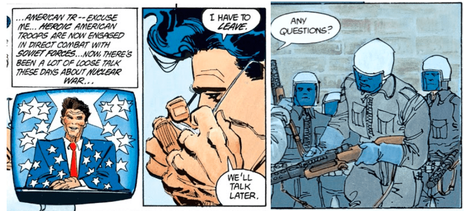
Superman is the book’s avatar of state power. Or at least obedience to it (“That big blue schoolboy”). He hobnobs with the president, and stops nuclear bombs. He is the picture of idealized virility, and would not look amiss atop a Fascist or Soviet monument. His apparent youth and strength are, quite literally, inhuman. Blue is the color of his spandex, half of the stars and stripes, and an American policeman’s uniform. It’s the color of law and order—just, or unjust. With that association in mind, it becomes significant and almost chilling that Batman so often appears to be draped in blue.
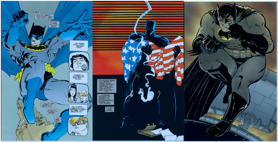
Gordon, in turn, is the face of mortality and cynicism. If Superman is the part of Batman that desires power, that feels like “a man of thirty—of twenty,” that thinks he has the right and duty and ability to take the law into his own hands, then Gordon is the Batman that is an old, human man. That will grow even older. That will spend a lifetime in the trenches of the world, and never really win. The more the story progresses, and the more fraught the concept of “law and order” becomes, the more Batman is depicted in silhouette and in black.
Consider this evolution, from Batman looking trim and triumphant in blue, to Batman only tinted blue and carrying a flag-draped corpse (read: America, do you think?), to a thick, brutish Batman in black. A vigilante Batman recapturing his youth, versus a Batman that’s feeling his age. Color is not the only meaningful change between the images, but it heavily reinforces the meaning that exists.
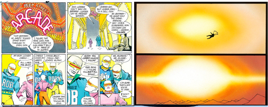
And then what is Carrie Kelly but truly youthful, optimistic determination? The avatar of energy. She is the part of Batman that really thinks he can make a difference (Wayne: “She’s young. She’s smart. She’s brave. With her, I might be able to end this Mutant nonsense once and for all.”). She is also one of many “next generations” in The Dark Knight Returns. Others are the Mutants, who declare themselves not “a gang” but “the future,” the Sons of Batman (who declare that “the Mutants are history,” and they instead are “the future”), Police Commissioner Yindel, and the Joker’s explosive robot children. It would be easy to see Kelly as a sincerely hopeful symbol. Kelly loses some innocence, but does not undergo any sort of devastating disillusionment, nor any of the sort of violation that stories are so often eager to heap upon female characters. It would be easy to see her and Yindel—women—as the modern heirs to fighting the world’s ills. But yellow is consistently used in two other crucial, complicating contexts. First, when depicting fire and firearms, and second when depicting the Mutants in their brightly-lit teenage arcades. In other words, the color draws a direct connection between vivacious youth and violent disaster. The book states several times that Batman runs a risk of “burning up.” Energy (and the idea of “new blood”), this suggests, is neither good nor bad, but can go any which way. It can light up an arcade or it can blow up North America. Pray that you use it right.


Gray, lastly, is the color of ambiguity. It’s what you get when you pour everything else together. Of course Batman’s color would be gray. He embodies the collapse of moral dichotomies, and is therefore a fitting protagonist for a book about exactly that. In a key sequence, Batman battles the Mutant leader in a muddy pit, and everything is so gray that it becomes difficult to tell the characters apart.

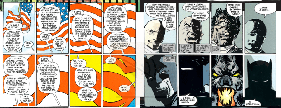
Significantly, the story leading up to the mud fight is full of dualities and chiaroscuro. The fight (issue #2) comes after the defeat of Harvey Dent (issue #1), who is all about duality. Dent represented the idea that you could draw a clear line between man and monster and choose one or the other at any given time. But even Dent was giving up on his Two-Face inclinations, pretending to be all-man again, while perhaps believing he’s all-monster. “At least both sides match,” he says. In a wryly hilarious moment, he ransoms Gotham for five million dollars instead of the more aesthetic two, because he’s “got bills to pay.” It’s no coincidence that in this issue following Dent’s defeat, Batman’s grayness seems to visually take him over. As Bruce Wayne says: “The room is split between light and dark, clean and dirty. But the split isn’t even—it favors the dirty.”
On the subject of ambiguity, check out this other color motif, one I found key to interpreting the whole book. The Mutants, the US army, Superman, a Soviet-spangled bomb, and Bruce Wayne’s heartbeat are each at times depicted using red highlights on a black field. The repetition draws a clear connection between multiple violent entities that we might have been inclined to think were so different. But whether violence is thanks to a Mutant or a missile, it’s still violence. And no matter how just he thinks he is, that violence is also Batman’s beating heart.

This association is key because it makes things more complicated than Batman—Actually Bad? Because the point is not that criminals, law enforcement, imperialism, vigilante-ism or any of these forces harm people. They do, for obvious reasons. The point is that squabbling about whether violence looks justified misunderstands what violence is. At bottom, it’s an ugly form of power, a means of control, that doesn’t stop being ugly no matter who uses it. Squabbling is the thing that talking heads do throughout the book. They’re the people who spend their time debating whether Batman is in the right, while not actually doing anything themselves. They’re the people who want to declare that Batman’s old nemeses are reformed. Whereas we, the audience, have learned to be suspicious of narratives by the end of the book. Bruce Wayne finishes The Dark Knight Returns at the top of his own little crime-fighting cabal, all of the young energetic people supposedly united by a supposedly do-good mission. He’s beaten Superman, which means he’s symbolically beaten the idea of violence made prettily institutionalized. He’s no longer chasing death, and instead wants to forge a life. Yet it’s a bittersweet ending, in part because of the imagery. He still calls his group an “army.” His heartbeat hasn’t really stopped. Will things really be any different?
Rhythm
We know that jokes are funnier when they’re told certain ways. We know that some action sequences drag, and others are exciting. We know that the same notes played in an orchestral or a bossa nova style would be drastically different experiences. These things all come down to rhythm. Rhythm is the art form of emphasis. It’s about expectation and follow-through. It’s about mood.
The Dark Knight Returns made me understand the particular ways in which a comic book could have rhythm. You can have rhythm in the text. Ie, poetry. When Batman repeats his desire for “...a good death” in each issue, and then ends the book having found “...a good life,” that’s poetic repetition. It’s a kind of punchline, a phrase that only has meaning encoded in it because of the built-up expectation that “a good life” subverts. The repetition also adds structure to the story. It’s like a beat. A check-in to see where Batman is at. It helps you organize the narrative information in your head the way that color helps you organize the visual information.
You can also have general narrative rhythm. That is, rhythm based on what happens, and how much of it. If a story starts slow, and then speeds up, and then gets slow again, that’s a rhythmic choice. If a story focuses on certain characters at certain times, that can be a rhythmic choice too. In the case of The Dark Knight Returns, the choice to feature one major antagonist per issue is a matter of narrative rhythm. In the first issue, the antagonist is Harvey Dent. In the second, it’s the Mutants. In the third, it’s the Joker, and in the last it’s Superman himself. This sort of repetition naturally lends itself to seeing these antagonists and what they represent as increasingly important concepts that Batman needs to defeat*. The fact that Superman, structurally, is the boss fight of the book, means that we pay special attention to what he might signify.
*(Whether it’s just Batman, the character, that “needs” to defeat the antagonists to be at peace with growing older, or whether one “needs” to defeat those antagonists symbolically to at peace with oneself, or whether we, the audience, “need” to defeat the cultural forces that the antagonists are associated with, is I think intentionally left ambiguous. Let’s not even get into whether or not Batman really defeats anything at all.)
But lots of mediums can have poetic and narrative rhythm. What excited me the most about The Dark Knight Returns was its visual rhythm. I had no preconceptions about what one could do with two-dimensional space in that way. So I was fascinated when the book turned out to be full of visual punchlines and callbacks. Its sense of visual rise and fall, and its ability to weave multiple threads together on any given page, is basically symphonic.
It’s rhythmic at every level, too. On the smaller scale, it has these wonderfully succinct little sequences like Superman’s introduction or Harvey Dent’s farewell. Those two sequences both have very simple concepts, meant to make simple, but powerful parallels: between Superman and state authority, and between Batman and Dent and their respective inner monsters. The Superman sequence plays off of the assumption that if you zoom in on something you’ll just keep on...zooming in, but instead as the frame zooms in on the flag it becomes a different symbol entirely (Superman!). The Dent sequence establishes a pattern on the first line, and then repeats it on the second line using Batman instead of Dent. Both set up a visual expectation, and then twist it.
But not only do those sequences have internal rhythm, they also use motifs that are repeated elsewhere in the book. Both the American flag and the roaring bat reappear multiple times. Like the “good death” line, this repetition adds structure to the narrative. Every time the flag or the bat show up, we know we’re supposed to be thinking about myopic symbolism or the state of Batman’s rage.
Or speaking of images that get repeated, take a look at the five-page sequence in which Bruce Wayne revisits his parents’ murder and decides to return to his vigilante ways. Unlike almost the entire rest of the book, these pages are organized into sharp, full-page grids. They feel obsessive and claustrophobic. They capture both the immediacy and the slow-motion unreality of watching something terrible happen. You can feel how Wayne is trapped by this memory. He stares, and his mother’s pearls stare back.

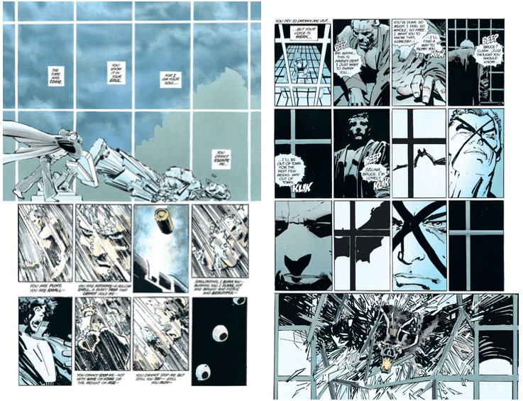
Like the other two sequences, this sequence builds up premises that it then manipulates. But unlike the other two, it’s not just telling a single “joke.” It’s telling two in tandem. One about how Batman feels trapped, and another about the claustrophobic nature of the comic panel itself. Over the course of the sequence, the rigid grid structure begins to break down. The third page has that row of closer-cut, almost oppressively urgent images. The fourth page has the words “you can’t escape me” literally floating between the white bars of the panels, while depicting sky that extends beyond those bars. It also features the diagonal lines of the shower (think: action and fluidity) cut between panels from the earlier part of the sequence, the part we now associate with being trapped. It’s not coincidence, I don’t think, that the toppling statue has the same diagonal lines. The whole page is straining to escape its visual confines. The prison imagery on the last page makes the mood of entrapment visually explicit, and when the bat finally bursts through the window, it’s almost a relief. It’s the climax of five pages of build-up.
But that sequence is unusual for the book in focusing on just a single character moment for so many pages (In fact, the unusualness of it helps contribute to the claustrophobia. More rhythm.). Most of the time, each page juggles multiple threads of plot and idea at once. Take this random pair of pages from the middle of “Hunt the Dark Knight”:

How many story threads are present here? There’s the Joker on the TV, there’s the flying gas bomb, there’s Batman battling the police, and there’s Kelly in the helicopter. That’s a fair amount of story, but there’s even more idea. In the police battle, we have Batman doing his usual monologuing about his weakness and age. The grayness of the fight on the first page directly evokes the grayness of the Mutant mud fight. Only this time, he’s battling strong young policemen, instead of young criminals. Then we have a parallel between Kelly and the robot. Both are “young” flying backup, and on the first page her panels and the robot’s are right next to each other. Batman is not just surrounded by the young in battle, he’s visually surrounded by them too. The Joker bit also gains its power from patterns that were set up earlier in the story. It switches quickly between what’s happening in “real life” and what’s happening on TV, making you notice the distinction. It chops up the speech boxes above the TV screens, and when the final box goes blank, it’s chilling both in contrast with the quick dialogue from earlier, and because we’ve never seen that sort of visual silence before.
In other words, not only is there rhythm within the individual visual threads, there’s also a rhythm across the whole two-page spread, along with details that connect the pages to the flow of the issue and the book as a whole. And that’s just those pages. Throughout the book, there are as many small-scale crescendos like the blank box as there are big crescendos like the screaming bat or any of Batman’s big splash portraits. That level of control and coherence means that not a single moment feels wasted or boring.
Context
I said at the very beginning that this series isn’t about why works are historically good. That remains the case. When I say that The Dark Knight Returns is good because of how it handles context, I mean that it makes great artistic use of the expectations that we bring to it.
This is a clever thing to do because any Batman comic that is not the very first Batman comic will be, on some level, derivative. It will derive from other work. You can say the same for other superhero comics, or for adaptations, or for fanfiction. You can say the same for almost all art really, given that most artists live in a society and have consumed other art, and so any art that they make probably uses that context, in some way, to create meaning.
But that’s getting a bit abstract. Point is, The Dark Knight Returns is not just a comic, it’s a Batman comic. An official Batman comic, at that. Readers in 1986 might have read it with decades of comics, superhero comics, or Batman comics baggage. To say nothing of the baggage that readers have today. Even reading The Dark Knight Returns in total ignorance of comics history, as I did, characters like Batman, Superman, Robin, Gordon, and the Joker still all meant something to me. I’d seen movies and TV shows. They’re nigh-mythological figures that have been remixed almost as many times as Santa Claus.
One of the reasons The Dark Knight Returns is so satisfying is that it makes this potentially-ponderous history work for it, rather than against it. Like I described in the very first section, it finds the essence of what the Batman characters symbolize, and then manipulates those symbols. To some degree it is about the fact that the characters are symbols. Icons.
You can’t read the book without noticing how much of a role the media plays in it. Every single narrative moment is processed and re-presented by newscasters and TV personalities, none of whom seem to really speak the truth. This might seem like a trite indictment of journalism, if the book weren’t constantly reminding us that comic books and any other forms of storytelling are engaged in the exact same practice themselves. Superhero comics are, classically, a pulpy genre full of soothing stories about good and evil and triumphant, strong-man heroics. A comic panel, like a TV screen, is a frame. And like any frame, it can be used for things like optics and politics as much as it can be used for grand, artistic pursuits. In other words, any form of narrative is potentially in the business of iconography.

One of my favorite things about the first issue is the way it juxtaposes all of these powerful images of Batman in action with Bruce Wayne’s inner moaning about how his body is old and in pain. This sort of irony wouldn’t have the same impact if we weren’t so primed to associate (super)hero imagery with youth and strength. Similarly, when the other characters fail to live up to their immortal comic book selves, it wouldn’t mean the same thing if the audience didn’t have the knowledge of what their characterizations normally are. It’s not tragic to see Dent lose his duality, unless you knew there was something to lose. It’s not uncomfortable to see a catatonic, purposeless version of the Joker unless you’re used to him being the gleeful face of absurdist nihilism. It’s not wrong to see Selina Kyle trussed up in Wonder Woman’s uniform unless you know that like Batman, she’s an ambiguous figure. A mortal woman always on the verge of either crime or reform, rather than a Superman-like goddess of Justice.

There are doubtless even more subtle references that went over my head. It’s possible, for example, that Batman dressing as an old woman at the beginning of Issue #3 is a nod to Kyle/Catwoman’s very first appearance, where she also disguised herself as an old woman. Which you could read a lot into.)
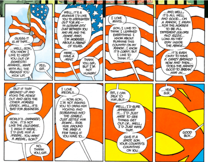
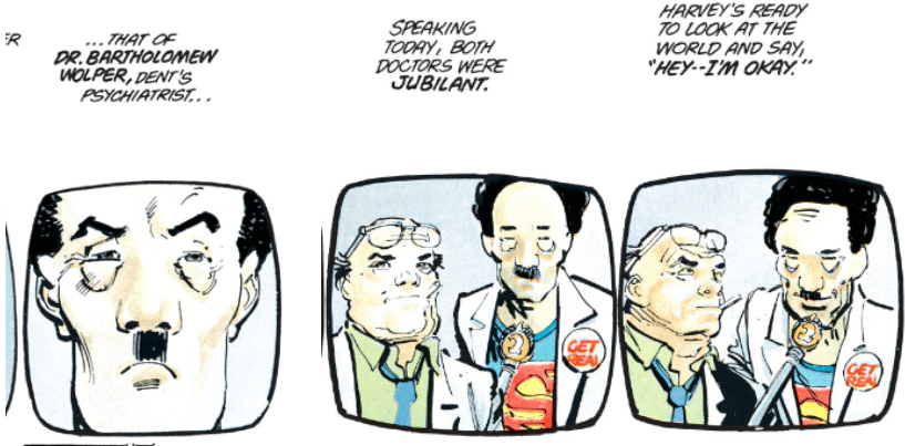
Even more interestingly, the book takes this comic book context and then connects it to the broader cultural context. It takes real people like David Letterman (“Endocrine”), Ronald Reagan and Dr. Ruth and treats them like comic book characters at the same time that it forces its comic book characters to experience the indignities of real life. It also depicts those comic book characters using almost parodically explicit real-world iconography. Superman gets imagistically associated with, variously: authoritarian propaganda, storybook romance, the American flag, and Dr. Bartholomew Wolper, who initially bears a hard-to-ignore resemblance to Hitler. Batman in turn gets associated with: the French Revolution, equestrian statuary, cowboys, and anti-war posters.
Superman:

 Batman:

 The fact that all of this imagery is so heavy-handed is a clear indication that it’s not just there to show how Bruce Wayne sees Clark Kent, or himself. Or how the world sees them. It’s also not there just to imply that Superman is bad and Batman is good. None of the Batman images above are really all that positive, even if they are stirring. Rather, the point seems to be about the power of image in general. Image is what people use to imply that one vigilante is noble, and another is a menace. The idea of Batman as a “dark knight” is just as romantic as Kent’s open-shirted posing, if not more. The book seems to mock people who say that Batman represents the return of “the American fighting spirit” as much it seems to mock the president’s gosh-darn-it version of dissembling.
So not only does The Dark Knight Returns make full use of its comic book context to convey idea, it then positions comics within the larger cultural ecosystem of imagery. It suggests that perhaps the way people felt about their superheroes in the 50’s was how they felt about their human war heroes too. It suggests that to keep depicting heroism the same way might be covering up something grotesque. It collapses the distinction between images we consume in art and images we consume in real life. Wherever you go, people are telling you stories.
*
There are doubtless a million ways for a comic book to be good, the same way there are a million ways for a poem to be good. The Dark Knight Returns is artistic, but it’s not an “Art Comic.” It’s a traditional narrative comic, and is good on the terms of that genre. It tells a story using words and pictures and does it extraordinarily well. To the extent that it plays with concepts and form, that play is always grounded by the story rather than being simply for its own sake. But secretly, I wonder if perhaps it’s actually more (or as) effective at exploring concept and form than a non-narrative comic because of this grounding. I wonder if I would have learned so much about comics if The Dark Knight Returns were trying to be something other than a comic. If the purpose of an Art Comic—or an Art Anything—is to reveal what the medium is made of by using form unconventionally, then why couldn’t a comic that uses form superlatively well do the exact same thing?


