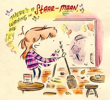
It was the unusual hand–written text that first attracted me to Leslie Stein’s diary comics. Instead of following the comics tradition of all capital letters, Stein makes surprising choices: some words use only lower-case cursive, others just lower-case print, some only traditional block lettering, while others move between these styles — and because she frequently changes text size and shape, some letters evade a clear-cut status as either upper- or lower-case, or print or cursive. It’s all done in an elegant, yet unpretentious calligraphy, the kind you might find in a thank-you note written by a thoughtful friend committed to the lost art of letter writing. Though she letters much of the dialogue in black, Stein uses color in an odd and stunning way: a single line of narration, for example, might employ as many as eight different water-color hues.

The energy of her letters and colors plays out in her drawings, especially in her character designs. At Vice.com (where her color diary comics have been appearing since late 2014), her comics are occasionally described as “cute.” This is certainly true. There’s a real charm to the way she draws herself and others, and she presents scenes from her life with a gentle comedic sensitivity. But unlike so many online diary and autobiographical comics, Stein avoids the genre’s love of bland, relatable cuteness and its dependence on verbal platitudes and visual clichés. She approaches nearly every aspect of cartooning — lettering, coloring, figure drawing, backgrounds, page layouts, etc. — in an original and idiosyncratic way.

Though her work shows the hand of a careful and confident cartoonist, it also communicates spontaneity, as if she began each comic thinking she was casually sketching a first draft, only to realize that it came out perfectly.
FACES and FIGURES
This page from Stein’s “Holly Jolly Sabbath” represents everything I like about her color comics.
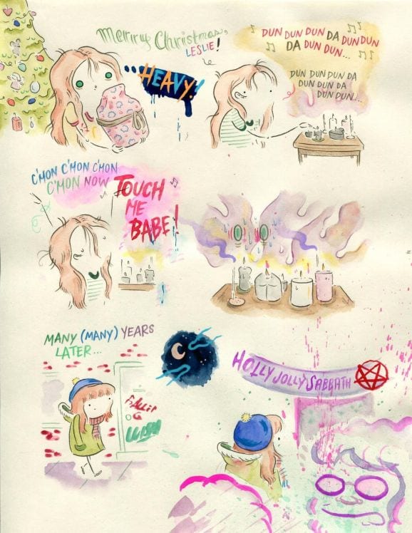
Part of her art’s weird charm arises from the ways she draws faces. Taking the classic cartooning/caricature traditions of distortion and exaggeration in unexpected directions, her characters’ faces have features that regularly change shape or shift position. (I’ve seen several cartoonists try this with unpleasant results.) The ever-changing eyes are key. She begins “Holly Jolly Sabbath” by drawing herself with wide circles that resemble the Christmas tree ornaments to her left. The eyes then become small dots, then “U”s (another shape from the Christmas tree), and then, behind watercolor clouds of smoke, they grow into large green ovals that reveal her immersion in a teen ecstasy brought on by The Doors and her candle altar’s glowing lights.
 The eyes express her growing excitement and longing as she lives out the erotic desire dramatized by Jim Morrison’s vocals. Perhaps as much as the dialogue and plot, the changing eyes communicate this memory’s narrative. As any smart cartoonist will tell you, get the eyes wrong and you're sunk.
Stein’s flexible faces, another key part of her cartoony style, get stranger and more interesting the longer I look at them. Lacking boundaries — seeming almost unfinished — they melt into characters’ bodies and merge into the page’s empty spaces. And noses seem to come and go at will (only three of the comic’s twelve faces have them). These kinds of transformations lend her work its odd quality, one that can also be found in the way she designs appendages. While the main character is drawn endearingly, her arms and feet sometimes resemble prosthetics made from wire, or perhaps a long piece of thin pipe. This design is made even stranger by the fact that the lines that indicate appendages often are incomplete, sometimes seeming as if they’re broken in the middle.
I’ve never seen anything quite like this mix of cuteness and a peculiar, hard-to-name affect. It wouldn’t be right to say her characters’ appearances are unsettling, but they are attractively weird, and this subtle friction adds a depth that keeps her work far away from a trite, polished cutesiness. Her figures possess the lyricism of the best doodles, drawings whose unpremeditated naturalness you can’t replicate or improve upon.
LETTERING and COLORS
I rarely see this level of lettering skill combined with this much inventiveness.

There’s something compelling about the way her text changes colors, both from word to word and from letter to letter, an approach that has long been used in the multi-colored logos of children’s toys, games, candy, and comics.
Perhaps the text’s coloring would be cacophonous if the lettering wasn’t so legible (with stylish letterforms and careful spacing) and if the colors didn’t harmonize so well. In this way, Stein’s work reminds me of a feature in early 1960s Marvel comics (and some Archie comics): word balloons were not just white, but move between colors, a tactic that makes already colorful comics even more colorful and pop-art-y.

Marvel eventually abandoned this approach (perhaps they thought it too child-like for “serious comics”), going instead with the industry standard of all white balloons. I like that Stein shows such little interest in “industry standards.”
Stein’s color technique may evoke childhood in a round-about way, but it’s sophisticated and artful. In comics like “Holly Jolly Sabbath,” color functions formally: some shapes and objects are pure color, lacking the black outlines present in many other cartoons and comics.
And she even goes a little abstract, using paint drips, splatter, and clouds of color that transgress the implied boundaries of “panels,” allowing discrete scenes/moments to blend into and overlap each other in a free-form sketchbook style.
FORM and NARRATIVE
Though Stein’s comics are narrative and representational, their artfulness and minimalism also put them on a continuum headed toward abstraction. There’s a looseness to the page’s layout, to the ways that images, objects, effects, lettering, and “panels” (which are not panels) blend into and overlap other aspects of the page. Something about her approach to form — energetically avoiding the orderliness of conventional grid-based pages — seems well-suited to autobiographical comics, especially to those that, like this one, deal with memories and impressions in a highly subjective, lyrical way.
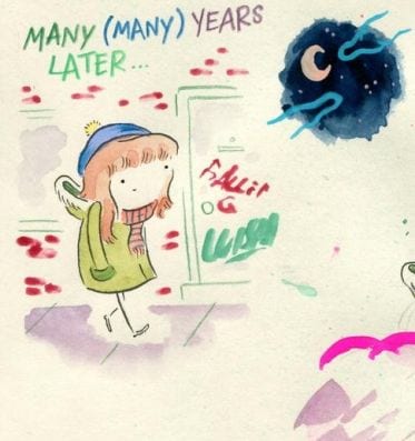
While “Holly Jolly Sabbath” lacks panels in a grid layout, its narrative is easy to follow, in the familiar left-to-right, top-to-bottom way. The comic’s internal rhythm is fundamentally different from the kind of dispersed “beats” that result from a series of discrete, bordered panels and well-defined gutters. A more conventional style would segment the narrative, making it too staccato for the kind of open, semi-ambient effect she’s going for, an effect amplified by the stray color marks and paint drips, along with the haunting, palimpsest-like echoes on the second page, especially at the top.

Her choices make for a striking way to represent the fluid passage of time across a comics page.
Stein also takes a minimalist approach to backgrounds, perhaps as a way to reinforce the subjective, personal focus of the memories she recounts. Some artists concentrate too much on figures and foreground, making environments seem less important and weakening the story dynamic of character-place interaction. But it’s always clear where her characters are — bedroom, streets, bar, satanic ritual, etc. And though “Holy Jolly Sabbath”’s minimalism contributes to its sense of openness, its layout also gestures to the “grid conventions” of symmetry, balance, and order. Page one starts with an upper-left corner image bleed and ends symmetrically with a lower-right corner bleed. Page two uses a familiar arrangement in which the final “row” of a comic's last page is anchored by a large panel that sits beneath several smaller-sized panels (which again, in Stein, are not really panels).

She artfully demonstrates that borders, gutters, balloons, margins, or panels are not essential comics elements, nor are they required for clarity and readability.
***
Stein’s techniques are adventurous and unusual, but most importantly, her comics are always thoughtful and funny. Death, depression, alcohol abuse, god, and suicide, as well as tales of exes, a trip to a barbershop quartet convention, a job as a telemarketer, and childhood holidays are treated with a light — but never facile — touch, all with real warmth and kindness. The internet is drowning in autobiographical and diary comics intended to uplift the reader with profound thoughts and precious visuals. Though well-intentioned, they tend to bring me down, as does all such sloganeering masquerading as art. Stein’s online comics represent a far different, far more human virtual world. They inspire me in the way a well set-up and executed joke does (“Holly Jolly Sabbath”’s punchline is the revelation of the atypical, yet appropriate gift). Smart and emotionally affecting, these are life-affirming comics.
_____________________________________________________________
Ken Parille is editor of The Daniel Clowes Reader: A Critical Edition of Ghost World and Other Stories. He teaches at East Carolina University and his writing has appeared in The Best American Comics Criticism, The Believer, Nathaniel Hawthorne Review, Tulsa Studies in Women’s Literature, Children’s Literature, Comic Art, Boston Review, and elsewhere.


