Comic book fans want something from me . . . I don’t want anything from them.
— Steve Ditko, 2013.
All [editors] ever want is a half-assed reprint of the story you did for them last week. . . . stay away from all the comic people before they make you as dull and repetitive as they are.
— Steve Ditko, 1977.
-
Prologue: Comicdom Assembled?
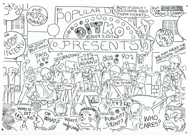
In 1978 Steve Ditko contributed a curious illustration to the San Diego Comicon’s program booklet:
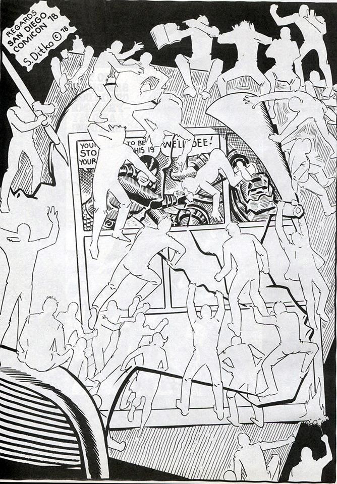
Shown in outline, an artist leans over his drawing table, hard at work on a page of comic-book art. But before he can finish a few panels, nearly thirty figures storm the page, disturbed and angered by what they see. Some grip their foreheads in disbelief, others raise their fists in righteous indignation. Several deliver a more aggressive form of critique: one steals the artist’s inking brush, another shoves his pencil through the art, while others bend the page and set it on fire.
Fans typically gather at conventions like the San Diego Comicon to celebrate the medium they love and artists they admire. Ditko conjures up an altogether different kind of con: enraged fan-boys (and perhaps a fan-girl) convene solely to attack his work. In the upper-left, he signs the art “regards.” Is he joking? How can he have any regard for a mob out to destroy his art?
Along with comics fans, industry professionals attend comic conventions — and Ditko’s not so fond of them, either. In comics and essays he rails against the kind of “comic people” he derisively calls “handlers.” During a comic’s production, they “handle” (which for Ditko meant “ruin”) pages after the artist submits them. In the Comicon drawing, figures with the brush and pencil evoke handlers who, in order to align a comic with the publisher’s dictates, usurp the artist’s role by erasing or redrawing art or by adding elements such as sound effects without regard for the artist’s compositions. By 1978, Ditko had suffered decades of aggressive mishandling. He cared immensely about his work’s “integrity” (a key term in the Ditko lexicon) but most editors and publishers had no such lofty concerns. They believed that, since they paid for the pages, they could do what they wanted to them. An editor’s goal was not to create “art”: it was to please readers and sell comics.
In Ditko’s anti-con, angry fans and incompetent handlers unite against him and his work. Is anyone brave enough to dissent from mob rule? Perhaps the person sitting calmly atop the chair can see the scene from Ditko’s perspective; unlike the others, he appreciates visionary comics. Or maybe he’s just waiting for the right moment to join the fray.
I. What Fans and Handlers Want.
Throughout his essays, correspondence, and comics, Ditko dramatized his complicated relationships with all kinds of comic-book people. At times he reached out, asking questions or inviting letters about a comic:
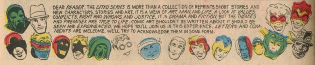
Though he hadn’t given an interview or attended a convention since the 1960s, by the time of his death at 90 in 2018 he had responded to thousands of fan letters and carried on decades-long correspondences with many readers. Yet, since the 1960s, he had also regularly directed his ire against fans and professionals. Using his distinctive Ditko-esque vocabulary, he mocked what he called “fan knowers” and “Anti-Ditkos.” He derided handlers who ruined his art and editors who claimed credit (and royalties) for concepts and characters he created.

He condemned fans (and fannish professionals) who, angry he wouldn’t give interviews, invented stories about his life. He had little interest in readers who expected him to be grateful for their affection for characters he created decades earlier and had long since stopped caring about. In many letters, fans assumed he’d happily autograph a Doctor Strange comic or send them a Spider-man drawing (he created the former and co-created the latter). Whether politely or brusquely, he always declined. Ditko had moved on. They hadn’t.

Readers wanted, or as Ditko felt, needed him to stand still artistically, to forever be the artist he was in 1963, creating conventional character- and plot-centric fantasy genre comics. He frequently regretted that, of the countless “S-m fans,” very few were “Ditko-Fans.” His mainstream post-Spider-man and Doctor Strange comic-book series such as The Hawk and The Dove, The Creeper, and Shade The Changing Man never made it past a handful of issues. He blamed readers and their nostalgia-driven fear of innovation.

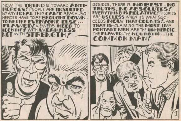
Ditko knew his political and stylistic approaches upset comic-book editors and fans. When he worked in the mainstream comics industry, the product was aimed at young readers. But in the late 1960s, unhappy with his audience and industry limitations, he started to release philosophical and formally inventive comics with independent publishers, many of whom gave him full artistic control and ownership.

Frustrating fans and publishers who wanted predictable comics, he began translating Ayn Rand’s ideas into superhero and crime stories whose pages often featured more words and concepts than comics people were used to. At a moment when mainstream comic books began to embrace flawed heroes, he insisted on portraying only idealized protagonists:
He believed that if his comics didn’t speak to readers’ desires — if they weren’t always familiar action-oriented escapist tales — then that was on them.
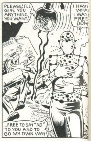
Against this mire of fan expectation, Ditko created heroes who elevated themselves beyond the public’s reach. Upright superheroes like Mr. A., The Question, and Static are Ditko’s comic-book alter-egos. Laws unto themselves, they are ubermenschen far more interesting — and far more Nietzschean in their way — than a milquetoast kids’ caped crusader like Superman. A typical Superman story ended with the villain subdued, in jail, or banished to the Phantom Zone. But when Static runs into a gang of criminals, it’s not enough to defeat them. In a scene too violent to meet the “Comics Code” — a set of child-friendly restrictions once embraced by most mainstream publishers — he guns them down and moves on.

Ditko was an arch satirist who never tired of mocking those he saw as backward-looking, greedy fans and inept, uncreative handlers. (It’s not surprising that someone so critical of comic-book people would name another of his alter-egos “The Mocker.”) In the graphic novel Static, the uncompromising protagonist defeats those who want to know what isn’t theirs to know and take what isn’t theirs to take. To these comic-book people, Ditko said no.
II. Ditko Edited / Un-Edited: “The Exploder,” a Case Study.
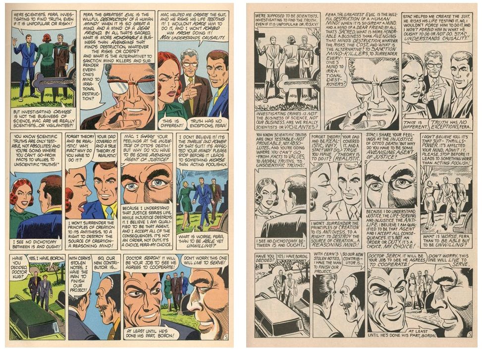
One way to appreciate Ditko’s independent work and the challenges it presented readers and handlers is to look at versions of “The Exploder” that were published under different editorial conditions. “The Exploder” is one of three Static stories that initially appeared in Eclipse Monthly, an early 1980s anthology containing work by many of the era’s most important writers and artists. Several months after the comic appeared in issue #2, Eclipse Comics founder and editor Dean Mullaney printed three readers’ letters in issue #4 that criticized Ditko’s dialogue. In a lengthy response to one letter, Mullaney articulated his editorial philosophy and recounted conversations he had with Ditko about editing his comics. He recalled that after receiving Ditko’s penciled and scripted art pages for “The Exploder,” he was especially unhappy with the fifth page. Believing its dialogue “excessive,” he told Ditko he wanted to cut a significant amount of text and have him draw “additional art” in spaces where balloons and dialogue had been. According to Mullaney, Ditko “believed the story worked best the way he had originally written it and asked me to restore the page to its original form. I complied and that is how you read it.” Mullaney then informed Ditko that, in the future, he wanted to “edit his scripts into . . . . a more readable form.” Ditko refused, saying he would no longer publish Static with Eclipse. Though Mullaney regretted the outcome, he felt it necessary. “The Eclipse method of publishing,” he said, “is the best.”
In the 1980s, Mullaney was part of a movement intent on addressing comic’s history of creator mistreatment by giving writers and artists ownership of their work and greater artistic freedom: since the 1930s, American comic-book publishers had retained control of characters, concepts, and artwork, and editors routinely — and often drastically — altered pages without asking artists. Speaking of the edits he requested on page 5, Mullaney distinguished himself from editors at publishers like Marvel and DC: “I did not feel that it is within my right to edit a creator’s work to that extent without permission.” Though forward-looking in some ways, these comments also reassert his editorial prerogative: he wouldn’t need permission to edit in ways he judged less intrusive. Ditko understood that when he worked with production teams that edited without consulting creators, unfortunate alterations were unavoidable. He knew, for example, that while lettering “The Exploder,” the letterer would redraw word balloons and ignore his indications for their shape and placement. “Collaboration,” Ditko often said, “means cooperating with an enemy.”
After its Eclipse publication, “The Exploder” appeared in Charlton Action #12 in 1985 and then in several Static collections. These later versions were edited by Ditko’s longtime-partner Robin Snyder, who took an editorial approach unlike Mullaney’s: he largely left Ditko alone, believing he’d do his best work when free from interference. In terms of art and text, the Snyder-Ditko versions were created without the kinds of “collaboration” and “handling” present in the initial release. (I’ll call the Eclipse Monthly version V1 and later versions V2 — though the story is colored in Charlton Action #12, all later versions share near-identical text and art.) Many readers call V2 a “reprint,” an odd term to use for a comic with Ditko’s new title logo, new lettering, dramatically different punctuation, new word balloons, and numerous art and dialogue differences. In comics, “the reprint” is almost always not the definitive version; using this term for V2 misrepresents the later comic, which should be seen as the authoritative version.
Without examining “The Exploder”’s original art pages (which, if they exist, are not accessible), it’s hard for me to say conclusively whether a given difference results from a post-V1 change made by Ditko or from intervention during V1’s production. (Even if I could see the pages, some production decisions might not leave traces; many of Ditko’s original art and text pencils would have been erased, inked over, and/or covered.) In many instances, though, I’m convinced that V1’s differences from V2 reflect editorial intervention. While V2 relies on approaches Ditko uses throughout his auteur comics, aspects of V1 appear so un-Ditko-esque as to almost certainly be the result of editorial decisions that neglect Ditko’s indications and follow established “collaborative” comic-book practices. In one sense, though, it doesn’t matter when a change was made. Comparing versions can help us appreciate the comic-book innovations Ditko employs when free from an editorially-dominated production process, free from handlers who made a comic more conventional, more fan-friendly.
*
Though Mullaney says he “restored” page 5 of “The Exploder” "to its original form,” I don’t think that this page, or others in V1, represent the artist's original vision. When compared to V2, numerous passages seem un-Ditko-esque. Mullaney knew that readers criticized Ditko’s comics as "too wordy" and their dialogue as not “naturalistic.” But as a verbal stylist, Ditko was uninterested in aping conventional speech patterns. In the Static comics and elsewhere, his characters move between unusual modes: in one panel they sound like people in a 1940s crime comic, in the next they act like characters in a cerebral Romantic “closet drama.” His marionette-like characters twist and flail impossibly while thinking Randian aphorisms mid-battle; then they stand motionless and debate philosophical concepts. For me, Ditko’s anti-conventional dialogue is one of his great strengths and innovations. But fans and editors often felt differently.
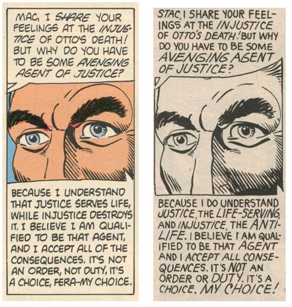
Many V1 passages read as if edited to make the comic easier to digest by eliminating words and altering Ditko’s idiosyncratic vocabulary and syntax in favor of generic language. The V1 version of page 5/panel 6 regularizes his wording and complex sentence structures while eliminating the hyphenated terms that he relies on throughout his comics, letters, and essays:
V1: “Because I understand that justice serves life, while injustice destroys it.”
V2: “Because I do understand justice, the life-serving, and injustice, the anti-life.”
In page 5's seventh panel, V2's language is far pulpier and energetic.
V1: “It’s the thrills and power of that suit!.”
V2: “It’s that suit - thrills - power.”

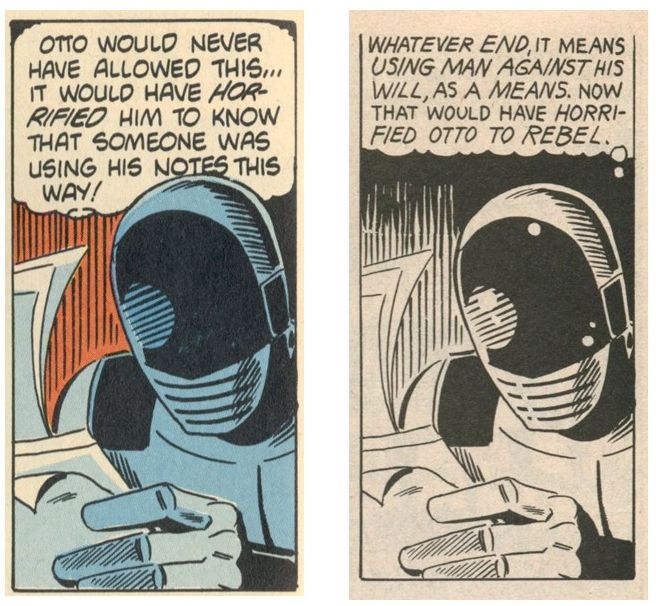
On page 6, the V2 panel is dense with the kind of ethical terminology that runs throughout Ditko’s work: “using man against his will,” “end,” “as a means.” None of these phrases appear in V1:
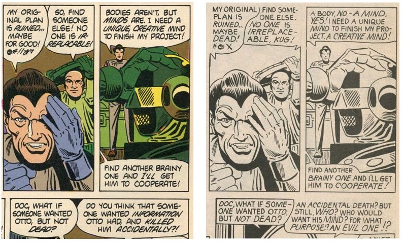
 In this panel from page 8, V2 uses a pulpy sentence fragment while V1 adds a subject and verb, homogenizing the villain's blunt description of Static's deadly situation:

On V2's page 4, Fera clenches her fists and rages about different “kinds” of justice. V1 eliminates three repetitions of “kinds” and tamps down her anger by putting her five sentences into two:

Throughout, V2 employs classic Ditko syntax, with sentence fragments, strings of nouns or adjectives connected by commas, repeated words, and philosophical terms. These linguistic elements are as essential to his work as his characters’ famous hand gestures — and to change them would be to go beyond house-style edits and significantly rewrite the script, making Ditko’s dialogue less rhythmic and far more prosaic.
Though I don’t believe Ditko made such changes, it’s possible he made some text edits when he revised the comic for Charlton Action. Yet his republications generally don’t reflect these kinds of revisions — and none that I’ve seen make nearly this many text edits (some, however, include a few spelling corrections and revised art).
Ditko believed we are defined by the words we speak (or don't). Words make us who we are and operate in the world as active agents for good or ill. Given this, he really did not like handlers making text changes: “a handler can change a word just because he likes another one better. . . . The handler is just arbitrarily ruining the original planned effort, effect, for his own gratification (“Art!?” 153).

In a move that suggests editorial interference, V1 features grammar-convention-based differences from V2, such as “foolishly" instead of “foolish”:
If one wanted naturalistic Ditko, it’s in this script, which, for all its intentional unnaturalness, sometimes imitates how people talk, not how grammarians say they should.
Like many comics fans, Mullaney said Ditko’s wordiness made his pages “visually unpleasant” (36), a criticism that reflects a widespread (and counter-productive) belief about comics storytelling: since comics is a visual medium, text must always be subordinate to imagery. In “The Exploder” and elsewhere, Ditko gives words center stage: characters rehearse and debate mantras and maxims, trying to convince themselves and others of their ideas’ rightness. In comics “talk” is, of course, not talk but written words impersonating speech. In his personal life, Ditko preferred writing to talking, telling fans (in letters, of course) that conversations were “unproductive” and “a waste of time.” He argues that written discussions carry more weight, allowing participants to think through ideas before memorializing them. His characters participate in debates that echo the argument-style back and forth of his fan-correspondence. Though Ditko often saw readers as adversaries, his fan-letter responses reveal his genuine urge to converse with them. And, in comics, this occasionally required more words than comic people were used to:

To hand-letter the Eclipse Monthly Static comics, Mullaney hired Ken Bruzenak, who’s rightly celebrated as one of comics’ most skilled letterers. But Eclipse’s allegiance to orthodox lettering practices de-energizes Ditko’s pages and compromises their coherence and integrity. Often, as in “The Exploder,” lettering is not a neutral rendering of the writer’s script. It’s editorial collaboration, even interference. In the essay “Art!?,” Ditko asks “Who has the greatest authority and power to determine what an original comic art story/art panel/page will finally look like?” And he answers: “The letterer.” “This conclusion,” he notes, “comes from long, first-hand experience and countless examples of having designed/composed panels that were arbitrarily changed by others” (153). Ditko frequently laments that “the work a letterer does shows his type of ‘collaboration’. . . . Much too often it is a . . . destructive ‘collaboration’” (149). V1 follows decades of comics tradition in which the exclamation point is the dominant (and often the only) end-of-sentence punctuation mark. The period was undramatic and insufficiently manipulative: readers need to be told what they’re reading is exciting! Nearly every line in V1 ends with an exclamation point, erasing the dynamics of Ditko’s characters’ speech and blunting the text’s design.

In V2, Ditko’s lettering and dialogue uses far more periods than V1, indicating speech that is at times far more restrained than V1’s and also far more over-the-top. Given Objectivism’s suspicion of emotion, it makes little sense to depict a Randian hero as always yelling. V1’s constant exclamation points clash with — and undermine — the key Ditko trope of the rational male hero’s stoic facial expression:
While Bruzenak employs regular-sized and heavily-bolded text to emphasize words, Ditko’s hand-lettering uses different size text and italics. Unlike Bruzenak’s assertive letterforms, Ditko’s thin letters communicates something almost reticent — even alienated. His lettering design makes a compelling counterpoint to his characters’ dramatic assertions and his art’s strong ink line.
Just as V1 regularizes Ditko’s words, it ignores the cartoonist’s design preferences by employing conventional balloons. Mullaney wanted the Eclipse Static comics to use the balloon shape that had dominated comic books for decades, calling Ditko’s method “a cheat for the readers,” who deserved “balloons rounded on the sides and art continued in the side blank space” (quoted in Bell, Stranger and Stranger 148). In “Art!?” Ditko highlights the damage done by “handlers” who don’t understand composition: “Unfortunately, the placement of . . . balloons, pointers . . . are rarely seen by editors [and] . . . letterers as an element of panel design/composition. They seem unaware or unconcerned that all the non-art elements need to be properly integrated . . . for visual coherence . . . and integrity” (149).

Though Ditko uses the term “balloon,” he rarely draws the familiar closed oval-shaped containers. In “Art!?” he critiques letterers — who drew the balloons — for failing to recognize “that a head, figure and action also need air, space for viewing clarity” (150). Ditko creates “air” by using small containers positioned toward the top of a panel. He employs unusually small pointers, trusting readers to follow the dialogue’s sequence, a faith “many letterers (editors, writers)” didn’t share: “unless a balloon pointer is sticking into a character’s head (or body) or almost coming out of his mouth, the reader/viewer (believed to be dumb) will never know who is speaking (or thinking)” (149-150).

While Ditko had problems with fans, he knew if an artist carefully set up panels (as he does in V2), readers didn’t need long tails yelling “follow this to see who’s talking/thinking!”
Another form of editorial intervention through lettering affects the artist’s use of symbols to suggest profanity: while Ditko’s upright heroes never swear, his villains do, a lot. Conventional “censor lettering” follows a basic pattern: e.g., four symbols represent a four-letter swear. But in “The Exploder” and elsewhere, Ditko’s defies regularity. He creates interpretive ambiguity by using one, two, or three symbols, which, rather than represent letters (is there a one- or two-word swear?), can represent a word, an “obscene” sound, and/or a disturbed mental or emotional state. While V1 generally employs standard typographical symbols, V2 mixes familiar forms with Ditko’s inventions, which morph as inspiration and spacing requires. Such a freewheeling approach seemingly didn’t align with Eclipse's practices. Take this panel:

Likely suggesting a popular seven-letter swear, the panel uses seven symbols, a literal choice that Ditko, a fan of artifice, likely wouldn’t make. Though he could be a maximalist with words, he was a minimalist when it came to symbols; why waste space with seven when two works fine?
Before the first Static comic appeared in Eclipse Monthly #1, Ditko agreed to one edit Mullaney requested: changing Static’s alter-ego from “Stac Rae” to “Mac Rey,” ostensibly to avoid confusion with Ditko’s DC Comics character “Rac Shade” (Bell 148). Mullaney wanted the name “to sound a tad more human,” a desire at odds with the weirdness of Ditko’s words and worlds, and an edit that ignores the cartoonist’s disinterest in literary realism (Bell 148). (This disinterest appears in his preference for human characters with other-worldly names, such as Static's Ort Krim, Fera Serch, and Dr. Kug.) When Ditko revised the Eclipse Monthly Static comics, he restored the character’s original name and spelling, reestablishing important connections in sound, look, and meaning between “Stac Rae” and “Static,” between alter-ego and hero. (Imagine if an editor had told Ditko-admirer and fellow odd-name fan Daniel Clowes that he should change Ghost World’s heroine from “Enid Coleslaw” to “Erin Coleman.”)
From names to syntax to art, the Eclipse Monthly Static comics — along with countless stories Ditko did for other publishers — try to contain his work within the literal boundaries of the comics panel and trap him within the metaphorical boundaries of comic-book traditions. What editors “want from you,” Ditko seethed in 1977, “is a half-assed reprint of the story you did for them last week.” To fans who asked him about his earlier comics (as so many did), he replied “The past is history. I don’t live there.”
III. Comic-Book People and Criminals.
After Steve Ditko died in June, 2018, social media overflowed with tributes from fans and industry professionals. Most focused on Ditko’s mainstream work for Marvel and DC, celebrating him as the creator of their favorite superhero. Unfortunately, though unsurprisingly, many tributes featured art Ditko didn’t draw, and few invoked his auteur black and white comics like Static, the cartoonist’s creative focus for decades. Such “tributes” would have confirmed Ditko’s belief that these readers were not “Ditko-fans.” They cared about caped crusaders, not radical artists. For decades, readers had repeated the unfortunate shibboleth that I’ll call “The Two Ditkos”: “Good-Ditko,” who expertly told superhero, fantasy, and horror stories, and “Bad-Ditko,” who angrily fumbled through wordy Ayn Rand-inspired tales.
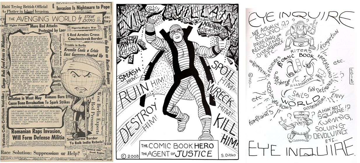
“Bad-Ditko” also had the nerve to reject the cherished (and false) notion that comics is fundamentally a storytelling medium. First published in 1969 and 1970, “The Avenging World,” for example, is a landmark in American comics history, an expansive work that wildly transgresses comics form: it’s a non-narrative comic with embedded narrative episodes, and it moves in and out of very different modes of representational and abstract drawing styles. In comics like this and so many others, Ditko reinvented the medium.
Ditko’s body of auteur comics from the late 1960s onward represents what we might call — what he might call — “Real-Ditko.” In most cases, no handlers touched these comics’ pages. It’s all him. Fans have long denounced Ditko for denying them access to his personal life, but they’re missing something. As he's said, these comics represent his mind projected onto the page. Like Mr. A.’s mysterious black and white calling cards, Ditko’s black and white comics are his letters — both love and hate — to the world, a life story obliquely told. In his final interview, Ditko articulates the principle that structures his life story: “Every person, whether he wants to be or not, is in a continuous struggle . . . against everyone he comes in contact with. It is a struggle to keep his mind from being corrupted” (Marvel Main #4, 1968).
For Ditko, real-life interlocutors are potential criminals, every interaction a potential mugging. Given this, it makes sense that his favored genre is the crime comic and that most of his antagonists are not grandiose supervillains bent on world domination. They’re just regular people — politicians, businessmen, comic-book editors, fans — out to take what’s not theirs. Static, like so many Ditko comics (perhaps even all of them), is covert autobiography, a compelling story about a hero and villains who stand in for the artist and comicdom. In Ditko’s work, the hero defeats the crime that is other people.
Conclusion: The Hero Who Leaves.
In 1984 Steve Ditko contributed a curious illustration to Superman #400:

At first glance, it resembles countless “pin-ups” celebrating an All-American hero who protects good people from evil menaces. Though Ditko admired Superman, we shouldn’t be surprised by his unusual approach to a character who embraces altruism and collectivism, two concepts Ditko and Objectivists disdain. While the illustration looks nothing like Ditko’s 1977 Comicon drawing, it, too, tells a story about the artist, his audience, and his art.
In the image’s two-dimensional field, Superman appears between the thugs and the public. But within its fictional world, he’s out in front, walking away from both groups. If Ditko wanted his Superman to represent the stock “defender of the people,” he could have drawn him thwarting the bad guys. Instead, the hero focuses on himself, breaking the chains that bind him (in Ditko’s work, chains recur as metaphors for self-imposed mental bondage). Ditko’s superhero is indifferent to all collectives, whether of fans or enemies; and, like the Comicon drawing, this image contains a lot more adversaries than admirers. While DC Comics’ Superman believes we should always save others, Ditko believes you can only save yourself: “no one can . . . fight [that “continuous struggle”] for” you (Marvel Main #4, 1968). Like the transcendent protagonist at the end of Static, Ditko’s superbeing lives beyond the grasp of devotees and detractors.
To elevate his brand of heroism above the altruistic do-gooding of corporate crusaders like The Man of Steel, Ditko sneaks in a little joke. A character’s sweater sports a large “A,” invoking Ditko’s quintessential Objectivist hero Mr. A., whose name refers to the Randian maxim “A is A.” Embodying “the virtue of selfishness,” Mr. A. is no sentimental softy like Superman (in one story, Mr. A. happily lets a thug he easily could have saved fall to his death). The “A” signals Ditko’s invitation to compare two different versions of comic-book morality as represented by the two heroes — and for Ditko, an “A” on your chest is better than an “S.” His “Superman” is not DC’s Superman, the public’s hero. He’s Ditko’s uncompromising ubermensch, an icon of the independent self. “I am not public property,” Ditko proclaimed in a letter. Thus says his super-man, who, as he leaves, looks serenely ahead toward his future.

A refrain in dozens of Ditko’s responses to fan inquiries about his past is the very un-nostalgic — and therefore very un-comic-book — question he told readers he forever asks himself: “What’s Next?” Ditko’s Static is, like the artist himself, the antithesis of stasis. The Ditko-produced Static comics tell the story of an artist always in motion, leaving comic-book people behind to breathe in what Nietzsche called the “bad air” of false ideals and received wisdom. What Ditko offers in Static and the many comics he created afterwards (he drew new material until months before he died), is “cacophony, noise, a racket . . . new concepts.”

As Nietzsche once remarked, forward-looking work requires readers willing to abandon expectations and embrace “rumination.” That’s what the restless art of Steve Ditko deserves.
_____________________________________________________________
Additional source and publication information:
First epigraph: from Creepy #93, 1977.
Second epigraph: from a Ditko reply to a fan letter, 2013.
Charlton Action Featuring Static #11, Charlton Comics, 1985.
Charlton Action Featuring Static #12, Charlton Comics, 1985.
[Ditko's title for the story is “The Exploder” - the Eclipse Monthly version is “The Exploder!” Above, I use Ditko's title for both comics.]
Ditko’s World #2, Renegade Press, 1986.
“Laszlo's Hammer,” as reprinted in Avenging World, Robin Snyder and Steve Ditko, 2002.
“H Series,” as reprinted in Avenging World, Robin Snyder and Steve Ditko, 2002.
Eclipse Monthly #4, Eclipse Comics, 1984.
Eclipse Monthly #2, Eclipse Comics, 1983.
“Art!?,” as reprinted in Avenging World, Robin Snyder and Steve Ditko, 2002.
Blake Bell, Strange and Stranger: The World of Steve Ditko, Fantagraphics, 2008.
Marvel Main #4, 1968, Btoom! Publications.
_____________________________________________________________
_____________________________________________________________
Ken Parille is editor of The Daniel Clowes Reader: A Critical Edition of Ghost World and Other Stories. He teaches at East Carolina University and his writing has appeared in The Cambridge History of the Graphic Novel, The Best American Comics Criticism, The Believer, Nathaniel Hawthorne Review, Tulsa Studies in Women’s Literature, Children’s Literature, Comic Art, Boston Review, and elsewhere.


