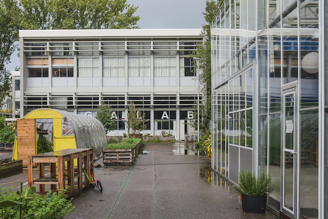
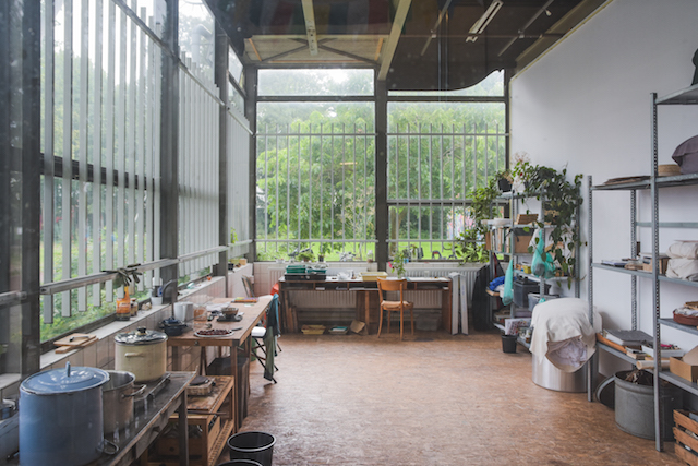
You can approach AGA LAB through a courtyard, in which raised beds of various plants are being grown. I will find out that this is part of an artistic research program developing vegan paints. The apparatuses of the tests of these colors are conducted at one end of a communal kitchen, one of the many instances where the laboratory element of creative practices is clear.
While typically not prominent in European comics historicism and criticism, the Dutch scene has plenty of devoted, experimental and intriguing comics artists in its midsts. Amsterdam’s AGA LAB, an artistic workshop containing various printing equipment, has attracted a fair amount of the city’s prominent illustrators and cartoonists into its gravitational zone. I wanted to explore the LAB exactly because of the intimate relationship some of the city’s prominent comics artists have had with it, as well as find out more about its Risograph printer, which here and elsewhere in the comics scene has become the machine of choice for producing work.
AGA LAB, formerly the Amsterdams Grafisch Atelier, was founded in 1958 as an affordable option for artists to access technology and space to experiment. It predates the boom of shared workspaces currently being offered to “digital nomads” in the city by a good few decades. Compared to the co-working spaces currently embraced by people in the “creative industries”, AGA is a more egalitarian project designed to (re)distribute resources and knowledge. That philosophy is apparent in the fact that the space relies on public funding and volunteers to sustain itself.
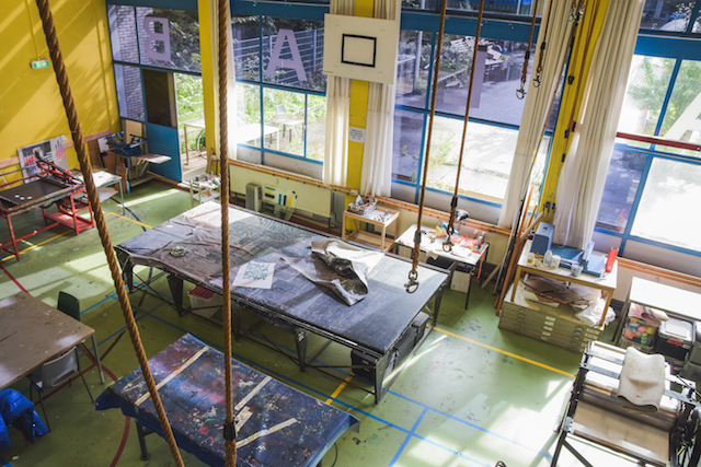
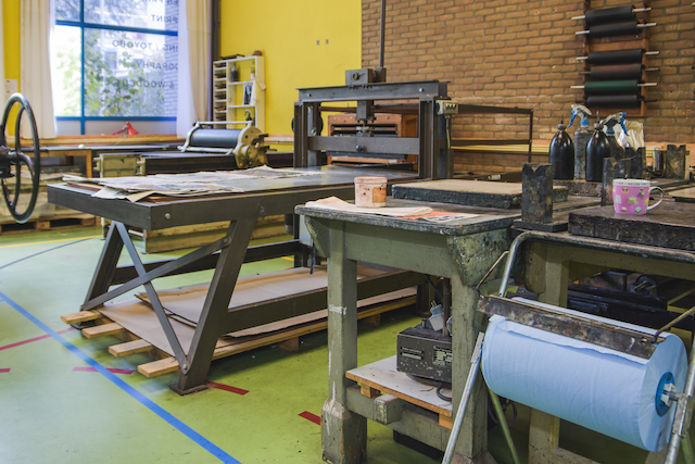
 Nearly everything is in one room, which boasts high ceilings and a wall which is almost entirely glass; it’s an old gymnasium, basketball hoops and typically colorful floor lines are still visible. There are various screen printing machines to wind between, some of which are so old and industrial they seem authentically steampunk. Under the workbenches are draws of archives, tests and works-in-progress. A side room has been repurposed into a space suitable for various experiments and now comes complete with a giddying miasma of hazardous chemicals.
The Artists
The volunteers at AGA look after particular machines or guide students seeking information on specific practices depending on their expertise. Maia Matches has been guiding guests in Risograph printing since 2017. Since moving to Holland from Canada in the early 2000s, she has worked at the cross-section between the country’s squatting movement and self publishing culture. Her style is excessive and violently funny; her themes and topics are serious. She often portrays strong female characters, and explores the realities of marginalized groups. Her position as Amsterdam’s official City Illustrator for 2019 has meant that four major collage works, discussing issues such as the city’s sex work industry, have been published by the daily Het Parool newspaper.
Maarten Schuurman is another artist involved in AGA, and straddles the various artistic worlds that are present in the building. As well as comics he produces fine art and installations. He is also head of the screen printing department at AGA. Hocus Pocus Comix, which was more active earlier this decade, is the name of his publishing outfit. Recent activity includes his 2019 miniature “one staple comic” Micro Snicker.
 Active since the late 1980s, Wasco (real name Henk van der Spoel) has been self publishing most of his career and has built a steady Dutch fanbase in the process. He is generally acknowledged as exploring abstract and naïve styles. Under the pseudonym Wanda Scott he has even branched into erotica.
British artist James Nash had until recently been working from Amsterdam and has self-printed work at the LAB. Nash can generally be recognized from his narratives centered around incidental, autobiographical anecdotes. The Risograph machine encouraged him to think practically and produce small format books and individual prints.
The Rebirth of the Risograph
The Risograph machine was launched as a copy machine by the Riso Kagaku corporation in Japan in 1986, although network printer models are more popular now. Its soy inks are affordable (although come with an environmental cost), and its printing process doesn’t use heat, so it is much more affordable than the likes of laser or inkjet printing. Once it’s set up, it’s also quick, printing up to 185 pages per minute. These factors meant that Riso was originally adopted by churches and public institutions to print one-color flyers at speed.
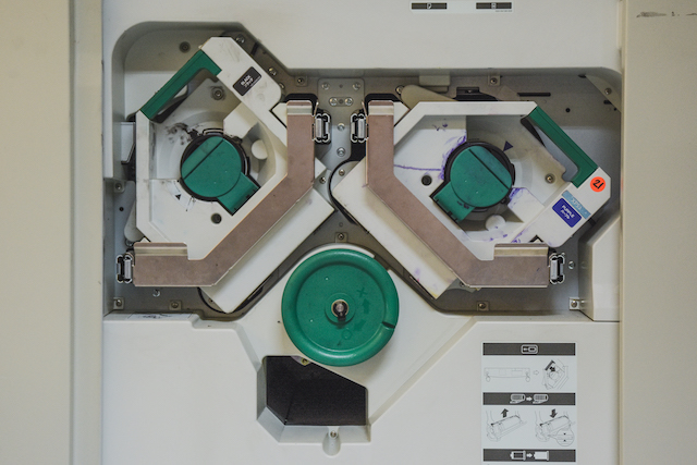 A majority of the time put into Riso printing is in the preparation. Because the colors are determined by the drums you use, digital files must be in black and white. To start printing a digital image, the machine first creates masters, stencils of your image, which wrap around the drums. Masters are made of wax, which means that each one has a relatively short utility span. While printing, the ink in the drums is pushed up through the gaps of the master and onto the paper. The ink the machine uses can’t be applied to glossy paper, the soy needs a matte surface in order to bleed into the material and make itself permanent. Of course, inks are not totally predictable, and to get more than one or two colors onto a page requires the paper to be fed through the machine again, with different drums, in order for colors to overlay each other. Although actioned by a machine, this has echoes of the painterly process of applying layers of paint on a canvas. The inherent uncertainty such a method produces is part of the excitement of the production process, it puts artist and machine into a collaborative mode.
All of these factors are what gives Risograph printed works what artist Gregory Thomas has dubbed “the alternative aesthetic.” This “alternative” is very much in opposition to digital printing techniques that became common in the 2000s, which were described as "soulless" by Ben Freeman, a co-founded Ditto Press, the first UK based company to use Riso for the purpose of printing art books in the later part of the previous decade.
 Ditto were far from the first in Europe to see potential in the humble Riso for the purposes of (re)producing art, however. The Riso machine at AGA is ultimately owned by Joyce Guley and Jan Dirk de Wilde of Knust. The Nijmegen based publishers, which operate from within Extrapool, an artist studio and venue for the unusual, has been printing with Risograph machines since the late 1980s.
There has been some debate in traditional art history as to the role of the artisan vs the role of the artist. The artisan has been looked down upon as being too “workmanlike”, a mere laborer producing a product. The artist, meanwhile, has been seen as producing something unreproducible, an object of total originality which has no practical purposes other than to be beautiful, etc. But art clearly has practical uses (making money, promoting ideologies), and “common” objects garner aesthetic responses. Comics artists demonstrate that the artist is artisan and vice versa. They are artisans because they skillfully produce an object which has a practical objective (to be distributed, to be read, to be shared) and also an artistic one, to inspire an emotion or desire, for example. Comics is a medium unabashed about being artisanal and artistic. Recognizing the dialectic relationship between tool (Risograph) and craftsperson (designer/creator) is one route to this clarity.
Producing an Antitype
The concept of “type” has been closely tied to print since Gutenberg became embroiled in the 15th century mission to invent machinery which could mechanically reproduce text. Since then, and increasingly so, the idea of endless repetition and reproduction has become not a goal but a characteristic of culture.
 The word stereotype, which nowadays means the simplified and fixed idea of something or someone, originally described the repeatable plates, based on a mould, which were adopted for the production of pre-industrial media. Working on the understanding that contemporary culture is oriented around types, I became interested in thinking about the work coming out of a workshop such as the AGA LAB as “anti”-types. They are (commercial) productions, yes, but they are not obsessed with the idea of easy consumption or being distributed beyond their own spheres of meaning or community.
One definition of an antitype is a person or thing that represents the opposite of another. The boom in DIY Risograph printing presses, and the various books, zines and comics that have arrived thanks to this trend, calls to mind this definition. Given that Risograph printing is typically best suited for limited to mid-range print runs, and that its results are not always identical, and never glossy, Risograph-printed publications are very much anti- to publishing formats typical of to more commercially minded comics publishers.
Rethinking the Antitype
There is a second definition for antitype which comes from Biblical analyses. In this theological context the type is also the thing that can be repeated, the metaphors of the Old Testament, but the antitype is something unreproducible, such as the ultimate symbols of the New, think of the Virgin Mary or Jesus for instance. The antitypes of the Bible, being so special that they couldn’t possibly have been born from the materiality of the perceivable world, could maybe be the conceptual root of the “specialness” given to works of art, which are themselves often seen as being produced by singular geniuses.
 I want to take this notion of the type/antitype binary and redefine it slightly. For my purposes, the type retains its general meaning, pointing towards the thing which can be repeated (it is befitting that, considering the conceptual implications it has dragged through with it over the centuries, the word “type” sounds so mechanic). Meanwhile, the antitype is that which is unique and singular.
Let’s apply this distinction and see how it might lead us to describe comics. If we think of the (stereo)types of comics we don’t only have to think of characters or genres, we can also think of packaging, presentation and paper. In this sense, stereotypical comics are types, materially speaking, because they are endlessly reproducible objects that refuse an original state. In this age of digital coloring and editing, there isn’t even an original object to be had. The production line’s aim is to make something that is reproducible. The more it is reproduced (and sold), the better. Small press works, the likes that are fed onto trays by the Risograph, defy this logic.
Culture vs Cultures
Arguably, it is the mass production and distribution aspect of popular comics which makes them quintessentially pop culture. Pop culture relies on the individual’s experience to be subjective (and be perceived as unique), but for their stimulus to participate in a discourse. The greater the distribution of the object, the more voluminous the discourse is, the more credible your subjective experience can be, simply because more people will recognize the object which inspired your epiphany. Batman is like God in the sense that He is available to everyone, but if you perceive yourself to have a deep affinity with Him, He is especially special to you.
 In being unable to produce the volume of product necessary for pop culture consumption, risograph publications fit my somewhat bent, Biblical notion of antitype. Not only in content, but also in form and in practice. Each risograph printed book or zine is an/the original. What is refused by them is the state of endless reproduction.
My position here is open to the criticism that I am fetishizing the notion of the original, a somewhat elitist idea, and one that has been routinely dismissed by many art scholars in their attempts to make “art” a less exclusionary zone, accessible only to certain people and not to their others. Some of them have even used comics as the medium through which to argue that the notion of originality, or at least of the importance of originality, is dimwitted. Comics demonstrate that reproducibility does not necessarily lead to a degradation of the content or affective prowess of a predominantly visual thing. Of course something being more original or singular does not mean it’s necessarily better in terms of the full scope by which we judge cultural objects.
But it’s become increasingly harder to enter and subvert the mainstream. This has felt like the case since digital culture fractured what was once the well managed attention of the general public, and the synchronic transition from the institutions of and on TV and radio to the user experience and behavioral economics-oriented world wide web. In conditions like this, in order to avoid subjugation to a system that exploits private thoughts and actions, the best tactic is to go below, to become sub- and countercultural. Beneath the mainstream, ideas and methods are not put under the thumb of cognitive and surveillance capitalism. Saved from overexposure, things take as long as they need to, and both the artist and their interlocutor are free to explore at leisure.
If the tedious “record revival” has taught us anything, it’s that there’s not much that capitalism can’t subdue. Anything that may add a whiff of credibility to factory-minded business is not safe from this superstructural predator. For the time being, however, the practice of risograph printing seems safe from gentrification. Practitioners have taken a machine that was designed to make prints that were disposable and have subverted it, using it to instead make things which are beautifully niche. They have set their antitypes upon culture, and demonstrate that, even in these reproducible times, there is still the possibility to make something special.
Photographs of AGA by Angelo Zinna


