From The Comics Journal #82 (July 1983)
Ronin is DC’s Big Project for 1983 — perhaps even for the decade. Frank Miller has been given total creative freedom, a contract rumored to be the largest ever signed in American comics, and an impressive upscale format that allows Miller 288 pages to do with as he pleases.
DC’s confidence in Miller is understandable. In his brief career, the young artist has united huge commercial success with the kind of critical acclaim not heard since the now dim days of Steranko. Ronin is hugely ambitious, meticulously conceived, and original in execution: it looks and feels like no other comic book on the market. If nothing else, Ronin stands as a rare example of a commercial comic book that totally reflects its creator’s vision, unfogged by editorial meddling, counterproductive collaborators, or the pressures of indefinite serialization. Perhaps the most important point, Ronin is not merely a replay of Miller’s Daredevil: although there are similarities in theme and style, it is bolder, less compromised, and richer in conception.
Unfortunately, all the weaknesses evident in Miller’s Daredevil have followed him to his new project, many in amplified form. Ronin further erodes Miller’s already precarious position as one of the very few major artists to emerge from mainstream comics since the early ’70s. His work is undercut by grievous flaws, and they are flaws that appear to be part and parcel of Miller’s artistic gestalt, rather than technical difficulties that might be corrected in the future. Ronin provoked in me not only disappointment, but also a sense of pessimism with regards to Miller’s future career: he seems headed straight for an arid no man’s land of mannered, disjunctive storytelling put in the service of second- and third- hand experience. Ronin is but the latest stop on the way.
Ronin’s central conflict is between a young samurai warrior and the demon that kills his master, thus shaming him and turning him into a ronin — a samurai without a master, a roamer. The focus of the battle is a Stormbringer-like sword: it is the only thing that can kill the demon, who wants it for reasons you can imagine. An added twist is that the sword can kill the demon only once it has spilled the blood of a good man. After 20 years of roaming, the warrior confronts the demon and slays him in a grotesquely logical manner that satisfies the sword’s peculiar requirement; at the same time, his and the demon’s souls are fused to the sword.

With the help of Miller’s rapid-fire narrative techniques, the story barrels along at a rapid clip. But the kinetic energy is built on nothing very solid, and little of the story stays with the reader as a result. As he did in Daredevil, Miller will sacrifice almost anything for effect, and this squeezes from the material any impact beyond immediate shock value.
Let us begin with character and motivation. Miller set himself a formidable task by placing the story in Medieval Japan, a culture that, despite Kurosawa revivals and Shogun, remains profoundly alien to the Western spirit. This is not an insurmountable problem, but Miller doesn’t even come within a stone’s throw of solving it. He writes the young samurai as a dour, ethically-obsessed, somewhat dim fellow, and then seeks to ease the cliché by giving his aged mentor a more earthy, with-it appeal. I don’t know if playing the samurai within the classic clichés and then mocking him through his master is such a sharp idea: we’re immediately alienated from the ronin, whom we regard as something of a humorless clod. Worse, Miller’s often clumsy verbal jousting reflects a contemporary cynicism that is most distracting: some of the mid-battle banter would not be out of place in Spider-Man. (Or Daredevil.) Easily the most leaden attempt at levity occurs when the young samurai begins to prate about his duties and his training, and the older samurai tartly quiets him with, “Oh, shut up.” True, the book needs humor: it’s the most humorless comic I’ve read in quite some time. But the attempts at wit here are terribly clumsy and labored, as if Miller had sensed a need for something to redeem the Oriental sententiousness, but wasn’t quite aware of what.

The Japanese notions of uncompromising honor and responsibility give the impetus to the ronin’s actions, but this imposes on the character a tediously linear line of action. Once the premise is established, we know he must kill the demon, and that’s that. Miller sets up two dramatic situations that might lead to a fuller psychological subtext for the book, but dismisses one out of hand and gives the other short shrift. First, there is the idea that the ronin has been shamed by his failure and must carry that burden with him until he has expunged it by ridding the world of the entity that caused this situation. But the concept of shame — or its Western equivalent, guilt — is quickly disposed of after the initial shock, and never resurfaces. Second, there is the idea of the magical sword that must be soiled with the blood of an innocent — a potent if blatant symbol for sacrifice, in both the literal and the abstract sense. But Miller throws the idea away after teasing the reader with the suggestion that the ronin might slay a woman and child he has just rescued. Then, at the climax of the battle with the demon, Miller suddenly pulls out the by-now forgotten conceit and has the ronin slay the demon by plunging the sword through his own body and into that of the demon. It’s an, uh, striking image, but the notion of sacrificing innocents had more of a moral resonance than this gruesome trick; at the least, keeping it around as a possibility would have given the narrative a little more tension.
The first half of the book is a stage-setter, true. But even so, there is no reason for the lack of dimension Miller has imposed on it. I can’t imagine that Miller will be able to pick up his character a full sixth of the way into his story and give him any kind of subtext; in fact, the clumsy attempts at characterization (the old warrior) here and his track record with Daredevil lead me to suspect that it won’t get any better.
The artwork is thoughtfully designed and meticulously executed, and virtually none of it is any good. Miller still draws the human body very badly; his characters never balance or move correctly. Now, in a book that is mostly composed of fight scenes, it would seem quite a liability to have an artist who doesn’t draw action well. In a sense, though, Miller doesn’t draw action at all. I had begun to notice this in Daredevil, and it, is even truer of Ronin: Miller’s panels, individually, are usually immobile. They display people posing before and after the action; every movement happens between the panels. Significantly, the few panels where the characters actually do move are among the worst constructed and least convincing.

Miller’s much-vaunted story-telling skills have also collapsed into a set of annoying mannerisms. Why must nearly every panel be either the length or the width of the page? It’s as if he had set himself the task of drawing his story on the wood of a picket fence, alternating between horizontal and vertical sections. One result is that the reader is pulled along at terrifying speed. The narrow slivers of art leave no room for the eye to wander, and it is unceremoniously shoved from one panel into the next; whenever I hit the occasional “normal” panel, I felt like stopping to catch my breath.
Even if one makes a forcible effort to stay with one panel for more than the two seconds it takes to actually scan the elements in it, one is hardly rewarded. None of the panels are composed in any way that is aesthetically pleasing. How could it be? You can’t draw anything in a space that’s 10 times taller than it is wide. When Berni Krigstein subdivided a page into slivers of time, he had the sense to establish, in a normal image, the location and characters, before using his exquisite sense of timing and design to zoom in on a particularly important detail or moment of the action. Miller will render whole sequences, from establishing shot to climax, in these oppressively designed panels, and the effect is alienating.
Miller’s command of perspective is also still shaky. On the double page spread showing the superscientific Aquarius Complex, for instance, the Manhattan streets and buildings splay out as if it they had been reproduced from a warped photograph. (No, it’s not stylization or forced perspective; it’s bad perspective.) Miller cleverly gets around this problem, though, by rarely trying to draw depth; when his panels aren’t entirely flat, he draws them in layers, like a 3-D comic.
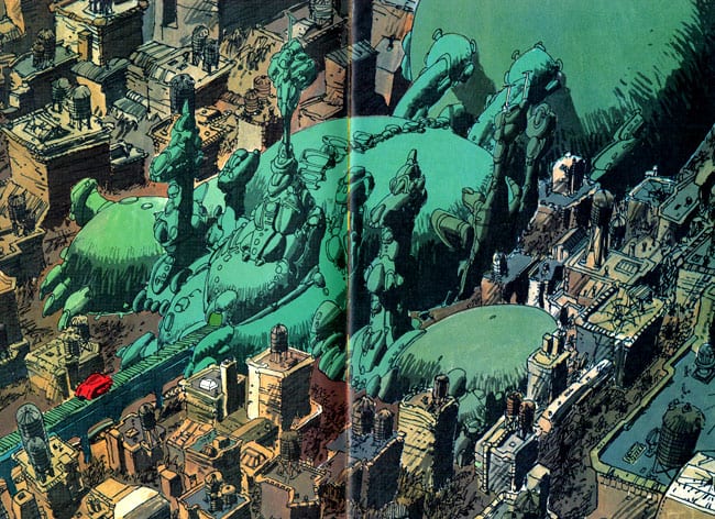
The fuzzed perspective and the picket-fence continuity put the reader in a permanent state of spatial dislocation, which is made even worse when he enters the Aquarius Complex and finds everything built on platforms or floating in the air. As a result, when the demon invades the center and chases toward the protagonist, the tension is sapped by the fact that we haven’t the foggiest idea where he is, where he’s going, or how fast he’s getting there. This is bad storytelling by definition.
Much has been said about Miller’s developing an entirely new way of rendering for Ronin—in fact, three of them. The first one is nothing more or less than an artless mess of crude cross-hatching. Ronin is being done as a full-color title, with the infinite variations of hue attendant; why, then, does Miller choose to do his modeling with cross-hatching, a system developed to work around early printers’ inability to work in continuous tones? Well, one reason might be the fact that if Miller didn’t throw on a few layers of scratchy stuff, his bad drawing would be embarrassingly obvious. Any aspiring artist knows that if you have a mediocre drawing, it will look less blatantly mediocre the more lines you put on it. Miller’s cross-hatching muddies the shapes and design enough to let him get away with quite a bit of bad drawing, and “stylization” carries him the rest of the way.
In interviews, Miller has explained that he has borrowed much of his technique on Ronin from Japanese comics, with which I am not familiar. I can only conclude either that the Japanese comics that inspired him are bad, or that something got lost in the translation. Considering Miller’s track record with Kane, Krigstein, and his other misappropriated influences, I incline toward the latter.
(Incidentally, Miller also plays with this technique on a truly awful series of two-page pin-ups of “Great Fictional Detectives” or somesuch he is doing for Ms. Tree’s Thrilling Detective Adventures. I can only conjecture that he used this idiotic assignment to practice the technique, take the money, and run. It’s such an obvious, crass ploy on Eclipse’s part to use Miller’s name that Ms. Tree’s editor certainly deserves what he got, and any reader seduced into picking up this silly little comic on the basis of Miller’s name deserves what he gets.)
It is in the second half of Ronin #1, which is set in the future, that the latter two rendering styles manifest themselves. The second is merely, more or less, the first one, but with a thicker pen. The third, however, is the surprise of the lot: It’s Moebius. Not Moebius-inspired or Moebius-derived, but Moebius, period. Miller has told me in personal conversation that he realizes he allowed Moebius’s style to take over too completely in the first issue, and hopes to fix this in future issues. I certainly hope so, for the duplication is astonishing.
Some artists have been able to absorb another artist’s style and do wondrous things with it; Joost Swarte’s spookily accurate duplication of the late Herge is the best example. Miller has no such luck. The main problem here is the fact that the Moebius panels and the non-Moebius panels clash frightfully. The former are fairly graceful and cleanly delineated, with few of the epileptic pen strokes that characterize the rest of the book; the latter are overdrawn and, well, ugly. When Miller goes in for a close-up of a character, for instance, he draws and draws until the paper almost groans under the weight of the planes and angles, each one defined by a pattern of cross-hatching and scratching; yet it fails because he is not sensitive to facial structure or expression.
We are now at the heart of Miller’s problems as an artist: his drawing is all technique and no observation. None of Miller’s panels gives any indication that he ever sat down and studied a face, a building, the way a fold of clothing falls on a robe, a leaf. I don’t mean to say that Miller doesn’t draw from life: in fact, Miller has quite a reputation for scrupulous research. (Ed Hannigan once lampooned Miller’s alleged habit of scaling the Manhattan rooftops just to get the water towers right for Daredevil.) What I mean is that he seems totally unable to translate what he sees onto the page. Somewhere between his eye and his hand, reality runs afoul of his technique. This is a common syndrome among artists who start off by developing a technique. When they finally get around to learning how to draw, the hand has developed its set of motions, and refuses to be coerced into the infinite subtleties demanded by the act of creating drawings based on observation. (Here we have, incidentally, one of the evils of the American comics system. Because of the financial structure, it forces young artists immediately to develop a set of techniques: one has to churn out the stuff if one doesn’t want to starve, and it’s easier to learn a technique than to learn how to draw. By the time the artist is being paid well enough to slow down — if he ever gets that far — his techniques have killed off his ability to traduce his own sensibilities onto the page. This is why people like Jim Starlin and Marshall Rogers will almost certainly never draw well.)
Ronin is, despite all this, a very good-looking comic. Some of the credit for this goes to DC’s production department and printers (and to Miller for insisting that it be done this way), but a large part goes to the colorist Lynn Varley. On the evidence of Ronin, Varley is, quite simply, the best colorist in American comics. Most other colorists have, when confronted with the full process separations, tried to do the artist’s job for him by playing around with modeling and airbrush effects, while ignoring the fact that the greatest benefit of the full process is the acquisition is a more varied, and therefore subtler, palette.
Varley (along with, I presume, Miller) has made three important and good decisions in coloring Ronin. First, she has avoided the use of graduated coloring almost entirely, allowing the art to indicate shape and movement. Second, she has favored earth colors, using great quantities of greys and browns, and toning down primaries and secondaries, except when she is aiming for an effect. (For instance, the Aquarius complex is colored a bright, bilious green, giving it the lustre of a monstrous green spider crouched on the ashes of the dead city.) Third, she has deliberately restricted herself further by doing most of every page in one or at most two basic colors, but using the process color to give herself an infinity of shades within these colors.
The coloring is extremely well thought out and even better executed. I initially read the strip in black-and-white Xeroxes, and many sequences that were confusing in that incarnation take on a new clarity in the colored version. Specifically, Varley has given each location in the story a specific color-code, the background color clues in the reader as to where the action is taking place. This does nothing to alleviate Miller’s problems with spatial relationships (you still can’t really tell who is where in relation to whom), but gives the strip a sense of location I had missed earlier. It is also difficult to overstate the amount of mood Varley has imposed on what is essentially frigid and poorly felt art. The coloring adds a dimension that is not at all present in the art itself. The medieval Japan scenes are colored in antique-looking earth colors that flare into expressionistic reds and yellows in the heat of battle. The interior of the superscientific Aquarius complex is rendered in pale, antiseptic greens that frequently carry over onto the faces of the humans within, giving them an unhealthy, artificial sheen.
The idea behind the second half of the story is complex enough that it is not worth summarizing; if you’ve read it, you don’t need a summary, and if you haven’t read it, there’s no point in spoiling the climax for you. I feel less easy discussing the story here than I did the art, since Miller has yet to show his full hand. Moreover, once I told Miller I was reviewing Ronin, he asked me to do a second review once the series was over. He may regret that request after reading this one, but I have agreed to do so. You may thus expect part two of this review in about 10 months, somewhere around Journal #90.
A few remarks, though. The switch from the past to the future in the middle of the first issue is a good, startling trick, and if there are more jolts like this in upcoming issues, the book will certainly have a good deal of energy. (Quality? That will depend on whether these ideas are any good, of course.) I am curious as to how the samurai-code-of-honor-demon stuff of the first half will blend with the ESP-post-holocaust-stuff of the second half. Frankly, my hopes are not very high, but we shall see.
Some influences in the writing stand out. I would venture to say that Miller may have borrowed some Heinlein books from Chris Claremont, although, for all I know, he may never have read The Moon is a Harsh Mistress (the computer who has created a visual image for itself on a television screen) or “Waldo” (the crippled lead character who uses mechanical appendages).
My reaction to the storyline is ultimately this: It’s a clever, if derivative conceit, and it kept me turning the pages. But cleverness is shallow, and I don’t trust Ronin to deliver anything deeper. I think that the first issue gives away Miller’s aims if not his actual way of executing them.
Ronin is a gorgeous package, produced and controlled by a single creator. In that, it is a step in the right direction for American comics. Ronin will teach the mainstream companies that they can make a huge amount of money without stealing their creators’ ideas, saddling them with unsympathetic and reactionary editors, and printing the material on toilet paper. Miller deserves credit for using his clout to effect this kind of change, and he deserves credit for trying to do something different. I just wish I thought it was any good.


