Ryan Sands, Publisher at Youth in Decline, joins me for Part 4 of my ongoing series where I speak to some of the pioneers of risograph printing.
I started this conversation with Mickey Z, then spoke to Jesjit Gill of Colour Code Printing, and caught up with Ryan Cecil Smith - check out the rest of the Risograph Workbooks: Risograph Workbook 1: Mickey Z; Risograph Workbook 2: Jesjit Gill/Colour Code Printing; Risograph Workbook 3: Ryan Cecil Smith.
Now Ryan Sands steps up to the plate!
================================================
Santoro: Ryan, have you heard this legend which has it that Mickey Z was one of the first makers on the comics scene in the States to use a risograph printer? Ryan Cecil Smith mentioned to me that he got interested in using risograph because he heard she and YOU were using them - can you talk about your "riso origin story"?
Sands: The legend is true! When folks ask me what got me into risograph printing, the answer is the photo below:

When I was still just a baby zinemaker, I got to know Mickey Zacchilli and her work online. We became friends talking about horror manga via my old blog Same Hat, and Mickey did some cool drawings for my "mixtape" zine Electric Ant (which includes Mickey and Michael DeForge's first-ever collaboration, the end papers for Issue #2). I was totally enamored with Mickey's comics, and how she used limited spot colors to give the zines a lot of life. Before her risograph comics, I hadn't seen people use their own handwriting as a specific layer of color, which makes a zine have this cool depth while still looking like a hand-made DIY object.

People ask me about risograph a lot, and I get hesitant to characterize it as a look or aesthetic unto itself. The machine is just a means to production, and how artists mess with it and use it is a reflection of their priorities and style - Mickey uses the riso to maintain spontaneity and a handmade griminess to the comics, while someone like John Pham applies his printmaking emphasis and precision to create these really sharp and dense books full of color and gradients. Then there are folks like Ryan Cecil Smith, and Colour Code Printing's Jesjit Gill, who want to push the color blending and technique as far as possible, recreating (and sometimes surpassing) the sharpness of CMYK offset printing. A risograph machine is just tool that allows creators & publishers to speed up & expand on an existing approach.
Tell me about what machines you've used or are currently using?
I currently use a RP 3105 at my space, which doubles as a little print shop and as a warehouse/shipping hub for Youth in Decline. The machine I use now was purchased by my friend David Murray (Telegraph Gallery/SEIBEI) via Craigslist - I believe from a printer in Sacramento who didn't want it and basically gave it away if he'd pick the thing up. We co-parented that machine when David lived and had an office here in the Bay Area, and I basically learned how to risograph over the course of printing Thickness #1 on it.

At some point along the way, I also purchased a risograph GR model from a church near Oakland, which had been using it to print their weekly bulletins for years. They were getting rid of it to get an all-in-one laserjet printer, and sold the machine to me for like $150. So, for a short while I actually had two risographs, but I gave my GR Series machine to another local SF bookmaker, Luca Antonucci at Colpa Press. It was getting expensive to acquire additional color drums (and keep supplies stocked) for two different models, so I doubled-down on the RP 3105. It's such a sturdy workhorse, and can print up to 11" x 17". I have 8 or 9 different colors for it, I believe.
Did you go to school for printmaking? I assume you were interested in printmaking before you discovered risograph printing.
Oh no, I have no formal art training whatsoever. I think of myself as a publisher (or zinemaker) first & foremost, and use a few different printers and methods to make books. Youth in Decline uses a few local offset printers, a bindery, as well as my own machine - it all depends on what a specific artist wants to do for their project.
That said, I did screenprinting in high school and college - mostly to make t-shirts - and learned a lot about stencils and color trapping via trial & error. The basic principles of screenprinting (layering inks, overlays, etc) all completely apply to the risograph. In university I worked as co-editor of my school newspaper's A&E section, and that was where I learned a few layout programs like Quark and InDesign, and how to plan out book signatures and layers.
I really think it is interesting that riso and the "art book fairs" of Printed Matter have run concurrent - meaning we are seeing more "zine" people at comics shows and vice versa - can you speak to this loose crossover? I feel like your label sort of runs in that corridor...
Whenever there's a tool that has lots of funky ways you can mess with it AND a fairly low cost to experiment and make mistakes, this sort of machine is good for folks that care about all the details of physical book production. I get super bored by books that are simply "risograph-themed" anthologies, but I love seeing "art book" folks use it in unexpected ways - like the thermography technique of Colour Code Printing to create elevated inks and push the envelope with the machine. That said - at its heart, the machine was intended to be a blue collar workhorse for schools and churches and offices to churn out hundreds of pages a minute for cheap, so I bristle a bit at the trend of high-end "risograph prints" in limited editions. I saw a gallery show in SF recently that had a 3-color risograph print for $40!!! Are you kidding me? That shit cost like $0.90 to print and you could make 1000 prints in an afternoon (including drying times!).
On a less cranky note, some of my favorite risograph books are actually not comics at all, but text-heavy magazines and journals. When I visited Motto in Berlin back in 2011, I saw a bunch of poetry zines and literary journals published on risograph - my favorite in this vein is the queer film journal Little Joe Magazine. Their embrace of a limited spot color palette feels vintage without being slavishly retro or lame. So nice.

Personally, I am fascinated with how risograph printing has changed making color comics. Before risograph was around the choices were expensive offset or expensive print on demand. I remember you stapling and folding zines the night before festivals like many of us but I think for you it has been different because of the riso - can you speak to the excitement surrounding the options now, as opposed to "just xerox or offset"?
You're right, my background is as a zinemaker and I've stapled thousands of zines by hand over the years. I have usually taken the approach that I want to learn something myself and do it by hand before I pay someone else to do it - whether collating and stapling, trimming, or perfect binding square books. A risograph is not some magical machine that takes the work out of DIY, but it does totally change the economics of self-publishing at a slightly bigger scale than purely DIY zines (say, doing 200-1500 copies of a book). For a run of that size, the cost of printing a 2-color book on Risograph is cheaper than xeroxing a B&W zine, and than printing offset in the US.
When I started Youth in Decline, I originally maybe conceptualized it as a risograph publisher, and all our books would have a signature "risograph" look. But, by the 2nd book I wanted to do - a collection of full-color paintings by Hellen Jo - I felt limited by that definition. Now I think of the risograph as one of many tools in the toolbox, and let the content decide the production approach (offset, xerox, risograph, digital-only) and not the other way around.

Some of my favorite things we've done have included a little of each medium. For both Frontier #5: Sam Alden and Love Songs For Monsters (a Science Fiction chapbook by Anthony Ha), we did the interiors on risograph, the covers offset in full-color, and then worked with a local bindery to bring the entire thing together and trim/bind the books. There's something really nice and elevated about a book mixing those techniques together with decent finishing that looks "pro" but still very personal. I also try to use the machine for anything that would cost money to do elsewhere - we've printed our shipping labels, our manila envelopes, our subscriber mailings, and even our wedding invites(!) on that damn thing.
Can you talk about how you choose to take on projects - how has it changed over the years?
We've put out a few dozen books by now, but Youth in Decline is still very much a small publishing house with limited bandwidth. My mission is basically focused on two things: Developing and fostering new talent with thoughtful editorial & production attention to their work, and helping most-established and international creators indulge in an interesting or experimental book or digital project. Youth in Decline is still (for now) my side project after work, so I try to work with good people on projects that have something unique and urgent to say (both aesthetically and narratively).
My wife Jane and I were lucky enough to welcome a daughter at the start of 2017, so we're taking a bit of a hiatus as we figure out this parenting thing. Juggling everything is a challenge, but we have some really cool plans in store for our Frontier series and other projects in the 2nd half of 2017 and in 2018.
==========================================
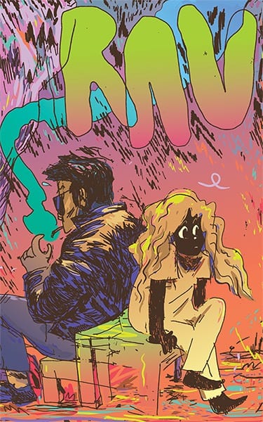
See the latest publications from Youth an Decline HERE. Be sure to check out Mickey Z's new RAV 2nd Collection and the Frontier series.