
The subgenre of comics-as-poetry has been exploding of late, with an anthology of that name being published a couple of years ago and several artists forming collectives such as Team Weird Comics as both a collaborative and motivational measure. Still, it wasn't until the first issue of Ink Brick came out in 2014 that a regularly-scheduled publication devoted solely to comics-as-poetry emerged. Ink Brick casts a wide net on comics-as-poetry, including the sort of experimentation for its own sake that I feel falls outside of poetry as well as some instances of mere illustrated poems. For the most part, however, the submissions here are great examples of combining word and image in immersive and evocative ways as well as creating worlds both abstract and concrete.
The editors-in-chief are Alexander Rothman and Paul K. Tunis, with Gary Sullivan and Bianca Stone being listed as editors. Rothman's own comics work has advanced quite a bit since he first began; he has moved beyond simply illustrating a poem and improved his line such that it can now carry the poetic narrative almost entirely on its own. His use of negative space in his poem "Keeping Time" helps create that sense of heat, of time clicking by slowly, while bees devour sugar from a nearby soda can as a hot summer day bursts open with rain.
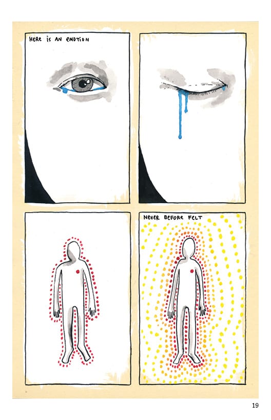
The excerpt from Sullivan's longer work Black Magic is less successful; it is essentially a laundry list of ghosts and monsters whose lack of context robbed it of any particular point of view. On the other hand, L.Nichols in "9 Weeks" uses the rhythm of comics in a four-panel grid to convey both the heartbeat of their gestating son and the heretofore unknown emotions Nichols felt when the fetus moved. The words are uncomplicated but nonetheless descriptive, adding power and context to the images without becoming sentimental. It's a remarkably good piece that speaks to Nichols's skill in navigating the gaps between narrative and poetry.
Tunis's approach is over-the-top and powerfully immersive, with the actual text taking on decorative properties outside of their meaning in terms of the narrative, the non-naturalistic use of color further pushing the reader into the world of Tunis's imagination and the actual drawings themselves bursting off the page with wit and cleverness. With lines like "the only difference between sand and glass is conviction" and using the phases of the moon to define both the eyes and the distance between the ocean-crossed lovers of the story, Tunis provides visual commentary on what he writes without merely illustrating the text.
Simon Moreton's piece is closest in style to that of Warren Craghead (the godfather of comics-as-poetry) in that the image is a scribble designed to allow the reader to barely recognize a setting and the words are scrawls that blend in with the images, sometimes commenting on them and sometimes serving as a way to express his own, difficult emotions. It's a merging of thought and apprehension of one's environment and overall perceptual and emotional state into an image that's meant to convey a powerful sense of immediacy. Stone's work is similarly visceral, only she uses layers of color and white-out to give her work a more visceral feel.
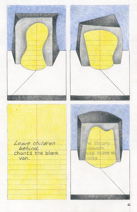
John Hankiewicz provides a typically enigmatic piece where a series of structures (a stage and proscenium?) flip by on a four-by-four grid, with the stage being a sheet of yellow legal pad paper. One of the panels is the paper itself, with an enigmatic poem, which is then reflected on the next page in one of the panels. The poem sounds like an announcement Hankiewicz might have heard or read about, one that resonated in a sort of performative way (hence the stages). It's a challenging piece that touches on the ways in which a simple announcement can have a transformative effective on reality, if enough people believe in it.
Simone Kearney's "Mobilization" is one of the weaker pieces in Ink Brick. There's a pleasant enough Gabrielle Bell-sort of quality to her drawings that are charming and engaging, but the narrative meanders and the illustrations themselves provide little insight. This is illustrated text, not really comics-as-poetry.

The second issue adds a "managing editor" in Alexey Sokolin and expands its page count. Jesse Reklaw kicked off the issue with a strong piece done in his recent, color-scribbled and slightly manic style. It's as though his formerly rigid style simply exploded out of their panels and on to the rest of the page. The results are fascinating, as he juxtaposes two different narratives (differentiated by the size of the text) against a nine-panel grid featuring the same image of stairs. The stairs are relevant in one of the narratives but also serve as a sturdy metaphor for the up-and-down nature of the relationships he describes.

Vidhu Aggarwal & Bishakh Som combined for a piece that addresses gender, weight, appearance, and identity, transforming the young woman in front of a mirror into a goddess while the evocative text works in tandem with the drawings, adding flavor and depth without superseding the images. This piece and Reklaw's piece both get at something human and emotional and aren't simply linguistic trickery.
The same can't be said of Mark Laliberte's interstitial pieces, which repurpose old word balloons against black space in an attempt to create something new. This feels like a gimmick without any awareness of interest in the original source material or what repurposing it means in this context. Matt Madden, one of the leading members of the "OuBaPo" experimental comics movement, contributes a bonus mini called "Walker" that is a comics attempt at a sestina: a visual presentation of a poem whose structure is built on repetition. Rather than build itself on rhyme, the sestina builds itself on repeated key words. The result is clever but ultimately another form of gimmick; it's an elegant kind of experimentation for experimentation's sake, not a genuine attempt at getting at the sublime through language and image.
On the other hand, Heather Simon's untitled interstitial pages accomplish what Laliberte's comics do not: tie longer pieces together with a grey wash and typewritten text mixed with a delightfully scrawled line. Nicolas Labarre's "Linger" cleverly makes use of negative space to get at issues of memory and identity. T.Motley (by way of Robert Duncan) has crafted a highly meta creation called "Comic Strip Beginning With A Line From 'A Poem Beginning With A Line By Pindar'". Those poems are about the act of creation and the nature of inspiration, and the comic is a tongue-in-cheek ode to group creation. John Robbins' twelve-panel grid comic about a young boy trying to get clothespins off a line is all about rhythm, motion and an unexpected quotation that nonetheless fits into the visual narrative.
This volume doesn't hold up quite as well as the first one does; pieces like Summer Pierre's drawing of a tree has the feel of a journal entry instead of a poem. Alexey Sokolin & Angel Chen's ode to city life is visually appealing, but the coldness of the lettering's font reduces this to image + words rather than something that manages to combine them organically. However, a great addition to the anthology is Kimball Anderson, whose "Online" gets at issues of identity through an internet chat conversation between two people who have never met. While text dominates this piece, the actual drawings of typing and the computer frame provide a crucial structure that would not be possible in pure text.
If the second issue is uneven, it's because the editors took risks in selecting different kinds of work. They cast a wide net in terms of styles of poetry and even the very definition of comics-as-poetry itself, which speaks to the diversity of its editorial vision. The diffuse quality of that vision makes for an uneven read, especially since it's obvious that different editorial voices have different ideas as to what comics-as-poetry actually is and what makes for a worthwhile example of this fledgling art form. However, a journal like this is the right place to make mistakes, engage readers new to the form, and stretch the limits of what can be considered comics as poetry. The devotion to high-end production values and the care taken to edit each issue as a discrete unit ensures that this is the best possible place for newcomers to explore this rich new vein of comics.


