
Let’s talk about space.
Not outer space, or rather, not directly. I’m talking more about the space on the page. You know, the area on which an artist draws. Every inch of the paper is empty space when you sit down to draw, just as every line is blank when you sit down to write a review. It’s how you fill the space that matters.
Or, as the case may be, how you don’t. Have you ever thought about white space? The gutters on a page don’t have to be white, and sometimes they aren’t, but usually they are. Gutters break narrative into chunks. Readers doesn’t usually think about that space between the panels, or at least I don’t. We accept both that white lines indicate the passage of time between discrete moments, and that the characters within the story don’t perceive these same white lines shaped like prison bars surrounding every moment of their lives.
Jesse Lonergan spends a lot of time thinking about space, all the different kinds: the empty space of the flat page, the liminal space of panel borders, as well as the cold expanse of outer space. Hedra is, on its most basic level, a story about an astronaut sent on a mission of exploration from a dying Earth, in hopes of finding something (or perhaps someone) who can help renew the biosphere. Now, yes, I should at least mention that is also very similar to the premise of Interstellar, but that was hardly a novel idea at the time, either. It’s not really worth more than a passing mention, considering said premise is merely a backdrop against which Lonergan presents his pageant of motion.
Wait, motion? I thought we were talking about space?
See, here’s another thing about comics: they’re a static medium. (Now is not the time to discuss those damn bastard motion comics, so I won’t.) Nothing moves on the page, but the illusion of motion is vital to comics. Now, certainly, there are speed lines, but speed lines indicate velocity inside a static image. The illusion of the passage of time - of an object moving, in other words - is accomplished by splitting up moments into tiny pieces, infinitesimally thin slices of time placed one after another to make a story. Usually separated by some form of gutter. You could also stack a pile of those sequential images on top of each other and run a sequence of those images in front of a scorching hot light bulb to project an image on a far screen. Same principle, different medium.
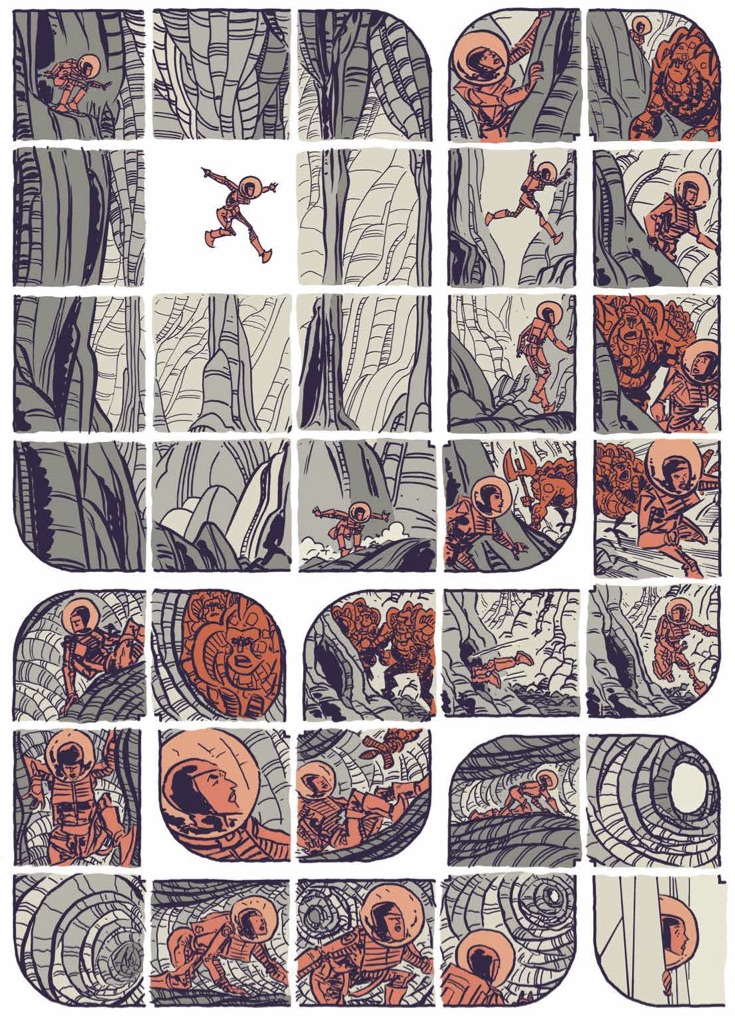
 Motion is important here because the book is preoccupied with trajectory, tracing throughout the flight path of rockets, spaceships, and spacemen. Hedra opens with the end of the world, here imagined as nuclear armageddon. Every page is broken into little boxes - thirty-five total, a 7x5 grid that underlies every drawing, though some boxes can be bigger than others. The gutters aren’t the only white space on these page, there are also parabolic trajectories of arcing rockets bearing payloads. When the rocket trajectories hit the white gutters they blast through the border and into the next panel. However, it’s worth noting that when the trajectories themselves intersect inside the panels, they don’t bleed one into another but are placed in spatial relation, one in front of another. Parallel in time but not space.
White space intrudes onto every image here, overlaying, sometimes undergirding, but never gone. Always a reminder of the brilliant white space lurking under every image on every page.
Busy layouts - and, regardless of effect, every page of Hedra qualifies as a “busy layout” - often flatten a page by forcing the reader to pay more attention to design elements than story. Hedra demands the reader adjust their pace, because there is never, or rarely, any kind of direct panel to panel left to right progression down an entire page. Sometimes there’s a clutch of narrative boxes stacked neatly one after another to indicate the passage of a discrete action, sometimes two boxes placed next to each other will indicate completely different planets. Sometimes it takes a while to suss out what’s happening in the story, a familiar sensation to anyone familiar with J.H. Williams or Chris Ware. Readability and design don’t always have to be a zero-sum game, but can be made so to interesting effect. When intricate design becomes reflective of thema the effort of decoding the page becomes intrinsic to the reading experience. Feature, not bug.
The astronaut’s progress through space takes a few turns along the way. There are robots in space - friendly ones, or seeming friendly. There’s also unfriendlies, in the form of a race of underground scavengers our hero encounters while exploring a mysterious planet. When she goes underground the story grid breaks into looping tunnels and gaping caverns, natural lines supplanting the precise grid if only for a few beats. There’s a gear shift into something resembling Fort Thunder, a comparison I make only because that crew was also obsessed almost to a man with drawing stories of strange creatures exploring vaguely suggestive claustrophobic underground realms. Eventually our hero finds the means to restore Earth, but I won’t give away the ending. The story gets pretty cosmic in the home stretch and its a credit to Lonergan that everything still makes sense despite the lack of narrative captions.
 The original printing of Hedra was a folded sheet of newsprint, much more massive than a standard comic. The Image reprint we’re discussing is also printed in a larger format, albeit not as large - 8.1” x 10.875” vs the original’s 10.5” x 13.5”. The new edition by Image will certainly be printed to higher standards as the original, but given that Lonergan designed the original to be printed on cheap translucent newsprint, I can’t help but think something might be missing without register errors and the occasional blurry smudge. Those white gutters wouldn’t be quite so white. He knows better than to surrender without conditions to a fastidious tendency. Much respect for anyone willing to print their magnum opus onto a paper napkin.


