I’m a flake. Last month, I wrote that my “Monsters Eat Critics” column would focus on genres other than superhero comics, and this month my topic is (cue trumpets) Jack Kirby’s Silver Age Marvel art. But I can’t help myself. I love the detail in Jack Kirby’s art. I love how he fills his panels with an almost promiscuous number of real and imagined objects, and I’m perpetually amazed by his ability to visualize and draw people and things from any angle in 360-degree space. My fascination with Kirby’s detailed, stylized, three-dimensional spaces has led me to write a few tentative ideas about how Kirby’s images—particularly in the 1966-67 heyday of the Fantastic Four, for me the visual apogee of Kirby’s art—structure a reader’s attention, and how backgrounds generally function in comic art.
By the phrase “structure a reader’s attention,” I mean that when we look at a Kirby picture, we prioritize—we give our attention—to some elements more than others. This variability of attention is true of our visual perception in general. In the first two chapters of their book The Invisible Gorilla (2010), cognitive psychologists Christopher Chabris and Daniel Simons argue that “we experience far less of our visual world than we think we do” (7). Because the visual array is so vast and dense with stuff, we learn, instinctively and at a very young age, to zero in on specific details relevant to an immediate purpose. We then ignore the rest, no matter how odd or incongruous the peripheral stimuli may be. As Chabris and Simons write, “Our vivid visual experience masks a striking mental blindness—we assume that visually distinctive or unusual objects will draw our attention, but in reality they often go completely unnoticed” (7).
Chabris and Simons’ book is named after an experiment they designed to reveal the limits of our attentive vision. The researchers shot a one-minute film of two teams of people moving and passing basketballs, with one team in white jerseys and one in black. They then showed the film to volunteer subjects, prefacing the video with the following instruction: “Count how many times the players wearing white pass the basketball.” You can try to keep the count yourself:
The result: fifty percent of the video watchers were so engrossed in counting passes that they missed the gorilla that beats his chest in the center of the frame and then exits stage left. The invisible gorilla experiment illustrates the cognitive phenomenon known as change blindness, defined as “the surprising failure to notice seemingly obvious changes from one moment to the next” (54). There are plenty of examples of change blindness online—here’s one guaranteed to drive you mad —and all remind us that our vision is effective only when backed up by our active attention.
Is the same true of visual art? We shouldn’t assume that the same cognitive practices apply to both our perception of the real world and our perception of visual art; film and comics are framed, simplified approximations of reality, and might require from us different ways of seeing. It seems, though, that some practices in various visual media encourage our innate selectivity of attention. A dominant visual norm in contemporary Hollywood film, for instance, is shallow focus, the crisp focus on one plane of depth accompanied by the blurring-out of other distances from the lens. I’ve embedded below a video by the playful film collective Majestic Micro Movies that illustrates how shallow focus works:
Shallow focus is so common that we hardly even notice it (unless—yet again!—we give it our attention). We also tend to ignore a fairly extreme variation of shallow focus called rack focus, where the cinematographer will change focal planes in the space and duration of a single shot. Near the end of the film of High Fidelity (Stephen Frears, 2000), John Cusack’s character is in focus, with objects closer and further away from the camera reduced to fuzzy blobs. Then a person-shaped blob (Caroline Fortis) enters the background from the right side:
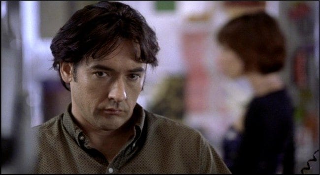 When the blob speaks, cinematographer Seamus McGarvey throws her in focus, and in the process blurs Cusack:
Rack focusing is so common in Hollywood films that it usually escapes a spectator’s notice, even though focal shifts profoundly change the visual composition of the shot. Yet rack focus is only the most rudimentary way filmmakers guide our attention; points of motion, particularly moving hands, heads and faces, shift our concentration to different zones inside the frame. For an in-depth, empirical study of how our eyes and attention move during a long take, read Tim Smith’s “Watching You Watching There Will Be Blood,” here. Smith likewise cites change blindness research—in this case, an experiment conducted by Simons and Dan Levin—to make a distinction between the visual information “at the centre of attention” that we perceive in detail and the “peripheral information” that is “processed in much less detail and mostly contributes to our perception of space, movement and general categorisation and layout of a scene.”
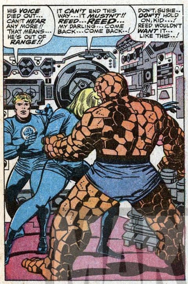
Does this division of attention exist when we read a comic book? One complication is that comics is a static medium that allows readers to linger over the visual field of a panel or a page for as long as they want; pace isn’t set by either the passing of time or the passing of film through a projector. Even so, comics creators have developed techniques for highlighting and minimizing elements. In older comics, such as the Silver Age Marvels, “unimportant” objects in a panel are sometimes swathed in one single, dull color, as with the gray machines behind Ben and Reed in this panel from the original printing of Fantastic Four #59 (February 1967):
Another way to indicate peripheral elements is through thickness of line. In the following panel from the second page of Fantastic Four #60 (March 1967), the figures dominate the foreground, especially Ben Grimm, whose outline is inked with thick holding lines, whose skin is dotted with spot blacks, and whose body is moving left-to-right in a dynamic diagonal:
As we look away from the characters, however, and allow our eyes to roam around the panel, we can see that the machinery on the far wall is inked with a much thinner line than the contours that surround the characters in the foreground. The formula is intuitive: the foreground is drawn in thick, eye-catching lines and the background in unobtrusive thinner ones, to create the illusion of receding depth. And the artist has the option to ditch backgrounds altogether if s/he wants the reader’s interest to focus exclusively on the characters.
Some of these ideas about selective attention can help us better understand Kirby’s art. If we analyze the cartoon image like a photograph, with different elements of the composition representing different planes of depth, then the splash page that opens Fantastic Four #62 has at least two connected but distinct fields of imagery: a foreground occupied by the “trans-barrier phone,” which Ben Grimm operates, and a background that includes Johnny, Sue, and the machinery behind Ben’s right shoulder.
Kirby’s trans-barrier phone has dials, switches, a complicated swivel arm, and other details, but the characters in the background command our attention more than the machinery does. In other words, there’s a distinction between those areas in the splash that actively engage our attention, and the scenery, objects and graphical elements that are less compelling to us. How does this hierarchy work?
Obvious focal points are people. Rooted deep in evolutionary history is our need to look at other people, to read facial expressions and body language for indications of danger, affection or sexual attraction. (In Understanding Comics [1994], Scott McCloud defines us as a “self-centered race” [32] that sees faces in car grilles and electrical outlets; reading faces is a survival skill.) In addition, we know from our previous experience with stories (in comics form and otherwise) that the personalities and desires of characters will move the plot along. In the Poetics, Aristotle argues that drama is about character that reveals itself through action, and this has remained true straight up through 21st century popular narratives; as David Bordwell points out in the first chapter of The Classical Hollywood Cinema (1985), most Hollywood movies focus on a defined protagonist who, over the course of a narrative, strives to overcome a problem or achieve a goal. Certainly the same is true of most comics, Kirby or otherwise, and readers have good reason to pay special attention to what the characters are saying and doing. The first-page splash of FF #62 picks up a cliffhanger from the previous month—Reed Richards has been blasted into the Negative Zone and will probably die there—and brings new and forgetful readers up to speed via a wordy caption (“In a desperate effort to save...”) and body language (Sue crumbling in Johnny’s arms, Johnny’s face full of apprehension) that communicates the emotional stakes of the situation. Stan Lee’s placement of the caption right above Sue and Johnny turns the left side of the splash into an area which compels the majority of our attention.
This focus on people—their faces, their poses—is amplified by word balloons. Comics aren’t an inherently narrative medium, but most comics do tell a story, and for that reason word balloons are often the first element we read in a panel. In Lee-Kirby comics, as in so many comics before and since, word balloons and captions are frequently placed at the top of the panel, where they bridge the gutter and usher us back into narrative space. In instances where the balloons aren’t placed at the top, we read the panel like we would a page in a book, sweeping our eyes left to right across the panel, moving incrementally downward to the bottom:
In the first panel from page three of Fantastic Four #62, we read the word balloons first, and then we look at the panicked gestures of the characters. Word balloons compel our attention by carrying important story information, and by prompting us to read them in the same way that we read text. And the tails of the word balloons point us back to the faces.
As an artist, however, Kirby puts in a lot of detail in the areas outside of the focal points of word balloons and human figures. What effect does all this secondary detail have on a reader? To float an ever-so-provisional answer to this question, I need to chart the possible relationships among focal points, non-focal points, and the narrative as a whole. On the most basic level, focal and non-focal points interact on the level of content; we expect both focal and non-focal areas to convey information (body language, a delineation of mise-en-scene) that tells the story. In the page three Fantastic Four panel, the machinery in the background feels “right” to us, given that the scene takes place at the team’s hi-tech Baxter Building headquarters. If Kirby and inker Joe Sinnott had drawn a field of flowers in the background, however, the dissonance between the points of maximum attention and the non-focal points would call attention to itself, pushing us readers out of immersion in the narrative.
The second way focal and non-focal points blend (or don’t) is through style. In the above example, Kirby and Sinnott draw the background machinery in the same style as the characters. Both foreground and background rely heavily on spot blacks as design elements, and flowing lines to indicate texture; the fabric folds of the characters’ costumes are slashing, overlapping brush strokes, while the pipes in the lower right corner of the panel are marked with the familiar squiggle Kirby uses to represent metallic sheen. (Personally, I mark Kirby’s decline as an artist when the squiggle begins to adorn non-metallic surfaces like hair and skin.) Kirby and Sinnott also create depth by drawing thick outlines around the figures in the foreground—note the bold undulating brushstroke that defines Sue’s leg—and thinner lines for background elements like the ovals and rectangles on the wall. The overall result is a formally unified visual, but what if Charles Schulz or Lisa Hanawalt had drawn the background instead of Kirby?
Based on these observations about content and style, I’ve created a diagram of the ways that non-focal areas can interact with the content and dominant visual style of a comics story:
 Most comic art falls into category 1, visual and narrative harmony. Artists typically fill their panels with objects and figures that create a plausible story world, and draw in a visual style that remains consistent across both focal and non-focal points.
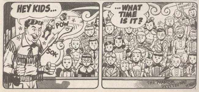
Category 2, narrative dissonance, occurs when the visual style is uniform, but the content of the non-focal areas drifts away from the dominant narrative. The canonical example is the work of Harvey Kurtzman and Will Elder, from the early issues of Mad to the final installments of Playboy’s “Little Annie Fanny.” The Kurtzman/Elder collaborations are full of “chicken fat,” sight gags whose contents spin off from the main narrative and function as autonomous jokes percolating in the backgrounds, as in this four-panel sequence (broken half-way through by a page break) from “Howdy Dooit!” (Mad #18, December 1954):
The foreground—both visually and perceptually—is governed by Buffalo Bill’s attempts to get a response from the “Peewee Gallery,” but there are many details that have nothing to do with Buffalo’s plea, but that Kurtzman and Elder include because they’re funny. The blonde girl with glasses in panels two, three and four waves in at least one more panel later in the story, and is a gentle parody of folks who wildly gesticulate when placed in front of a camera. In panel two, “The Phantom Spitter was here” graffiti reminds us that artists working in the Mad tradition often use words tucked into non-focal zones—background labels, captions and signs—as Easter eggs for alert close readers. And the “Bigelow 2-3467” vignette in panel four juxtaposes the supposed innocence of the Howdy Dooit demographic with an adult exchange between the boy and girl. The multi-layered, dense, digressive style pioneered by Kurtzman and Elder appears in countless comics after Mad becomes a success, including Marvel’s Not Brand Ecch (1967-1969), where Kirby and other Marvel Bullpen artists dabble in chicken fat.
In Kirby’s more dramatic work, however, the background elements are sometimes so striking that they continually threaten to become interesting in and of themselves, regardless of the narrative. The sheer visual density can overwhelm a reader, and represents Kirby’s challenge to the hierarchical distinction between focal points and non-focal points in a typical comics panel. Here is Kirby at his most baroque, again from FF #60:
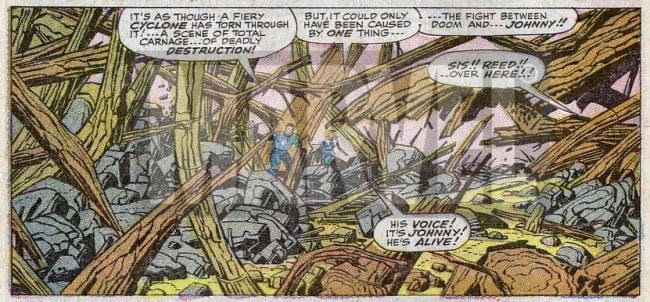 Reed and Sue are in the middle of the composition, and the tails of the word balloons guide us to them, yet the trees limbs in the foreground are a network of overlapping planes and stylized detail, impossible to ignore both as evidence of Dr. Doom’s destructive power and as dynamic graphic elements. Kirby is about spectacle as well as narrative, and sometimes the spectacle is manifest in those areas of the panel that are traditionally ignored or minimally perceived. (For more on Kirby and spectacle, let me recommend two posts—one by Charles Hatfield and one by me on our old Thought Balloonist blog.)
In category three, visual dissonance, content harmonizes with narrative, but there is a disjunction in visual style. In his discussion of the “masking effect” in Understanding Comics, Scott McCloud argues that reader identification is easiest when a character is drawn as a cartoon abstraction, like Charlie Brown or Bart Simpson, since visually simple characters are broad enough to accommodate a variety of reader subjectivities. In contract, realistic representations of people (like comics made from photographs) are too individualized to allow for generalized identification. (Incidentally, all this is highly debatable—as film viewers, we easily identify with the photo-realist characters on the screen—but I’ll save my objections for another time.) According to McCloud, once identification clicks in, we wear the mask of a character as we dive into a fictional world, but this new world is sometimes drawn in intricate detail, to convince the reader that what s/he is seeing and experiencing is “real.” The masking effect, then, is comics where a realistic world is inhabited by cartoony characters:
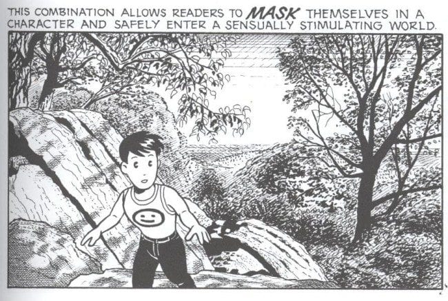
As McCloud memorably puts it, “One set of lines to see, another set of lines to be.” We see the masking effect in manga, in classic Disney animation, in the juxtaposition of Dave Sim’s Cerebus with Gerhard’s naturalistic environments—and it’s an example of visual disjunction between the inherent focal points that characters represent and the non-focal elements of the mise-en-scene.
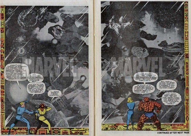
Kirby’s most common type of visual dissonance is between his drawn figures and his photo-collage backgrounds. Occasionally, in the pages of the Fantastic Four, Thor, The New Gods and other comics, Kirby assembles backgrounds that represent alien cultures and vistas out of elements snipped from black-and-white newspaper and magazine photographs. The effect is once again spectacular and graphically bold, as in this double-page splash from FF #62:
 Later cartoonists brought photos into their art in ways more conventional than Kirby’s collages. In his “Nick Fury, Agent of SHIELD” strip in Strange Tales #159 (August 1967), Jim Steranko constructs a splash page that places hand-drawn versions of the SHIELD characters against what looks like a photograph taken on Broadway:
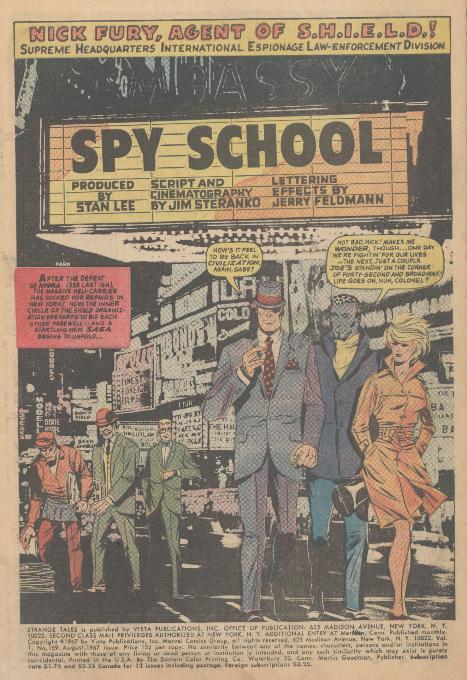 The photo was altered for publication—note the “Don’t Yield, Back SHIELD” billboards in the lower left of the page—but there’s still a visual clash between Steranko’s characters and the realistic background. (In this story, Steranko continues to use photos in the first panel of page two and in a couple of panels on page three.) Following Steranko’s lead, the contemporary artist who drops in photo backgrounds most extensively is Mike Allred:

The backgrounds for the confrontation between U-Go Girl and the Coach in X-Force #120 (November 2001), for example, are photos of a beautiful sunset, and are less obtrusive than Steranko’s, probably because Laura Allred colors the sunset in muted tones while keeping the foreground figures bright. I’d argue that Kirby’s photo-collages are much more transgressive and experimental than the Steranko and Allred examples; Kirby’s collages typically take up more of the picture plane (the double-page splash in FF #62 is all about scale, and Reed Richards’ insignificance in the face of alien enormity), and Kirby’s cut-and-paste, pseudo-Surrealist juxtaposition of elements grabs my attention more than Allred’s subtle backgrounds.
Category four, visual and narrative dissonance, is uncharted territory. I can’t think of any comic I’ve read where the peripheral elements deviate from both the content and style of the comic’s narrative and the high-attention zones (although I’d be grateful to be corrected in the comments). My hunch is that such complete dissonance would make telling a story and creating a coherent fictional world impossible.
In the process of writing down these thoughts, I had two small epiphanies. First, we need more empirical research into the basic act of reading comics; while my description of the way we tackle words inside a panel (in western comics, from left to right and top to bottom) seems commonsense to me, I’m reluctant to presume that everyone else reads like I do. I’d love to see an analysis of how our eyes skitter across the pages of a Lee-Kirby issue of the Fantastic Four that has the same rigor and depth as Tim Smith’s research on the There Will Be Blood scene. (Again, if someone knows of empirical work like this on comics, please let me know.) Second, I discovered that perhaps my favorite aspect of Kirby’s art is its free-wheeling, improvisatory experimentation. Kirby makes and breaks rules as he races through a panel, a page, 24 pages, 48 pages: sometimes human figures are adrift in empty space, sometimes the dominance of these figures as attention points is challenged by impossibly complex backgrounds, and on special occasions Kirby unleashes his scissors on a stack of old Look and Life magazines to create a vibrant pop-cult equivalent to the chance meeting on a dissecting table of a sewing machine and an umbrella. Kirby is prodigious and generous—he always gives us more than we expect, in ways we don’t expect, and we are compelled to pay attention. Kirby’s comics meant everything to me as a child, and as an adult I still find new visions in them. I can’t ask any more of an artist.


