Magicians and Architects

I recently visited my grandmother in Iowa. Now over ninety years old, her and my grandfather have finally moved out of their home of thirty years and into a transitional assisted care facility. Part apartment complex, part hotel and part hospital, the center provides a kind of gradated care, simply preparing meals and cleaning house for some residence, with more substantial help for others.

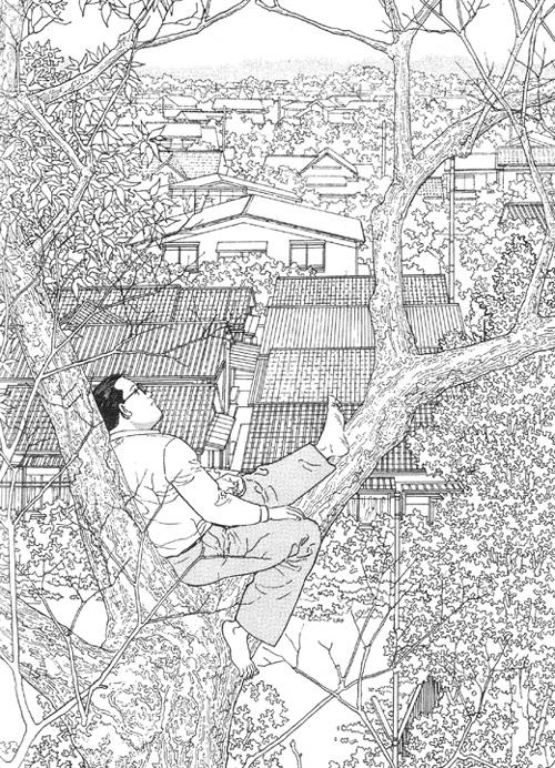
Before heading down for breakfast, I visited with my grandmother in her room and looked over some of her watercolors, which were hanging on the walls of her living space. Talking about her painting led to a brief discussion about technique, which in turn led her to voice the very familiar argument that art is something that can’t be taught, is in fact something inherent in someone. When I pointed out that she herself had learned from a teacher of some skill, she modified the statement somewhat, essentially saying that there was some kind of spark that could not be acquired like some techniques might be, and that it was this spark that was missing from most art.

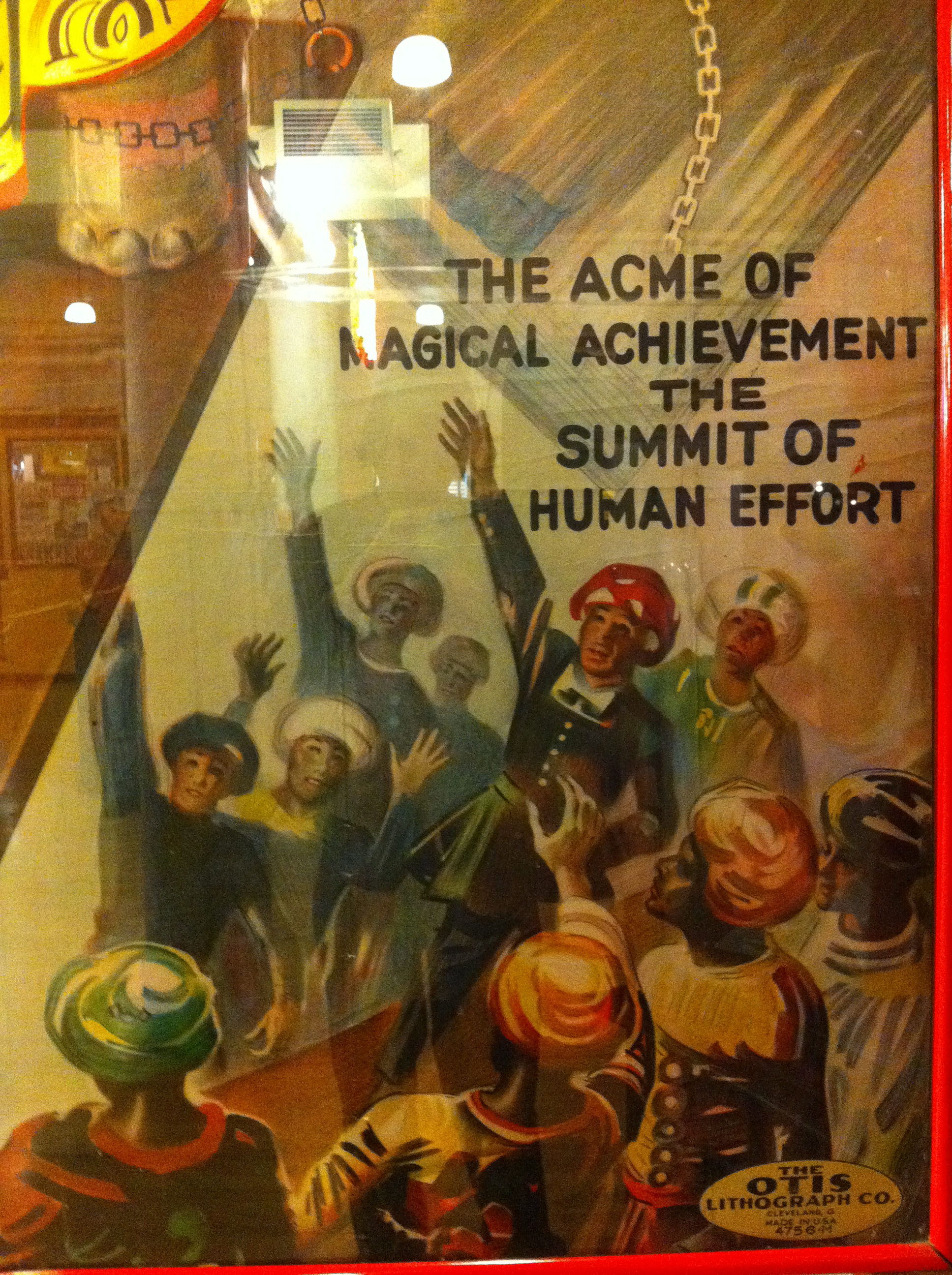
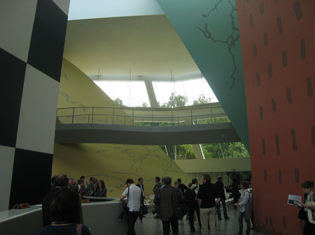
She warmed to the topic over our breakfast of rice crispies and room temperature eggs. “It’s magic that there’s not enough of,” she said and then gestured to the room around us. “Take whoever designed this place.” I looked around at the off-white room, saw the bland color, the plastic trim, the perfunctory decoration, complete with obligatory fake oil painting landscapes and little plastic flowers. “This place was designed by an architect.” She said the word with a disapproving shake of her head. “We need less architects, and more magicians.”

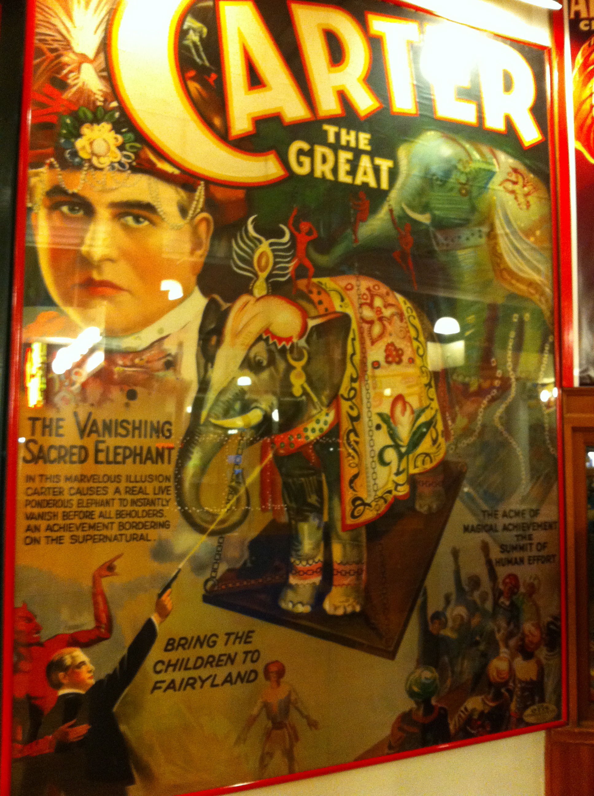
Instead of debating it any further, we ate our eggs and drank our watery grapefruit juice and moved on to other activities. But the division she suggested—and her judgment on the room where we ate—stuck with me for the rest of the day.

There’s something to that idea, I thought. But she has it exactly backwards.


She’s right in the sense that many, many things in our world are needlessly, almost willfully, functional alone, when there’s no compelling reason for them to be so. The room we sat in was oppressively dreary, oppressively utilitarian, with nothing but the most casual thought given to the look of the space itself. It doesn’t cost any more to build a beautiful, functional room than it does to build a dreary functional one. Similarly, a plate of eggs cost the same regardless of what temperature they’ve been served at, or whether or not they’ve been seasoned with a little bit of salt, onions, some paprika, and a hint of vinegar. I would indeed consider the eggs that my sweetheart is capable of making a kind of magic, especially when compared to what we shoveled in our mouths that morning.

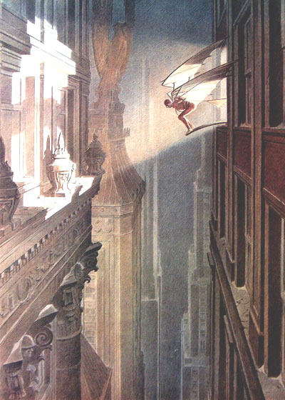
But there are two things that significantly undercut the argument for magic, and the magician, or at least the magic metaphor. First, as you might have heard, magic is all about illusion, is in fact only presentation. A good magician is literally a presenter, a salesman, his creation content-less save the verve of his presentation alone. It’s a bit like non-representational painting in a way—when the subject of painting has been removed completely, the attributes of art themselves are the content, and these attributes themselves must be compelling for the painting to be successful by itself.

Secondly, the illusion of magic is, like any other technical skill, eminently teachable. Want to learn sleight-of-hand? It’ll take reading a page of directions, practicing in front of a mirror for a few hours, and more time to hone your patter. Of course, there’s aptitudes involved, and even physical limitations—dexterity, verbal skill, etc, and some magicians with only rudimentary technical skills will at the very beginning have a more convincing act than other magicians with a wider range of technical skill. But the basic skills themselves are accessible to almost anyone.

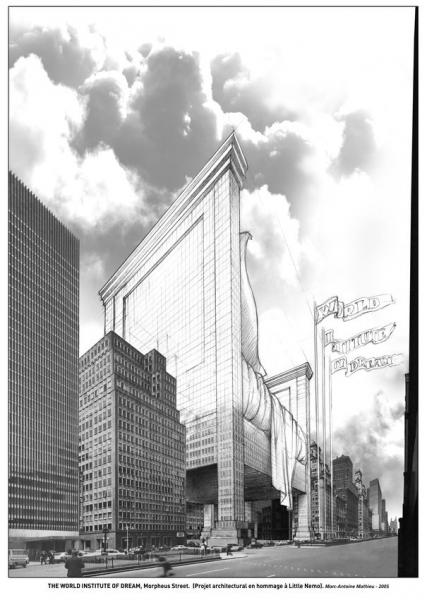
Compare this to the architect who designed the room in which we ate that dreary breakfast. Though the man may have lacked a certain surface charm or presentation to his work, his task was ultimately much more difficult than the task of virtually any fine artist. Specifically, his work had to be functional, in specific, demonstrable ways. The template that the room was most likely adapted from had to literally hold up the weight of the ceiling, had to protect the inhabitants from fire and earthquake and flooding, had to be open and spacious, had to freely circulate air, had to be easily cleanable, had to be built primarily with affordable materials and readily available modular parts.

What visual artists are ever tasked with so many requirements? Only designers of various stripes will ever have to deal with so many potentially competing requirements for their work, and certainly they will never have to deal with such heavy consequences to failure. An incompetently designed poster is unreadable, doesn’t impart information clearly, or at worst drives its potential audience away from the product it endorses. An incompetently designed building can mean discomfort or death.

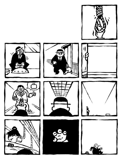
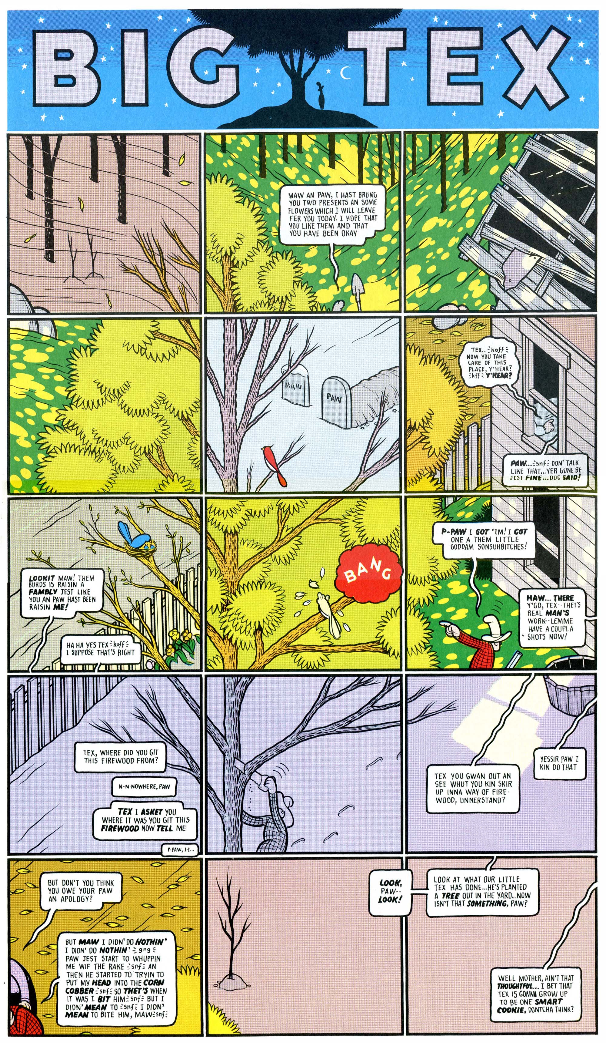
In certain divisions of both North American comics and popular music there is a mistrust of the crafted, of the purposeful, a search for the authentic that manifests in a variety of ways. A comic might tell us of its authenticity by gritty subject matter that challenges some kind of conventions or taste, or by an appeal to truthfulness, or actuality (most common in autobiographical comics or even semi-memoir). Or it might manifest itself in a visual crudity, which is its own kind of claim to the authentic. Even more common is the appeal that reaches beyond the art itself, into the biography of the artist.

There is, in short, an overabundance of preciousness in much of the arts world. I can’t say that this is a recent trend, or even what may have caused it—but I can point to the anonymous nature of much of the great art of previous centuries, and the cult of celebrity that has sprung up to embrace the artist in recent history. Regardless of the cause, there’s no doubt in my mind that preciousness actively works against the ruthlessness necessary to create art as an architect—to create with a high level of function and intention. In my time teaching songwriting, it was one of my chief pieces of advice to novices—if you really want to improve, write about something you don’t care about at all. It’s harder to be ruthless, to acknowledge when something just isn’t functioning the way it was intended, when its something you feel strongly about emotionally. The same is just as true for a cartoonist—self-expression is a fine goal if a comic is literally intended only for one’s self, but the moment it has an audience other than the creator of the work, the function has radically changed.

On the other side of this divide lies the ultimate expression of the architect’s art alone, no magic and only function—pornography, romance novels, the action movie. Stripped of any artistry, or magic, these categories exist with clear functions, clear outcomes in mind. Did her heart race? Did he come? My grandmother would possibly find the comparison between her dining room and Pool Studs 4 less than useful, but for me the metaphor holds, and brings the argument back to her side of the divide. How much more interesting would a piece of pornography be if it were carried out with the artistry, with the presentation and verve, of a Melville or a Pynchon? What would a romance novel look like that violated that strict, stultifying formula, that dared interject a kind of artistry into the romantic recipe? What would an action movie look like that had all of the skill of its competitors, but had equal parts message and purpose, and even guts?

I recently re-watched Bridge on the River Kwai, David Lean’s 1957 Hollywood classic, and while it’s far from a perfect movie, it does an incredible job balancing these seemingly competing objectives. Here is a movie that performs its functions very well—it causes the heart to race, it builds tension and expectation over a tremendous amount of time and satisfies those expectations in surprising ways, and it does all of this while managing to say something larger in a meaningful and unique way, even indicting the audience’s expectations by violating them. Even more effective than Kwai are virtually any Kurosawa movie from the 1950’s, all of which were the Japanese equivalent of blockbuster genre movies, popular entertainments, that manage to each say something unique and important within that framework.

As we discuss the marginalized status of comics in contemporary culture, and the increasingly fragmented nature of the music and film industries, it’s worth thinking about this divide, and why and how it might be bridged. In the case of comics, the split is self-evident—genre comics that attempt something measurable, racing the pulse or inciting a sense of wonder, and incompetently pursue these goals without any spark of artistry or originality—or comics in which the spark is the point itself, yet often lack a functional, craft-centric grounding.

And maybe this is an argument for art makers versus art consumers—to be willing to be less precious, more ruthless with yourself and your work, or conversely, to be willing to suspend that ruthlessness at key times, letting intuition guide certain decisions.

For my taste, both as consumer and creator, I prefer work that is capable of straddling that divide, that is well-crafted, intentional, and simultaneously has that streak of verve and originality that comes across as magic. Planning, laying the groundwork, but willing to detour, to deviate when some impulse hits us, or something new seems on the horizon. Why shouldn’t we expect a little architecture with our magic?

Reading Drawings: Architecture and Comics

Following tardily on the heels of this month’s onslaught of architecture-based posts, welcome to a belated examination of the ways in which we read comics and architectural working drawings. Based on the merits of a comment I made on Alex Buchet’s first “Draw Buildings, Build Drawings” article, Noah invited me to elaborate on the topic in the form of a guest post. It’s something I’ve been thinking about for some time, but not necessarily something that has much practical value for anyone looking to analyze either comics or architecture.

As an architect and cartoonist, I can’t help but notice many similarities between comics and architectural construction documents. Superficially, the pages of both tend to convey information in similar ways: drawings of simplified pictograms are ordered into grids of panels, often in conjunction with text and an elaborate system of symbols and line weights. But is there a more fundamental way that we can understand each?

In this post, I will look at how we read both architectural drawings and comics, based on my own understanding of how each works. I’m going to apologise in advance for my limited knowledge of comics theory; I am going to base most of that segment on my own observations about how they function. Feel free to jump on me in the comments if anything doesn’t ring true.

A caveat: I will not be discussing architectural illustration/renderings, drawings meant for public consumption, publication in architectural journals, or intended for competitions. Rather, I will be taking a rather narrow look at architectural working drawings, and the commonalities and dissimilarities they share with comics. I will also not be considering single-panel gag strips, as it is really the act of reading a page of comics that I am interested in for the purposes of this post.


Barton Myers' Wolf Residence

Site Plan and Floor Plans: The Wolf Residence, by Barton Myers (Note that these architectural sheets are not from a construction set; rather, they are the metric system instructional drawings from Architectural Graphic Standards, and thus differ slightly from contract documents)


How We Read Architectural Drawings.

Architectural drawings are, at their essence, a series of iconic pictograms organized in such a way as to allow a third party to construct a building based on the designer’s concept. These drawings are typically depicted as “cuts” through the imaginary building, both horizontal (plans) and vertical (sections) – though some drawings, including elevations and roof plans, are not.

Barton Myers' Wolf Residence

Elevation, Section and Plan from Myers’ Wolf Residence

Architectural working drawings are generally organized by scale, smallest to largest. From a plan point of view, this usually entails starting with the site plan, then the building plan, plan enlargements, and plan details (this ordering system also applies to sections, as well). The benefit of this approach is that it allows the designer to identify important building elements that are focused on in more detail with each subsequent enlargement. It is also possible to indicate elevations or sectional details on plans, and vice versa. This is accomplished with a variety of identification tags and bubbles, conventional symbols that guide the reader to the appropriate page. While this method of navigation may seem difficult at first, it is possible for the diligent layperson to parse its meaning and “read” an architectural set.

Plan Enlargements, Interior Elevations, and Details from the Wolf Residence

These pages are laid out in a grid of discreet drawings, each marked by an identification tag that marks the destination from the tags on the building-scale sheets. The smaller the scale (ie. the smaller the building appears on the page), the more of the sheet is taken up by the drawing; the converse is true of a large-scale detail. Thus a site plan usually appears by itself, while details can be twenty-four or more to a page. A page of details is a holistic field of drawings, with no one frame given more weight than any other; this allows the casual observer to jump in at any point and understand that part of the building, while simultaneously denying them the opportunity to construct a narrative from the panels. Daniel Worden made an interesting point in his essay “On Modernism’s Ruins: The Architecture of ‘Building Stories’ and Lost Buildings” (from the book The Comics of Chris Ware: Drawing is a Way of Thinking), when he talked about the “dialectical relation… between the fragment and the whole, the panel and the page, the page and the text…”. He was writing about Ware’s comics in “Building Stories”, but he could just as easily been discussing the tension between the sheet of details and the building as a whole.

Barton Myers' Wolf Residence

Architectural details from the Wolf Residence

Unlike comics, architectural drawings cannot function as illustrations alone. Text is always required on these sheets, though it is necessarily descriptive, not narrative in nature. These notes call out materials and processes (ie. construction sequencing), generally accompanied by arrows indicating which elements are being described.


How We Read Comics

Comics are, at their essence, a series of composed iconic pictograms organized in such a way as to allow a third party to mentally construct a narrative. It is the purposeful sequential arrangement of these drawings that allows us, as readers, to decipher the cartoonist’s intent.

As mentioned earlier, comics share some general organizational principles with architectural drawings: in particular, the grid. A page of comics typically adheres to a strict grid of individual drawings bounded by panel borders and separated by gutters (negative space between the frames). Despite this superficial similarity to architectural drawings, the “rules” of cartooning are much less hard and fast than those of the construction documents. The direction of reading and the shape of panels need not be consistent as long as the narrative thrust is clear to the reader.

Maggots, by Brian Chippendale

For example, Brian Chippendale often uses a regular method of laying out panels so that we read “like a snake” back and forth down one page and up the next; Osamu Tezuka has been known to allow readers to move their eyes either horizontally or vertically, with both directions achieving the desired narrative effect.


Osamu Tezuka’s “Space”, from Phoenix

In both cases, a patient reader can comprehend the writer’s intent and follow the prescribed narrative. On the other hand, scroll-like comics without borders (or comic-like scrolls), like the Bayeux Tapestry or portions of Dash Shaw’s Body World, direct the eye in such a way as to allow even the most visually unsophisticated reader to comprehend the author’s intent.


Wayang Beber: Indonesian narrative scrolls that function like comics


Body World, by Dash Shaw

But how do we know how to read a comic? We seem to inherently want to read panel-to-panel in the same way we read prose: left to right, top to bottom. However, even the most basic arrangement of panels does not always follow this pattern, with unusual arrangements of tall or wide frames that seem to disrupt the eye’s flow. Navigating a comics page is a learned skill, one that is arrived at through trial and error (often as a child, desperately trying to decipher a page of Bone or Tintin).

And how are we able to interpret the pictograms on the page: person, dog, house, movement, distress? Perhaps this too stems from our childhoods, and our own artistic inability to accurately depict the world around us; with our unskilled hands, we can only illustrate an over-simplification of what we see with our eyes. This is not dissimilar to the purposeful simplification of reality as filtered through a cartoonist’s pen, which may explain why so many of us are drawn to comics as children. Architectural drawings are not as intuitively understood. I would hazard to say that it is these very comics-decoding skills that would enable the casual observer to decipher a set of construction documents.

As has been mentioned previously, one of the primary features of the comics page is a bias towards narrative momentum. This generally involves the perception of time by the reader. This is manifestly different than an architectural set, where time is not a consideration in the drawings themselves. Rather, this points to the fundamental difference between these two modes of visual communication: the architectural set is a means to an end, while a comic is the final product itself. Narrative in architecture does not come into play until the drawings are read, understood, and constructed; buildings are meant to be experienced in four dimensions, not two-dimensionally on paper.

So all of this begs the question – why bring this up at all if these two art forms are so fundamentally different? How does architecture – on paper – relate to comics? Is there an approach to reading architectural drawings that can be applied to comics?

There are endless examples of similarities between comics and architectural renderings, most of which have been touched on in Alex’s previous posts (François Shuiten, Jiro Taniguchi, Hergé, etc.). However, I find that these illustrations stray somewhat from the practice of architecture as discussed in this essay. Architectural renderings are as much architecture as a cover illustration is a comic book; both are meant to grab the public’s attention and “sell” the content (either a comic or a building, as the case may be).

Rabbit Head

Rabbit Head, by Rebecca Dart

There are examples of cartoonists who are keen to play with the formal aspects of comics in such a way that their work begins to resemble modes of reading architectural drawings. Rebecca Dart’s Rabbit Head is perhaps a good starting place, as it makes use of several of the conventions mentioned above. Rabbit Head is a relatively standard comic, but one with a peculiar method of reading: a single narrative strand gradually splits into multiple narrative paths that are meant to be read at the same time to create a larger web of story. From the beginning, it is apparent to the reader how we are to follow the multiple plots; a system of symbols and tags clearly points our eyes to the simultaneous narratives. This system is extraordinarily similar to architectural navigational symbols, but it is perhaps more easily understood.

Like an architectural set, each of these narrative branches tends to literally increase in scale as it breaks from the central story. The further the split is from the primary narrative, the more the panels zoom in. This is not dissimilar from the progression from plan to detail in architectural drawings. There is even a map at the back of the book that provides an overall view of the action, and points out key narrative locations, much like an architectural “key plan”.

Page 9 of Morlac, by Leif Tande

Morlac, by Leif Tande, follows a similar narrative conceit to Rabbit Head. It is a “Choose Your Own Adventure” of sorts, one that begins with a single panel per page. As the main character is faced with directional choices, so to is the reader, and the narrative splits up, down, left and right. As a reader, the inclination is to follow only a single strand of narrative, but it quickly becomes evident that this is not how Morlac is intended to be read; the character begins to interact with the other “selves” on the page. The pages ebb and flow, apparently populated semi-randomly with a holistic field of discreet panels as the main character comes and goes. The effect is similar to opening an architectural set to a page of details and trying to discern the overall building from those few drawings. The “narrative” in Morlac is the equivalent of the “architecture” in a set of construction documents.

Page 25 of Morlac

There are other comics that explore similar territory (including some by Jason Shiga and Lewis Trondheim, among others), but I feel that none are able to capture this “architectural essence” as well as Tande and Dart.


Big Tex, by Chris Ware

Chris Ware’s “Big Tex”

No discussion of architectural representation and comics is complete without Chris Ware.  Not only is he an adept draftsman, but he seems to grasp certain methods of architectural representation that have not really been exploited fully by anyone else. Take, for example, a “Big Tex” strip from the Acme Novelty Joke Book: the page as a whole illustrates a finite amount of space, which is subdivided into individual panels in order to depict a larger scene and drive a narrative. Architectural details are often laid out this way on a page, so the eye can travel around the perimeter of the building, for example, or down a façade in a way that the mind can easily comprehend. Ware exploits the narrative flow across the page and he composes the panels in such a way as to guide the reader across the page and back again, not always in the same direction. He also takes advantage of this unusual flow by running the strip back in time from top to bottom, following both Tex and the tree from middle age back into their respective youths. This is certainly an interesting and exciting approach to comics, echoing closely methods of laying out architectural details on a sheet. Though I cannot say with any certainty that Ware was influenced by architectural drawings, I feel that his chosen mode of representation in this instance is close enough to warrant a mention.

Gasoline Alley, 1934

“Gasoline Alley” 1934 Sunday page, by Frank King

Innovative as this page is, that’s not to say Ware’s work does not have precedent. Perhaps the most direct influence on this particular “Big Tex” page are the many similar pages from Frank King’s “Gasoline Alley”. King loved to lay out pages as a field of panels that together created an overall image, often returning to the same spot Sunday after Sunday to explore the building of a house over time, for example. However, King was as not as concerned with narrative experimentation as he was with pushing certain formal boundaries.

“A Short History of America”, by Robert Crumb

It wasn’t until almost half a century later that the extra layer of chronology was pushed into King’s formula; Robert Crumb built on King’s work with his one-page Short History of America, and Richard McGuire cracked it wide open with the brilliant and challenging Here.

“Here”, by Richard McGuire

Ware synthesized each of these elements and produced an intriguing post-modern comic that is entirely his own voice, influences notwithstanding and, in fact, celebrated (this will probably be the only time I’ll ever compare him to Quentin Tarantino, but I think the comparison is apt in this case).

Chris Ware’s endpaper diagram for “Lint” (ACME Novelty Library No. 20)

Ware also has a penchant for diagrams that function on the same level as architectural drawings. They can communicate a large amount of information that, if it was told as part of the narrative, would interrupt the flow of the story; some are even tangential to the narrative entirely. Ware often inserts these diagrams into and around the narrative in the least disruptive way possible; he tends to save the most elaborate ones for covers, endpapers, or frontispieces, while working the simpler ones into the body of the comic. Like an architect, he uses a standard set of symbols to signify a complex set of relationships in the clearest manner possible. Some would say that this is a masturbatory self-indulgence on Ware’s part, but I find his diagrams both edifying and entertaining. Anyone interested in exploring this topic further (from an information design point of view, rather than an architectural one) should have a look at Isaac Cates’ essay “Comics and the Grammar of Diagrams”, from the book The Comics of Chris Ware: Drawing is a Way of Thinking.

Building Stories Diagram

Endpaper diagram from Ware’s “Building Stories” (ACME Novelty Library No. 16)

Now, having examined a few examples of existing comics, what would my ideal architectural meta-comic look like? It would not necessarily be an abstract or non-linear piece; as I’ve stated previously, I feel that in one sense, the narrative (or simply a perceived temporal momentum) is to comics as the constructed building is to architectural drawings. To me, the perfect “architectural” comic would read something like Italo Calvino’s Invisible Cities. Let’s assume for a moment that it would be exactly like Invisible Cities: a literal cartoon adaptation. The book is structured around a central (sparse) narrative involving Marco Polo describing cities he has visited at the court of Kublai Kahn. The majority of the novel is taken up by these stories, and the Kahn slowly comes to realize that each tale is describing a different aspect of Venice, Marco Polo’s home. Kublai Kahn listens to Polo, not understanding yet somehow comprehending; a good portion of the book passes before Marco Polo learns to speak Mongolian. An adaptation of Invisible Cities might fare well as a wordless comic, benefiting from the extensive use of symbols and diagrams. To me, Invisible Cities is ideally suited to an “architectural comics” experiment such as those I have outlined in this post. The overarching narrative functions like a building’s plans, with each subsequent tale like another detail describing the whole. The sequence of stories could be entered randomly and understood individually, though they would not allow the reader to perceive the whole without approaching the narrative a particular way (chronologically, in this case). The descriptive nature of the stories within lend themselves naturally to illustration; with a little planning (and a whole lot of drawing), they could be arranged in such a way that they could function like an architectural drawing set. If anyone is up to the challenge, I will gladly read your comics interpretation of Invisible Cities.


Aaron Costain is an architect and cartoonist who lives and works in Toronto.

Strange Windows: Draw Buildings, Build Drawings (part 3)

In the two previous parts of this essay, we surveyed the intersection of comics and architecture in a one-sided way: showing how comics draw on architecture.

But what do comics have to offer architecture in return?

In conjunction with the Archi et BD exhibition reviewed in part 1, several architects were asked about their relationship to comics.

Francis Rambert and Jean-Marc Thevenet , curators of the exhibition

David Trottin, co-founder of the Peripheriques architectural collective:

“Many are the architects who have been marked by Gotham City and all those American cities you’d see in Strange [a French superhero reprint mag] and other comics. More recently, I’ve been attracted by the strips of Charles Burns or Daniel Clowes (…) I like this vision of the city, cleaving to reality while leaving the door open to the supernatural. These authors create a sideways banality (“un banal decalé”).

The city, anyway, is never so beautiful as when it is the medium of a story.

We architects are not supposed to tell stories.

And at the same time, our role is to imagine places for living. This debate about the ‘scripting’ of life in the architect’s work is extremely interesting.”

So it would seem that comics provide a source of inspiration, but also of reflection.

As Trottin indicates, narrative is inherent to architecture yet secretive, difficult to articulate; one can, however, follow possible architectural narratives in comics. Comics can serve as a sort of test lab for the liveability of a space. It is always a challenge, in an architectural drawing, to show how human beings will occupy and inhabit a space.

But if there’s one thing comics characters do well with architecture, it’s to inhabit it– and architects are very much aware of this.

Reza Azard, from the Projectiles studio that designed the Archi & BD exhibition:

“For architects, drawing is primordial, it even represents a great part of our work. Before construction, there’s the project that must be drawn and, in order to convince, the drawing must express life, emotions, things one finds in films and in comics, which are media that place man in his context. Many architects are inspired by films and comics.”

As a parodic, playful witness to this inspiration, this tribute to Winsor McCay’s Little Nemo by cartoonist Marc-Antoine Mathieu:

(Comics certainly are also useful for presenting the architects’ work: Trottin’s Peripheriques agency produced its 2003 catalogue in the form of a comic book. The same goes for the Danish agency BIG, which has sponsored a travelling exhibit of its work– ‘Yes is More’, a parody of Mies Van der Rohe’s dictum ‘Less is More’ — jointly with a comics-formatted catalogue; see the result here)

And architects also revel in the sheer invention and vitality of comics. Here’s the cover of a manifesto by the 1960s British architectural agency Archigram:

Yes, this draws on the Pop Art and Camp vibe of the times, but I prefer to think the Archigram crew was attracted by the brashness, the childishness, the sense of play of comics — of illicit creativity.

They certainly proposed fantastical projects that could, indeed, have come straight from the comics, such as their Walking City:

Norman Foster has done more than any other architect to bring to life some of the spirit, and even the fabric, of the optimistic, technologically underpinned world celebrated in the futuristic British strip Dan Dare by cartoonist Frank Hampson.

Foster is in no doubt that Dan Dare has been a genuine influence on his work. In 1983, he even commissioned John Batchelor, a former Eagle artist, to draw the new Renault Distribution Centre in Swindon as a pullout poster for the Architectural Review, which ran a feature on Foster’s approach under the headline: The Eagle has landed. (The Eagle was the comic magazine in which the strip ran.)

“I loved the coloured, cross-sectional, technical drawings that appeared in the middle of the Eagle after Dan Dare,” says Foster.

One Dan Dare episode features Big Ben housed in a Perspex sheath, shaped exactly like Foster’s famous Swiss Re building in the City of London, the so-called ‘gherkin’ (pictured above).

Laurie Chetwood, born in 1957, is one of Britain’s leading architects. His most recent proposal is a $300m space-age sanctuary for world leaders in the Nevada desert. It looks exactly like something Dan Dare would manoeuvre his rocket around.  Says Chetwood:

Architects don’t often seem to have had childhoods. Or at least, they pretend they can’t remember them, in case they appear to be less than earnest. My cousins handed me down their Eagle annuals, and I became a Dan Dare fan. I drew loads of space rockets and strange machines.

The draftsmanship skills required of a cartoonist and those required of an architect are similar– rigor, clarity, mastery of perspective and space, a controlled line, a good sense of measure and proportion.

(These skills, however, may seem less and less relevant to young architects in this age of computer-aided design; I once had a book entitled Perspective for Architects — incidentally the most useful book on drawing I have ever owned– in which the author scolds architects for their poor draftsmanship, comparing them unfavorably with illustrators and cartoonists.)

Many cartoonists have had training in architectural or technical drawing. Dave Gibbons, of Watchman fame, trained as an engineer ( he points out that not only could he draw a window, he could also build one), as did Jacques Martin, the author of the Alix series set in ancient Rome:

Jacques Martin, Alix

The late Marshall Rogers trained as an architectural draftsman, a fact readily apparent from his city backgrounds:

Marshall Rogers and Terry Austin, Detective Comics

Some cartoonists, however, go beyond depictions of buildings and get involved in building design and decoration.

The most basic way is the painting of exterior murals. And, indeed, the city of Brussels — one of the historic capitals of comics creativity — has commissioned 32 of them to adorn its streets with the works of popular cartoonists:

Le Chat, by Phil Geluck

Cory Moussaillon, by Bob De Moor

However charming these be, for the most part the murals don’t integrate well with the buildings — merely adding an illustrative layer on the facades– sometimes to add a gag:

Gaston Lagaffe, by Franquin

Here is a complete series of photos of this delightful urban phenomenon

But one in the series does seem to dialogue with its support:

… and this doesn’t come as a surprise, for the comics artist who designed it has thought much about architecture over his three-decade- plus career’s span: François Schuiten.

A typical architectural fantasia by Schuiten

And another one

His most renowned series in that vein is Les Cités Obscures, written by Benoit Peeters.

Francois Schuiten and Benoit Peeters

These stand-alone but thematically connected works deal in an often fantastic or metaphoric mode with humanity’s relationship with the city and with buildings.

In Les murailles de Samaris (the Great Walls of Samaris) a mysterious city seems to be in a perpetual state of flux, with shifting walls and morphing buildings:


From Les Murailles de Samaris

In La Fièvre d’Urbicande (Fever in Urbicand) two cities that have always been separate are joined by a strange grid that starts out as a desktop toy and grows slowly to immense size, overlaying the cities:

La Tour (The Tower) is Schuiten’s take on the Tower of Babel legend, with a nod to Borgès, featuring a Medieval-style tower of seemingly infinite height and depth.

All in all, there are nine Cités Obscures albums so far; several are available in English from NBM.

And another urban landscape…these are addictive

It comes as no surprise that an artist of his accomplishments should be solicited to realise those architectural “dressings” known as scenographies. And, indeed, Schuiten has done several; most spectacularly, a platform on the Paris Metro’s ‘Arts et Métiers’ subway station:

Schuiten’s preliminary sketch

The finished station

You step into a dream of “steampunk”, a Jules Verne setting made real, a way station in the Cités Obscures.

In walls of copper sheathing, portholes worthy of Captain Nemo’s Nautilus display models of marvellous inventions from the Arts et Métiers museum.

In the tunnel’s ceiling, we see the ominous edges of gigantic gearwheels…for what obscure purpose?

Schuiten has also designed scenographies for the Pavilion of the Grand Duchy of Luxemburg at the Seville World’s fair, and the Pavillon des Utopies (A Planet of Visions) at the Hanover World’s Fair.

World’s Fairs? How appropriate for a designer of architectural utopias.

Schuiten comments:

“The risk in drawing utopia, is that it isn’t incarnate, it distances itself from reality, that it is complacent in its own invention and detaches itself from the roughness of reality. So, when one works on worlds, one wishes to test them> my drift into scenography allowed me this, and in exchange has modified my draftsman’s gaze. This back-and-forth between the two forms of expression creates a new awareness of what drawing can bring and what reality cannot.”

What the heck, I can’t resist… Schuiten adapts Jules Verne’s ‘Paris au XXeme Siecle’

François’ brother and erstwhile collaborator, Luc Schuiten, has abandoned comics altogether and become an architect full-time.

His projects, though, show definite comics influences in their utopian designs:

Jean-Claude Mézières, the artist on the noted science-fiction series Valérian, was commissioned by the city of Lille, France — the European Capital of Culture for 2004 — to transform a boulevard into a spaceport landing strip: ‘ Le Chemin des Etoiles’ (The Way of the Stars):

The Dutch illustrator and cartoonist Joost Swarte is also known for the strong architectural presence in his drawings; he is yet another artist with training in industrial design:

Joost Swarte


Swarte has collaborated with architects to actually design and realise buildings.

His first major project was the Toneelschuur Theater in Haarlem, in partnership with the Mecanoo agency:

Swarte:

“Architecture projects are big puzzles to be solved… An architect friend pointed out that a wall is a pen-line on paper, while it has thickness in the real world. I’d forgotten that when I had started organising the different spaces in the theater. But walls make up about 15% of a building’s area! Comics also have this advantage over architecture that you can launch a project with zero budget…”

The Swarte/Mecanoo design for the Toneelschuur Theater in Haarlem

The director of the Hergé foundation, Nick Rodwell, then asked Swarte to design the Herge Museum in Louvain-la Neuve; with Thierry Groensteen — a man possessing great experience as a comics curator — and Philippe Godin, the foremost Herge scholar, as consultants, he came up with a design for the building that was completed by architect Christian de Portzamparc.

The Musée Hergé under construction

Front approach to the museum

The main hall


Footbridges link the four main exhibit rooms; Pontzamparc compares them to the gutters between panels


Note how the spaces reserve surprises and summon the spirit of exploration and adventure of a Tintin album:

Side view; note the colors, all carefully matched to those in the Tintin albums.


Swarte:

“It’s bizarre, but when I’m working on an architecture project, I think about the comic I could make of it. And on the other hand, when I’m doing a drawing, I start drawing facades, and imagine what I can put behind them. I can’t fight it! It’s natural.”

The Musée at dusk

Christian de Portzamparc:

“The Musee Hergé is perhaps the only example of a comic transformed into architecture. At least, it has materialised in three dimensions”.

Joost Swarte also designs for other media. Here he presents his tapestries at the Stadhuis (City Hall) of Haarlem

Hob-nobbing with architects is all very well, but why shouldn’t the guys who actually build the building inspire cartoonists? Why this snobbery towards the hard-hats? Cartoons may lead to construction, but can’t construction — with your own two hands — lead to cartoons?

The cartoonist Alan Weiss spent a summer on a construction site; it got him thinking about the lack of real proletarian heroes in mainstream American comics.

Thus was born Steelgrip Starkey, a genuine blue-collar fusion of Li’l Abner, Edison, and Doc Savage: a superhero who disdains violence for the kicks of building huge wicked cool projects the world over! Check out this quirky but good-natured series from Marvel Epic.

Yes, I know — the full title sounds like a porno movie. So sue me already.

***********************************************************************************

There is a final, compromised but creative way for cartoonists to “realise” their architectural ambitions, through a third artform: the cinema.

Directors and designers have not been slow to call on the creativity of comics artists. Ron Cobb designed the ship Nostromo’s interiors for Ridley Scott’s Alien; Mike Ploog designed for films such as Tomb Raider.

Two of France’s top science-fiction comics artists were the chief designers of director Luc Besson’s The Fifth Element, and that film’s futuristic New York: Jean ‘Moebius’ Giraud and Jean-Claude Mezieres. Here are a few of Mezieres’ preliminary sketches:

And here’s Meziere’s designs come to life:

Mèzière’s city comes to cinematic life in this clip.

Enki Bilal has gone further, directing as well as designing Immortel (Ad Vitam), an adaptation of his Nicopol series of albums:

A trailer for the film.

Another option for cartoonists who wish to concretise — if only virtually — their designs is video games. Such was the path chosen by Benoit Sokal, the creator of the anthropomorphic noir series Inspecteur Canardo.

Inspecteur Canardo, the police duck, in an introspective moment

Sokal was the designer behind the games Amerzone and Syberia.

From Amerzone

From Syberia

This concludes my essay on comics and architecture; as a valediction, this advice:

Architects, draw more; cartoonists, build more.

****************************************************************************

“Concludes”? I wish! this is too vast a subject.

Where, for example, have I mentioned Alan Moore’s and Eddie Campbell’s From Hell, in which architecture is used narratively in such an innovative way?

What of the Japanese comics masters?

In other words, I can’t exhaust this subject, and follow-up columns on it will appear from time to time; as ever, your suggestions are welcome.

********************************************************************************

This is part 3 of a 3-part series. Click here for part 2 and part 1

Strange Windows: Draw Buildings, Build Drawings (part 2)

What are the links between comics and architecture?

At first thought, not many, other than the banal facts that cartoonists draw a lot of buildings, and that a few modern buildings look like something whacky or sci-fi-like that could’ve come from a comic book.

I believe there are deeper connections.

A strip cartoonist ‘builds’ a complex structure, manipulating space to organise time and impose a narrative.

An architect does much the same thing.

Consider a museum, a cathedral, an airport terminal: there is an implicit narrative in each, with the visitor “reading” the constructed space.

These resemblances even show up in technical vocabulary.

We speak of the “construction” of a script; both a building’s floor plan and the roughs for a comics story show a “layout“.

(Speaking of floor plans, cartoonist John Romita Sr revealed that the first thing he did before blocking out a scene was to draw a floor plan, prelude to his mise-en-scène of characters; doesn’t an architect do the same with regard to a building’s users?).

The Pritzker prize-winning architect Christian de Potzamparc (who collaborated with the cartoonist Joost Swarte on the Hergé museum) said:

“When I made the lodgings of the rue des Hautes-Formes in Paris, in the ’70s, I created a dozen successive perspectives. Like a film. […] It happens that this subjective vision is also the perception of the cinema but above all of comics.”

Rue des Hautes formes: lodgings designed by Portzamparc

Let’s now hear the thoughts of François Schuiten, a cartoonist who over his career has gained renown for his architecture- centred tales:

” [Between architecture and comics] there are identifiable meeting points. For example, one of the primordial things in comics is to bring the eye into the picture, and for this, architecture is a good tool, for it allows one to guide, to orient the gaze through the play of materials and light. What equally interests me is composition. The comics page — it resembles a topography, it plays on the relation between positive and negative space.

One can therefore compare the writing and composition of a page with an architect’s preoccupations.”

Lithograph by Francois Schuiten

“There are,” Schuiten goes on, ” in my stories, practically no drawings without a human character. I don’t get so much pleasure from drawing buildings for themselves. I like them to the extent that they can help me set a scale, tell a story, nurture fields of tension.”

Another Francois Schuiten cityscape

Schuiten often characterizes the city and comics as comparable systems:

“That’s what interests me. Benoit Peeters [Schuiten’s longtime scripter] and I track that: the character caught in a system. How an environment builds us, reveals us or destroys us. What organic links the city weaves to us. Those fractal links that arise between very small and very large things. Comics and architecture are good tools for discussing that. […] Small things must reflect the dimension of the system, detail becomes synecdoche, a carrier of meaning.

For me, there too, it’s possible to establish a link, if one wishes, between architecture and comics. Comics are the art of the sign, and through the staging of a building’s details, a lot can be expressed.”

(quoted from an interview with Stephane Beaujean; tr. from the French by A.B.)

Cover by Schuiten

Schuiten is articulate about architecture and comics for good reason; that has been his theme for over three decades. We shall return in detail to him in a later installment.

Architecture and architects are not that uncommon a theme in comics.

1983 saw the debut of Dean Motter’s comic book Mr X: the eponymous hero being the architect of a utopian metropolis, Radiant City, gone wrong; besides Motter, notable artists to draw it include Jaime Hernandez, Paul Rivoche, and Seth.

Mr X by Paul Rivoche

This dystopian approach didn’t prevent the artists from reveling in retro-futurist stylings; indeed, that seems to have been largely the raison d’être of the comic, whose real hero was the city itself.

Mr X art by Jaime Hernandez

In Hermann Huppen‘s Babette, we follow in great detail the building of a medieval cathedral:

click to enlarge

Jean-Marc Thévenet (script) and Frederic Rebena (art) have crafted a comics biography of Le Corbusier, the great Swiss architect:

The album delves seriously into the process of creating architecture, and avoids hagiography:

Andreas appropriates the buildings of Frank Lloyd Wright for his 1995 Le Triangle Rouge, a strangely oneiric multi-layered tale not unlike this year’s film Inception; Wright’s buildings seem the only sure anchor for the reader’s understanding.

The architect as savior from chaos?

2009 saw David Mazzuchelli‘s Asterios Polyp, the story of a “paper architect”– one who never actually builds anything– who has lost his way in art as in life:

(Asterios Polyp was extensively discussed in a roundtable on this blog)

But for a devastating critique of architecture, of urbanism, and indeed of modern civilisation– nothing surpasses Robert Crumb‘s brief, wordless, building-haunted masterpiece, A Short History of America:

I find most admirable in Crumb, here and elsewhere, his unflinching observation of the ugly, the banal, the quotidian of the city that we erase unconsciously from our perception.

There is a telling scene in Terry Zwigoff’s documentary film Crumb where the artist shows an album of photos he’d commissioned, showing freeway intersections, clusters of lampposts, concrete islands… all the most boring and brutalist “invisible” patches of our urban environment. Crumb pointed out that there was no reference accessible for these despised spaces, so he had to have them documented himself.

This is a true artist: one who sees what we don’t want to see, and opens our eyes to it.

Sofia, Bulgaria, 1966, by R.Crumb

Crumb was far from the only artist from the ’60s–’70s underground comics movement to show an interest in architecture. Bill Griffith, in his Griffith Observatory and Zippy strips evinced a fascination with the bizarre and often garish building vernacular that characterises so much of America’s urban landscape — showing affection for the trashy and banal:

Griffith organised a campaign to have the ‘doggie head” sign that so inspires Zippy be landmarked…and lo! It was. Click image to enlarge.


Architecture, then, can be the subject of a strip or cartoon…but obviously,the great majority of comics do not deal directly with architecture.

How, then, do comics and architecture interface? How do comics use architecture?

The prime use is functional. Architecture and landscape are the setting wherein the cartoonist will stage the actions of his characters.

Many cartoonists will keep the architectural features spare, to the point of minimalism; this stems from a valid aesthetic that heightens the narrative in contrast to its context. ( Others will do so out of laziness or hackery).

Look at the buildings in these panels from Ernie Bushmiller’s Nancy:

They are reduced to their barest essence: just enough to convey the idea of “building”.

Consider the economy shown in this depiction of a shopping mall in Archie:


Click to enlarge

Just enough graphic information conveyed, and no more, to advance the story.

This aesthetic became a house style at Fawcett Comics’ Captain Marvel in the ’40s, as defined by C.C. Beck and encoded by the Jack Binder sweatshop; this page was drawn by Kurt Schaffenberger:


click to enlarge

In Europe, too, this stripped-down approach had many adherents. The ‘ligne claire’ (‘clear line) school of Belgium is famous for the detailed backgrounds of Hergé, E.P.Jacobs, or Jacques Martin; but it also featured more humdrum strips such as Chick Bill, by Gilbert “Tibet” Gascard that kept the architecture fairly spare and functional, though accurate:


click to enlarge

Beyond the purely functional, architecture in comics is illustrative. It complements and augments the story; it creates an ambience; it reinforces a fiction’s believability.

This is key for comics of historical fiction.


Renaissance Paris; fromLes sept Vies de l’Epervier‘, drawn by Juillard.


Prince Valiant, by Hal Foster. .


The above strip is a curious case; it combines scrupulous accuracy in depiction with heedless anachronism in setting. For example, the above drawing shows a typical 12th century castle and contemporary knight; but the action is supposed to take place in the 4th century!


Architecture is a capital component of science-fiction and fantasy comics, essential for establishing credibility.

Jean ‘Moebius’ Giraud: The Long Tomorrow

The veteran fantasy artist Mike Kaluta notes that the believability of drawn architecture depends on the artist being able to visualise the invisible parts of a building– its hallways, pipes, rooms– even if none of them are shown the reader.

Carson of Venus; art by Mike Kaluta

Sometimes past and future collide, as in Gene Ha’s richly imagined The Forty-Niners:

…where early 20th century architecture is augmented by futuristic buildings; a design approach reminiscent of that of Syd Mead on the seminal science-fiction film Blade Runner.

But Mead was anticipated in this by Enki Bilal, who perfected the “mash-up” of futuristic, contemporary, and past architecture:

Besides the historical past or the fantasised future, of course, architecture establishes the verisimilitude of the present. Certain cartoonists have so excelled at this that they have become indelibly associated with a particular city.

Jacques Tardi is the cartoonist laureate of Paris:

Jacques Tardi, ‘Nestor Burma’: Paris in the 1940’s

Jacques Tardi, ‘La Position du Tireur Couché’: Paris in the 1970’s

London arguably belongs to Carl Giles:

For New York, my choice would be Will Eisner.

I was born in New York and lived there for the first 14 years of my life. I can attest that Eisner’s rendition of the crusty, crumbly, fire escape-festooned tenements and elegant stooped brownstone townhouses of the Big Apple are the real deal.

New York view, by Will Eisner

Eisner’s yenta mom substitute bawling out the Eisner stand-in (en Français in this translation). From ‘A Contract with God’.

The cartoonist Chris Brunner notes about the above image:

“Worth mentioning is the way architecture can be used as a graphic device to create panels within panels. A couple of the images here touch on this (…) the Eisner fire escape shot- the man part of the outdoor environment, the woman framed by the window in a way that suggests its own panel.”

Mark also how New Yorkers appropriate the fire escape as a mixed private/public space.

Eisner again, in French again.. a lucid look at the impermanence of New York edifices. From ‘The Building‘.

There is, of course, a quicker and lazier way to identify a city: landmarks, such as the Statue of Liberty:

The Gift, by Alfredo Alcala

…or the Empire State Building:

A mean ol’ monster emerging from the Empire State Building, as sketched on the spot by Herb Trimpe (The Incredible Hulk), inked by Sal Buscema
… or the Eiffel Tower:

Star Trek, art by Alberto Giolitti & Giovanni Ticci

(This use of famed monuments has been thoroughly sent up by Scott McCloud in his Destroy!, where two rampaging superheroes demolish every famous landmark in New York:)

I call this use of architecture in narrative emblematic.

These landmarks can fulfil a metonymic function:

From Doonesbury, by Gary Trudeau.

The manor of Moulinsart (Tintin) by Hergé. Click image to enlarge.

The Batcave (Batman).


Snoopy’s Doghouse, from Peanuts (art by Carl Shulz)


The Daily Planet building (Superman) as rendered by Paul Rivoche.
Click image to enlarge.

The bard’s house (Astérix) by Uderzo

The Baxter Building (Fantastic Four) by Jack Kirby

(Compare with the Batcave: a staple of the ’60s superhero comic, the cutaway view of the hero/villain’s headquarters is but a memory now. You kids today…I just don’t know…)

The Money Bin (Uncle Scrooge) by Carl Barks

Pop’s Chocolate Shoppe (Archie).

The above location also functions as what T.V. sitcom writers call a “crossover set” — a place where any of the characters can meet, and any plotlines intersect.

The Marsupilami’s nest (Spirou), by André Franquin

Superman’s Fortress of Solitude; art by Ross Andru and Dick Giordano

These recurring landmarks serve as touchstones for the regular reader, offering the reassurance of familiarity; much for the same reason that Donald Duck always wears a sailor suit, or that Superman wears tights, a cape, and his underpants on the outside.

Sometimes architecture is used to signal a genre.

Arcane’s castle (Swamp Thing) by Berni Wrightson
Big spooky castle = horror comic

Nick Fury, agent of S.H.I.E.L.D. by Jim Steranko

Gratuitously futuristic décor = cool spy thriller.

The next function of architecture in comics I call expressive. The cartoonist uses architecture and landscape to evoke specific emotions in the reader.

See the expressionistically twisted yet realistic world of Alack Sinner, by Muñoz and Sampayo:

The harsh streetscape mirrors the sense of doom and injustice that pervades this noir series.

Less baneful, but as subjectively gritty and urban: Will Eisner’sThe Spirit :

Even the buildings are bent to the story– to the very logo:

Or consider Jack Kirby’s stunning imaginary cityscapes, such as Asgard:

click  image to enlarge

…or his Great Refuge:

…or his New Genesis:

Now, note that many, if not most, of the buildings in the above Kirby panels have no discernable function. Or, rather, their function is emotional– to instill awe.

It’s far different emotions that are invoked by the quotidian landscapes of Jiro Taniguchi: peace, melancholy, mixed with a quiet joy.

The last use of architecture in comics celebrates the quiddity of the artist’s vision; for want of a better term, I call this use poetic.

How else to describe the quirky lunacy of George Herriman‘s ever-shifting buildings:

click image to enlarge…or the baroque hallucinations that Jim Woodring conjures up for dwellings?

Five categories, quite subjectively and idiosyncratically arrived at: functional, illustrative, emblematic, emotive,poetic. Of course, most comics architecture features more than one of these aspects, often all of them.

And this is nowhere truer than in Trondheim and Sfar’s Le Donjon series, where the titular dungeon, a seemingly infinite Gormenghastian source of terror and desire, dominates the actions of every inhabitant of its world.

It’s also obvious, merely from all the examples shown above, that architecture in comics can’t be considered in isolation: it relates to design, to landscape, to scenography, to narrative.

In this installment, we surveyed what architecture brings to comics.

But do comics have anything to bring to architecture?
We’ll examine that puzzle in part 3.

—————————————————————————————

This is part 2 of a three-part series. Click here for part 1 and part 3.

Here’s a link to a great recent post on notable comics places.
If you wish to see the work of one of last century’s true masters, this site collects a stunningly huge, searchable database of Giles cartoons. The “random cartoon” function is addictive!

Too Much is Never Enough: Morris Lapidus’ Postmodern Curves

HU’s been preoccupied with architecture this week. In yesterday’s post, Suat noted that “the building shorn of its façade has long been favored by cartoonists in search of a structure which best encapsulates the comics reading experience in a physically possible form: the rooms and walls acting like panels and borders…” But it’s worth noting that the gridded interior which resonates most efficiently with the conventional comics form is a historically situated architectural shape: the rectangular multi-story urban dwelling, industrial tenement house or modernist skyscraper.

When architect Morris Lapidus was designing the 50-story Americana hotel in New York City in 1960, he needed to save his client the half-a-million dollars it would take to stabilize the high building against wind pressure. Lapidus’ solution was to bend the building so it would stand by itself, without support. First he illustrated the concept for his client using a calling card:

And then through illustrative drawings:

Basically, Morris Lapidus knew the limitations of a straight line. In the 1930s, living in New York and working as a merchandiser, he was already getting customers’ attention through curvilinear ornamental devices that an editor at Pencilpoint magazine described as “bean poles, cheese holes, and woggles.” [Woggles were amoeba-like shapes.] By the early-50s, during his rise to prominence in Miami Beach as the go-to architect for luxurious exotica, these features had become a signature style.

Lapidus himself defended the curves as natural — ”People don’t move in straight lines like an army — they meander. So, my plans meander” — but his protégé, Deborah Desilets, captures the more subjective experience of eschewing linearity: ”Mr. Lapidus knows how to give emotions physical form,” she said. ”His space swirls you; it prompts you to move; it’s an interactive architecture.”

Around the same time as Lapidus was swirling the glitterati through his Miami hotels, The Chicago Tribune was publishing a single-panel “comic strip” by Arthur Radebaugh called “Closer than We Think”, which traded on the same curvilinear futurist aesthetic.

Although explicitly futuristic, both Lapidus and Radebaugh stand in marked contrast to the stark modernism of the International Style and European futurism of the early to mid-century. Theirs is a decadent, utopian futurism, apolitical, indulgent, ultimately more pop psychology and marketing than technology and science. Contrast with the futurism of Metropolis or Marinetti: these spaces are futuristic environments for an affluent bourgeoisie, professional men and women, with an expectation of technological luxury (an expectation not unrelated to our current economic malaise). This is a characteristically American futurism, indicative of “The American Century” and redolant with the capitalist fantasies that propelled America’s mid-century economy as well as American’s mid-century style.

And that’s where Deborah Desilets has a point: those decadent curves really are more immersive, emotional, and interactive than their more starkly linear cousins. This is the fantasy formation that makes it possible for marketing to mask commodification. Decadent futurism feels so postmodern not just because it foregrounds non-linearity as the avant garde would have it, but because it puts that non-linearity in the service of a fluid, imaginative fantasy — an unanchored, forward-looking fantasy of possibilities rather than the nostalgic one of history and memory that’s more characteristic of modernism. It’s that futuristic fantasy that is characteristically postmodern, in contrast with modernism’s fascinations with history, autobiography, and the contours of the past.

Not that a curvy, luxurious, decadent aesthetic is inherently bad or even inherently capitalist; in pre-modernist art, it was certainly put to far more bohemian ends. And non-linearity certainly isn’t associated with capitalist success in literature — it’s remained avant-garde despite 30 years of experiments with it. But in visual culture, decadence has lost those bohemian connotations and become pretty thoroughly bourgeois. That narrowing of signification needs to be challenged.

By the most fully postmodern standards, comics with a few exceptions tend to be quite linear: narrative storytelling through panels, even at its most flexible, is essentially a medium of vectors and lines. Sometimes in comics conversations and criticism there’s a sense that the form of comics – that sequential narrative storytelling through panels – is somehow transhistorical, that it can be endlessly manipulated internally to speak to and resonate with many and any aesthetic paradigms. But that isn’t true for any other artistic form, so it’s probably not true for comics either. Sequential narrative-through-panels is an architecture, and architecture is as historically situated as anything else.

Review: Josh Simmons’ House

In an interview given in conjunction with Archi et BD, la Ville Dessinée (see Alex Buchet’s post), Jean-Marc Thévenet suggests there is in many comics “a psychological pressure suffered by a hero who is more often than not dominated by the environment in which they live.”  This is, perhaps, the most common manifestation of architecture in American comics.

At a more popular and utilitarian level, we have Marshall Rogers’ delineation of the ornamented skyscrapers, alleyways, fire escapes and bricks that make up the borders of Batman’s Gotham, casting the caped crusader into realistic space, Rogers’ occasionally clumsy anatomy and staging notwithstanding.

Continue reading