
Hello! I’m known as Telophase in various places online, and when I dropped a couple of comments about the visual language of manga on a post a couple of weeks month or so back, Noah asked me to make a guest post (originally during the time that HU was down, and rescheduled for today). So here I am! My day job is an academic librarian, but I wrote a few posts on manga layout back in 2005-2006, when I was trying to figure out how to improve my own comics, and served as Tokyopop’s manga columnist for a while back in the day.
As a convenience, I’m going to use the shorthand of “comics” to refer to American comics, and “manga” to refer to Japanese comics, although there’s a strong argument to be made that “comics” is just “manga” in English translation. (What do Japanese call Spider-Man? Manga!) It just means fewer chances for me to typo “American” and “Japanese.”
I also want to stress that I don’t consider either of the trends I’m going to discuss to be better or worse than the other – they’re both effective ways of telling a story, depending on the needs of the story, the audience, and the industry.
Usually when discussing the visual language differences between manga and comics, manga is discussed in terms of higgledy-piggledy shoujo panels, speedline overload, sweatdrops, and nosebleeds, and nobody pays attention to the way the art elements and speech balloons are structured to steer your gaze through the page, but I think this may be a more defining characteristic of manga than all the sweatdrops and nosebleeds in the world.
Comics appear to have a much less obvious push through the page, often relying on American readers’ style of reading left to right first, then, if needed, secondarily directing the reader’s gaze through the page by use of action lines and other cues in the art.
I think these differences, more than the art styles, form the core of the two visual languages of manga and comics.
Let me see if I can simplify these to some guidelines:
Japan: First, follow where the art and speech balloons are pointing you. If that fails, read right to left, then up to down.
U.S. First, read left to right and then up to down. If that fails, follow where the art and speech bubbles are pointing you.
This is not to say that these guidelines are slavishly adhered to! There are many examples of the rules being broken, but I think they represent a general trend (and, perhaps, fundamental difference) in each industry.
How did this come about? I think the structure of the manga industry is a major factor. Many of the most popular (and thus influential) manga are published weekly in chapters of 15-30 pages, collected with other manga into phone book-sized anthologies called tankoubon. (Edit: I misremembered – tankoubon are the books the chapters get collected into later. Zasshi are the magazines.) Shounen Jump is one you’ve probably heard of if you’ve paid any attention to manga being translated and published in the States. The publishers of tankoubon have an economic motive to get you to consume as much manga as possible as fast as possible, because they want you invested enough in the stories to purchase next week’s tankoubon. Because of this, there’s often strong editorial control over each manga, leading to more uniform layout techniques (and possibly even house styles, although I haven’t done any comparison between publishers).
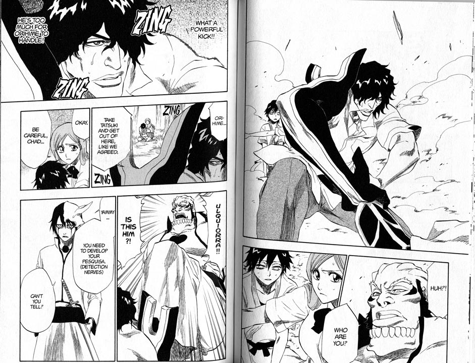
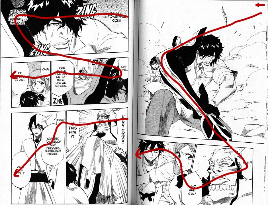
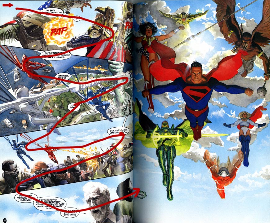
Here’s an example, a spread from Bleach, one of the Shounen Jump properties and one of the most popular manga in Japan. The first image has the spread itself, while the second traces the action lines through the page, the path your eyes take as you read. Note how every important facial expression and image is included in that line.
Bi-weekly and monthly manga are not as subject to this editorial control, and the mangaka have a greater degree of freedom to diverge from the standard and to experiment. I still see similarity to the weekly manga layouts, though – the biggest of which is that the main action lines through a page tend to steer your gaze across characters’ faces, or across important items or spaces in the art.
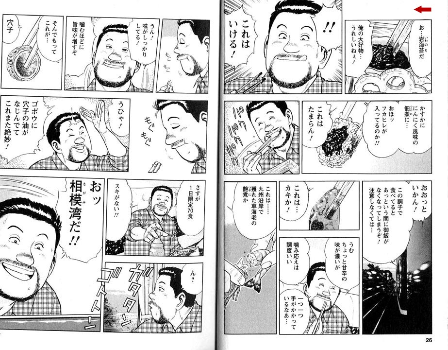
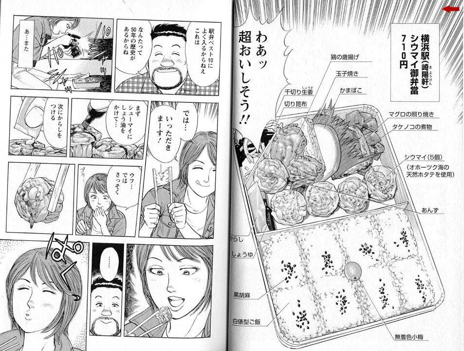
You can see this in the following spreads from a manga about ekiben otaku (ekiben = regional specialty bento [boxed meals] you can get in train stations; otaku = obsessive fans). I’m not sure of the title because I don’t read Japanese, but a friend thinks it translates to The Solitary Love of Ekiben. I want you to note how the speech balloons often frame the character who’s speaking, or the piece of food being discussed. (Also note the speedlines of AWESOME surrounding the bento in the second spread. The entire manga is nothing but ekiben porn, train porn, and landscape porn. It is the geekiest and yet best thing ever. And there are four volumes of it!)
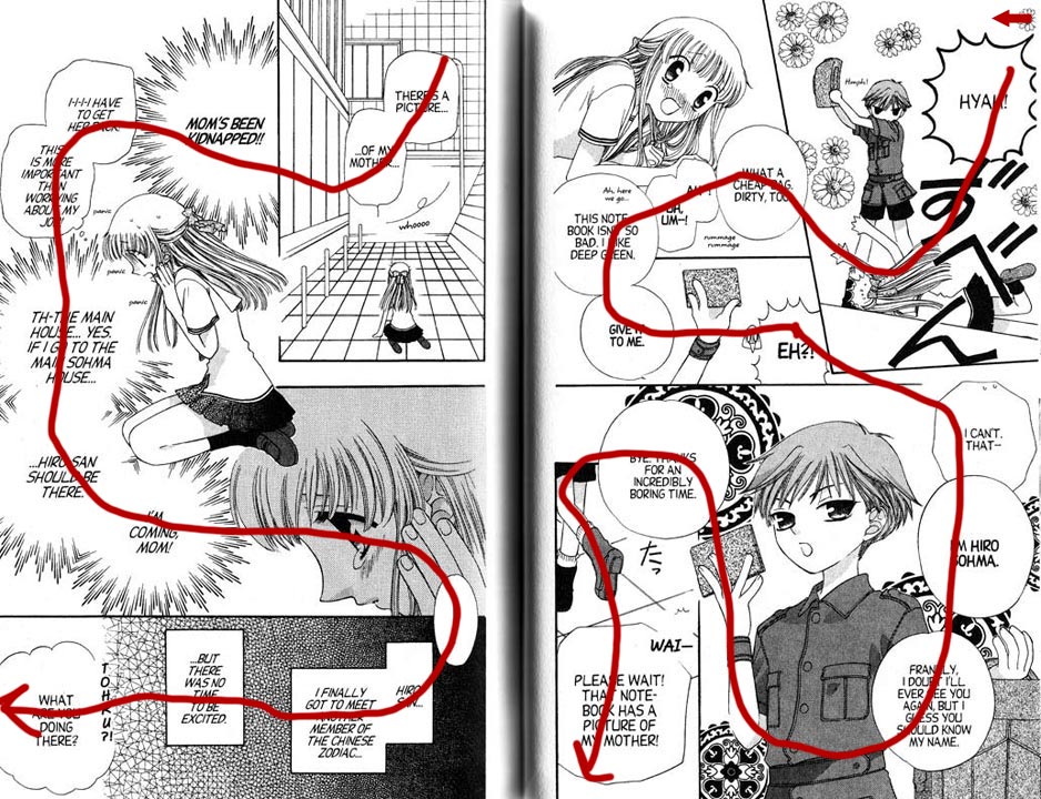
Something in manga layout that I have yet to find in comics is the action line forcing you to read backwards through part of a page. Note this spread from Fruits Basket. At first glance it’s chaotic and if you’re not well-versed in the visual language required to read this, you may get lost.
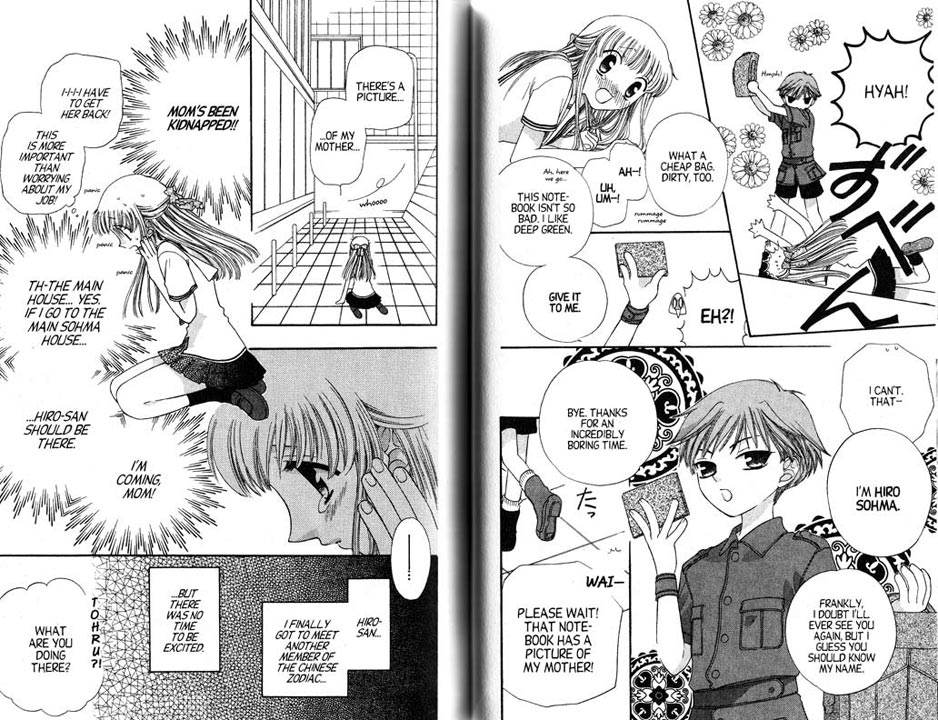
But if you look carefully, you’ll notice that not only are the speech balloons positioned to pull you through the page, often the characters themselves are pointing you at the next stop on the journey through the page. The characters’ bodies and speech balloons break panel boundaries deliberately, not randomly, and drag your eye across the portions of the art that emphasize the characters’ emotions or tell you what is going on. In the third panel of both pages, you even read backwards – left to right – through the panel.
(As an aside: now that more and more Japanese are reading manga on their phones, I expect the layouts are changing to fit the new medium. I visited Japan in 2007 and a Japanese woman showed me a yaoi manga she had on her phone. When you paged to the bondage scene, the phone vibrated.)
In the U.S., until the recent Graphic Novel Revolution the most common way to get comics was by purchasing individual monthly chapters (I am not familiar enough with older comic practices to know what the usual release schedule was before the 1970s and 1980s). There’s no economic motive to push the reader through the book as fast as possible, so the layout doesn’t need to focus on reader speed and the artist can do other things with page composition and action lines. I might even be able to make an argument that there’s a motive to slow reading down a bit, so that the reader feels she got her money’s worth. (That would be one reason I cut down my comics reading when I had to start paying my student loans back after grad school – I couldn’t justify $2.99 for ten minutes’ entertainment!)
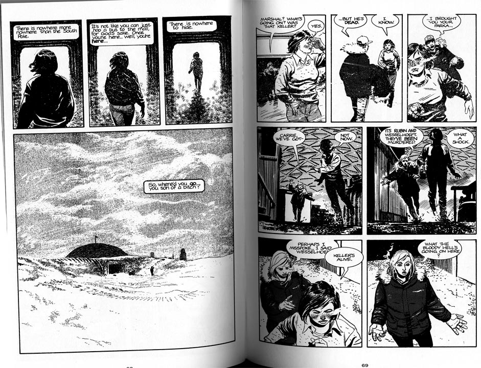
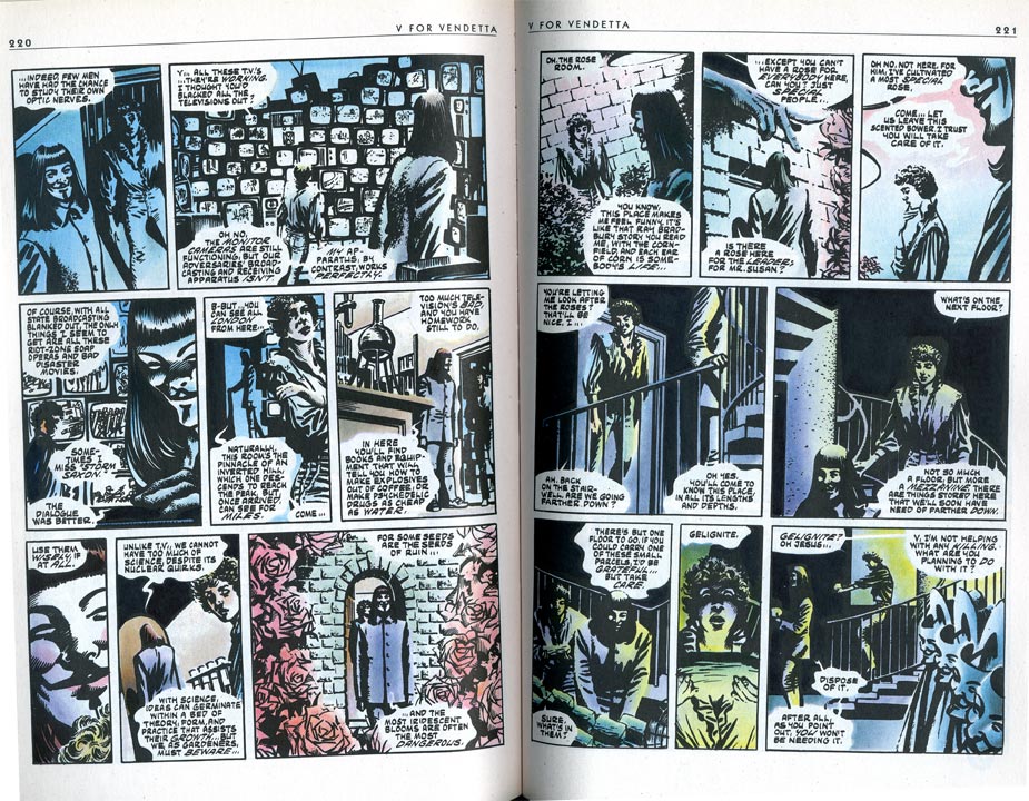
Here’s a couple of examples from Whiteout and V For Vendetta. I acknowledge that these aren’t quite comparable to Bleach – I should be using a current bestselling comic for a true comparison, but I’m stuck with what’s on our shelves at the moment. I think the general idea will hold, though.
In Whiteout, the speech balloons tend to float to the top of the panels as if they’re filled with helium. In most of them, the reader is expected to read the narration or dialogue and then look at the art in the panel before going on to the next panel. It reads in a more staccato way than the easy flow through Bleach, or even the less-easy but still flowing line through the panels in The Solitary Love of Ekiben. V For Vendetta bookends many of the panels with speech balloons, but the action lines that draw your attention to the important bits in the art are subtle, and the pages as a whole are subsumed to the rhythm of the grid that the panels are based on. In neither of the comics are the faces of the characters or specific pieces of the action deliberately highlighted in the way speech balloons frame characters and items in the manga examples I’ve shown you (forgive my wonky scanning: I’d rather not break the spines of the books).
This isn’t to say that comics don’t use dynamic action lines at all! Witness this spread in Kingdom Come:
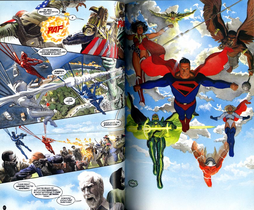
There’s a strong zig-zag action line in the artwork on the left-hand page that swings your gaze across and up directly into the splash-page layout of the right-hand page. The only sour note I detect is the placement of the tiny “Indeed,” speech balloon on the right-hand page. I believe it’s supposed to be right in your path as you read through the bottom panel on the left and scan over the faces, but the superhero splash page is so strong that you tend to skip it. (I didn’t even notice it was there until I drew the redline!)
In Transmetropolitan, I often find that cigarette smoke is used to highlight action lines or characters’ faces and emotions, as in this spread. There’s an action line anchored by speech balloons, smoke, and white highlights that drags your view across Spider’s face several times in the left-hand page, but the action line through the right-hand page is not as active, even causing confusion in the transition from panel 1 to panel 2, because the figures in panel 3 are pasted on top of panels 1 and 2. This is a perfect example of “read from left to right first, then read following the cues in the art,” because if you followed the cues in the art, you’d read panel 1, then panel 3, then panel 2. (I like how Spider’s and Yelena’s smoke trails flow off the page. If you look closely, your mind connects them into one flowing line off-page.)
![]()
I think that’s a reasonably good illustration of what I see as the core of the different visual languages of manga and comics, and how if a reader is used to one language, it may take a little bit to get into the mindset of the other.
Thanks for letting me blather here!
One interesting thing that I’d never quite put together before (though I’m sure others have) is how much more Western comics rely on filmic compositions and progressions than manga seem to. Whiteout and V especially look like they’re using shots, whereas Fruits Basket in your examples here is relying on overlapping images and page composition as a whole in a way that doesn’t really reference film (Transmetropolitan is somewhere in the middle maybe?)
My 13-year-old self, who really wanted to be a filmmaker, is appalled that I didn’t notice that.
Eh; it’s not like I thought of it myself exactly. There’s something of a debate in Western comics circles about whether it’s a good idea for comics to be so focused (as it were) around film language.
Back in 2006/2007, Rachel Manija Brown and I self-published a couple of manga-style comics. She’s a television writer, among other things, and it was an interesting tension between her scripting directions and my paneling instincts, as she thinks in terms of the screen.
(I also realized I’d left my name as “telophase” on HU, and changed it to my real name – I tend to be telophase for fannish squeebles and Stephanie for things that could be construed as professional or pseudo-professional. Call me whichever)
Whoops! Okay, Stephanie it is!
Stephanie, this is a fantastic article! As a manga critic with no artistic background, I often find it really difficult to recognize (and even when I can, find the vocabulary to express) what makes paneling in manga work the way it does in terms of storytelling. I tend to have strong emotional reactions to the visual language, but no means for working out why. I find posts like these incredibly helpful in my seemingly endless quest to understand what it is I spend all my time writing about. :)
Thanks for posting this, and thanks to Noah for urging you into it!
Those posts on manga panelling led me to your LJ in the first place and that opened up all the other fascinating LJers I regularly read. As always a great and clear explanation.
I don’t mean to pick on the two commenters above this, but it’s one of those things I see and here’s a chance for me to briefly rant…
Can the term “panelling” be outlawed in relation to comics. It makes me think of 1970s basements and I’m never clear what it means… Is it about the layout of the page (how the panels are organized)? Is it about the (for lake of an english term) découpage (how the narrative/events/story/sequence is broken up into pieces)? Is it something else?
I do like the post though. I’ve done a few similar analyses in the past, and there definitely are comics (as opposed to manga, here) that have a similar way of directing the reader’s eye in ways that are not the most conventional left-to-right, top-to-bottom way. Of course, I’m blanking on any examples at the movement.
Melinda, Estara: thanks!
DerikB: My problem is that I don’t have a good verb-equivalent for “paneling,” which to me means “to work out how and where to place the panels on the page”. The “page layout” would be the final placement.
Perhaps I should do a more British-looking “panelling?” :)
And yeah, there are many ways to push the eye from one panel to the next, although framing the characters’ faces with speech balloons or special effects I see much more often in manga (and it tends to be the thing that’s most different in OEL manga, or whatever we’re calling it this week). I do think that most of the time when a comic or manga resorts to an actual arrow to point the way to the next panel, someone’s gotten lazy!
Panelizing?
That quip, Derik, made me think of that satire of comics academia in TCJ 107 by “Christian D. Grabbe, Professor of Panelology.”
LOL.
“to work out how and where to place the panels on the page”
That’s composing the page or designing the page layout… Or you could even say “laying out the page.” Though, I would suspect for most artists it is also tightly integrated with the découpage.
See that wasn’t so hard.
-Derik. (Panelologist)
Fascinating piece, though, I find myself idly wondering about the origins of the different approaches. Don’t mangaka often letter their own work? American comics usually separate the illustration and lettering functions, so the artist doesn’t necessarily know how dialogue and captions will be placed. They are essentially limited to the art to convey the eye across the page. If a mangaka is lettering his/her own work, then it’s more likely that they would integrate the word balloons as part of the page layout.
Witness Will Eisner as the perennial exception. Since he frequently lettered his own work, his speech balloons and captions are integral parts of the page design and help to guide the reader through the page as much as his drawings.
Oh, the Bento Porn Manga! You should post the link to that! In fact, I’ll save the trouble and just reproduce it here:
http://telophase.livejournal.com/1120897.html
In addition, I wanted to add some commentary of my own. One other thing that separates Manga from Western comics is their willingness to be experimentive with their word balloons. In the samples above, it’s not unusual for a word balloon to take up half a panel, only, rather than take the room above, they move it to the side so that the character’s cool hair isn’t obscured. Another popular option is to make the balloon partly transparent so that there’s a faint outline of a balloon within the character’s body. With Western comics, the preferred usage is having the balloon over the character’s head. (Newspaper comics might be to blame for this)
Also, compared to Manga, which uses lots of white space for their balloons, Western comics are completely claustrophobic. It’s like they don’t want to waste any space on the art that they’re afraid of letting any intrusive text get in the way, so they cramp as much words as possible into a tiny balloon to be as inobtrusive as possible. I’m constantly reminded of the coloured Marvel version of Akira, which replaced ALL the large balloons with smaller cramped balloons to appeal to Western artists. How they were able to replicate Otomo’s detailed artwork is a mystery.
Some people think that Western comics are more cinematic, but I think Manga is more movie-like, given how much of their work is like reading storyboards in comic form. The Shojo elements that are so pervasively common are elements that Movies used to have, such as Fade-ins, overlapping images, metaphorical imagery (flowers being the most common), which have all been lost with time as movies have moved away from subtle camera trickery into the realm of cool explosions.
In fact, regarding terms where the images in a comic can be used as visual metaphors, the closest I think come close are David Small’s Stitches, and David B.’s Epileptic. (Is it a coincidence that both authors’ autobiographical comics have the same name? Granted, the latter had his changed, but still…)
A popular staple is to have a character’s face blown-up in a larger format in front of the character. Also, it’s not unusual for Manga to totally ignore the 180 degree rule, and show both characters facing away FROM the camera, and seeing their facial expressions SIMULTANEOUSLY. (An example would be seeing the character’s backs as they see a horrific event, and seeing their faces in a faded image above them) I’ll try to find a relevant page later if I can.
I might come back and talk some more about this on my blog, but for now, the closest relevant entry I’ve got is this:
http://sundaycomicsdebt.blogspot.com/2010/02/reading-backwards.html
DerikB: We may have to agree to disagree, then. :) I tend to separate what I’m doing when I work out the panels and the transitions from panel to panel from the page layout of, say, whole books. I’m probably getting way more precise about the differences than I need to be, but oh well.
SKleefeld: Yes, I think a lot of mangaka letter their own work, or at least someone on the mangaka’s team who works with them in their studio does it, as opposed to someone who doesn’t have daily contact with the primary artist. However, I have picked up from interviews with mangaka that the editors – certainly at the beginning of the mangakas’ careers – work extremely closely with them, and make changes on the name (rough draft) to fit with what I’ll call house style for lack of a better word. So the ultimate decision making about placement can lie with the editor or the mangaka, but it’s definitely done while the pages are still in rough draft.
DanielBT: The bento porn manga is one of the perennial favorites on my LJ – the hits for the images are always high when I check my stats. Clearly it strikes a chord!
I remember talking to Brian Stelfreeze at a con about the tension between the writer and the artist. He told me that when he drew an X-Man comic, he did a sequence of Gambit following Rogue through a low tunnel that caused them to crouch or crawl. One panel was Gambit, shall we say, appreciating the view ahead, with a wonderful expression on his face that said all you needed to know. Stelfreeze told me he was annoyed that the writer and letterer came through and then dropped in half-a-panel’s worth of unnecessary text in a speech balloon, explicitly saying everything that was inherent in Gambit’s expression already.
Stephanie: “I tend to separate what I’m doing when I work out the panels and the transitions from panel to panel from the page layout of, say, whole books.”
Eh? I’m not understanding you… “the page layout of whole books”?
Isn’t working out the panels and transitions either a) figuring out the découpage or b) figuring out the page layout? You’re putting something into parts (the panels) and your’re putting the parts on the page (the layout). (Obviously one is also composing image inside the panels, etc…)
Daniel: I think you are making a lot of generalization in re “Western” comics. Though, in regards to cramped word balloons and the like, I’d imagine a lot of that points to a production limitation of the historically most common forms of comics: either in size of images (comic strips) or the serialization schedule (comic books). In both cases there is more of a need to jam stuff in there and offer more narrative than is necessary in a manga that is serialized weekly and allowed to stretch on and on.
When I lay a book out, I’m pulling on different skills than when I’m designing comic panels. Page layout, for me, is when I’m in InDesign and putting a book together out of its separate parts: text, pictures, the meta info that goes on it (page number, chapter title, etc.).
What I’m doing when I’m panelling is not what I’m doing when I lay the book out, it’s *part of the writing process*. With panels, I’m starting with an unfinished script and looking at pacing, flow, visuals, etc. that are integral to telling the story. When I’m laying a book out, yes I need to see what design works best to enhance the story, but the writing is already complete.
I don’t separate creating the panels from the writing because it’s an inherent part of creating a comic story. Whereas a book’s layout isn’t inherent to the story unless you’re doing something avant-garde like Milorad Pavi?’s “Dictionary of the Khazars” or Mark Danielewski’s “House of Leaves.” (I assume, not having read either of them.)
Does that make more sense?
I’m pretty sure the mangaka does draw the speech balloons, though maybe doesn’t do the final typed lettering. I’ve seen plenty of pages where the balloons are an integral part of the panel layout (they’re quite tightly woven on that Fruits Basket page), and some rough sketch pages that have the balloons drawn in.
Stephanie: See when I say designing the page layout, I mean that element of the writing/designing/planning aspect, not the book design… again I must turn to the French… mise en page.
Paneling is taking a text script or outline and deciding how to break it up into panels. Right? And page layout is composing the panels on the page in a visually pleasing way that also has good flow from one panel to another, and good flow from one page to another.
I’m thinking back to when we did that Death Note doujinshi together.
I wonder whether this would be a good place to recommend Bakuman as a manga that shows the behind the scenes, editorial and business sides of manga creation.
Managed to update my blog with further commentary involving speech balloons. I hope to include scans of the coloured Akira for comparision’s sake.
http://sundaycomicsdebt.blogspot.com/2010/07/here-have-balloon.html
Pingback: Vaguely fannish stuff in a pile. Funtimes. « by Erin Ptah
Pingback: weekend review fumettologica -7 « Fumettologicamente
Pingback: Visual Language of Manga and Comics « jakelowedissertation
Pingback: Flow, & the Eyelines! – Making Comics