A. Ten Theories and Contexts
1.
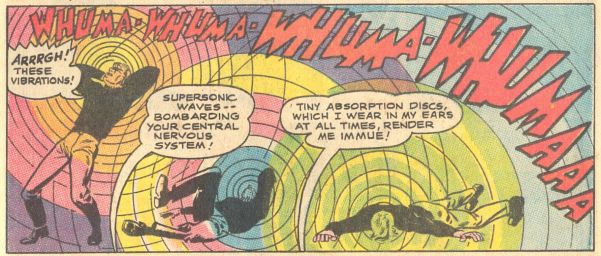
I assume the letterer for the above story was working from a script that indicated “immune.” Perhaps he mistakenly wrote “immue” after a tedious day spent filling in hundreds of balloons and caption boxes. Or maybe the error entered by another route: the writer accidentally omitted the “n” when typing and the letterer passively replicated the slip-up. Either way, the comic’s editors and/or copy editors should have caught it, but didn’t. Wondering if the mistake might be mine, I looked it up. “Immue” is not a word.
2. There’s one way in which current corporate comics (such as those by Marvel and DC) generally outperform alternative/art/independent comics: copy editing. Though certainly not error-free, corporate comics typically have fewer problems. Yet smaller publishers’ hands-off editorial approach has also been a strength. It’s partially responsible, I’d argue, for the graphic novel emerging as an important and popular form. Left on their own, great cartoonists produced great comics. Had they labored under the thumb of brand-obsessed, innovation-averse corporate editors, we’d have been deprived of many medium-defining works.
3. The longer a piece is, the more typos it likely has. It’s practically unavoidable. Every book I’ve written, edited, or co-edited has some. While working on one project, I read the manuscript and galleys multiple times, as did the assistant editor, project editor, and two other copy editors. Yet errors slipped by. Typos are the price of doing business. But what amount is ok?
4. On the typical word-and-picture comics page, text inhabits far less space than images. A comic’s visual details can occupy or blend into a panel’s background and be easily overlooked by readers. But in most conventional comics, text = foreground. Often placed in special white containers like those odd balloons floating around characters’ heads, words are highlighted — and exposed — in a way they aren’t on a page of prose. Given this exposure, shouldn’t it be easy for cartoonists, editors, and copy editors to pay attention to words and punctuation — and to get it right?
Given the important role that text, punctuation, and related mechanical conventions play in the art of cartooning, it seems odd that most readers rarely, if ever, look in detail at these issues. I’m not saying that there is a “grammar of comics prose” that would make it easy to definitively label something “correct” or “incorrect.” The medium is far too fluid for that. But we could say that each cartoonist or comic creates their own temporary internal grammar — and it’s worth asking what ideas that grammar involves and if the artist/comic follows it. (And deviations could, of course, be valid and interesting.)
5. It’s important to remember that comics is not prose. An error in one context might not be an error in another. The “rules” of punctuation, formatting, consistency, and spelling that govern prose often have no relevance to comics. Word balloon text, for example, frequently evades such guidelines. Consider Ernie Bushmiller’s comic strip Nancy:

The cartoonist omits punctuation at the ends of sentences — a clear mistake in prose. But in comics, a balloon’s boundary can function like a period. Because Bushmiller takes this approach consistently, we don’t see it as an error.
In Peanuts, Charles Schulz uses standard and nonstandard ellipses, some of which contain as many as seven periods:

His choices make sense semantically and aesthetically: they communicate different pause lengths and/or they balance a balloon’s text contents with its white space.
In comics, it’s not unusual to see strange forms of punctuation. This panel from a 1950s romance story uses three unconventional marks:
 1) ?..
2) !..
3) ?!.
A comics copy editor, then, needs to be alert to differences between comics and prose. (Did the editor of the above story miss a mistake? Should the comma after GODDESS be in bold? It makes sense to me that the punctuation after LOVE is, as these marks (?!.) reflect how the character would speak the words and amplify her facial expression.)
6. The comics page is like the poetry page. Poets enjoy a freedom with mechanics that prose writers don’t — and the same is true for cartoonists. A cartoonist may decide, consciously or otherwise, that she needs a two-period ellipsis in one speech balloon and a seven-period ellipsis in another because “it reads right,” a tactic that makes sense. These panels by artist Mark Connery use poetry-like line and panel breaks, dividing and reorganizing words and ideas in the manner of poets such as e. e. cummings:

Similarly poetic, Aidan Koch’s The Whale employs open-ended, unpunctuated lines: 7. A cartoonist’s overall approach can make the notion of consistency irrelevant. Ben Jones’s comics gleefully violate all manner of prose rules. He magically transforms ‘mistakes’ into ‘not mistakes’ by the Power of Jones.

What he can do, however, others often can’t. But why is it OK in this case and not another? I’d argue that it’s one of several peculiar tactics that, working in concert, form Jones’s distinctive aesthetic, a liberated vision of cartooning. When I read comics by great cartoonists such as Adrian Tomine and Chris Ware — whose work looks nothing like Jones’s — I always get the sense they are similarly in control of every aspect of their craft.
8. Yet sometimes a mistake is a mistake. It can’t be explained away as poetic or “cartoonistic” license, or as somehow intentional: “The character meant to say immune, but because he was so excited he blurted out immue!”
9. We should never be our own copy editors. We can’t see the mistakes and problems in our work that others can. More so than artists, editors and publishers bear final responsibility for proofreading/copy editing. Their job is to present artists in the best possible light: leave them alone when it benefits the work, intervene when necessary.
I wonder if this Nancy panel reveals traces of helpful editorial intervention:
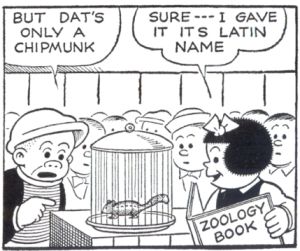 The space between the “t” and “s” in the second balloon is significantly larger than the distance between other letters within the balloons. I’d guess that an apostrophe was removed to fix the common “it’s vs. its” error. (Compare “its” in the second balloon to “dat’s” in the first: the “t” to “s” spacing is the same, though only one has an apostrophe.)
10. Of the final fifteen alternative/independent comics I read in 2015, twelve contained many errors and several questionable inconsistencies. In our current age of comics, one defined by the mix of graphic maximalism and textual minimalism, all (or nearly all) of these problems shouldn’t be too hard to find and fix. There just aren’t that many words on most comics pages.
A friendly warning:
If you're allergic to fussy musings about details, stop reading now — or you'll be sorry.
B. Practice
By far my favorite of these fifteen comics is Brandon Graham’s “Ghost Town,” which appears in the first issue of Island, an anthology edited by Graham and Emma Ríos. It’s beautifully drawn and colored, with a relaxed approach to pacing. Graham slowly explores the comic’s world, one full of ingeniously designed characters and unusually attractive natural and manufactured environments. He gives himself plenty of time and space to populate the margins and backgrounds of his cartoon universe with interesting minor characters and brief side stories. He also sets up compelling mysteries for his main characters, one of which involves a strange dream that appears near the comic’s beginning:
 The cartoonist’s confidence shines through in his love of puns. You’ve got to be unusually self-assured to include so many verbal, visual, and verbal/visual jokes. The punning never stops, and I’m glad:
Graham’s inventiveness also plays out in his varied approaches to hand-lettering. In word balloons he alternates between capital and lowercase letters, as if indicating changes in a character’s speaking volume and/or differentiating their ‘tone’ from other characters’ voices. He employs what we could call a poetic use (and avoidance) of punctuation:

Mixing English and invented languages with invented letterforms and leetspeak, he creates his own punctuation marks and experiments with the size, shape, format, and angle of his letters. This clever sequence employs a catalog of interesting and funny lettering ideas and balloon tactics: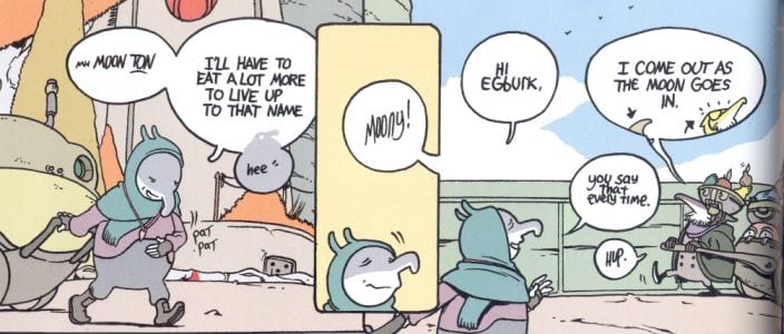
Through such choices, he accomplishes something that might be near impossible to do with computer lettering: he gives his characters distinct voices.
There’s much skill and originality on display in this episode of Graham’s ongoing Multiple Warheads story — as there is in all of his work. He's one of the most entertaining and innovative contemporary cartoonists, especially when it comes to expanding the relationship between language and lettering in unpretentious ways. But I’m puzzled by a few issues involving spelling, punctuation, and consistency. I can’t quite reconcile these issues with the comic’s forward-looking cartooning, though perhaps you can.
I’ve noticed that online comics critics seldom examine lettering choices and what they indicate about a cartoonist’s aesthetic and comic-book production. After drafting this GRID essay, I read over a dozen writers talking about Island #1. While one criticized typos in the issue’s prose piece, others said the anthology was “careful” and “flawless” — and no one mentioned what I discuss below. Perhaps these readers believe that since comics is not prose and the comics page is like the poetry page, it’s all good. Perhaps, for them, texting and other digital communication methods have rendered pre-twenty-first-century orthographic conventions obsolete. Whatever the reason, fair enough.
In what follows, I discuss several choices that Graham makes. Whether you agree with me or not, thinking through these issues might help us to better understand a given cartoonist’s practice and the comics medium.
[Note: Island’s table of contents includes each story’s page numbers, but the volume’s pages are unnumbered. The page numbers in bold below refer to “Ghost Town.”]
Table of contents: “Multiple Waheads.” The short biographical paragraph spells the title of Graham’s ongoing story without an “r.”
Page 2: “Is it.” Given that this is a question, should it end with a question mark?

Did Graham intentionally leave it out to communicate the character’s disinterest (which we see a little of in his facial expression)? On the first page of Graham’s “Polaris 1” (also in Island #1), he omits a question mark from a quotation that should have one (the quotation tells us Graham is quoting a question), leaving me uncertain about what he’s up to with punctuation:
Shouldn't it be “Why . . . real one?” (Here's the source text, which includes a question mark after “one.”)
Page 2: “Were wolf.” A dictionary and image search confirm that werewolf is one word, though here it is spelled as two:
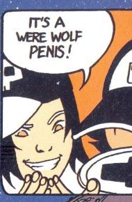
But on page 15 it appears as one:
Page 4: “Very old snake, Alexander.”
Page 6: “Hold tight Alexander.”
 The phrase on page 4 follows a standard prose rule for punctuation in dialogue (see here), but the one on page 6 doesn’t. As mentioned earlier, comics isn’t prose and cartoonists can do what they want. But, again, it’s the inconsistency I wonder about: why one place and not another? Is it un-punctuated on page 6 because the name appears on a lower line of dialogue (unlike on page 4) and is therefore already visually separated, making a comma redundant? (If so, this tactic would resemble Bushmiller’s use of the balloon boundary as a stop; on page 6, the line break acts as implicit punctuation, providing a comma-like separation and pause.)
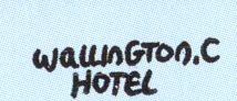
Page 10: “Wallington. C Hotel.”
Page 11: “Out making deliveries for the Wallinton.” Did he leave a “g” out on page 11 or add it in on 10 by mistake? Are there two places with similar names?
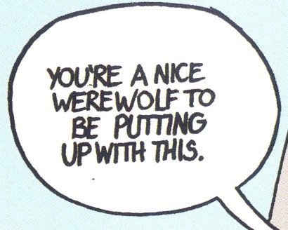
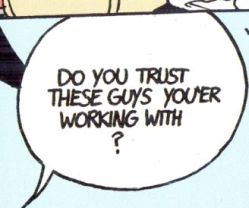
![]() Page 15: “Do you trust these guys you’er working with?” Perhaps this was intentional, but I assume he accidentally switched letters, intending to write “you’re” (as in “you are”):
Page 15: “Do you trust these guys you’er working with?” Perhaps this was intentional, but I assume he accidentally switched letters, intending to write “you’re” (as in “you are”):
Earlier in the comic he writes “you’re”:

A similar letter switch (“doesn’t“ becomes “dosen’t”) occurs in another recent Image comic, 8house #3 by Graham and Xurxo Penalta: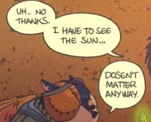
(Note the interesting use of different ellipses within a single panel, as in the Peanuts image in section 1.)
Page 18: “Some
-thing.”
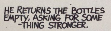
I can’t recall ever seeing a word split at the end of a line with the hyphen delayed to the beginning of the following line. Since the hyphen doesn’t follow directly after “some,” readers might assume that “some” is a complete word until they realize it’s part of “something.” (On this page, he writes “half truths.” Though most dictionaries hyphenate it, it seems fine without one. I wouldn't have given it a second thought if not for other questions I had about hyphens.)
Page 26:
“. . He ate the
repair-
-man.”
He splits “repairman,” but does the splitting differently than on page 18, by using two hyphens:

This might be an intentionally playful/poetic take on punctuation, but it’s hard for me to tell, especially in light of other deviations. It looks weird — and it's something that readers might stumble over. The best argument for following a convention is that readers don’t notice you’re following a convention; they read right on through.
Hand lettering can sometimes generate more mistakes than computer lettering. So I grabbed a random issue of Graham’s King City — which uses both kinds of lettering — to see how it stacks up to Island. Also released by Image, King City #8 starts with an apostrophe problem that recurs throughout:
Inside front cover: “In Pete Taifighters pockets.” (Convention dictates ’s, as in Taifighter’s.)
Page 5: “In Anna Greengables pockets.” (Ditto.)
Page 6: “In Maximum Absolutes pockets.” (Ditto.)
I was beginning to think I failed to recognize that the comic’s implicit style guide called for omitting apostrophes. But on the next page, the standard form appears: “In Maximum’s coat pocket.” Then, on the hand-lettered back cover, the apostrophe goes missing again. When told to use a towel, a character says “were out of those too.” I assume he means “we’re,” as in “we are out of those too.”
Perhaps the viral culture of the internet text-image meme, which often uses “its” when grammarians would demand “it’s,” is rendering — or already has rendered — the apostrophe a quaint artifact, the kind of thing that only an uptight, pedantic type would worry about.
Another apostrophe issue pops up in “Polaris 1.” Graham writes character’s twice, though he’s referring to something possessed by multiple characters. So the conventional form would be s’, as in characters’:
 Using standard punctuation would have eliminated the sentence’s confusing shifts.
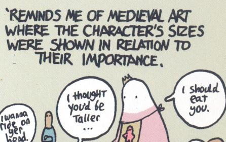
Yet, Graham also does something interesting here and throughout his work: when a character/narrator begins a sentence with a verb (implicitly omitting the subject), the cartoonist indicates the omission with an apostrophe, as if to signal a kind of contraction: It reminds me becomes ’Reminds me. (Also: note the mix of uppercase and lowercase Ts in the word balloons, which seems like a stylistic choice, not a mistake.)
**
Looking at Island’s other pieces didn’t bring much clarity when thinking about “Ghost Town.” I couldn’t sense an overarching editorial vision about text mechanics. The title of Ludroe’s “Dagger-Proof Mummy” has no hyphen in the table of contents, though it does on the comic’s first page; it seems to me editors should follow the artist’s lead on such things. The story, which includes relatively little text, has an apostrophe error or two — “somethings wrong” instead of “something’s wrong” — but it gets things right that Graham sometimes doesn’t, such as “we’re.” Emma Ríos’s story, which uses computer lettering (as Ludroe’s does), is generally error-free. Though its comma use may be a little inconsistent (and differs from that of “Dagger-Proof Mummy” and “Ghost Town”), I largely ignored the comma while writing this piece because, for me, it’s the most subjective punctuation mark.
As I hope I made clear, I like Graham’s comics a lot (and I’m happy that Island introduced me to Ríos’s work). But I wish the editors had taken a different approach to proofreading the anthology. I recognize that some publishers don’t have the time or money to hire copy editors and that some readers don’t care about conventions or consistency. For cartoonists, editors, and publishers who do, maybe some version of “crowd-proofing” is the answer — or they could take a pedantic English-major friend to dinner in exchange for some proofreading. I copy edit for a few cartoonists and publishers and recommend it to anyone who writes about comics. It has helped my criticism by forcing me to be more attentive. If I miss something, it’ll end up in print and I’ll feel bad — or is it badly?
[This essay was written in late 2015.]
_____________________________________________
Ken Parille is editor of The Daniel Clowes Reader: A Critical Edition of Ghost World and Other Stories. He teaches at East Carolina University and his writing has appeared in The Best American Comics Criticism, Nathaniel Hawthorne Review, Comic Art, Tulsa Studies in Women’s Literature, Boston Review, GuitarOne, The Believer, and elsewhere.


