As a teenage fanboy, I gravitated toward comic art that I thought was “experimental.” The artists who epitomized my vision of “the cutting-edge” were Bill Sienkiewicz and the man known only as Steranko. I had no interest in guys like Pete Morisi. The Morisi art I saw in Charlton comic books was cartoony in ways that seemed old-fashioned and just plain boring. It lacked Sienkiewicz’s mixed-media bravado and Steranko’s pop-art cinematics:
These artists’ active, boldly designed pages provided the perfect vehicle for the action-based genres stories they told. Poor Pete Morisi, I thought. He just doesn’t get it. Where’s the innovation, the excitement, the life?

Now that I’m an aging fanboy, Morisi ranks high among my art heroes, for all of the reasons I once disliked him. He’s a master designer and an eccentric storyteller.
*
We often talk about the ways that readers “animate” comics, bringing characters and narratives to life. In an essay on comics’ appeal, the cartoonist Seth muses on the medium’s “frozen . . . nature” and the reader’s life-giving role:
There is something very lovely about the stillness of a comic book page. That austere stacked grid of boxes. The little people trapped in time. Its frozen and silent nature acting almost as a counterpoint to the raucous vulgarity of the modern aesthetic. Of course, the drawings aren’t really frozen. When we look at them, we immediately invest them with life. That little ink world pops into life as our eyes move across the drawings. I actually find it very difficult to look at a cartoon and hold on to the stillness. The essence of the cartoon language carries a kind of animation with it. This is true even with a single drawing, but it is especially evident when one panel is placed next to another. That juxtaposition creates a tension that implies motion and time. (1)
As Seth says, it’s “difficult . . . to hold on to the stillness,” and many artists don't want readers to linger over individual drawings or panels — contemplation prevents immersion in a comic’s plot. But Morisi’s art, especially his 1960s and ’70s Charlton work evokes a deliberate sense of stillness. Given that Morisi worked in genres defined by narrative tension and violence, his approach seems all the more weird. Much of his energy lives, not in panel-to-panel flow, but in the framed confines of the panel, in flat images on lifeless pages.

I can’t invest Morisi’s work with motion — and I don’t want to. I like comics that, while populated by supernatural menaces, gunplay, and fistfights, manage to maintain an aura of quiet.
Although many artists struggle with the comic page’s limitations as a static, silent surface, Morisi harmonizes with newsprint’s inert pulp essence. His peculiar genius lies in the way he seems to disrupt our desire to glide across a page. While it’s hard to talk about the specific effect that images have on us, many of his panels feel calming, almost a little hypnotic and “sculptural” to me, working against the animation that Seth rightly sees an important feature of narrative comics.
In fact, Morisi’s characters often resemble a drawing of a sculpture of a person, rather than a “direct” representation; and many of his horror comics feature sculptures in the panels’ backgrounds and margins.

His characters evoke the stasis of statues and the stillness of photo-referenced drawings (a technique he used for faces), yet without the bland, stilted feeling.
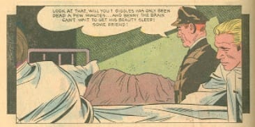
Morisi’s people are poseurs. Rather than appear as though “in the middle” of an action, they pose for each other and the reader:
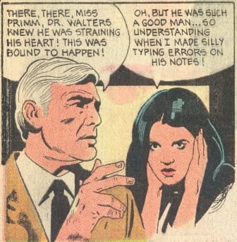
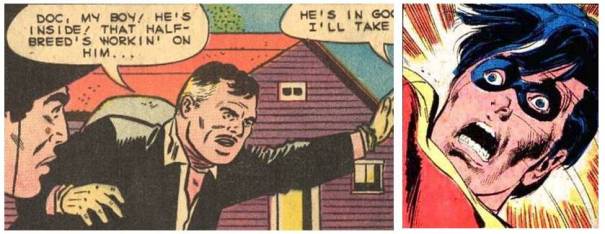
The characters’ faces and the comic’s text reveal an odd disconnect: the dialogue and narration convey the situation’s drama, yet the facial expressions don’t. People stare off somewhere beyond the panel, disengaged from the plot and from each other, counteracting the intensity that the text’s many exclamations points are supposed to carry. This disconnect lends Morisi’s Charlton work an odd, subdued pathos:

Morisi designs grids and panels in ways that enhance the posed stillness. He repeatedly uses frames within frames, a technique that figuratively traps characters, events, and moments within and against multiple frames: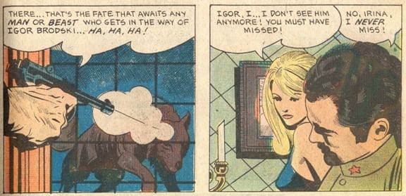
Note how the grid shifts in the above two-panel sequence, from window panes to angled wallpaper.
As part of his interest in “re-framing,” the artist frequently employs square inset panels and echoes a panel’s rectangular shape by including rectangular objects (desks, tables, picture frames, doors, posters, square clocks, etc.) and parallel lines:

The yellow square next to the character's face is positioned within five concentric rectangles, six if you include the page — that's a lot of re-re-framing . . .
Two other panels dense with rectangles:

Morisi loves the stasis of straight lines.
Another recurring Morisi re-framing device consists of a narrative panel superimposed on — almost as if resting atop — a non-narrative black panel:
And the right-angled shape of the lighted area on the back wall suggests yet another a frame-within-a-frame.
Morisi often sets his “sculptural” characters against stylized shadows/backgrounds, a move that violates conventional notions of adventure comic-book realism:
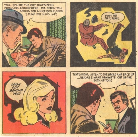
In the red panel, he again creates a curious emotional distance between the character’s almost-neutral facial expression and the dialogue’s bolded, urgent drama.
This panel’s background employs a circle/faux-spotlight,

an artificial tactic that recalls the story panel superimposed on an all-black design panel; in both instances, Morisi adds a non-functional, non-narrative shape into his page design. Given his interest in freezing motion, we can see this panel as almost creating a kind of “characters frozen in a strobe light” effect (the narration emphasizes the character's "speed," while the image portrays something all-together different.)
In another atypical design decision, he splits the scene/panel below in two, placing the dialogue in a pseudo-gutter instead of a balloon.

If the dialogue appeared in a conventional balloon — one with a tail pointing to a character’s mouth — the command would actively connect to its speaker. But Morisi diminishes that association, deemphasizing action and dampening the dialogue’s urgency. “Don't Move” seems to be the artist’s imperative to his characters — and his artwork.
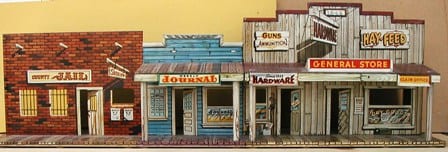
With its simple background structures and blocky coloring (another thing that used to seem goofy to me), this panel now feels as pop-arty as Steranko:

Rather than try to represent an actual town, it looks as if Morisi set out to draw a picture of a child’s 1950s Western play set:
Unlike Sienkiewicz and Steranko, Morisi executes interesting effects without drawing much attention to his art. His peculiar visual approach continually unravels — even deadens — a plot’s tension, working against the excitement that comic-book readers expected and demanded. He’s a subtle and strange artist.
*
To further get at this strangeness, it’s helpful to examine Morisi’s art in relation to that of one of his most influential and imitated contemporaries, Neal Adams. (Sienkiewicz, for example, started out as a kind of Adams clone.) Beginning in the late 1960s, Adams’s comic-book art exemplified the trend toward a looser, more illustrator-ly line and active style. Many 1960’s and ’70s readers saw Adams’s approach (as many current readers do) as the advent of a new comic-book realism — in fact, “realism” is the word almost always used to describe his art. Given his reliance on sinewy heroes and villains with anguished faces surrounded by copious motion and emotion lines, I might call Adams’s over-the-top style something like “Hysterical Faux-Realism” (I don’t mind his art – I just don’t see its “realism”):
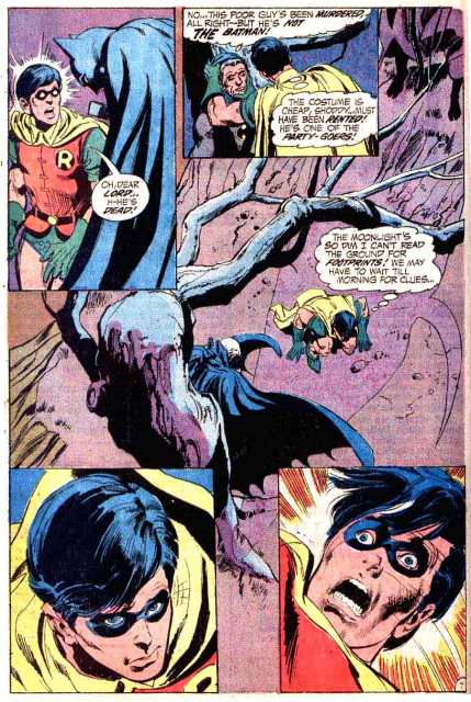
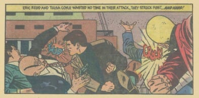
This is about as agitated as a Morisi character gets, a far cry from Adam's hyper-distraught Robin:
Artists who worked in horror and adventure genres often followed in the Adams’s tradition. Many whose art appeared in Charlton comics alongside Morisi’s tended toward a wavier, often scratchier ink line, and their drawings typically used far more lines than his:

This dense and varied line work gives their art and pages an inherent sense of action. But Morisi stayed with his 1950’s George Tuska/Alex Toth-like approach. His accurate, old-fashioned ink line adds to his art’s tranquility, just as it set him apart from contemporary comics, in which peril and panic were omnipresent. Morisi’s work is ever placid and precise, qualities visible in this original art panel:
He discards popular techniques for communicating action and anxiety, such as crowded and energetic artwork, strained faces, motion lines, emotion lines, and even sound effects. (2) Morisi’s rejection of these tricks in favor of an aesthetic of stillness makes him pretty avant-garde.
*
Seth notes that “when we look at [comics], we immediately invest them with life.” In this literary relationship, the reader plays the “animating” role. But American comic-books have also relied on a different dynamic: the comic animating the reader. Cranking out narratives driven by violence and sex, many “Golden Age” (c. 1938-54) comic publishers hoped their stories would activate a reader's physiology in a way analogous to drug use. After viewing page after page of unconsummated sex and consummated violence, an excited youngster would jones for more thrills, running to the newsstand to cop another fix — the action of Action Comics appeared on the newsprint page and within the reader’s trembling body. “Golden Age” comic-book titles like Sensation Comics, Thrilling Comics, Shock-Suspense Stories, and Exciting Comics broadcast this physiological intent, making a promise that mainstream comics today still try to keep.
Who, then, could be more subversive in the history of American comic books than Pete Morisi, a master of stillness who freezes his heroes and villains in austere grids of little ink boxes?

___________________________________________________________
NOTES:
1. See Seth’s essay here.
2. Morisi almost never uses sound effects, though they appear (along with some very atypical Morisi motion lines) in a few of his Charlton Vengeance Squad stories:
 3. All of the Morisi art above appeared in Charlton comic books from the late 1950s to the early 1980s. The selections come from Ghastly Haunts, Ghostly Tales, Haunted, Lash Larue Western, Scary Tales, and Vengeance Squad.
___________________________________________________________
BONUS: Active/Frozen
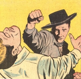
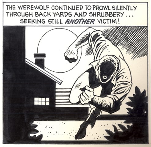
Here Morisi draws a charging animal:

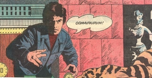
Here, he draws a tiger frozen by magic:
 "The magic chant you taught me stopped him cold!"
______________________________________________
Ken Parille teaches at East Carolina University. He recently edited The Daniel Clowes Reader: A Critical Edition of Ghost World and Other Stories, with Essays, Interviews, and Annotations.


