Today on the site, Dash Shaw talks to Gary Panter about Panter's new masterpiece, Songy of Paradise.
This book doesn’t feel like it needs footnotes the way some of your books have. I just read it straight as a story. I thought, “Oh, this’ll be great interviewing Gary about this book, because I won’t have to do any research!” [Panter laughs]
Yeah, there’s tons of research underneath it, but you don’t have to have it to get the book. And really, it’s because the story of Jesus being tempted by Satan—I don’t know how many verses, five or six verses in the Bible—and Milton just lards it with words and allusions and his philosophy. And so it’s hyperinflated, but the story’s simple. One of my friends, John Wray, who was also in the Cullman Center, he asked me why I stopped using multiple panels the farther I went. But the farther I went, there was less said, you were just hashing over the same things in different categories, and they weren’t worth turning into comics in a way. I start realizing, “Well, Milton’s using all these words to say something that’s just two sentences often.”
Right, right. Yeah, I understand.
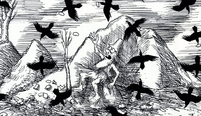
Oh, can I say one thing. I still interspersed a reading of Dante with this. I did the same thing as the other books formally, somewhat, in that I broke the pages down according to the same books and visions of Milton pretty much, divided among the 33 pages. And I still read Dante for lighting effects. So I didn’t address Paradise by Dante directly, but the lighting gets lighter or darker according to Dante or more stars or eagles appear, that sort of thing.
The lighting meaning the darks on the page?
As you’re going through, like on the first few pages when finally the Babylonian God appears, and there’s a moon in that panel. And that place in Dante’s Paradise is when the moon appears. And then as you go through, rings of stars or interlocking rings of stars or birds or the eagle appears… There are these big symbols that appear in Dante’s Paradise that are the stagecraft of the book, a hidden set of tiers. It’s not important, you don’t have to know about it, but that’s just how I did the book.
Elsewhere:
Tablet has a lengthy look at Eloise creator Kay Thompson's life and identity.
Continued proof that comics history remains under-explored, no matter how many books are printed: Jay Jackson's Home Folks, which appeared in African-American newspapers in the 1950s.
Longtime inker Joe Sinnott is profiled in the NY Times.
And over the weekend a controversy erupted online over the cover of the upcoming fourth issue of The Divided States of Hysteria, a comic book by Howard Chaykin, published by Image Comics. The cover image shows the aftermath of a lynching: a hanged man with a slur on a name tag and bloody/mutilated genitals. The cover can be viewed here. The first issue of the series was also offensive to some. In both cases, the arguments back and forth involve issues of intent, privilege, and the depiction of (and profiting from) particular acts and identities. Image, with Chaykin's approval, pulled the cover from publication and released this statement. That problems inherent in the statement have been well-annotated by Jordan Calhoun. Chaykin has responded here. The reaction to that statement, which is one of the clearest examples of a total generational disconnect I've seen in comics, is still unfolding on Twitter, and Sarah Horrocks has been particularly strong there. There are other strands to this story that pull in other Image creators (notably Brandon Graham), but going down those (many) rabbit holes becomes the stuff of a much longer piece of writing, and, to be honest, I haven't read any of the comic books in play here, nor do I keep up with Image. Anyhow, there are many good Twitter threads that articulate the issues with and around the cover/series. One could start with Michelle Perez.