
Bill Boichel had a magazine that was a giveaway with paid attendance at his comic book shows. It was called Transformer and it ran monthly for its first 12 issues. One for every show that Bill or BEM (his business name essentially) put on in 1985. Monthly show, monthly comic. The first three issues were magazine sized. The cover to #1 is by Tom Grindberg (above).
Bill did all the production and he included some comics and images of his own. He wrote many of the lead stories (which were all drawn by Tom Grindberg), he designed the logo, did the paste-up and whatever else by hand. Bill got the covers printed offset and xeroxed the guts himself on BEM's xerox machine.
When the deadlines were tight he started doing more, like contributing a cover for #3 (below). His images were geometric which was a perfect fit for the strongly designed black-and-white books he was assembling.
========================

========================
If he did draw the figure then the drawings were rough and cartoony like a notebook doodle. Or he would use photos. Bill used comic relief to get across some solid text and image combinations.

============================
Boichel's back cover to Transformer #16 (below).
========================
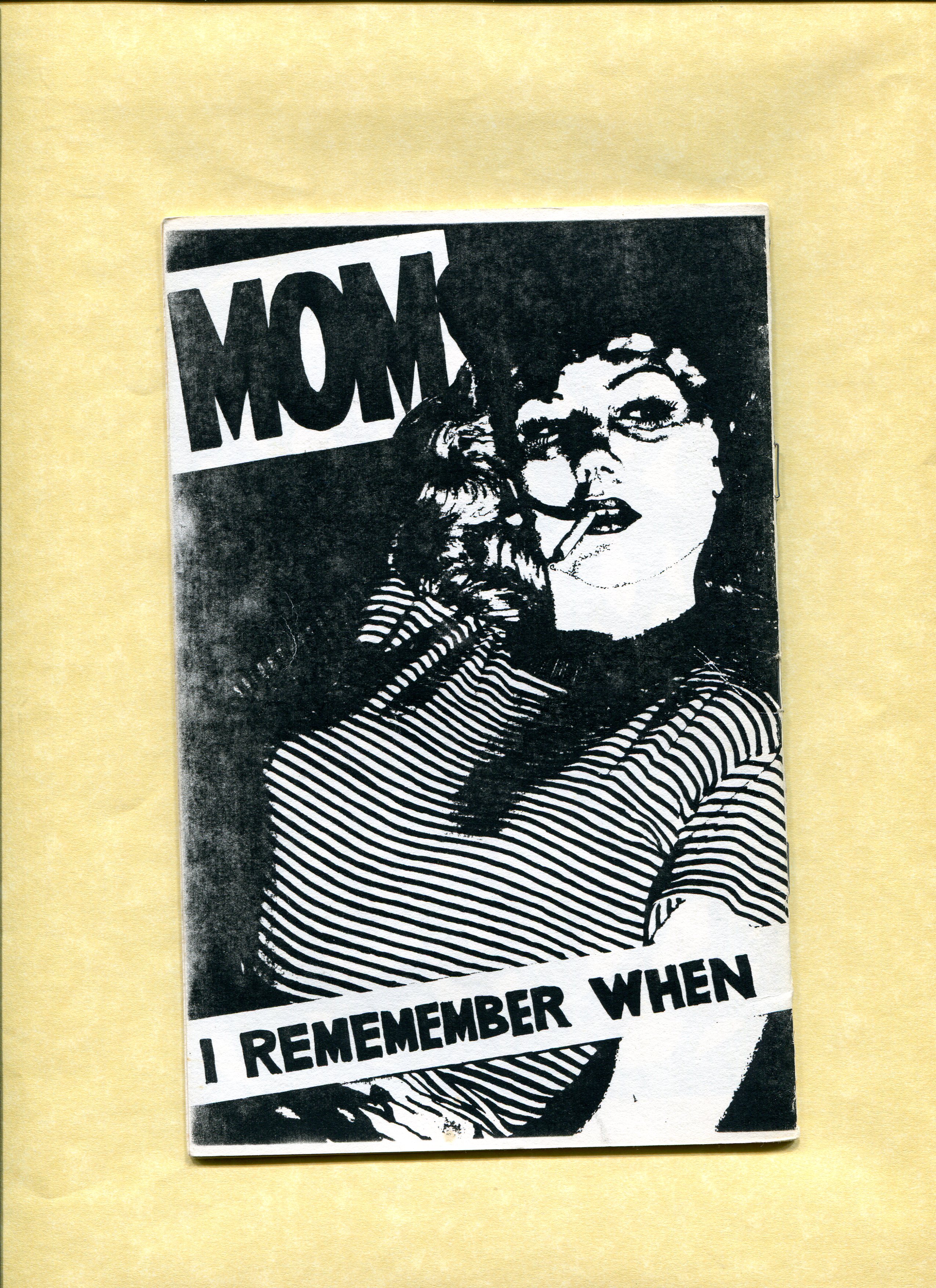
BEM was Bill's first comic-book shop. It was called "The Store" really. BEM was named after the Gilbert Hernandez story of the same name that ran in issue one of Love and Rockets. So, BEM, or "bug-eyed monster," was the machine that ran the store. The store's early logos said, "Coming to Grips with the Machinery." It meant the machinery of art and commerce together--comic books. It was high concept for a comic book store in a rundown post-industrial Rust Belt neighborhood like Wilkinsburg, just outside the city limits of Pittsburgh, PA. Somehow it all worked. Like a machine.
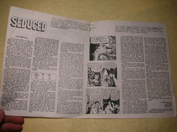
Boichel also made these giveaways that a customer would get with a purchase. The BEM Reader ran for about a summer, if I recall. Issue 3 was a reprint of an article about Simon and Kirby's romance comics (below).

===================
Boichel also made a ton of fliers for the store--check those out here. And he made a ton of variations on his store's logo--check those out here. So, it seemed really natural when he started making these wacky mini-comics. He'd make the comic at his desk and then print it up in the basement on the xerox machine and then give it away or sell it upstairs on the new comics rack. It was a way for Bill to be fully in the "machine" that was BEM. It was also a way for Bill to produce art like a machine. All of the comics Bill made at this time are credited to BEM which was, of course, the name of the store.
=============================
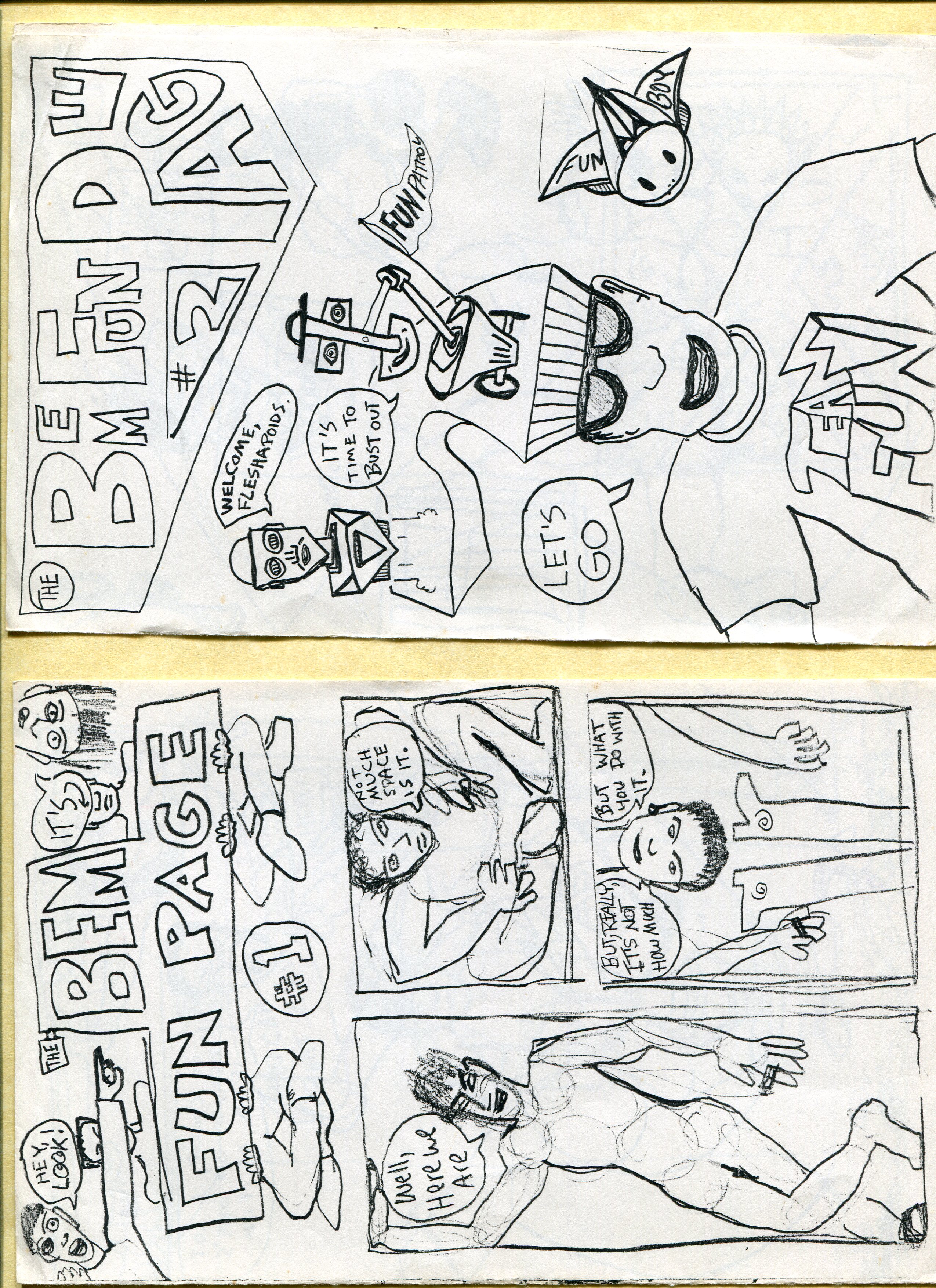
The BEM Fun Page from 1991 (below).
============================
Fetish Funnies from 1991 (below):

===========================
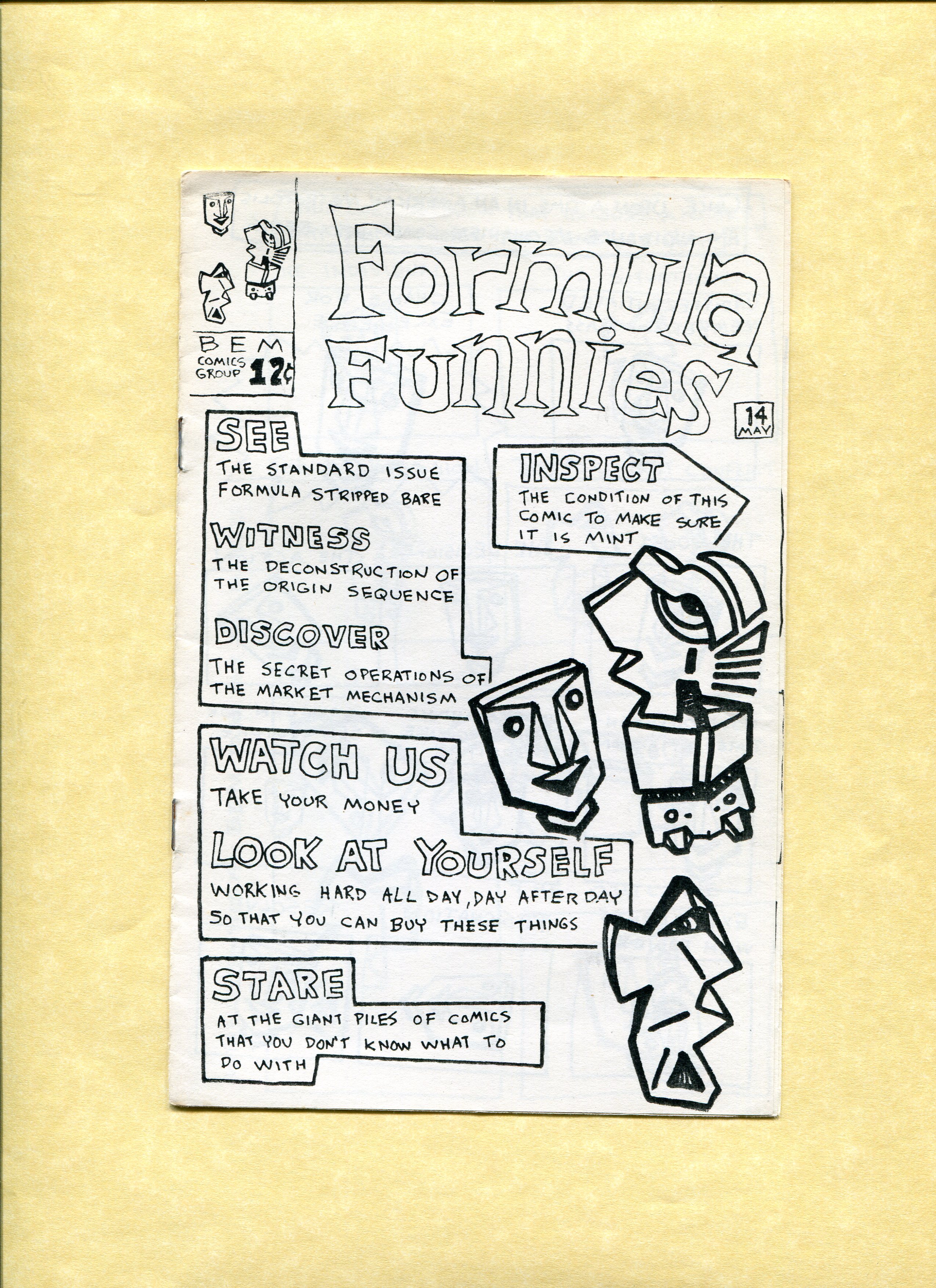
Formula Funnies from 1991 (below).


=============================
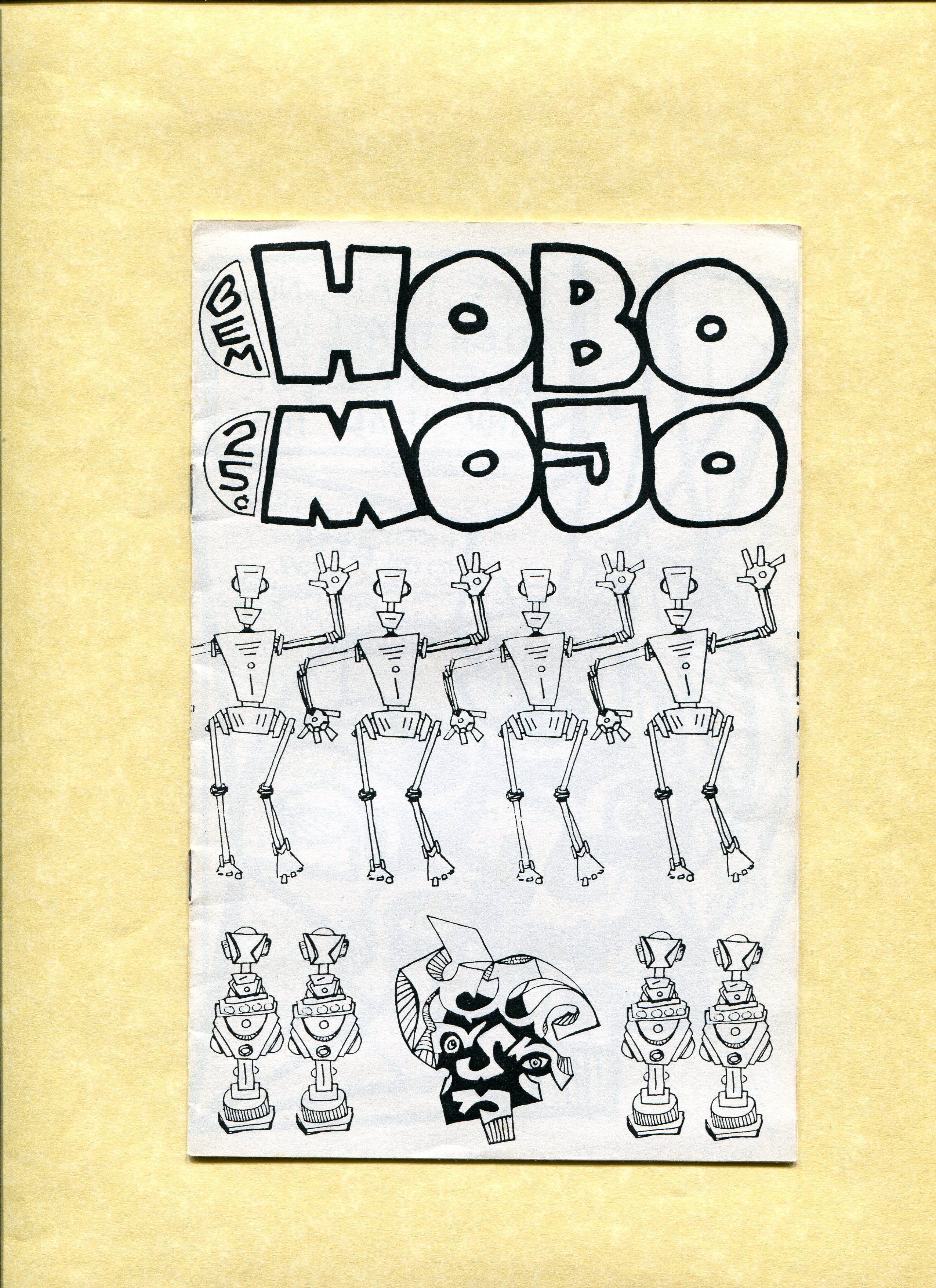
Hobo Mojo from 1991 (below):

===========================
From Geeky Watsusi (below).
================================
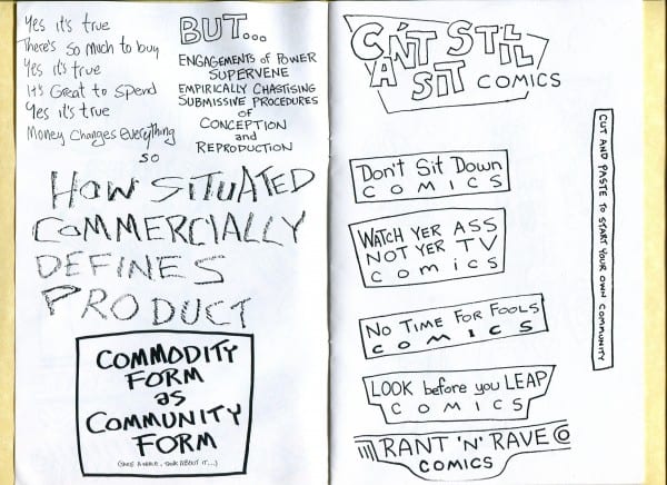
Four different comics from the '92-'93 era (below).


=============================
From I Want To Understand How My Brain Works (below):

From Lazy Kiss Comics (below).

Then in 1995 Bill got a copier where you could switch out the color cartridge. There was green, red, blue, brown and black. It was similar to a Riso machine but just a type of copier. Sharp 7800 was the make and model.

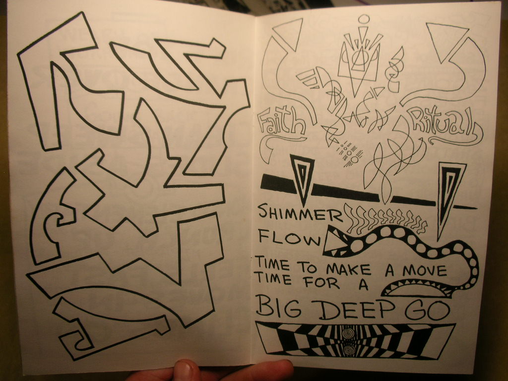
The guts were still in black and white. But still, color covers! That was a big deal to have color covers in the mid '90s. Here's a spread from Big Deep Go (below).
===============================
And then sometime around 1995, his work becomes very formal. Boichel leaves out the text and begins isolating his images. Kino-Rectate (below) is one my favorites from this period.

=================================
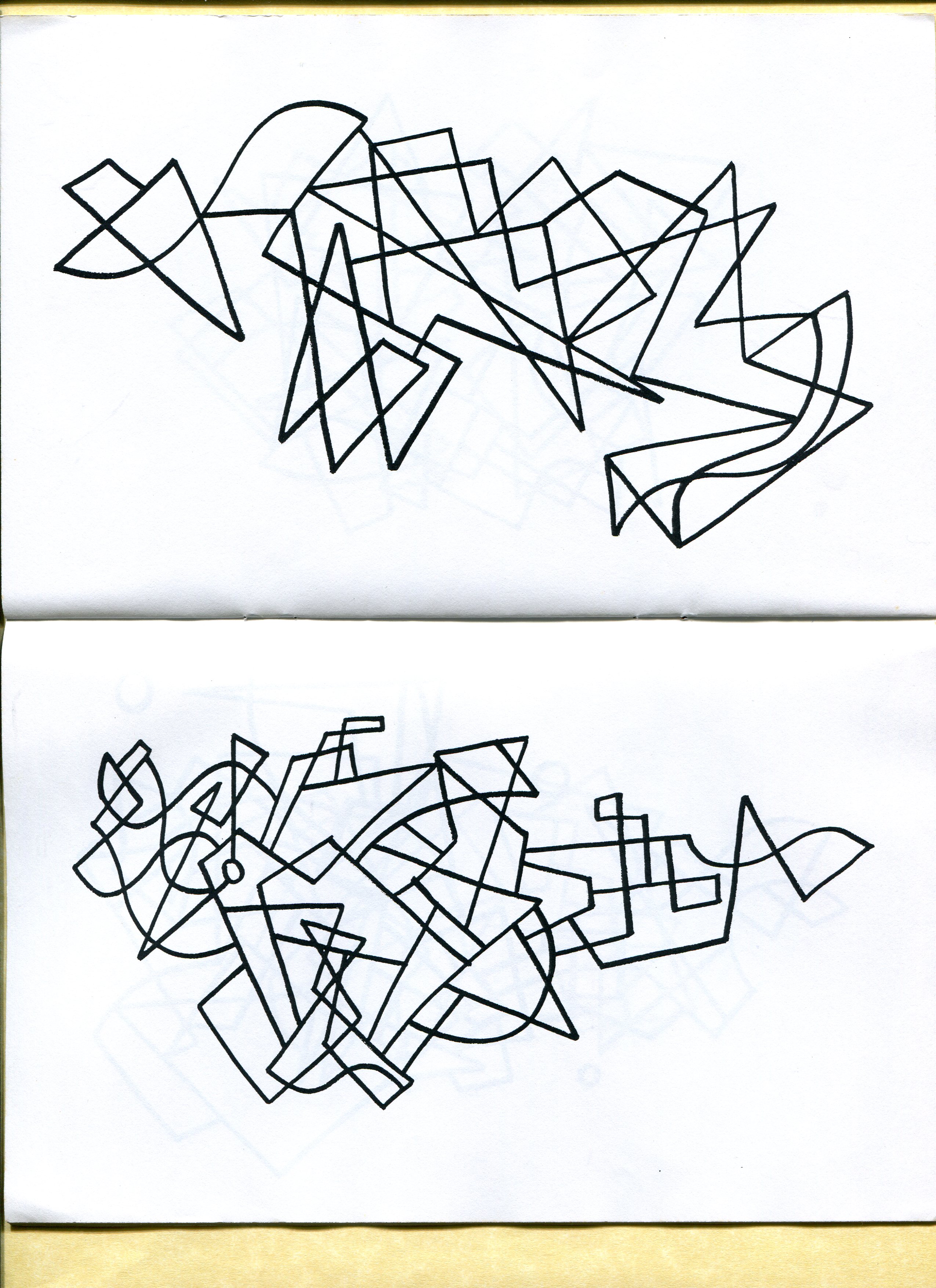
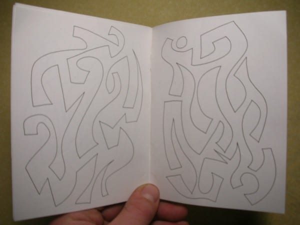
And then in a year or so he begins making drawings that are one continuous line. He presents the drawings as books.
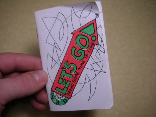
The drawing starts with the arrow on the cover and continues at the spot on the cover where the line goes off the edge. Boichel then continues the line across the left-right page spread and then across each subsequent spread until the back cover.


Back cover of Let's Go! (below).

===============================
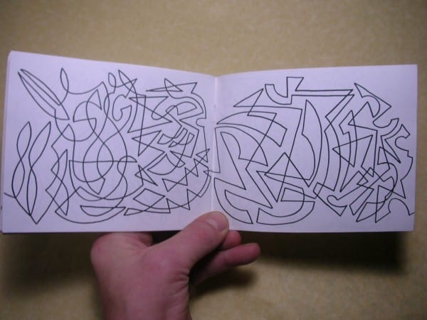
Here's another experiment with line and comics sequencing. This is called I'll Go When The Bus Comes and it's from 1995 (below).
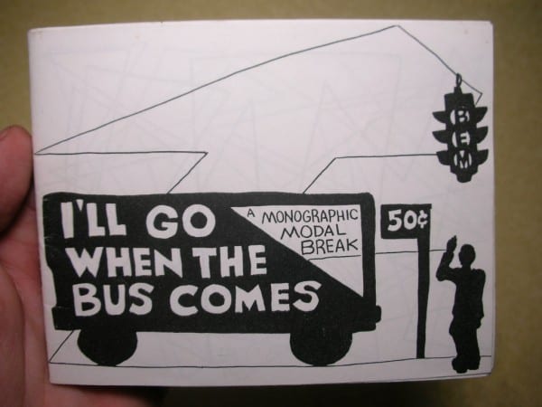
The line drawing begins on the front cover (above). it's the line for the sidewalk. That line is where the drawing "starts" on the first spread (below).

This is a spread from the middle of the book (below).
============================
Then, it felt like Boichel began to isolate certain styles from each other. Just like he was isolating forms on the page, then letting the forms spill across the page--now he was isolating styles. Kino-Rectate, I thought, had only "hard edge" geometric forms and no forms with curves. Tempora Mutantor was all isolated geometric forms with curves and few straight lines (below).

========================
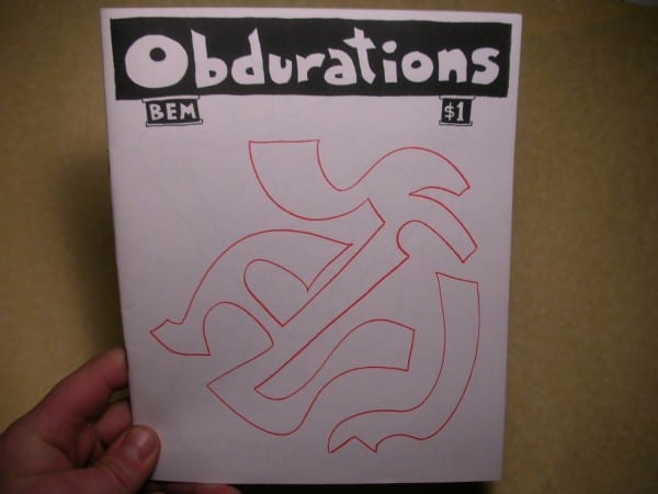
Boichel also played around with the way we take in the images as books. Obdurations (below) is a flip book. The other side has the same layout with a different title, Confessions of a Slave Girl.
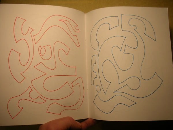
So, when you read the comic starting with the Obdurations side--the spread below looked like this:

If you started on the Confessions side--the spread looked like this (below). I like how Boichel plays around with that old joke about the abstract image being exhibited upside-down and it not making a difference.
==============================
Boichel started to get really good with manipulating the colors on the copy machine. The feckled blue on the left (below) is from placing a piece of tracing paper over the image before copying it.

============================
I was living in San Francisco in 1996 when Bill sent me a copy of Hey! What's The Big Idea? (below).

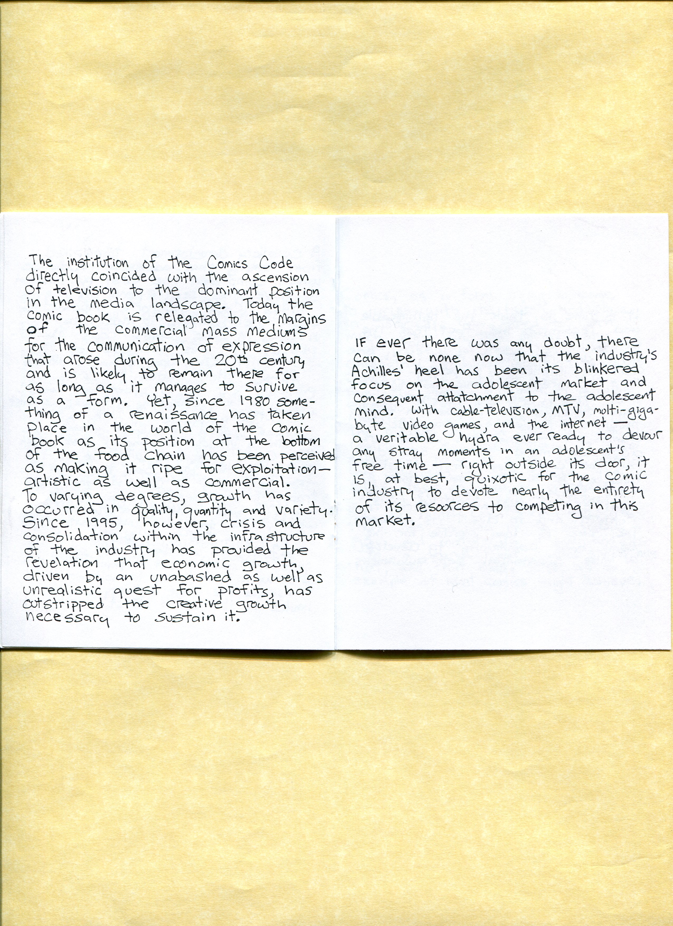
It was a really exciting time for me. Comics seemed liked it was having a renaissance of sorts. It felt like everyone was issuing manifestos. Dan Clowes had a manifesto. Bill had a manifesto which eventually became the mission statement for his yet to exist Copacetic Comics store. I distributed these amongst friends and through Comic Relief in Berkeley. I always wondered if Bill's essay made its way to Clowes back then. The Clowes manifesto first appeared in 1997. Bill's first edition of this essay was 1996 and the reprint is 1997. So who knows? Regardless, this type of essay was very popular back then and Bill's Hey What's The Big Idea was (and still is) important to me. And then seeing it echoed by Clowes was heartening. A rallying cry from all corners to take comics to the next level. Read the Boichel's whole essay here.

This is my favorite passage (below).
========================
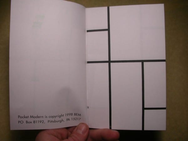
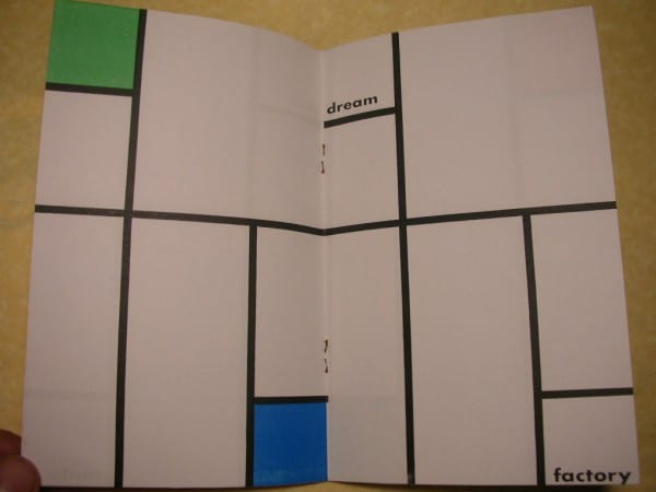
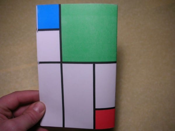
I also think it is interesting that he also applied his methodology to erase almost all aspects of his hand in the creation of 1998's Pocket Modern (below). The lively line drawings are now the panel borders of a comic book which look like a Piet Mondrian painting. Boichel adds words to the mix and because of the sequencing of the comics pages there is a slow movement or reveal within the narrative. It's a beautiful and effective use of layout color and text in the most reductive sense. The below passage is the first six spreads in order.


======================
I appreciate how Boichel choose to combine cartooning and doodling and note taking along with his "serious" abstract drawing in these publications. Boichel ran the gamut of expressivity with line and carefully sequenced his combination of words and images like a rigid formalist. It was an "anything goes" approach to making comic books. I think it's hard to be both a geometric formalist and a cartoonist and do both well. I don't think Boichel's cartooning is as well crafted as his abstractions, but the comic aspects of his work often acts as a necessary foil to take the potential hot air out of his formalism. Bill met the medium head on and used the language of comics to comment on itself. And did so, I think, with a specific type of comic book humor that is inherent to the form.
=============
For the BEM archive - check it out here.
I hope to write about more of Boichel's publications in the future. I skipped writing about his homage to Stuart Davis called Apodeictic Else In Der Anschauung from 1998 because it is one of my favorites and I would like to reserve it for another time.
Thanks! Over and out.


