I did say there'd be more on this later, right? Well, there's been a lot written about Art Spiegelman's stunning exhibition, Co-Mix, now on view at The Jewish Museum in New York. I want to add a few thoughts to the pile. Co-Mix is a comprehensive look at Spiegelman's work over the last 50 years, including a good helping of preparatory drawings, publications, and ephemera. But the focus here is on the original art for his comics, covers, and books. So, assuming I don't need to introduce the man or the work, here are some observations.

6. Art Spiegelman, original art for RAW no. 7: The Torn-Again Graphix Mag, 1985. Copyright © 1985 by Art Spiegelman. Used by permission of the artist and The Wylie Agency LLC.
1) The Curatorial Touch
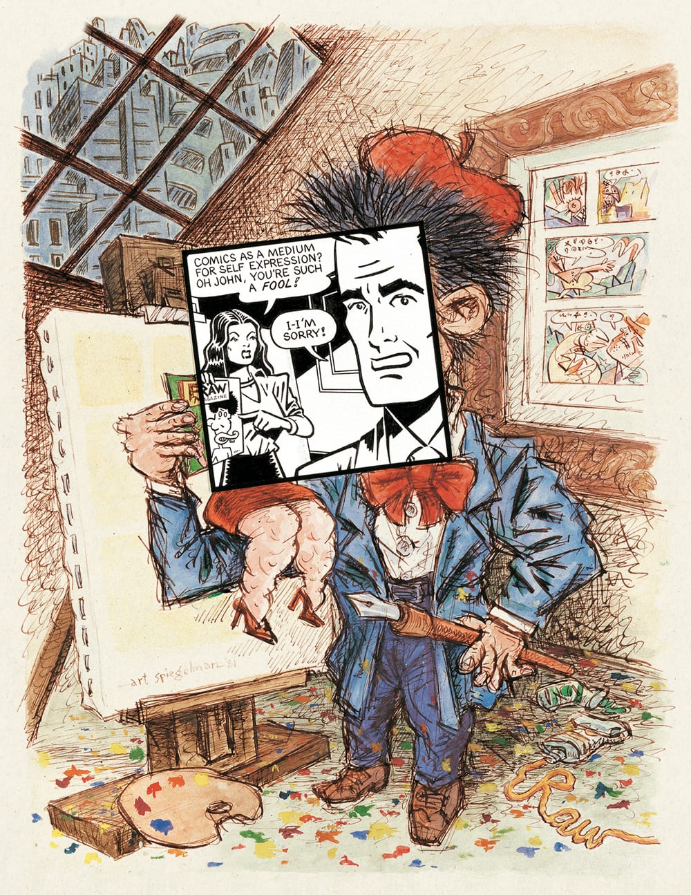
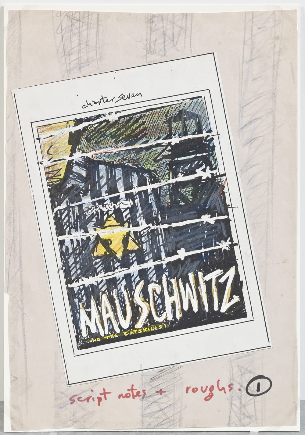
Having a good pair of eyes sifting through the archive is essential. Just when you think you have Spiegelman nailed down, he kind of slips away again. Oh, there's a Viper page, and there's a Maus print I hadn't seen, and, oh, those Boris Vian covers... And this is thanks largely to the efforts of Rina Zavagli-Mattotti, the owner of Galerie Martel in Paris. Zavagli-Mattotti curated the original exhibition, which opened nearly a year ago in Angouleme. With Spiegelman, she selected the work for that show and each iteration thereafter (it has made stops at the Pompidou in Paris, the Museum Ludwig in Cologne, and the Vancouver Art Gallery). So, yes, the "hits" are all here, but so are lesser known pieces, including the largest showing of underground work yet (certainly more than I've ever seen in an official compilation) and a fascinating set of layout progressions for Spiegelman's Raw #7 cover. Maus is rightly given pride of place, and beautifully installed, with Spiegelman's nearly frantic preliminaries occasionally jutting out from the finished pages like word balloons.
2) The Importance of Presentation
Yes, it counts, and especially so for comics, which do not naturally look good on walls. Intent or not, the white of the page sometimes just bleeds into the white of the walls, and it's all just marks. But Rina Zavagli-Mattotti got around that and the old variable-size conundrum by framing all the work with acrylic frames (finished with a urethane paint) that look almost like grey matte-boards. No matter the size of the original artwork, there are just a handful of frame sizes throughout the exhibition, so each section of the show has an internal modular coherence. Moreover, the size of the frames serves to make each drawing into an object, offsetting it from the wall and, in a way, itself. These frames force the viewer to engage with the work within them -- that white rectangle in there -- you have to read/see it. I've never seen anything quite like it, and at first I found it jarring and then kind of hypnotic. It wouldn't work for a lot of drawings, but for comics on walls, which require sustained attention paid to an artifact that is not a "final" thing, it's perfect. Combine that with deftly placed spotlights within each section of work, and walking through the galleries takes on the feel of a kind illuminated pathway, marked by rather brilliant "folios" applied to the tops of the walls at the beginning of each section: "Breakdowns", "Maus", "The New Yorker", etc. So as you progress through the show you've no room to really worry about the size of the work vs. the space, where you're headed, where you are, or any other distractions at all. It's all light and frames and the work. It's really rather beautiful.
3) The Work
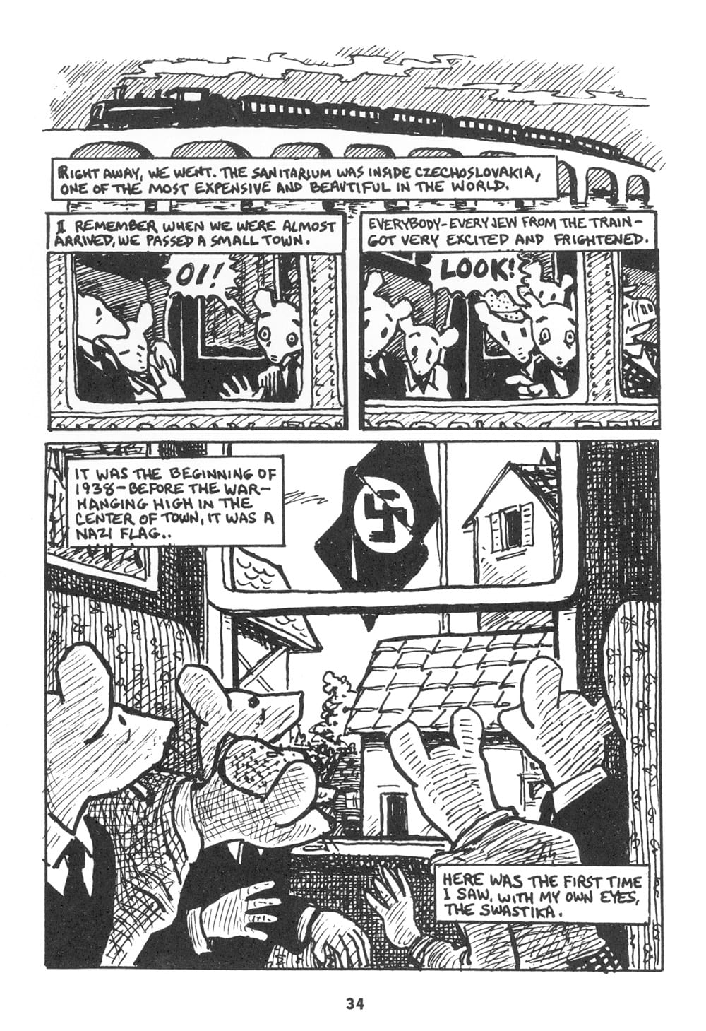
Yes, and there is the work itself. I must struck by how meticulously clean it all is. What a prosaic observation, and I'd only make it if so much original art wasn't so much about the process -- blue lines, scratch marks, underdrawing, etc. There's something almost eerie about how present and singularly crisp these original are. It's as if they materialized from thin air. This has a lot to do with Spiegelman's method, which involves multiple sets of tracings, so the final is more or less predetermined, but it is also a testament to his underrated skill as a draftsman. The cleanliness, though, does not detract from the importance of the work as drawings. The original art for the underground work is precise, and, in the case of Breakdowns-era strips like "Don't Get Around Much Anymore", elegant. And there are simple surprises: It turns out the cover to Breakdowns was drawn tiny, giving it an unexpected intimacy, while the cover to Read Yourself Raw is enormous, making those famous figures fall through a far greater space than I'd previously imagined. And Maus, for all its prep work, is a sight to see. This is the only iteration of the exhibition at which original art from the book has been shown. The urgency and exactitude of the pen lines really does give the work an aura. The prep drawings for The Wild Party are as unhinged as the finals are refined, if that's the right term for such darkly lustful images.
4) The Through-Line
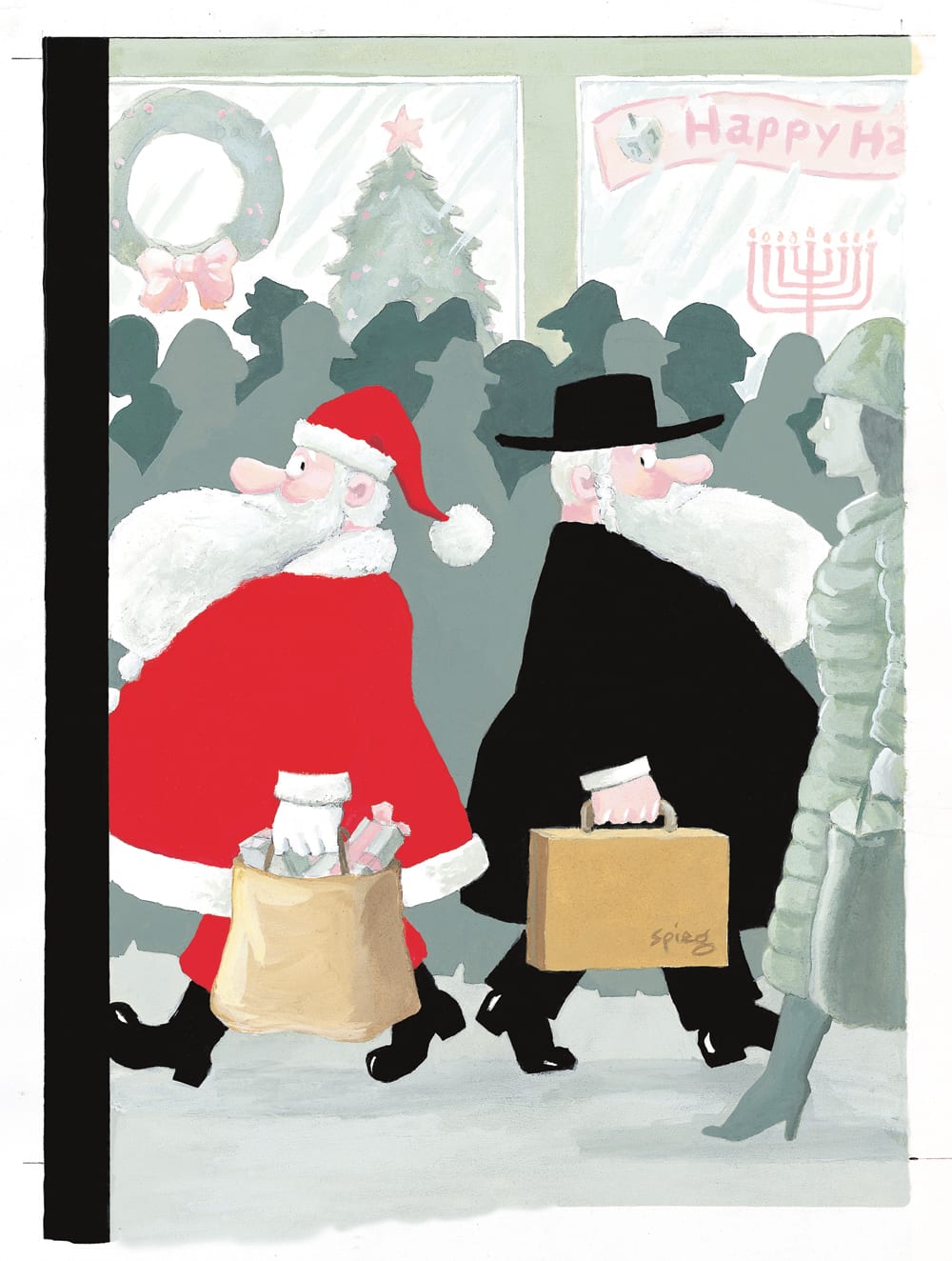
More than any book can do (though the catalog for the show is very good), a walk through the exhibition made me live Spiegelman's restlessness and riskiness. In the beginning he made underground work that was stringently formal when everyone else was getting deeply funky. Maus is, well, Maus -- as much as we take it for granted now, seeing the early stages of it, and seeing it in the context of the early 1970s work, made me realize again how daring a work it is. It just should not have worked, and certainly not in the market and culture of its time. But it did, and does, and now works as drawings all over again. And on to those Vian covers, the unhinged surreality of which I love so much. The Wild Party, which was another daring thing which produced some of the artist's finest images. The New Yorker covers make you double back to the Topps work, and the Raw ingenuity, and see that, yes, that facility for single-image visual communication was always there; Spiegelman could always work in stand-alone images that tell a story. And in the end, there's the recent work in dance and theater, which is restless again, and once more obsessed with form, history, and comics. Spiegelman never ceases to take risks, propelled by what seems like a compulsive need to explore the skill set (essentially writing with pictures) and medium (comics) he so loves. The show itself, for all the reasons above, is another risk, and another experiment in the organization and presentation of visual information.

5) Go See It
I don't often advocate for much of anything on TCJ, but this is an exhibition that has a lot to teach about the medium itself. To observe this kind of omnivorous trajectory means understanding how elastic comics can be, taking in everything from politics to porn to formalism to history to the medium itself. Co-Mix successfully presents Spiegelman as a location as much as an artist, and that location is where a lot of historical paths cross -- the various paths of gag strips, underground culture, pulps, children's books, print-making, drawing, political cartooning -- all these aspects and more feed into a single creative place. It's a place that rewards exploration.


