“LOOK - - - THE LAST PANEL OF THIS COMIC STRIP IS PRINTED UPSIDE DOWN BY MISTAKE” — Nancy, August 29, 1947
Compared to the images presented throughout this book, this version of the strip may look a little different. But it is essentially what most readers on August 8, 1959, saw when they scanned the comics page that morning. The drab, sour hue of cheap newsprint is a far cry from the crisp white paper that you hold in your hands. Made from coarse wood pulp (the entire log, bark and all, is utilized in its manufacture), newsprint absorbs printer’s ink like a thirsty sponge and the results stand in dramatic contrast to the printer’s ink that forms the letters of this sentence, which sits upon the surface of the slick coated stock so handsomely.
The strip above is neither quite black nor white (as the photostat camera saw Bushmiller’s Higgins ink lines on fresh three-ply Strathmore) but a combination of gray newsprint (soon cream, then yellow, now dun), imperfect ink coverage, and lurking phantom grays — the visual artifacts of the soaked-in mystery images on the reverse side of the thin newsprint sheet. Paper itself is evocative, and the varieties and grades used in the printing trade can affect the reader’s preconceptions, the reading itself, and the memory of that reading as well. Printed newsprint, in particular, carries a distinctive tactility and unique scent and, when especially well inked, may not completely dry for many years.
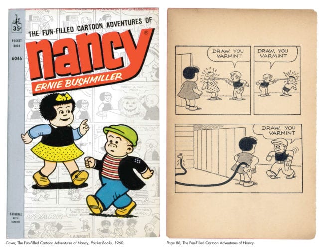
Typical mid-twentieth-century newspaper technology may have produced a daily record that was dependably legible, but never one that was particularly definitive when it came to reproducing photos of NASA space monkeys, ads for the brand-new Bic ballpoint pen — or comic strips. Nor was it ever expected to be. Yesterday’s newspaper has been synonymous with today’s toilet paper since the invention of the daily press. In comparison, twenty-first-century technology delivers imagery that is so pixel-accurate that it is not to be believed. So don’t believe it. In full disclosure, even the version of the strip presented in this book has been compromised. With the whereabouts of the original artwork for August 8, 1959’s Nancy currently unknown and no extant proof sheet available, we began our production work with the best available source material: a 1960 paperback reprint on a paper grade only slightly better than newsprint (see illustration above).
Even so, Bushmiller’s lines had considerably thickened; some had vanished and others assumed the crunchy surface of the newsprint itself. Dots in the Ben-Day patterns had either swollen or shrunk. The indicia, date, and artist’s signature (which had all been excised by the book’s publisher) were grafted from the example above.
Weeks of painstaking pixel manipulation resulted in the restoration used in the preceding chapters. The unavoidable irony of crafting an appreciation of craftsmanship around a recrafted specimen (a fact not lost on the authors) leads one to ask if such a thing as a definitive version of any published comic strip can ever truly exist.
As mentioned, differences in paper stock, ink, printing quality, and innumerable other variables conspire to ensure that each reproduction of a daily comic strip is inherently unique. In addition, the specifics of the strip’s context (editorial policy and layout practices of a given publication) can alter the reading of the work dramatically.
Some daily newspapers scattered their comic strips throughout their pages like raisins in a bowl of oatmeal. Others, like this example, segregated them onto a dedicated page (in this case the penultimate page of the day, sharing space with local ads and “Negro News”). Both editorial strategies had their adherents, and both have continued to the present. In 1959, United Feature Syndicate was servicing approximately 640-odd daily and Sunday newspapers with Nancy. Major venues included the New York Post, the Los Angeles Mirror-News, the Chicago Sun-Times, and the Philadelphia Bulletin. This obscure eight-page daily, “South Georgia’s Most Complete Newspaper,” was one of the many small-town venues where Nancy was probably obtained for a few dollars a week and remained a familiar fixture for many years.
Situated just above the page’s fold in the upper stem of its T-formation of three-column thrills, Nancy was neither prominently featured nor completely buried; rather, it was just one more feature of the day to be consumed or ignored depending on which of Thomasville’s 18,239 citizens this page reached. There is no official hierarchy of syndicated strips on a newspaper page (although the newest as well as the most popular are typically placed strategically) and each editor (one E.J. Jerger in this case) is free to present them in his own customary manner.
According to layout authority Edmund C. Arnold in his Modern Newspaper Design (1969), “Placement of comic strips has no measurable effect on their popularity. Some editors prefer to alternate dark strips (those with large masses of black, such as Rex Morgan, M.D. or Buz Sawyer) with light ones (such as Peanuts or Andy Capp). Some say that this makes it easier to control ink on the presses, but most admit that they do it only because it pleases their own eye.” Certainly, on Mr. Jerger’s comics page the strips appear to have been arranged in no systematic order that is discernible to these readers a half century later.
As an example of what can potentially go wrong in the presentation of a daily comic strip on a printed page, the Thomasville Times-Enterprise for August 8, 1959, stands as a virtual encyclopedia of small disasters. Strip titles were insensitively slapped onto (or directly into) the strips, vertically as well as horizontally, at the episode’s start (or finish). Panel borders were randomly sliced and diced. The only thing on this page preventing Dick Tracy and The Phantom from morphing directly into Blondie and Beetle Bailey is a ninety-nine-cent car wash ad. The strikingly poor printing eradicates several entire titles, and although Nancy, with severed hose and obliterated panel lines, fares worse than many of her page mates, it is well worth noting that this still does not prevent the eye from being drawn to the strip (nor from the gag being quickly communicated).
Scientists David Hubel and Torsten Wiesel were awarded the 1981 Nobel Prize in physiology for their work in visual sensory processing, which uncovered a hierarchical sequence in the transmission of visual information in cats (but presumably applicable to humans as well). Their findings distinguish vision itself as true information processing, not simply direct transmission to the brain’s processing centers. The number of neural transmitters in the eye is far greater than the optic nerve can accommodate simultaneously, so a hierarchy of information is created (with VIPs at the front of the line and the riffraff at the end). Part of their findings (in very general terms) asserts that one of the immediate tasks of the retina is to register contrast — which it does with shocking accuracy, sensitivity, and speed. Thus the eye itself can make a sort of snap judgment to help determine if what it is seeing is friend or foe (or comic strip).
On a large (17 x 22-inch) and noisy page abounding with so many competing parcels of dense visual information (the chiaroscuro of The Phantom, Craftint faux halftones of Buz Sawyer, and spidery lines of Judd Saxon), Nancy’s simple contrasting shapes, ample negative space, and bold linework does indeed command the reader’s eye. (Although in the final analysis it is, in this case, clearly no match for that special on stewing hens at Jitney-Jungle.)
Books were a profitable part of Nancy’s afterlife from the 1930s onward. As a secondary character, she was initially included in the ten-cent comic book reprints of her early appearances in Fritzi Ritz, followed by slots in such United Feature anthology titles as Comics on Parade, Tip Top, and Sparkler. Nancy began her own long-running title in 1949, which continued for upward of 192 issues. In the ensuing years the strip was also adapted to a wide variety of other formats: from Big Little Books to children’s popup books to “deluxe limited editions” to the volume you are presently reading.
The above right page, from a cheaply produced 1960 paperback reprint of Nancy dailies, attempts to thwart its standardized (and ill-suited) format by stacking the daily strip’s panels in two even rows, creating two awkward bands of dead space in the bargain. Other paperback reprints (including the long-running Peanuts series) typically indulged in a more elaborate reformatting of daily strips, often eliminating the panel borders completely, resulting in a more airy and design-conscious page (which nonetheless completely sabotaged the cartoonist’s original intentions).
Nancy’s integrity here fares a bit better. A number of newspapers of the period ran multipanel strips (including Nancy) in a square “boxed” formation, similar to this paperback page (see St. Louis Post-Dispatch above). Being culturally trained to read everything in order — first from left to right and then from top to bottom — we do not question where to go after leaving panel 2. When creating a full page of comics (or a multiple-page story), the intended tracking of the page as a unit is (ideally) a primary compositional concern for the cartoonist.
Here the gag is still delivered, albeit haltingly, as the pause between panels two and three is necessarily extended and shifted, creating a momentary visual hiccup en route to the snapper. Although this sort of reformatting was never the norm, it was common enough that Bushmiller and his peers always needed to keep that eventuality in mind and conscientiously composed their strips with a panel break at dead center.
The Fun-Filled Cartoon Adventures of Nancy was no continuous narrative but a series of seemingly random dailies culled from the years 1958, 1959, and 1960. However, with all clues to their episodic nature obliterated (title, indicia, date, signature), this collection, it can be argued, was unintentionally encouraged to be read straight through as a kind of absurdist pseudo-narrative, built page by page on the nonstop miracles that constitute the lives of Nancy and her cohorts (even the earlier Big Little Book reprints parceled the gags out into discretely labeled “chapters”). Interestingly, comedian Jerry Lewis’s directorial debut in The Bell Boy, released the same year, delivered a similar (though vastly more intentional) structure of episodic, gag-driven narrative to the contemporary feature-length Hollywood film.
Here is an example of the unorthodox practice of a newspaper running its daily comics page (in addition to its Sunday section) in color. While that is common today, the St. Louis Post-Dispatch was decades ahead of this particular curve, inaugurating the practice in the early 1950s. The strips there were printed in three colors (the customary black plus two additional color plates) and showcased on the back page of their “Everyday Magazine” supplement.
While Bushmiller was probably well aware that his strips were being chromatically enhanced in St. Louis, it was still an anomaly and the “colorization” job was left up to the Post-Dispatch’s art department. For his Sunday strips, however, Bushmiller made regular accommodations, in the drawing itself (Sluggo’s ubiquitous turtleneck sweater was striped on weekdays but always a solid primary color on the Sunday pages) as well as by always specifying gag-crucial color information to the engravers at American Color (it’s ketchup in that bottle, folks — not soy sauce!).
Within so many contexts and with so many degrees of separation from the original drawing that this strip has been subjected to, Bushmiller’s sturdiness as a communicator remains. The gag still works.
[This is an excerpt from How to Read Nancy: The Elements of Comics in Three Easy Panels.]


