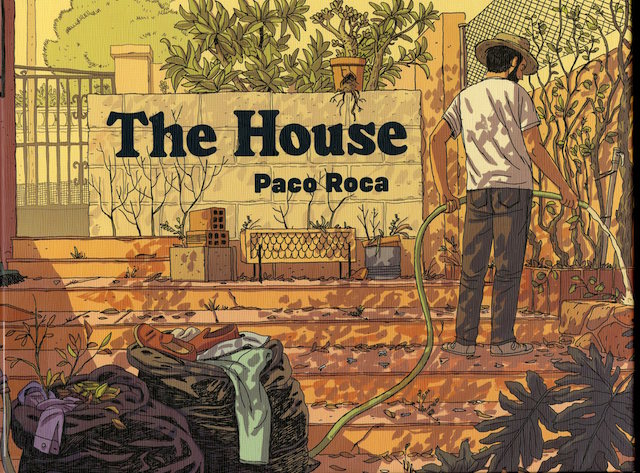
 I picked up The House by Paco Roca, a Spanish artist whom I had barely heard of, attracted by the warmth of the drawing on the cover and curious about the book’s oblong, horizontal ratio dimensions, about 7” high by 9 ½ “wide (imagine an iPad turned on its side).
The story is low-key. After a father’s death, his progeny convenes at the family country home to try to figure out what to do with the place…and with their memories. I know this sounds like a bad indie movie: siblings coming to grips with their family history as they uncover dark secrets, lingering resentments, until finally they discover the truth of what “Family” means.
Refreshingly, however, Roca avoids all sentimental histrionics. No tragic, buried secrets are revealed, but, as can happen when a family gathers to mourn, cards are unexpectedly laid on the table, shifting relationships and alliances explored, and, at the end, life goes on. It’s a solid story that unfolds gracefully.
Although it’s possible that I was initially drawn into The House because I am at that time of my own life when my friends and I are all coming to terms with elderly parents and the “stuff” – both material and emotional – they’ll leave behind, the subject matter of The House was not what that kept me reading – and, once I opened this book, I did keep reading, right through to the final page.
Roca’s storytelling and inventive use of the horizontal format – rarely chosen and even more rarely successful – is brilliant. He finds many ways to breakdown the unusual oblong proportion, none of them contrived, all of them supporting the story. And that masterful manipulation of form, over and over, in service of a compelling story, had me riveted.
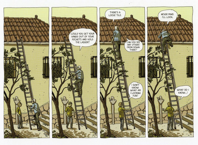
To start with a simple example, when two characters work on the roof of the house, since a ladder is a vertical object, the panels are vertical:
When a scene in a bustling kitchen has characters coming and going, and moving within a rectangular space, the panels are horizontal:

Commonly comics pages (such as your typical comic book) are vertical in format, taller than they are wide. Since the eye moves from left to right and top to bottom, the vertical page can be converted into convenient rows of information generally referred to as “tiers” (a typical Carl Barks page is often four tiers tall, while Harvey Kurtzman generally preferred three). The panels thus read easily from left to right within a tier and proceed to the tier below. Occasionally a cartoonist must stack panels like frames of a movie, one above the other, within a tier, which can create tracking problems.
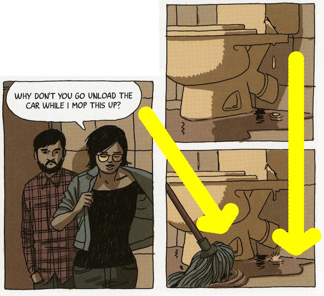
In a horizontal format, a page wider than it is tall, the number of horizontal tiers is limited and stacking panels (describing continuous action in a series of panels like building blocks) can be even more problematic. In the page below, Roca embraces these limitations. Here – on a left-hand page (this fact will become important later on) – one of the sons (an incompetent handyman who lives in the shadow of his late can-do-it-yourself father) and his girlfriend are first to arrive at the family house. They enter the bathroom to discover a slowly dripping toilet that the recently deceased patriarch never got around to repairing:

There are several ways that this page can be read. Roca brilliantly engineers this page so that any of the paths below work together – and deliver the same information.


The six equal panels on the left depicts the conversation between the characters. The three stacked panels to the right are occurring at the same time as that conversation, a discrete unit of information telling us that the toilet is leaking. It makes perfect sense for these panels to be stacked vertically because water drops vertically. As the ladder to the roof demanded vertical treatment, so does the water.
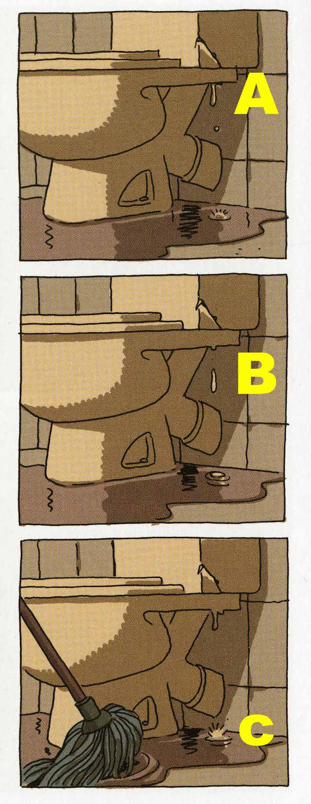
Roca gets the reader to land solidly in the final bottom right panel no matter which order the previous panels are read. Either we follow the line from the woman’s shirt aligning with the mop handle or we connect the droplets. In either case the page, and the scene, conclude.
Sixty pages later, after the reader has perhaps forgotten this minor incident with the toilet, the competent brother arrives, fixes the leak, and he and his mate have their bathroom conversation – on a right-hand page. Roca mirrors part of the previous layout with purpose. That toilet has been left dripping for 60 pages, back there on a left-hand page, so we are ready to see the bathroom on a right-hand page, as though taking up the bathroom story where it left off. But, to make it a mirror image, the toilet, which had been on the right-hand side of the page is now on the left-hand side of the page.

Roca also uses spreads – and the opportunities they present – in other elegant variations. In this two-page spread, on the left-hand page the son reminisces about being in the garden with his dad as a kid, and on the right-hand page, remembers being an adult in the garden with his elderly dad. The two vertical panels on the right side of each page illustrate the physical changes brought by age in body mass, gesture, and stature. The young father on page left, made superheroic in the son’s memory, pushes the panel wide, while the panel on the right, taking place decades later, is narrow as dad has begun to shrivel and the son is slender.

Roca sprinkles the book with diagrams that serve to enrich the tale. Here is the dumpster where junk, tossed from the house, will end up in the near future. Inset cameos above silently point to various moments in the past when that junk was not junk, when those objects once had meaning:

In similar diagrammatic fashion, this next page depicts the rings of a sawn tree in the yard to pinpoint past moments associated with the tree’s history in relation to the family’s history:

Both these diagram-rich pages demonstrate that Roca is a master colorist. His subdued palette never overwhelms or obscures the drawing. Instead it supports and propels the drawing. Throughout the book (and in the above examples) different moments of time are color-coded. Color, like layout, supports and helps to tell his story. And in this final example towards the end of the book, after the adult children have left, a neighbor comes over to have a chat with his ghostly old pal. Note how Roca precisely uses color to delineate time, space, fantasy, and reality, the living and the dead.

Brief and economical, in some ways more like an extended short story than a graphic novel, The House does not overstay its welcome. Its length, like everything else about its construction (layout, coloring, dialogue) perfectly serves its story.
When I finished the book, and closed the cover, I suddenly understood one more way in which Roca uses form to tell his story.
In The House, there’s a lot of conversation about house construction and renovation; rightly so, as the house, itself, is a central character as well as the setting of the story. And when you close the book, and hold it in your hands as you allow the foundation of the tale to settle, you realize that Roca has one final statement to make in that conversation: The House, itself, is the shape of a brick.


