The internet tells us that comics criticism and reviews typically ignore a comic’s art, focusing only on the story. Even if this is true (and I’m not sure it is), I see even less talk about words. This neglect should surprise us given that definitions of ‘comics’ almost universally grant text and image equal billing: e.g., ‘comics is a medium of words and pictures.’ The great cartoonists — George Herriman, Chris Ware, Lynda Barry, Daniel Clowes, and many others — have been masters of language. So why give words short shrift? Are plot and pictures truly King?
In Part I of this review survey, I look at twelve comics, most of which were published in 2013. Many are great, a few are not, and several are included because they use words in interesting, if not always successful ways. Though I often discuss the comic’s text (i.e. narration and dialogue), I also consider drawings, plots, characters, color, productions methods, text/image interaction, and anything else that seems worthwhile. (Part II will appear next month.)
Optic Nerve #13 by Adrian Tomine (Drawn and Quarterly, 2013)
This comic’s three stories are so visually and narratively distinct that you’d be forgiven for thinking a different cartoonist created each one. The issue’s range represents the culmination of Tomine’s recent exploration of new cartooning approaches, which began with his late-2000s New Yorker comics and covers, continued in 2011’s Scenes from an Impending Marriage, and developed further in that year’s stylistically diverse Optic Nerve #12.
#13’s first story, a one-page autobiographical sketch about the cartoonist’s frustration with crappy art supplies and a condescending art supply salesman, displays Tomine in his ‘rant against contemporary culture’ mode, a genre with a long history in American comics that has R. Crumb as one of its early masters:

"Proselytizing about computer gadgets."
Here Tomine employs a thin pen-line sketchbook style that — unlike a typical sketch — is meticulously drawn. Even in his looser modes, the always-precise Tomine never cuts corners . . .
In the second story’s protagonist — a hopelessly deluded, small-time drug-dealing deadbeat dad in search of inner peace — Tomine may have created 2013’s most memorable, fully realized comic-book character, a feat largely accomplished through dialogue. The main character of “Go Owls” reels off all manner of clichés but never lives up to his self-aggrandizing slogans. While these clichés communicate his lack of self-awareness, they also display his verbal flexibility. He’s a creep, but he’s clever and funny.
 The banter between the main characters is completely unforced. It displays the quick wit of the best TV sit-com dialogue (e.g., Seinfeld) without any of the shallow quippery that sinks so many scripts. Visually, the comic employs a minimalist cartoony style, and its compelling female protagonist sports a catalog of facial expressions new to Tomine’s trick bag:

(Notice that "L o t t a" is stretched out, indicating that he says it slowly for effect.)
Tomine blends his breezy, seemingly effortless drawing approach with a restrained palette of around a dozen muted colors that serve a narrative purpose: each scene uses only a single tone, and it changes only when a location changes.
The closing comic, “Translated, from the Japanese,” represents a complete about-face from “Go Owls.” The narration is subdued, taking the form of a mother’s letter to her daughter. This text — concerned, apologetic, sincere, evasive, understated — is paired with a detailed and precise visual style, a text/image juxtaposition that creates an evocative, almost haunted effect. Communicating a type of photographic neutrality, the images avoid capturing the text’s pain by focusing on locations where the story takes place: an airport baggage conveyor, a fast-food restaurant, an apartment complex. While images appear in chronological order, they don’t convey any of the drama that the mother’s words dance around: they resist the drama that she resists. The emotional and chronological distance between narration and images (the mother’s letter was written long after the scenes occurred) adds to the comic’s reserved effect.
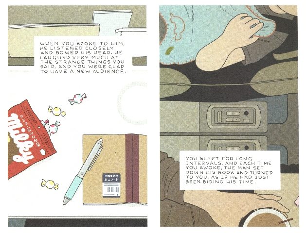
Though the letter recounts a painful personal story, we never see the main character’s face, as we do throughout “Go Owls.” In fact, we never see any faces up-close, with one exception. In a disorienting moment, the cartoonist depicts the face of the daughter’s stuffed animal. With its smiling expression, Tomine cleverly reminds us of the unhappy faces — and the possibility of identification — that the drawings deny us. “Translated, from the Japanese” is a formally brilliant and gripping comic. The precision of every line of art and every line of text is something to behold.
In Optic Nerve #13’s opening story, Tomine represents himself as a cranky cartoonist lashing out against change. But “Go Owls” and “Translated, from the Japanese” show him to be a thoughtful observer of what we might once have described as ‘the foibles and fragility of human nature.’
The Blobby Boys by Alex Schubert (Koyama, 2013)
Everything about this comic is appealingly minimal — the sparse panels, block coloring, limited narration and dialogue — and it all works together well. Schubert’s economy makes the gags about surfing robots and cunning art critics that much better because he never forces the words and art to do more than they need to: the deadpan laffs come naturally. As Schubert implies in one of his strips, he invents character names and lets the gags flow from comedic scenarios that these word-pairs suggest:

To pull off this kind of simplicity requires self-control. It’s easy to imagine that many cartoonists, lacking Schubert’s confidence, might feel compelled to fill their panels with needless details in an attempt to distract readers. But thankfully Schubert doesn’t.
The Whale by Aidan Koch (Gaze Books, 2010)
A suggestive lack of narrative detail pervades this comic. We learn neither the main character’s name nor any details of the accident she survives, a traumatic event that takes the life of someone close to her, who is cryptically referred to as “S.” This kind of ambiguity plays out in the comic’s language: since nearly every word appears in a text-only panel, we can’t always be sure what is internal monologue, spoken dialogue, or possibly even writing from a journal.
The Whale dramatizes the inability of words to console; the concern of family and friends push the protagonist deeper into herself. Koch’s wispy lettering and pencil art — which seem to be fading as we read it — nicely evokes the main character’s troubled interior life. Some of the most haunting moments are full-page panels in which she inhabits an expansive of white space; these panels compositions, too, are open-ended: they could be seen as menacing (expressing the character’s intense alienation) or as comforting (representing her desire to shield herself though isolation).
At the narrative’s end, the protagonist silences the cacophony of well-wishers’ sentiments, a dissonance that Koch depicts as a series of overlapping words:
The protagonist finds “quiet” (the comic’s final word), perhaps only for a moment, in one of the artist’s serenely open compositions.
Amazing Facts & Beyond! With Leon Beyond by Dan Zettwoch, Kevin Huizenga, and Ted May (Uncivilized Books, 2013)
This cartoon collection of fake trivia is really funny. But it goes beyond ‘funny’ to a place of pure invention. These cartoonists “liberate [their] capacious minds,” building a vast counter-factual universe inhabited by oddities such as the Organ Donor Hall of Fame, billiards played with noses for cues, and The Feet Poets’ House Museum. With hundreds of witty strips, it’s the most visually and verbally generous collection of the year.

Batman Superman #1 by Greg Pak, Jae Lee, Ben Oliver, June Chung, and Daniel Brown (DC Comics, 2013)
In the old days, a comic’s lettering was typically applied by hand to pages of hand-drawn art work. In nearly every current corporate comic, the lettering, and the balloons or narration boxes it fills, are created digitally and added to a digital file of the art. Past comic-book production methods (which changed little from the 1930s to the 1990s) guaranteed that all story elements occupied the same ‘visual plane’ in the published comic. There’s nothing inherently wrong with current system, but the results can be a bit jarring: often, the text and its containers appear to float above the art. The pages of Batman Superman #1 present a good example of this effect. Even though the word balloon tails point to a character’s mouth, I can’t quite accept that the characters are speaking the words assigned them: the speech is visually alienated from the speaker, and the bright white word balloons are out of sync with the art. These problems may be exaggerated by the dark mood created by Jae Lee and colorist June Chung’s accomplished stylized and painterly art, but I get the same feeling from many comics created this way. The seams are showing, making it difficult for me to lose myself in its world. The art continually reveals the division of labor that produced it.
For comparison, here’s a row of panels from a 1950s Mutt & Jeff comic book, in which the lettering style is 'of a piece' with the artwork:
Hawkeye Annual #1 by Matt Fraction and Javier Pulido (Marvel, 2013)
Matt Fraction possesses a seemingly infinite supply of interesting and unusual ideas — he’s got more strong concepts than any other writer working for the Big Two (at least the many I’ve read). In the series this annual comes from, he’s usually paired with David Aja, whose streamlined art (hyper-minimalist by current corporate standards) is well-suited to the writer’s inventiveness, as is Pulido's art here. And yet . . . I don’t enjoy Hawkeye. There’s a lot to admire, and I want to like it. But I can’t get past the narration and dialogue, which, for me, suffers from an almost campy kind of cuteness:
It's loaded with words/phrases like “totes,” “staycation,” “base tan,” and other pop culture slang. But everyone seems to love the series. Fair enough.
I wonder, though: would hand-lettered text (instead of computer-generated fonts) lessen some of the blunt cutesy-ness by adding a little human personality, giving the characters a more individualized ‘voice’ . . .
Maybe this analogy will help. Often, when Frank Sinatra sings a corny phrase, it somehow becomes no longer corny. The same phrase crooned by Michael Bublé remains trite. Bublé and computer lettering are fine — they’re just no Sinatra, whose charisma and authority can transform the words he sings.
Ice Haven by Daniel Clowes (Pantheon, 2005)
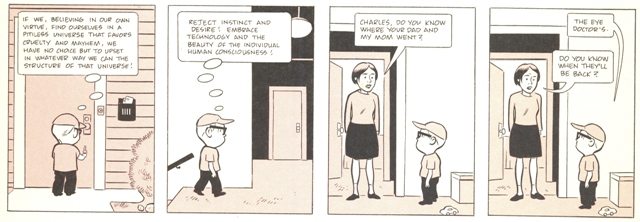
If there were a creative writing textbook with a chapter called “How to Create Interesting and Distinct Characters through Dialogue,” it would surely employ numerous examples from Ice Haven. A ventriloquist with a extensive vocabulary, literary range, and a longstanding interest in ‘the possibilities of language,’ Clowes ‘speaks’ convincingly as a love-struck teenager (Violet); a pompous and nostalgic poet/local historian (Random Wilder); an awkward, ambitious, and clever young woman (Vida); a genial grandmother (Mrs. Wentz); a laconic boy/loquacious philosopher (Charles); a tense, sentimental, and hypocritical private detective (Mr. Ames); a viciously funny misanthropic convenience store clerk (Kim Lee); and a goofy, defensive, and terminology-obsessed comic-book critic (Harry Naybors). Cartoonists interested in improving their dialogue should adopt Ice Haven as their textbook.
Passage by Tessa Brunton (Sparkplug, 2011)
People who haven’t read an autobiographical comic since 1994 pop up on the internet once a month to rant about how self-indulgent, mundane, and poorly drawn every auto-bio comic is. While it’s a waste of time to engage such people, if you are so inclined, show them Passage, a story about the cartoonist’s adolescence as a member of an endearingly strange family. The comic’s striking and idiosyncratic art (some might see a kinship with Mark Beyer or early Richard Sala), its decorative page layouts, and gently clever storytelling display the hand of a confident cartoonist with a light touch, visually and verbally. One of the most enjoyable autobiographical comics I’ve read since 1994.

Bunny # 5 (Harvey Comics, 1968)
Published from 1966 to 1976, Bunny may be the apotheosis of the silliness that was the American teen comic book. If you don’t love dumb word-play, hippie slang (“She’s mod! She’s boss!”), made-up “gear” exclamations (“Yvoorrg!”), very bad puns, stupid teen antics, “marvie” reader-submitted fashion designs, and artistically hyper-active “groovy happenings,” then stay far away. Like all Bunny issues, #5 is what many companies called a “giant”: at twenty-five cents, it was twice the price and over twice the length of the era’s typical comic book. Collectively, Bunny's twenty-one issues form a giant-sized repository of visual-verbal pun-driven hijinks.

(Note how the pallet's paints change color from panel to panel . . .)
With a few exceptions (notably those by cartoonist John Stanley), teen comics rarely register as worthy of critical attention. But Bunny does. As some future scholar might observe:
Bunny engineers a verbal utopia in which 1960s countercultural values are fully aestheticized. The comic celebrates ‘the teen imaginary’ as a space of rebellion: works of art, not the lies of parents and politicians (one-and-the-same to the revolutionary truth-seeker) will lead the culture forward. Likewise, the comic’s word-play, its investment in what I call a ‘lucid sense of linguistic liberation’ should be seen as a rejection of the bourgeois sermons that upright parents deliver to wayward teenagers: ‘Thou shall not.’ In every artistic way, Bunny says ‘No’ to the containment and repression central to the American capitalist dream: ‘consume, marry, breed future consumers, die, be buried in expensive coffins.’ The comic says ‘Yes’ to Pure Style, which, as Bunny and her hippie cohort intone, shall set you free.
Or something like that.
Buck Rogers #1 by Howard Chaykin (Hermes, 2013)
Many publishers seem to have an endless desire to revamp old pulp heroes and revive caped crusaders who’ve been MIA for years, such as the recent (and uninspired) resurrection of the great Pete Morisi’s superhero title, Peter Cannon, Thunderbolt. Such updates, which often ‘modernize’ the character by making him, look, talk, and act like every other contemporary superhero, are rarely worth the time. But with this makeover, it looks like Howard Chaykin will energize a stale property by giving Buck Rogers a not-so-modern world-view, one that revisits 1930s America and speaks to 2013 by looking to an era that shares much with our own. Rather than the coded jingoism we expect from traditional pulp fictions, Rogers articulates a ‘workers vs. capitalists’ socialist perspective; because the character first appeared in 1928, Chaykin’s move has an historical rationale. While I prefer Chaykin’s art in black and white (here it’s colored and printed in the ‘hyper-gloss’ method), I enjoyed reading a book with an unusual take on what many others would’ve approached as a generic space opera: a handsome white guy battles an ugly alien to save a beautiful white woman and the universe. Bypassing such clichéd territory, Chaykin fashions an intergalactic Eugene Debs.

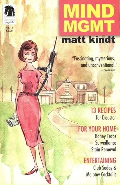
Mind MGMT by Matt Kindt (Dark Horse, 2012-Present)
Until I read this series, I wondered if mainstream companies had stopped producing densely plotted series in which each issue offers numerous significant developments. A fun and smart comic, Mind MGMT features a central mystery narrative, related stories on inside and back covers, and the occasional counter-narrative in the bottom margin. To this already dense presentation add all sorts of clues, codes, hidden-in-plain-sight messages, subliminal verbal tricks, marginalia, and meta-commentary. In one of the many meta-moments, Kindt mocks his own art by having a character criticize another's drawing ability. But his art does what it needs to do and leaves space for words to do their thing.
Ticket Stub by Tim Hensley (Yam Books, 2012)
Tim Hensley possesses an omnivorous mind, a synthetic imagination, and a love for the ways that familiar phrases, clichés, and images can be twisted into something radically new. Like a beat poet, Hensley investigates the bloated excess, unintentional humor, and artistic potential of popular culture — especially its expressions and slogans — to create a book that gently disturbs and comically unnerves. Though he cleverly dismantles and reassembles the language around us (his main sources/targets are TV shows and movies), he never plays the propagandist. His cartooning builds a better, more artificial world. To read this comic is to enter a linguistically absurdist alternative to what ‘the media’ and ‘the man’ give us. This is intelligent comics word-play at its best.


