A close look at three features of Steve Ditko's innovative comic-book art.
I. Abstraction [1980, 1957]
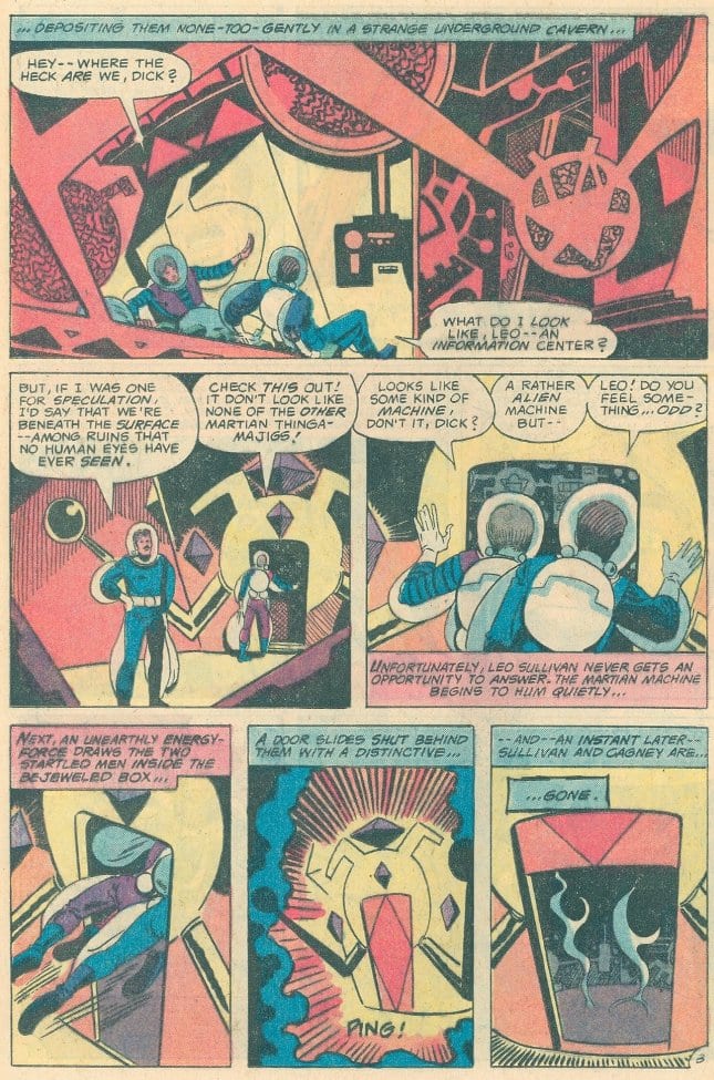
Although Steve Ditko’s comic-book art has always been firmly rooted in conventional modes of representation, it often features some of the most abstract cartooning to ever appear in mainstream comics. His interest in abstraction surfaces throughout his celebrated 1960s Spider-Man and Doctor Strange stories, but also in obscure pieces such as “The Dimensions of Greed,” from the anthology Time Warp #3 (1980, DC Comics). In this story, as in so many others, Ditko employs a dizzying array of liquid, angular, geometrical, and bizarre shapes, all drawn with a sense of humor, even mischievousness. While his comics frequently grapple with heavy themes (crime, justice, heroism, etc.), stories like “The Dimensions of Greed” simultaneously recall comics' lighter, comical traditions. There's real joy in his abstraction; he has loosened the constraints of representation while still adhering to the dictates of narrative storytelling. Unlike so many of his artistic peers who worked for mainstream companies, Ditko is able to take conventional genre scripts and, by employing abstract techniques, transform them into something strange.
If we removed the human figures from these two pages in “The Dimensions of Greed” (which appear side-by-side in the comic), the context for understanding objects and narrative spaces would disappear. It would become an abstract comic:
While a machine drawn by an artist such as Jack Kirby, for example, is instantly recognizable as some kind of machine (and the characters helpfully tell us so),
Ditko's Martian ‘devices’ look like an amalgam of familiar cartoon shapes ("Whatever this is!," the character says). The panel below features a giant ‘paint splat’ surrounded by a (seemingly) bendable ‘lightning bolt’:
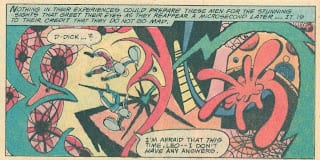
Even though a cartoon paint splat has a visual connection to an actual one, Ditko severs that connection here, for the nature of the object (inanimate, sentient, moving, stationary) is unknown. The things of this world are really gestures, plays of form and color — it’s as if the human characters are floating inside an abstract painting. Within standard cartoon idioms, a splat is the result of an action. In Ditko’s ‘dimension,’ we face uncertainty: in the grammar of this scene, is it a subject, a verb, both, neither?
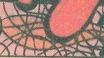
Here are some 'cobweb'-like shapes (Ditko’s horror comics are filled with literal cobwebs):
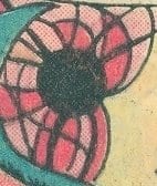
Many of the cartoonist’s shapes suggest a flower seen through the fragmented prism of a kaleidoscope:
 Are the two ‘creatures’ in the panel below — the green shape on the left and the red one on the right — life-forms?:
In the following three-panel sequence, the narrative aspect itself is highly abstract, seen in the strange transformation of the door’s shapes:
In the panel below, a character appears to comment ironically on issues of representation and recognition — it’s obvious to Dick and Leo that it’s a city, but we might not think so if they hadn’t told us:
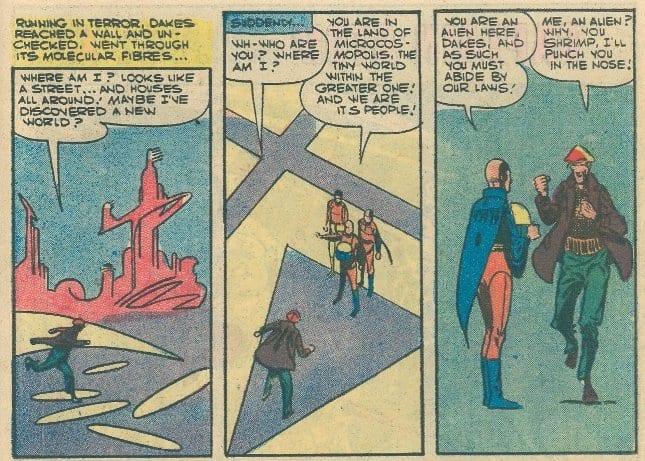
In the following page from 1957’s “Escape” (reprinted in Charlton's Space Adventures #11, 1978), Ditko's abstraction changes, turning toward a more minimalist/geometrical approach. Underneath a highly stylized city (again, so abstract that a reader might not recognize it as a city without textual clues), a man runs:
He says the location “looks like a street” — but it kind of doesn’t. It’s a series of circles or ovals floating in space. As the ‘ground’ of this narrative world, the next panel introduces a purple triangle and cross, two yellow triangles, and other shapes created by panel borders and lines that define the cross and triangle:
The last panel above features a different kind of abstraction: Ditko literally abstracts (i.e., removes) almost all sense of the physical context in which the figures ‘stand’ (except for a small shadow under a foot). While the story’s art is sparse, this scene takes Ditko’s minimalism a step further, as each consecutive panel holds less visual information than the one before it.
Note how the floor of the character’s ‘home’ changes shape in the story's final two panels: a square surrounded by other four-sided irregular shapes becomes a series of squares. And the oval shape of his room also gets ‘squared’:
And what's that big black ink area in the lower corner? Is it intentional or a Charlton printing error? [It oddly extends below the plane of the panel borders into the margin.] Either way, it fits with the abstract strangeness of the images . . .
Here and elsewhere, Ditko is uninterested in representing, in either a literal or conventional way, what the writer asks for. He rewrites/reinvents the narrative as he draws it, making the finished story far subtler and stranger than what the script could possibly have suggested. Ditko is one of the few artists who consistently makes something special from mediocre, even horrible writing — I often think that he takes scripts given to him by Marvel and DC far less seriously than the scripts' writers and editors did, seeing conventional plots as occasions to explore his unconventional visual sense of humor. Too often readers focus solely on Ditko's thematic concerns, overlooking the way he transforms conventions, building new worlds out of familiar cartoon vocabularies.
II. Word vs. Picture [1983]
In The World of Steve Ditko, Blake Bell recounts a story about the publication of Ditko’s Static, a superhero tale serialized in Eclipse Monthly during 1983. Eclipse Editor Dean Mullaney initially altered Ditko’s script for the episode in #2 because it was “too wordy, and visually unappealing.” Bell agrees with Mullaney’s assessment, noting that Ditko’s debt to Ayn Rand “continued to have an impact on the quality of the storytelling” (145). Ditko, however, rejected the changes, and the story ran as he originally intended.
Mullaney’s criticism reflects a widespread belief about comics storytelling: comics is primary a visual medium and so the text must always be dramatically subordinated (at least in terms of the space it occupies) to the images. But I think the intensity of Ditko’s sequence visually depends upon the fact that, as we move through the first three panels, words take up an increasing amount of space while the image decreases (with the fourth panel echoing the first):
The third panel is designed to direct the reader's attention to the character’s calm, yet intense eyes, as he’s surrounded by his philosophical argument:
 To eliminate some of Ditko’s text would alter the visual effect — the art would read differently, featuring more of the character and removing the focus from his eyes (eye close-ups are a Ditko hallmark). The words function as a visual, nondiegetic frame and as dialogue; the face is an extreme close-up because of text placement, not because of ‘camera-to-subject’ distance, a uniquely comics effect.
Here’s the passage in context. Ditko frames the conversation that takes place on the page with parallel long shots of full figures —those in panel 1 are stationary and in panel 7 are moving (a conventional set up and release formal move):
It’s true that pages four and five of the story are relatively text heavy, but the preceding and following pages employ a conventional word/text ratio. This fact gives the story a visual narrative rhythm that Ditko clearly intends, one in which conversation-heavy pages are followed by action sequences:
If we look at Ditko's independent comics of the period, we find a high diversity of text/image ratios, demonstrating the considerable attention he paid to the issue as well as his willingness to experiment with techniques that readers might not easily accept.
Perhaps Mullaney was not thinking of Ditko as a cartoonist/designer, but as a writer whose characters spoke too much for the tastes of 1980s comic fans. Mullaney likely believed (and was certainly right), that fans wanted more action than dialogue. Ditko’s innovative choices simply didn’t look right to most readers, who came to his comics with expectations about how pages should look. They often wished Ditko remained faithful to the corporate storytelling principles that governed his mainstream work, especially his comics for Marvel in the 1960s. Although I enjoy these stories, his independent comics (and his Charlton work with Joe Gill) reveal an artist constantly expanding comics’ visual and verbal aesthetics.
III. Representing Motion [1999]
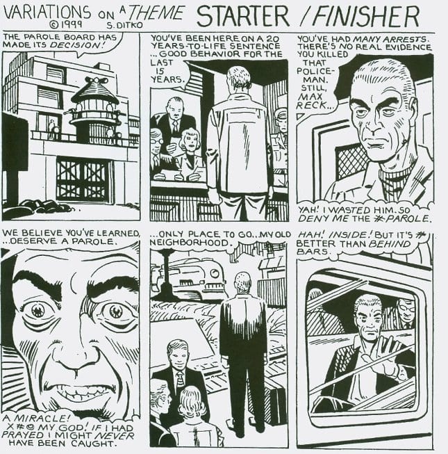
Bell uses the above page as evidence for his claim that Ditko's late '90s work is characterized by a “positioning of characters [within a scene that] was static, with characters standing straight up in the same position from panel to panel” (167). Bell looks primarily at the figures and not at the many ways Ditko's figure placement and characters’ postures amplify the narrative.
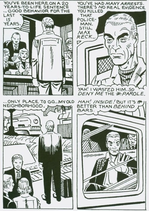
In panels 2-5, the criminal Reck (a play on ‘wreck’?) is at his parole hearing. His stiff, upright position in panel 2 — flanked on the left by the parole board and the right by a prison guard — suggests his outwardly submissive posture, with semi-clenched fists to communicate his internal tension. Bell says that “characters are standing straight up in the same position,” yet the ‘camera’ position and size of the figure change (as does how much of him we see) from 2 to 3 to 4. We would expect a prisoner at a hearing to stand unusually still when in front of those who will determine his fate. What's of primary interest to Ditko seems to be the way the character's body and face simultaneously reveal different emotions throughout the sequence. He creates visual interest (the quality some critics claim later Ditko lacks) in a number of ways, such as by waiting a panel to reveal a character's face or by moving closer to the subject in consecutive panels.
Ditko sets up pairs of panels — 2-3 and 5-6 —so that they mirror each other:
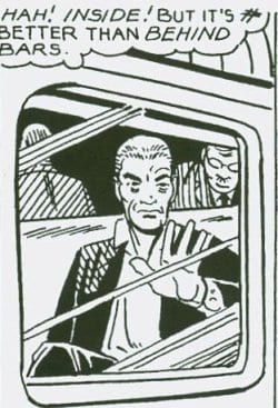
In the top pair, Reck is inside (in prison), and in the bottom pair, he’s outside (a free man). In panel 2 and 5 he stands in the same position, as Bell notes, but there’s a clear reason for this. The fear Reck initally feels in the hearing foreshadows the fear he feels upon his release — he must face people on the outside for the first time in twenty years. Both panels suggest that he experiences a temporary paralysis in the presence of others. Here, as in panel 2, he is flanked by three people on his left (both panels symmetrically feature two background men and one woman). In panel 6, Reck puts his hand on the train's window and comments on the irony of his situation: he’s 'trapped' inside the train, but free from the bars of the prison. His dialogue in this panel — “But it's # better than behind bars”— and the window’s box shape both echo the bars and shape of the prison gate in panel 1:
[Note how lines on the glass follow the direction of some of the bars.]
The figure of a still Reck in panels 2-6 finds its release in the last, and largest, panel of the page. Now he is free and in motion:
Also note the variety of character postures in this panel: the angles of their heads, the hand gestures - with some standing still while others are in motion. Ditko is careful here, employing visual echoes, parallel shapes, recurring panel compositions, set up/release, etc. for design and narrative reasons. This sequence shows that his storytelling and layout skills are clearly visible in the later work, a body of comics that has yet to receive the critical attention it deserves.


