In my "Grid" column, I typically look at cartoonists, artists, and comics that I like, focusing on those that do interesting things in unusual ways. This time, I examine five recent comics that didn’t work for me. I tackle a specific problem in each narrative that represents the comic’s larger troubles, as I see them. I conclude by recommending a few new books and answering the question, “Who is the best American-comics-influenced British writer?”
Seconds
A well-produced and stylish graphic novel, Bryan Lee O’Malley’s Seconds features nicely drawn and colored art, with attractive hand lettering. Generous white margins around the pages give the comic an unusually uncluttered and open feel — a welcome contrast to the claustrophobic layouts of many current comics.
In an interview, O’Malley says that, in Seconds, he “wanted to make adult stress cute.” Reading the first few pages, I assumed the main character, Katie, was a pre-tween girl.
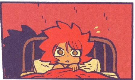
Nothing in the way she was drawn indicated “adult” to me, though the narration soon revealed she was 29 and suffering from a near-debilitating identity/career crisis. The book’s art owes a considerable debt to manga, and to the characters of artists such as Rumiko Takahashi, with their enlarged eyes, small noses, and overall sense of age-defying youthfulness. While the faces of Takahashi’s characters typically come to a point at the jaw, O’Malley’s sport very child-like chubby cheeks — and for me, the combination of chubby cheeks, super big eyes, super cute faces, and button noses telegraphs “child” and resists “adult.”
Several of Seconds’s males have round cheeks and look like teenagers, too. But others have facial hair and resemble men in their twenties and thirties.

O'Malley draws his female lead as very short (especially compared to some much taller men), further challenging her “adult” status: is her height supposed to make her more sympathetic, visually signifying her emotional issues and challenges?

All of this creates an odd gender divide: while all of the women are young-looking, only males get to resemble adults — and only they get to be less than perfectly cute. I don’t think the book intends to infantilize women: it’s clearly invested in both of its female protagonists, Katie and Hazel. Yet for me, its gendered “cute aesthetic” seems to diminish them, creating a strange gap between what I’m told through narration and dialogue and what I’m seeing. While I appreciate the significant craft on display, I’m unable to accept most of Seconds’s characters as adults and the comic’s plot as an exploration of adult issues. Maybe the “old problem” of this column’s title refers to me. I’d guess that other readers, especially those (much) younger than me, won’t have this issue. If I’d been raised on manga, I might’ve responded differently.
“Bone White, Blood Red” (from Vertigo Quarterly: CMYK)
No one expects poets to follow the restrictive dictates of grammar. “Poetic license” allows them to do whatever they want with words. Likewise, artists possess an “artistic license,” liberating them to bend, stretch, and ignore reality as they see fit. In comics, we typically don’t view such choices as violations of realism — it’s all just cartooning. But each of us needs to decide when an artist has exceeded the dispensation, when the loose-ness becomes a little too loose.
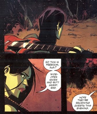
Opening the recent anthology Vertigo Quarterly: CMYK, “Bone White, Blood Red” features two main characters: a woman and her electric guitar. The depiction of the woman stays relatively consistent from panel to panel, but the guitar, which appears fifteen times in the eight-page story, frequently morphs in weird ways. As someone who once played and taught guitar for a (meager) living, I likely pay more attention to guitars than other readers do. So if my dissection comes off as a little fussy or misguided, fair enough.
In one of its early appearances (the first panel below), the guitar has only eight frets.
While the confines of a comic panel might make it tough to fit in the typical twenty-one or twenty-two frets, eight isn’t enough — and there’s plenty of room for more. What makes this panel doubly odd is that, in the next panel (the second above) — a tighter shot — the neck looks right. Though only a small portion is visible, it has many more frets. When the guitar appears again, it returns to eight frets — while elsewhere it has around thirteen.
The side-by-side panels below illustrate problems that occur throughout the comic. In addition to changes in the fret number, the shape of the pick-guard (the flat black shape on the guitar's top) changes, jutting out in different directions.

In the first panel, the top pickup (the higher of the two silver rectangles) is mostly surrounded by the black pick-guard: in the next panel, the pickup sits fully outside of the pick-guard and is now red. In the first image, the pickup sits right against the neck; in the other, a gap separates the two, as it does on the Gibson SG guitar the drawing is based on. In image one, two very thin rectangular pieces of hardware (the bridge and tailpiece) appear below the pick-guard. In the second, they've moved. They're now on the pick-guard — and are different shapes. The bridge has tripled in size . . .
To capture string vibration, guitar pickups often have six magnetic pole pieces, one for each string. 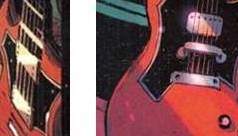
In the first image, they’re drawn at the sides of the pickup (where they would only pick up the lowest and highest strings). In the second panel, they’re correct, with one underneath each string.
I haven’t mentioned other issues, such as the way that the volume knobs, tone knobs, and the output jack (the place the cord plugs into) change position. I assume you are either with me or against me by now . . .
Any one of these deviations — or a few of them together — would be fine. But this story overflows with “continuity violations.” I can’t imagine that staying more “on model” would’ve been too difficult.
In expecting consistency for the guitar, I may have failed to appreciate the context in which it appears. This comic is part of Vertigo, DC Comic’s mature imprint, often described as their “sex and violence for males” line. I guess I’m not supposed to look closely at the guitar, but rather linger over the other main character, as the story does:

Thor and Archie
Hoping to create a powerful moment, a writer shifts quickly from something hyper-dramatic to something mundane — a shift so rapid and extreme that it unintentionally turns serious into silly. That’s bathos. In such instances, it feels like the writer is trying really, really hard to be meaningful, to trigger the readers’ deepest emotions and show something profound and pathos-evoking about Life and its Vicissitudes. But the writer overshoots the mark.
Ragnarớk #1
 Walter Simonson’s new series opens with four pages of Mythic Conflict and High Drama, as his Norse god Thor (not Marvel’s Thor) battles a monstrous, world-devouring creature:

The sun turns black,
Earth sinks into the sea.
The hot stars down
From heaven are whirled.
Fierce grows the stream
And the life-feeding flame,
Till fire leaps high
Above heaven itself.
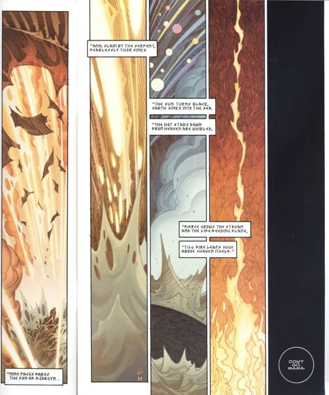
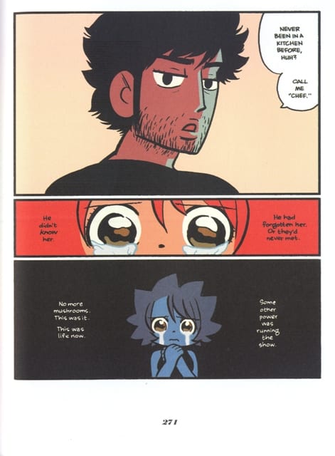
After all of this drama comes the bathetic shift: an all-black panel with the words “Don’t go, mama.” Following a sense-shattering epic opening, we hear the affecting plea of a needy child.
On the next page, the cute little elf is consoled by his sexy elf (?) mother. She’s an assassin about to leave home, make one final kill, get the “big reward,” and then “retire.” (That premise sounds a little too familiar — minus the elf part.)
Simonson tells his story with straightforward layouts and a strong sense of scene-pacing gained from decades making adventure comics. And he draws well; in particular, the four tall panels form a nicely executed sequence of near-abstract compositions, attractively colored by Laura Martin. But the “mama” moment is just too much for me. Perhaps a text-free black panel would have made for a better transition from Epic to Everyday.
Life with Archie: Death of an Icon, a Life Celebrated
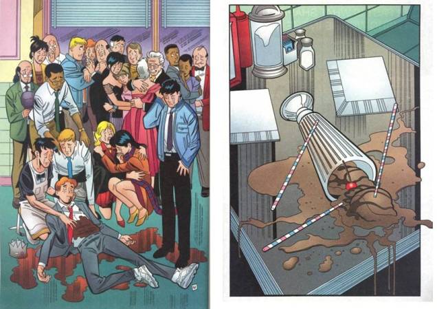 In the comic’s climatic panel, America’s loveable loafer Archie is violently knocked off. This image appears directly before a close-up of a knocked-over ice-cream soda. The metaphor is, to put it lightly, absurdly blunt: a dead icon whose wounded body spills brown blood is symbolized by a broken glass that spills brown soda (Archie debuted in 1941 and the glass is the iconic “milkshake glass” of mid-century American diner culture). Thus, the ice-cream soda is Archie — and, most importantly, the ice-cream soda is us! Archie’s death hails the end of our nostalgic American malt shop, comic-book innocence — all good things come to an end. But, of course, Riverdale’s unruly redhead is alive and monetizing, with new Archie comics populating the racks as we speak.
I’ve read and enjoyed hundreds of Archie comics, but perhaps because I haven’t followed the new socially-engaged series (I guess comics has finally grown up), I’m unprepared for all of this. I thought Archie was supposed to be funny, not funereal: the book presents him as an adult who’s nostalgic to the point of mourning: I think he knows the end is near.

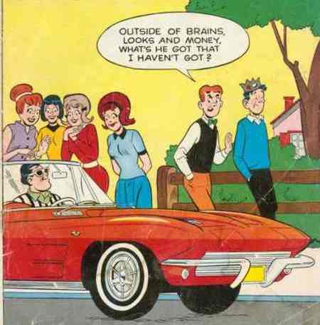
I can’t accept this updated Archie as Archie, so it’s impossible for me to feel anything like pathos. Because of the pre-release media hype, as I read the black-bordered “double sized commemorative issue” (designed like a tacky memento mori), I knew Archie was about to get gunned down. I kept praying for the hit-man to hurry up, to ice this faux-Archie and put me out of my misery. This will always be my Archie, forever funny and forever irrelevant:
Multiversity #1
I’ve heard that Multiversity benefits from reading online annotations, and I’m sure it’s true. Given that I just edited a book on comics with “annotations” in its subtitle (and a few hundred annotations inside), this new Grant Morrison meta-comic should be just the thing for a died-in-the-newsprint comic-book fan like me. Unfortunately, no. Referring to earlier stories (many of them by GM himself), several of the allusions seem more like product placement than expansive inter-textual meaning-making. Is Multiversity a gift to longtime GM readers and a devious plan to keep skeptical interlopers like me out of the clubhouse — after we paid the $4.99 entry fee? Maybe not, but it kind of feels that way.
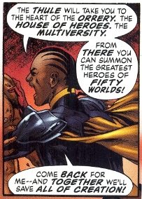
The plot unfolds as a parable about the empowering joys of superhero comics and the deadening effects of comics criticism (perhaps it’s true that all art stems from a desire to get revenge against those who’ve wounded us). Multiversity recalls nearly every Event Comic Series of the last few decades: a group of famous and obscure heroes (fan favorites!) come together to save the day from an evil force out to destroy the universe in a battle that conveniently takes six to twelve issues (plus untold crossovers). GM’s Event will make comics safe for sincere superhero fans — and it’ll make a lot of money for those who regurgitate old ideas.
The book’s critique of the lily white world of superhero comics is morally commendable (I guess comics really is growing up). Yet, when it comes to the never-ending story of mainstream comics’ retrograde representation of super-heroines, GM and his art team might as well be phoning it in from Earth 1993. The women look like costumed porn stars who, while the amped-up boys run around, scream, and save the universe, just stand there and pose for the pleasure of male readers. (I guess comics really hasn’t grown up).
I recognize that, not having followed Morrison too closely, I must be missing a lot of the continuity-based complexity that’s readily available to devotees, and I don’t begrudge them that fun. I have, though, read a vast number of old DC and Marvel comics, and the Silver Age wackiness that Morrison invokes was done far better in the Silver Age. Even when it wasn’t so great, a typical DC story of the 1960s, for example, was a tightly scripted affair, often a carefully plotted mystery masquerading as a superhero story. These comics’ writers believed in “the narrative engine”: develop a central organizing conceit, ditch all distractions, and drive the plot home. Yet many current superhero writers struggle to script a compelling chapter or single-issue story — since every series will quickly be collected into a graphic novel, there’s no need or incentive to. So each issue, with a reading time of less than seven minutes, only presents a bite-sized build-up to something bigger and better that’s perpetually on its way, but rarely arrives.
I’m all for old comic books and nostalgia driven meta-comics, but so far Multiversity feels more like a rote University Lecture (with the British Morrison as pedantic schoolmaster) than a love-letter to Silver, Bronze, and Morrison Ages past. I’d guess that readers unfamiliar with these comics might think that GM was either a bad writer or was mocking superhero comics by employing so many clichés: “We’ll beat them at their game!” “Stand back, everyone! I’ve seen what this thing can do and I won’t risk any--!” “Together we’ll save all of creation!”
In Multiversity, as in Flex Mentallo, superhero propagandist GM seems giddy with the nostalgic possibilities offered by raiding earlier comics — he just can’t trim down the number of ideas to something manageable or coherent. The guiding question for Multiversity is not “Who will save the universe?” but “Who will save Morrison — and you, the reader — from an excess of clichés?” When our world needs them, where are the all-too-human heroes of yesteryear, the always on-track Silver-Age scripters Otto Binder, Gardner Fox, and John Broome? Can The Comics Industry please resurrect these guys instead of unearthing Earth 13’s Tentacle-Lass (again)?
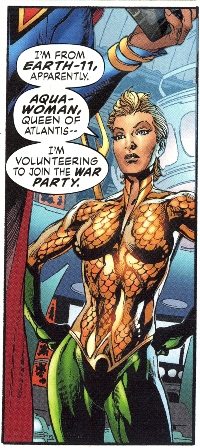
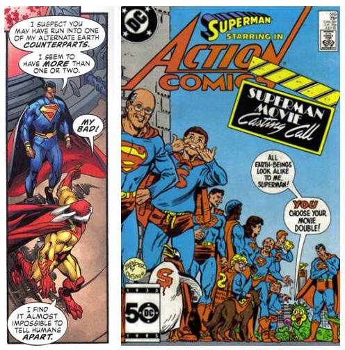
(I’m not sure if it’s an allusion or a coincidence, but a line in Multiversity about race and recognition that’s spoken by a ‘wacky’ character to Superman recalls a similar scenario on the cover of Action Comics #569, a comic I recently read. It seems like the kind of allusion Morrison might make, though others would know better.)
“Who is the best American-comics-influenced British writer?”
The answer, of course, is Andy Partridge of XTC. Take, for example, the power pop of “Sgt. Rock (Is Going to Help Me),” a three-minute new-wave masterpiece that echoes the no-nonsense approach of an old Our Army at War comic’s short story. Like Multiversity, the song portrays a male reader’s engagement with heroic comics, in this case, the DC war stories of Sgt. Rock, the macho leader of “Easy Company.” Partridge explores boys’ investment in the power fantasy central to adventure comics and their male supermen. Feeling impotent in his own life, the protagonist prays that the war hero, who has lead his company out of the most harrowing situations, will step off of the newsprint pages and set his life straight.

Partridge takes the character’s frustrated romantic predicament seriously, yet communicates an awareness of his naiveté through the song’s vocal performance and the background vocals’ wordless “commentary.” While mining earlier material, he blends sincerity and irony in a way that few writers can. “Sgt Rock” imaginatively mixes sympathy, desperation, and comedic wordplay, as each line brilliantly plays out the song’s guiding military metaphor, using war comics’ conventions to inform the “battle of the sexes” scenario. Partridge generates something new, smart, funny, and unexpected out of something old. There’s no comic-book propaganda or uninspired “trope regurgitation” here!
For other Partridge comic-book-influenced songs, check out the Brit Psychedelia of “Brainiac’s Daughter,” the quirky lushness of “That’s Really Super, Supergirl,” the angular agit-pop of “Scissor Man,” and the Steve Ditko dub of “New Broom”: Mr. Ditko was right / Mr. A is so near / Break out the paints and the brushes / And spill out your hearts / No amount of soft soap / Can ever give you a fresh start.
Coda:
These recent books get it right, and I strongly recommend them:
Emily Carroll’s graphic short story collection Through the Woods
Ted McKeever’s comic book series The Superannuated Man
Nick Maandag’s graphic novel Facility Integrity
Joe Casey’s Catalyst Comics: Casey twists familiar Multiversity-type tropes (cosmic crisis / assembling a team of heroes / the “idea of the superhero” / Silver-Bronze age “purple prose” / etc.) into something new and far less insular than Multiversity.
____________________________________________________________
Ken Parille is editor of The Daniel Clowes Reader: A Critical Edition of Ghost World and Other Stories, with Essays, Interviews, and Annotations. He teaches at East Carolina University and is the author of 50 Essential Guitar Lessons.


