The 672 pages of Craig Thompson’s Habibi boldly announce a graphic novel with high ambitions. Resembling a leather-bound holy text with gold leaf gilding, the book’s design adds to its gravitas. Then there’s its imposing mission: to reconcile Christianity and Islam, the Masculine and the Feminine, along with other fundamental binaries. (Thompson also dabbles in "sequential art" theory, divining a mystical unity between the 3x3 comic book grid and the ancient Lo Shu 3x3 magic square.) By all accounts, Habibi set a benchmark for judging 2011’s graphic novels. What comic could possibly be more ambitious?
Yet, in many ways, Thompson’s project is one we’ve seen before. Habibi offers a traditional lesson in comparative religion and mythology. Echoing any number of attempts to reveal parallels among different cultural traditions, it discloses the underlying unity between ostensibly conflicting ideologies, showing us that, despite surface differences, we all share the same meaning-making stories. Traveling this familiar territory (maps and spatial metaphors abound), Habibi really isn’t all that ambitious. One way to understand the comic’s lack of ambition is to think about the faith it lacks in readers: a more ambitious work might imagine a more actively engaged audience. Before we get a chance to discover for ourselves the organized world Thompson is unfolding, seemingly every image or concept is explained and immediately connected to one that appeared before it: drawn lines turn into sentences, which turn into rivers, which turn into names whose etymological origin derives from words for water. Driven by a simple engine—“this connects to that”—Habibi is programmatic rather than intellectually or narratively ambitious. Much of its structure emerges from the comic’s central image of boat in a desert, which unites water and sand, natural and manufactured, culture and no-culture, etc . . . (Its obsession with binaries and parallels evokes David Mazzucchelli’s hyper-organized Asterios Polyp, a comic as programmatic as Habibi but much less didactic.)
Lacking confidence in its audience, Habibi recalls a graphic novel that appeared on many 2009 “Best Of” lists: Logicomix: An Epic Search for Truth. (Publishers Weekly celebrated it as “ambitious.”) The authors of this Bertrand Russell biography tell us that not all comics are about superheroes, but that, if it helps, we can think of Russell as a superhero of the mind. They frequently pop up to explain things that don’t need explaining, as though addressing a readership of unperceptive 12-year-olds. Perhaps it’s Thompson’s similar lack of faith that leads some to view him as a “Young Adult” author. For me, Thompson’s best work is his least ambitious—the 2004 travelogue Carnet de Voyage, which documents the research he did for Habibi. It’s free from the programmatic execution of the later comic and the purple prose of his earlier Blankets. In Carnet de Voyage’s opening “Disclaimer,” Thompson repeatedly apologizes for his limited ambition: “This is not the ‘Next Book.’” In other words, if you want another Blankets, you’ll have to wait for Habibi. But there’s no need for apologies. Carnet de Voyage succeeds.
***

While reading the first few pages of Matthew Thurber’s 1-800-MICE, we might think that Thurber’s world, like Habibi’s comparative religion framework, is one we’ve also seen: an absurdist fantasy starring kooky characters and missing a plot. But any such assumption quickly evaporates. The cartoonist controls a vast number of characters as they move through a series of carefully interlocking narratives, a tricky combination that has defeated many authors. All the plots—Peace Punk’s search for Valhalla, a trio of murderous sushi chefs’ search for Peace Punk, a galactic banjo contest, a human/tree marriage, and more!—slowly come together. While Habibi reads like the labor of considerable research, 1-800-MICE reads like the invention of a synthetic imagination that discovers itself on the page. Thurber reinvigorates a vast visual-verbal vocabulary of contemporary and antiquated images and phrases. It’s a surrealist thriller, and a beautifully organized farrago.
Part of Thurber’s success stems from his line work and character design. While Thompson’s lyrical brush line often erases, or at least smooths out much of the drama, Thurber’s constantly shifting yet always scratchy pen line animates his farcical and occasionally disturbing proceedings: he draws the beautiful, the grotesque, and the comical with equal ease.

Habibi has some funny jokes, but there’s a little too much Will Eisner-esque earnestness and facial/gestural overacting, which stifles the comedy and drama. Nearly all of Thurber’s drawings are funny, and (if you ask me), funny is harder to do than lyrical.
***

The religious traditions that Habibi joins together, Frank Miller tears asunder. There’s no mystical union in Holy Terror, only the Fixer’s “postmodern diplomacy”: a barrage of all-American hot lead.

Before the comic’s release, Miller proclaimed his ambition: he planned to “piss people off” with a work of pure “propaganda.” If we judge the book according to this standard, it’s a spectacular failure. Holy Terror yearns to be a seething provocation, a call-to-arms against Obama and Chamberlain-like appeasers who fail to enlist in the Holy War on Terror. The aggressively reactionary political messages are there (Islam is evil, torture is good, gratuitous torture is really good), but on nearly every page Miller’s genre allegiances tread on his political commitments. It’s a fascinating hard-boiled love story, an attractively designed romance set against the backdrop of a post-9/11 America in which love is a disease.
In this world gone wrong, all the Fixer and the Cat Burglar have is each other. They begin as a classic romantic comedy mismatch: he’s on the right side of the law, she’s a sexy lawbreaker. But there’s plenty of heat, hate, and sickness to bring them together. Miller’s desire for clear-cut polemic is thwarted by his love of and long-time reliance on soft porn. Dressed in figure-revealing bondage gear and fishnets, the Cat Burglar is the central focus of Miller’s audience (he writes exclusively for hetero white males).

“Uh, were you saying something about religion or whatever?” He doesn’t recognize that, in his dystopia, the time for propaganda is past. It’s a grotesque, fallen world.
While 2011’s universe-resetting Justice League #1 [see here] stuffs an eye-straining excess of detail into its panels and pages, Miller knows how to use space. His horizontal widescreen approach features full-page panels with splattered paint and ink blotches, some of which look like they could be the artist’s fingerprints:

Just as he’s not afraid to go artsy, he’s not afraid to go minimal:

On his blog, Miller aligns Holy Terror with WWII-era comic books, in which Captain America and other heroes demolished national threats. Miller forgets that these comics derive part of their polemical force from character design: the good guys are attractive and the bad guys are ugly. In Holy Terror, everyone becomes unsightly when rendered by Miller’s pen. Despite his pretense to partisanship, Miller spreads the hate to both sides.
Our Puritan forebears, no strangers to religious propaganda, believed that art must employ “the playne style.” Adornment was anathema. Ornamentation didn’t just distract readers from religious content, it negated it. Perhaps no religious-political graphic novel is less plain than Miller’s. It’s far too seductive and strange to be propaganda, as he so fervently hoped. Holy Terror’s artistry triumphs over its political will.
***

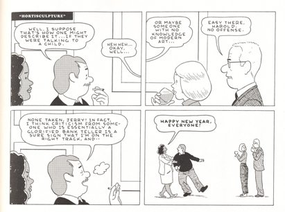
At the end of Optic Nerve #12, Adrian Tomine includes a two-page autobiographical strip that he refers to as “filler—the kind of strip an artist dashes off to get an issue finished or meet a deadline." Tomine reflects on his current ambitions in an era dominated by The Long Graphic Novel. Though feeling the pressure of the moment—every cartoonist is going Habibi big—he decides to go small, releasing a trend-bucking, old-fashioned stapled comic book featuring two self-contained short stories. He models the construction of one of these, “A Brief History of the Art Form Known as 'Hortisculpture'", on a genre with even less cultural cachet than the comic book: the newspaper strip.
The organization of “A Brief History” imitates the week-long cycle of a daily newspaper comic. It opens with six four-panel strips (i.e., the Monday through Saturday episodes) followed by a large color comic (i.e., the Sunday episode). Tomine alludes to Charles Schulz’s Peanuts; the strip was often printed in newspapers as four consecutive panels, though “A Brief History” follows the less common 2x2 stacked arrangement:


This organizational device carries with it none of the overwrought repetition of Habibi’s mystical everything-is-connected-to-everything format. It frames Tomine's narrative and modulates its rhythm—every “strip” works as a light but touching gag. Without explicitly linking its thematic concerns to Peanuts, his strip conveys the comfort of familiarity yet avoids any the indulgence of nostalgia. Tomine’s choices are compelling, not because he rejects the graphic novel and champions a literary lost cause—the comic book—but because he’s one of the few top-tier cartoonists still producing high-quality short stories.
***

After Daniel Clowes finished Ice Haven, he tossed around ideas for his next book, asking himself, “What’s the dumbest possible thing you could do? Like, what’s the worst idea to ever pursue in comics?” His answer: “a realistic superhero story.” A lesser cartoonist would fear his worst idea. Attempting to transform dumb into great is an act of pure ambition, one with a high likelihood of failure. Though the superhero story is inherently no better or worse than any other genre, seventy years of crap (mingled with a few gems) might lead one to think (wrongly) that the genre is cursed. More often than not, creators simply defeat themselves by relying on past formulas. But Clowes turns all superhero conventions inside-out, as he simultaneously follows and violates nearly every genre expectation. As I explain here, The Death-Ray (first released as a stapled comic in 2004) pulls off the impossible. Clowes has the “realistic superhero” genre all to himself.
***

When a cartoonist collects and revises a serialized story, it rarely reads like an entirely new work. Clowes’s Mister Wonderful is one of those rarities. For the 2011 hardcover version, Clowes redesigned the narrative and its format, offering a new sense of pacing and visual scope. His adult romance ignores unwritten rules of comic book page design, taking inspiration from children’s picture books:
...in older children’s books . . . [y]ou’ll see the standard one big illustration per page with minimal text, and then all of a sudden there’ll be a few images on a page to further the story along. Maurice Sendak does it occasionally. Having read thousands of children’s books to my son, it seeped into my consciousness as I was working on this. That’s really where that came from. It’s one of those things: It seems against the rules to combine big single images with comics. For some reason, it seems like something you can’t do. Children’s books . . . don’t worry about that kind of stuff.
[Interview by Sean Collins.]

Mister Wonderful's endpages

use the montage approach familiar from many kid’s books, such as Disney's The Ugly Stepsisters:

Like his friend Chris Ware, Clowes has an expansive notion of storytelling that takes into account book design, size, and even orientation (i.e. “portrait” or “landscape”), reinforcing the union of form and content. And nothing about the appearance of a Clowes book suggests a look-at-my-lofty-aspirations vibe.

[Size Flatters: Clowes comes near the large dimensions of the 1970s Marvel Treasury format, the size best suited to portray super-adventures. When compared to The Death-Ray, 2011's Justice League #1 seems to fight against its space limitations . . .]

***

One of 2011’s least pretentious comics, and one of my favorites, is another superhero story, “The Red Torpedo: Life at Sea”, a five-page tale from Image’s Crack Comics #63, part of the publisher’s Next Issue Project line of Golden Age-inspired comics. A dialogue and narration-free adventure, “Life at Sea” looks to 1940s adventure narratives, but rejects derivative parody and fanboy homage. Moore, Fosco, and Larsen create light entertainment, a tale attractively inked in ways precise, loose, and blotchy—and nicely colored with a limited flat palette.
Although the Red Torpedo reads Hemingway’s The Old Man and the Sea in the story’s final sequence, “Life at Sea” never strives to recreate Hemingway’s Melvillean plot of Man v. Fish. (The main parallel: an old man fishes). The reference is mostly a punch-line. The tale may get a little extra literary resonance from the hero’s resemblance to Chris Ware’s God character:

“Life at Sea” alludes to Golden Age comics, a literary classic, and perhaps Ware, but eschews grand aspirations. It does, however, possess emotional depth—a gentle and understated pathos. The comic’s solitary hero saves a yacht of party-goers from pirates, only to end up alone as the story closes. When compared to comics like Justice League #1, “Life at Sea” is especially welcome as an underplayed approach to superheroics. Without JL’s burden to introduce DC Comics' new corporate direction for 2011, “Life at Sea” succeeds as a well-executed, fun, and subtly poignant story. I wish there were more mainstream comics like this.
***

Russian literary theorist Mikhail Bakhtin described the novel as an omnivorous genre. In fact, he conceptualized it as "a supergenre, whose power consists in its ability to engulf and ingest all other genres (the different and separate languages peculiar to each), together with other stylized but nonliterary forms of language." [Michael Holquist: The Dialogic Imagination: Four Essays]
Kevin Huizenga demonstrates that the supergenre of the 21st century is the graphic novel. His stunning 2011 issue of Ganges (part of on ongoing long narrative) engulfs and ingests science text books, instructional diagrams, architectural plans and models, video games, natural history, continental philosophy, religious tracts, maps, calendars, adventure comic books, European folk tales, early 20th century American newspaper comics, all manner of infographics, song lyrics, and more! Huizenga doesn’t merely allude to these forms; he integrates them within the visual and verbal discourse system that is his innovative brand of comics-making.

Often described as Huizenga’s “Everyman,” Glenn Ganges is equally a no-man—a series of blank panels eagerly awaiting content. The sleep-deprived Ganges absorbs seemingly every visual, verbal, and hybrid image-text information system he sees, transforming himself into a new character/new way of seeing on nearly every page. In one, his mind functions as a video game’s first-person shooter; in another, as an interactive calendar; in another, as a building’s floor plan, etc. Huizenga/Ganges is the Walter Mitty of comic book narrative technologies.
It’s hard to imagine a comic that’s more ambitious and less pretentious; it’s reader-immersive and reader-friendly. Huizenga’s style recalls the “big nose” school of cartooning—Glenn Gange’s schnoz is one of the comic’s stars. This unaffected old-timey style lends the narrative a sense of charm and elegance, much in the way that Tomine’s “A Brief History” benefits from its Peanuts-inflected form. Unlike Habibi, Ganges never feels like the result of calculated study. Like 1-800-MICE, it reveals a highly flexible and omnivorous mind at work—and at play. Perhaps we should judge 2012’s comics according the standard set by Ganges #4.
***
Chris Ware has said that literary cartoonists engage in a constant struggle: to tell complex emotional narratives in a medium developed to deliver bawdy jokes. Seen this way, the contemporary cartoonist appears almost absurdly ambitious—and perhaps a little foolish. But Thurber, Tomine, Clowes, and Huizenga look to the comic in comic book to keep themselves honest. All of them are innovative authors, to be sure, and they have created the year’s most intelligent works. But infused with each cartoonist’s distinctive sense of humor, these comics never collapse under ambition’s often cruel weight.
_____________________
I. Comics mentioned, in order with letter grade:
Habibi: B+
Asterios Polyp: A-
Logicomix: “D+” (I was so annoyed I couldn’t finish it.)
Carnet de Voyage: A-
Blankets: C+
1-800-MICE: A+
Holy Terror: A
Justice League #1: D+
Optic Nerve #12: A+
The Death-Ray: A+
Mister Wonderful: A+
“The Red Torpedo: Life at Sea”: A
Ganges #4: A+
II. 2011 books and cartoonists not mentioned, in alphabetical order with letter grade:
Kate Beaton’s Hark! A Vagrant: A-/B+
The Believer’s comic section: A
Chester Brown’s Paying for It: A (See here for my imaginary three-person discussion.)
Michael DeForge: A
Tom Gauld’s New York Times Magazine illustrations/comics: A
Lisa Hanawalt: A
Shigeru Mizuki’s Onward Towards Our Noble Deaths: A (Fun Fact: lettering designed by Kevin Huizenga.)
III. This essay and the above grades should not be read as any kind of comprehensive "best of/worst of" commentary. Works truly great and truly awful have been omitted.